
by Yang Xiao
Today we are announcing the release to web (RTW) of Visual Basic for Windows Phone Developer Tools. This walkthrough demonstrates how easy and convenient it is to develop a VB Windows Phone application using the newly released tools. You’ll see that the many new IDE features in Visual Studio 2010, which help you navigate and write code, are now available for VB Windows Phone applications!
You may have seen the Tip Calculator application on Jason Zander’s blog. This post is a variation on that example, and shows how to create a tip calculator that calculates the tip and splits the bill among a group. We’ll need a way to specify group size, percentage of tip we want to give, and bill amount. Now let’s get started!
First, create a Windows Phone 7 application. After installing VB for Windows Phone Developer Tools, when you create a new project you’ll see new Windows Phone application templates under the new “Silverlight for Windows Phone” node. The tip calculator we’re writing only has one page, so we’ll select the simplest template – Windows Phone Application, as shown in figure 1:
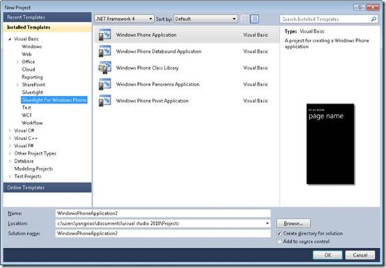 Fig 1. Create a VB Windows Phone 7 Application
Second, add controls to select group size, tip percentage and bill amount. Similar to other Silverlight applications, we can add controls through the designer surface, by handcrafting XAML, or in code. We’ll demonstrate a bit of each. The tip calculator’s UI looks like this, shown in Fig 2.
![clip_image004[4]](https://devblogs.microsoft.com/visualstudio/wp-content/uploads/sites/4/2010/11/7673.clip_image0044_thumb_246C799B.jpg)
Fig 2. Tip Calculator UI Design
Here’s the XAML for the content panel which draws the above UI. As you can see, I use nested StackPanels to organize the controls, whose Orientation property take care of the location of containing text boxes, text blocks and buttons, making layout super easy to manage. The top level StackPanel contains five parts: a sharedByPanel to specify the group size, a tipPanel to specify the tip percentage, a StackPanel to enter bill amount, a StackPanel to display the calculated total tip, and a StackPanel to display the calculated total payment (bill + tip) for each person in the group.
<Grid x:Name=”ContentPanel” Grid.Row=”1″ Margin=”12,0,12,0″>
<StackPanel Orientation=”Vertical”>
<TextBlock Text=”Shared by: “ Style=”{StaticResource PhoneTextNormalStyle}” />
<!– StackPanel is purposely left blank here. Will add controls in code –>
<StackPanel Orientation=”Horizontal” Name=”sharedByPanel” >
</StackPanel>
<TextBlock Text=”Tip %: “ Style=”{StaticResource PhoneTextNormalStyle}”/>
<!– StackPanel is purposely left blank here. Will add controls in code –>
<StackPanel Orientation=”Horizontal” Name=”tipPanel” >
</StackPanel>
<StackPanel Orientation=”Horizontal”>
<TextBlock Text=”Bill Amount: “ Style=”{StaticResource PhoneTextNormalStyle}”/>
<TextBox x:Name=”BillAmount” Width=”150″/>
<Button x:Name=”calcBtn” Width=”100″ Height=”80″ FontSize=”13″ Content=”Run!”></Button>
</StackPanel>
<StackPanel Orientation=”Horizontal”>
<TextBlock Text=”Total tips: “ Height=”50″ Style=”{StaticResource PhoneTextNormalStyle}”/>
<TextBlock x:Name =”totalTip” Style=”{StaticResource PhoneTextNormalStyle}”/>
</StackPanel>
<StackPanel Orientation=”Horizontal”>
<TextBlock Text=”Each pays: “ Height=”50″ Style=”{StaticResource PhoneTextNormalStyle}”/>
<TextBlock x:Name=”eachPays” Style=”{StaticResource PhoneTextNormalStyle}”/>
</StackPanel>
</StackPanel>
</Grid>
</Grid>
You can easily drag controls such as TextBlocks, Textboxes and Buttons from the Toolbox to the design surface, as shown in Fig 3.
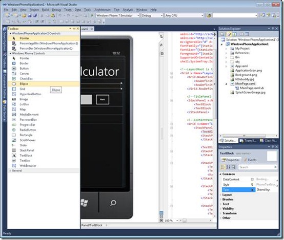
Fig 3. Drag controls from the Toolbox to Design Surface
Nested StackPanels can be conveniently added wherever necessary in MainPage.xaml file directly. The Visual Studio editor’s IntelliSense makes XAML editing user friendly. See Fig 4 for an example of XAML intelliSense on the orientation property for a StackPanel.
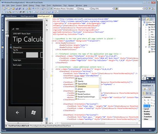
Fig 4. XAML IntelliSense
To make the UI more interesting, I’m going to draw a person icon to indicate the group size, as shown in Fig 5. The green color indicates how many people are sharing the bill. If the user clicks the 4th icon, then the first 4 person icons will turn green. This has been implemented through adding code in MainPage.xaml.vb.
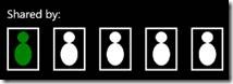
Fig 5. Use the Person Icon to Indicate the Group Size
The person icon is implemented as a button with two ellipses, which allows me to use Fill property to change color. Each person icon is also hooked up with an event handler that processes the color change for all the icons before itself. This requires that each icon knows its position and is able to identify the icons before it. To achieve this, I use an inherited class PersonBtn from Button, adding Id to indicate its position.
One enhancement you’ve probably noticed in Visual Studio 2010 is that we removed the line continuation character (in 95% of cases)! This was a long requested feature from VB developers, and it works in VB Windows Phone applications as well! Furthermore with Auto-implemented Properties (highlighted below), you can declare a property and its default value in one line!
Public Class PersonBtn
Inherits Button
Property Id As Integer
Property Head As Ellipse
Property Body As Ellipse
Dim headSize As Integer = 20
Dim bodyWidth As Integer = 30
Dim bodyHeight As Integer = 40
Public Sub New(ByVal i As Integer)
MyBase.New()
Id = i
AddControl()
End Sub
Private Sub AddControl()
‘button
Me.Width = 80
Me.Height = 100
Me.BorderThickness = New Thickness(0)
‘person
Head = New Ellipse With {.Fill = New SolidColorBrush(Colors.White), .Height = headSize, .Width = headSize}
Body = New Ellipse With {.Fill = New SolidColorBrush(Colors.White), .Height = bodyHeight, .Width = bodyWidth}
Dim personStackPanel = New StackPanel With {.Orientation = Orientation.Vertical}
personStackPanel.Children.Add(Head)
personStackPanel.Children.Add(Body)
Me.Content = personStackPanel
End Sub
Public Sub ChangeColor(ByVal c As Color)
Head.Fill = New SolidColorBrush(c)
Body.Fill = New SolidColorBrush(c)
End Sub
End Class
Now that we have PersonBtn, I can add multiple instances of it on the UI, as shown in code below. The first highlighted line uses a VB collection initializer to conveniently define an array of user-defined types and assign values in the same statement. The icons are added to the containing StackPanel by calling sharedByPanel.Children.Add method. The second highlighted line adds a universal event handler to each PersonBtn to specify the group size, and changes the corresponding person icon color to green.
Dim personArray As PersonBtn()= {New PersonBtn(1), New PersonBtn(2), New PersonBtn(3), New PersonBtn(4), New PersonBtn(5)}
For Each p As PersonBtn In personArray
sharedByPanel.Children.Add(p)
AddHandler (p.GotFocus), AddressOf HandlePersonSelection
‘set default
If (p.Id = 1) Then
p.ChangeColor(Colors.Green)
Else
p.ChangeColor(Colors.White)
End If
Next
Private Sub HandleTipSelection(ByVal sender As Button, ByVal e As RoutedEventArgs)
percentTips = DirectCast(sender, PercentageBtn).Ptg
DirectCast(sender, PercentageBtn).ChangeColor(Colors.Green)
Dim nonSelectedTipPercents = From t In tipPercentArray
Where t.Ptg <> percentTips
For Each t In nonSelectedTipPercents
t.ChangeColor(Colors.White)
Next
End Sub
Next, we’ll add the remaining controls and logic to the code. The tip percentage icon is implemented in a similar manner, as shown in Fig 6. See attached solution for detailed code.
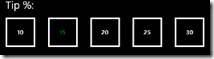
Fig 6. Tip Percentage
There are a few tricks are worth mentioning when you write a Windows Phone app. For example, to enter the bill amount, the default keyboard setting is English characters and users can click the number button to switch to numeric input. However in code, you can change default keyboard setting and save users a click. Here’s how to do it through the TextBox’s InputScope property:
Dim DigitKeyboard As New InputScope()
DigitKeyboard.Names.Add(New InputScopeName With {.NameValue = InputScopeNameValue.Digits})
BillAmount.InputScope = DigitKeyboard
Also, you can use the string format to easily change numbers to the desired currency format in just one line. Here’s an example:
Private Sub calcBtn_Click(ByVal sender As System.Object, ByVal e As System.Windows.RoutedEventArgs) Handles calcBtn.Click
‘calcualte and show updates
If (Not String.IsNullOrEmpty(BillAmount.Text)) Then
Try
totalBill = CDbl(BillAmount.Text)
totalTips = totalBill * (percentTips / 100)
payPerPerson = (totalBill + totalTips) / sharedBy
totalTip.Text = totalTips.ToString(“C”, New System.Globalization.CultureInfo(“en-US”))
eachPays.Text = payPerPerson.ToString(“C”, New System.Globalization.CultureInfo(“en-US”))
Catch ex As InvalidCastException
MessageBox.Show(“Please enter a valid $ amount!”)
End Try
End If
End Sub
Now we’re done coding both the UI and the application logic! Let’s hit F5 and run it. If you don’t have a Windows Phone 7 physically connected to your computer, Windows Phone Developer Tools will launch the Emulator. This is also the default setting. To see how this tip calculator runs in the Emulator, please see Fig 6. (I removed the button borders to make them look nicer. J)
Windows Phone 7 applications provide the same full debugging experience as other VB Silverlight applications. You can set breakpoints, step into, over and out function calls, and use all the debug windows such as Watch, Autos, Locals, Immediate, and Threads.
As an exercise for yourself – the current application only allows sharing among group size of 5. Add UI and logic to remove this restriction!

Fig 7. Tip Calculator Running in the Windows Phone Emulator
Visual Studio 2010 IDE Tips & Tricks
At the end, I want to highlight a few new IDE features in VS 2010. These features are also available in Windows Phone application development, and can help improve your code navigation and editing experience.
Navigate To (Ctrl + ,)
Activate this command from the Edit menu (Edit->Navigate To), or using the keyboard (Ctrl+,). “Navigate To” helps quickly navigate to functions, type definitions and files. It supports Pascal Casing and multiple-string search. See Fig 8.
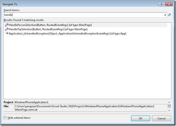
Fig 8. Navigate To, for functions, type definitions, and files
Generate From Usage (Ctrl + .)
Generate types and method stubs on the go! You don’t have to define everything before you implement your logic. This also helps in a collaboration environment where your team members can implement dependent components. See example in Fig 10.
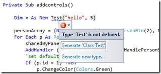
Fig 10. Ctrl + . to Bring up Generate From Usage Smart Tag for Undeclared Type Test
Selecting “Generate Class Test” in Fig 10 will create a new file Test.vb , containing a newly generated class . Selecting “Generate new type…” will bring up the following Generate From Usage Dialog, which provides further customization of the new type being created. See Fig 11.
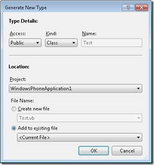
Fig 11. Generate From Usage Dialog
Intellisense Consume First Mode (Ctrl + Shift + Space)
Disable aggressive matching from IntelliSense. This comes up most frequently in situations like above, when you reference a symbol name before it’s been defined. However with Consume First Mode enabled, when you’re typing a new type that doesn’t exist, IntelliSense will not get in your way anymore! See Fig 9.
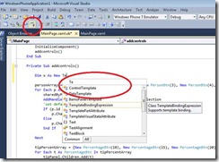 Fig 9. Intellisense Consume First Mode
Box Selection and Multiline Editing (Hold Alt and drag mouse)
You can now do box selection and edit multiple lines! See a video demo here:
http://blogs.msdn.com/b/visualstudio/archive/2009/10/26/box-selection-and-multi-line-editing
Now you have all the secret weapons. Have fun writing your own VB Windows Phone applications!
0 comments