

Starting with the 2310.30 version of PIX on Windows, the Timing Capture Metrics view can produce a statistical comparision of the average duration for the points that represent PIX event hierarchies in two selected ranges of time. Statistical comparisions help determine which portions of the event hierarchies had statistically different durations for the set of points being compared.
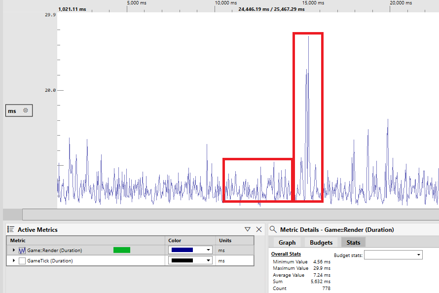
For example, the following graph of a metric named Game::Render shows several ranges of time where the event durations are relatively consistent, but there are also ranges of time in which the event’s duration is significantly longer than the average. A statistical comparison of the event durations in the two highlighted time ranges can be used to determine which portions of the Game::Render event hierarchy account for the differences in duration.
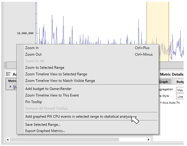
To determine the statistical differences between two time ranges, select the first range of time, right click in that range for the event that you’d like to compare, then select Add graphed PIX CPU events in selected range to statistical analysis. Repeat the process for the second range of time.
After two ranges of time have been added, the Statistical Comparision window appears. The two ranges of time can be from different captures. This allows you to compare data from a capture taken on one device with the data taken on a different device, for example. Note that each selected range of time must have at least two points for the event being compared. It’s recommended that you select ranges that have enough points to provide a good sample representation of your game’s behavior. The amount of data may vary depending on how noisy your source data is, but a good rule of thumb is to look for ranges with 50-100 data points. A warning indicator will be shown if the number of data points is below 20.
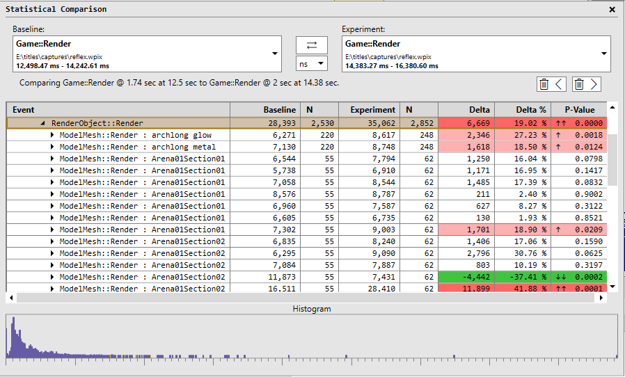
The Baseline column in the table displays the average duration for the set of points in the first range of time. The Experiment column displays the average duration for the set of points in the second range of time. The Delta and Delta % columns show the differences in duration between the baseline and experiment groups.
The P-value column identifies whether the differences between the baseline and experiment groups are statistically significant or whether the differences are due to other factors such as noise, random sampling, or sampling bias. The lower the P-value, the more statistically significant the differences are. Those rows with the lowest P-values, are the rows you’ll likely want to investigate further, by drilling further into the event hierarchy. Rows that are statistically significant are colored in either red or green depending on whether the delta between the baseline and experiment groups is negative or positive. The boldness of the red and green colors is relatlive to how close to 0 the P-value is. Up and down arrows are also displayed in the P-value column to aid with accessibility. Sorting by P-value is a convenient way to bring the most statistically signifcant points to the top of the table.
The histogram at the bottom of the Statistical Comparison window shows the distribution of the durations for the baseline and experiment groups for the selected row in the table. There is generally a correlation between the P-value for a given row and it’s histogram. The histograms for the baseline and experiment group are largely overlapping for rows with high P-values, and vice versa.
The number of points in the baseline and experiment groups also influences how to interpret the results. The N columns in the table display the number of points for each group. A yellow warning triangle is drawn in those cells with low sample counts. Results may be biased in these cases.
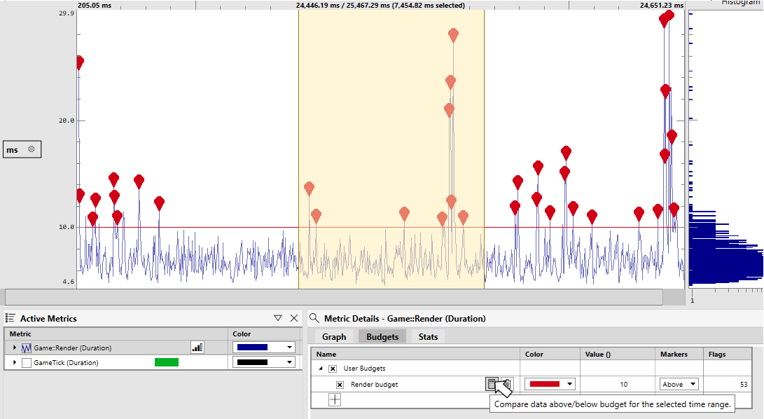
Statistical analysis is integrated into the performance budgets feature in the Metrics view. After establishing a budget and selecting a range of time, use the calculator icon to create a statistical comparison of the points above and the points below the budget.
Thanks for reading!
Steven.
0 comments