
We recently announced preliminary support for Android L Developer Preview, and as you dive into playing with the new SDK you will immediately notice one of the biggest enhancements is the brand new Material Design concepts that Google has developed. This is the first time that Google has created a full design specification for developers to work off of when creating Android applications. In this post I will introduce the main concepts and impact of Material Design for Xamarin developers including:
- Theming and Accenting your Android App
- Elevation and View Shadows
- New Drawable Capabilities

Additionally, Jérémie Laval and I will be giving a wonderful session at this year’s Evolve entitled Android Material Design from Concept to Implementation. In this session we will cover every aspect of Material Design including design concepts, new widgets, animations, compatibility, and so much more.
Setting Up Your Project
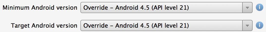
Before we get started be sure you have all of the latest Xamarin.Android and Android SDKs installed. Be sure to read our Android L Developer Preview Support announcement for full details of how to get started. Once you have your project open you will want to update the Target, Minimum, and Compile Target Framework found under your project options General and Android Application settings. In the future, you will want to change your Minimum Target to support older frameworks, but since Android L is not officially released you won’t be able to ship L apps to Google Play yet. Additionally, be sure to create an Android L emulator or have a device such as a a Nexus 5 or 7 that can run the Android L Developer Preview.

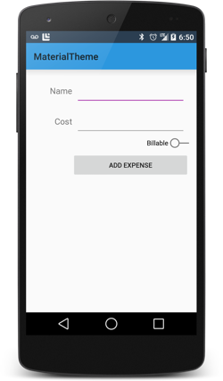
Material Theme
When developing Android applications you are able to use and customize themes to brand your application. You might already be familiar with the Holo theme that has become very popular in the last few years. Android L introduces a brand new Material Theme in multiple flavors that you are able to use in your application. These will not only theme your ActionBar, but will give you a refreshed style for all of the controls. Here are the three themes available:
- @android:style/Theme.Material (dark theme)
- @android:style/Theme.Material.Light (light theme)
- @android:style/Theme.Material.Light.DarkActionBar

To start to use these themes you will first need to create a new folder in the Resources folder called values-v21. This is where any of your Material Theme customization should be placed. Since you will most likely need to support older versions of Android you would want to fallback to a supported Theme in the Resources/values folder for older versions. With this folder in place you should now create a new styles.xml file and create a new theme for your application that inherits from one of the themes above (to support older versions create a styles.xml in your /values folder and create a theme with the same name there). Here is a new theme for my app called AppTheme which is of the default dark material theme:
<resources>
  <style name="AppTheme" parent="android:Theme.Material">
  <!--Customizations Here-->
  </style>
</resources>
To use this theme you simple need to add it to your AndroidManifest.xml under the application node:
<application android:label="My Awesome App" android:theme="@style/AppTheme">
</application>
Alternatively, you can set it on a specific Activity with the Theme attribute.
[code lanaguage=”csharp”] [Activity (Label = "MaterialTheme", Theme = "@style/AppTheme")] [/code]
Add Branding
 Sometimes the default color schemes might not match your companie’s brand or you might just not like them. No worries, as Google has made it extremely simple to customize the Material themes by setting these three properties in your theme:
- android:colorPrimary – Your app’s branding color
- android:colorPrimaryDark – Darker variant of colorPrimary, used by default for status bar
- android:colorAccent – Accent color for UI controls
Here is what a Xamarin based theme might look like with these colors:
<style name="AppTheme" parent="android:Theme.Material.Light">
  <item name="android:colorPrimary">#3498DB</item>
  <item name="android:colorPrimaryDark">#2C3E50</item>
  <item name="android:colorAccent">#B455B6</item>
</style>
You can customize the status bar with the android:statusBarColor attribute.
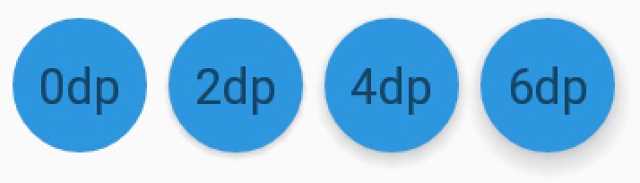
Elevation
When developing for Android L you are no longer restricted to just the X and Y properties of a control and have the ability to adjust the Z value to elevate controls off the page. To achieve this we are able to set the android:elevation attribute on our element using a specific size such as 2dp, which is used to determine the size of the shadow.
The shadow is drawn against the view’s background drawable. Let’s say you wanted to add an elevation to a TextView. You could set a background color and elevation, but you can spice it up and create a circle drawable for the TextView’s background with a specific fill color:
<!-- Resources/drawable/mycircle.xml -->
<shape xmlns:android="http://schemas.android.com/apk/res/android"
       android:shape="oval">
    <solid android:color="#3498DB" />
</shape>
You would then set the elevation and background attributes on the TextView:
<TextView
  android:id="@+id/my_circle_text"
  ...
  android:background="@drawable/mycircle"
  android:elevation="2dp" />
Here are three lined up with different elevations:
You are also able to set a translation of a view for animations using the View.SetTranslationZ method.
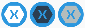
Drawable Tinting
A unique addition to Android L is that you can now define bitmaps as an alpha mask and easily tint them by using the android:tint attribute. You no longer have to create multiple versions of your assets to simply change their colors. Mixed with the new theme color attributes and the brand new Palette Library that enables you to get colors samples from an image you can do some amazing things. Here is an example of a white Xamarin logo tinted in a few different colors with a circle background:
<LinearLayout
    android:orientation="horizontal"
    android:layout_width="wrap_content"
    android:layout_height="wrap_content"
    android:layout_gravity="center_horizontal">
    <ImageView
        ...
        android:src="@drawable/xamarin_white"
        android:background="@drawable/mycircle"/>
    <ImageView
        ...
        android:src="@drawable/xamarin_white"
        android:background="@drawable/mycircle"
        android:tint="#2C3E50"/>
    <ImageView
        ...
        android:src="@drawable/xamarin_white"
        android:background="@drawable/mycircle"
        android:tint="#B4BCBC"/>
</LinearLayout>
So Much More
This is just an introduction to Material Design, but there is so much more including animations, notifications, CardView, and RecyclerView just to name a few. Be sure to check out our Android L samples on GitHub and our Android Samples page.