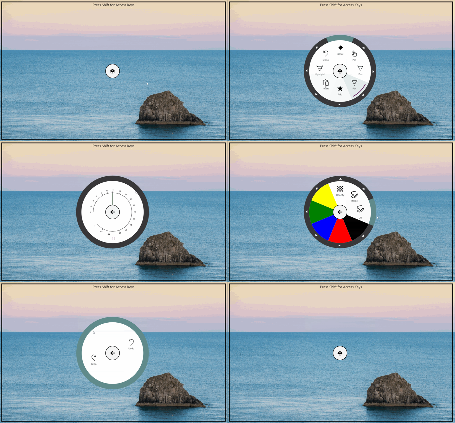
User interfaces should not stand between user and content – a known golden rule that can be difficult to implement. For presentation-heavy applications dealing with notes, images, or documents, being as unobtrusive as possible has always been an important mantra. The most popular apps in those fields tend to have user interfaces that collapse or even disappear entirely. One popular solution is a flexible radial control, which the user can drag around on-screen, providing as little or as much interaction as the user wants.
In preparation for the launch of the new Surface Book, the Surface Pro 4 as well as the Surface Hub, we built and open sourced a powerful radial control for XAML/C# Universal Windows Apps together with the popular PDF Reader and Annotation app Drawboard.
This code story describes how we built the control – and how your app can benefit from the open source code that will be preinstalled on Surface devices. It first explains the features before guiding you through building a small “Hello Radial Control” app.
Requirements, Features, Benefits
For those uninitiated, Drawboard is a powerful PDF Annotation app that can be currently found on Surface devices. It’s a true game changer for professionals who spend a lot of their time scribbling on large documents – the typical example being a civil engineer confronted with hundreds of ever-changing building plans. Replacing dozens of gigantic printouts with a Surface and its stylus is a dramatic leap towards mobility. Built in beautiful Melbourne by a small startup, the Drawboard app provides such great value that it is preinstalled on new Surface devices including Surface Hub, Surface Pro and Surface Book.
To provide a good user experience, the app uses as much screen real estate as possible for the actual PDF currently displayed. Interactions, like the selection of various digital markers or pens, happen on a radial menu control, which the user can drag around the screen and position wherever it is convenient. While the experience is great, Drawboard outgrew the control purchased from a third party provider – it wasn’t as flexible or powerful as needed for future features while also consuming too many resources. In particular, the shortcomings included frequent crashes, suspected memory leaks, lack of flexibility in usage, unavailability of source code, and a restrictive license.
Let’s Build a Better Control
Let’s take a quick look at the feature list, starting with the pieces that make up the control: In the middle, we have a center button, which is surrounded by a variable number of buttons. Each button contains two clickable pieces: A rim on the outside and an inner part. The inner portion contains the primary action, while the outer rim opens up additional options to configure the primary action. Those pience are decorated with icons, labels, and colors for various pointer states.
Beyond a simple button, we have the various ways users can interact with the primary portion. Each button is capable of being a host for a submenu, which can be opened by clicking on the outer rim. The button itself can either be a simple one, behaving just like a normal XAML button – but it can also be a toggle or radio button, capable of being either selected or unselected.
In addition to those features, we sprinkled in some special features to enable cool scenarios – most notably around the submenus accessible by clicking on the outer rim of a button. If the user is asked to select from a large number of options (like a font list), you can use a “long list selector” instead. If the user is asked to select a numeric value, you can make use of the “meter submenu” – an interactive gauge, allowing the user to move the needle to the right value. If none of those options seem appropriate for selection, you can use the “custom input” button, which allows the user to enter a value directly into the button.
Around all those features, we also have a small floating control, which enables the radial menu to float around in your application. Getting the floating behavior right is a difficult task and involves a large amount of subjectivity – for that reason, we split up the radial menu and the floating control into two pieces, allowing you to mix and match. This concept applies to the whole project: We built the control with large amounts of flexibility, breaking pieces into as many small modules as possible. This makes it tremendously easy to tweak settings or to add additional features to the control, should that be required.
Using the Control in Your Application
To explore the usage of the Radial Menu Control, fork, download or clone the Git repository. If you prefer NuGet, you can install it using the Visual Studio Package Manager:
PM> Install-Package RadialMenuControl
To explore the full flexibility of the control, we walk through building a simple “Hello Radial Control” app. Open up RadialMenu.sln in Visual Studio 2015, where you will find two projects: RadialMenuControl (the actual control) and RadialMenuDemo (which you can ignore for now).
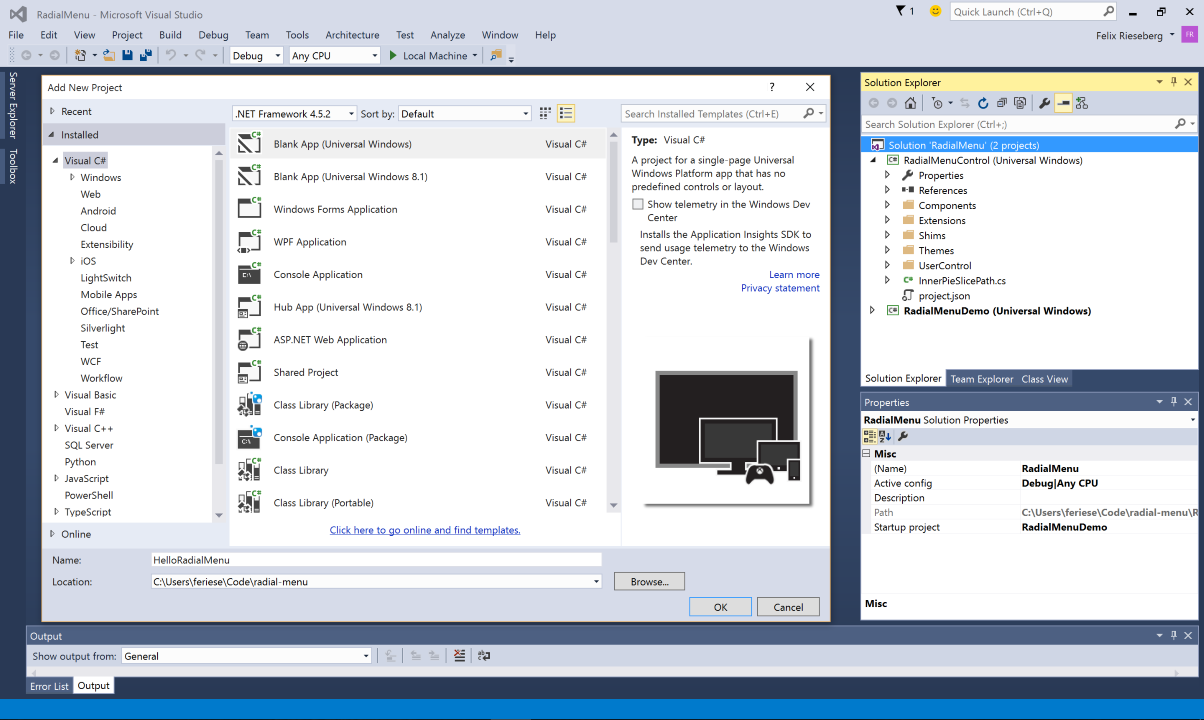
To get started, add a new ‘Universal Windows Blank App’ project using XAML and C# to the solution, naming it HelloRadialMenu.
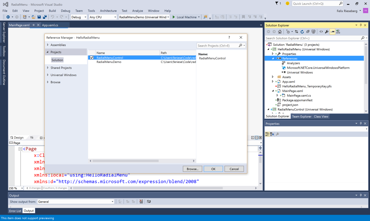
Then, add the RadialMenuControl as a reference to your project.
At the core, this control comes with three XAML user controls: The first one is a Floating control, enabling a child element to float on top of all other elements, which allows the user to move said element around on the screen. The second one is the RadialMenu itself, which is able to house a number of RadialMenuButtons. Should a button contain a submenu, the button then houses a RadialMenu (or a custom submenu control).
Let’s add a floating control and a simple Radial Menu to our MainPage.xaml. Open up the file and add xmlns references to your XAML page. You need add a reference to two namespaces: RadialMenuControl.UserControl and RadialMenuControl.Components.
<Page
    x:Class="HelloRadialMenu.MainPage"
    xmlns="http://schemas.microsoft.com/winfx/2006/xaml/presentation"
    xmlns:x="http://schemas.microsoft.com/winfx/2006/xaml"
    xmlns:local="using:HelloRadialMenu"
    xmlns:d="http://schemas.microsoft.com/expression/blend/2008"
    xmlns:mc="http://schemas.openxmlformats.org/markup-compatibility/2006"
    xmlns:userControl="using:RadialMenuControl.UserControl"
    xmlns:components="using:RadialMenuControl.Components"
    mc:Ignorable="d">
    <!-- ... -->
</Page>
You might be wondering why we have two namespaces here – the reason lies in the abstraction of the radial menu button, done to optimize performance and minimize resource usage. When added to the radial menu, the button is just used to generate a radial menu in a certain state.
Next, we’ll add the Floating as well as the RadialMenu control. Add a Canvas to your MainPage’s grid and fill it with a Floating user control. The floating control has two parameters of interest: You can set either IsBoundByScreen or IsBoundByParent to true to configure how far the user is allowed to drag the control. The floating control can have only one child, which is ideally the often abused Border element, which we filled with another Grid to ensure that XAML renders inside the radial control correctly.
Inside the Grid, add the RadialMenu like outlined below. The RadialMenu has a bunch of options, but to get started, just set the Diameter, the StartAngle, the CenterButtonIcon (which we set to a donut), and the CenterButtonBorder. The diameter describes the total width and height of the radial menu, while the starting angle is the angle at which the first button is drawn. If you leave it unset (or set it to 0), the first button will be drawn at “north top”. Also, just to make things less boring, we set the Grid’s background to GhostWhite.
<Grid Background="GhostWhite">
    <Canvas>
        <userControl:Floating IsBoundByScreen="True">
            <Border>
                <Grid>
                    <userControl:RadialMenu Diameter="300" StartAngle="-22.5" CenterButtonIcon="🍩" CenterButtonBorder="Black">
                    </userControl:RadialMenu>
                </Grid>
            </Border>
        </userControl:Floating>
    </Canvas>
</Grid>
The control itself is fairly boring without any buttons, so let’s jump right in and add some buttons. Buttons can be added either in code-behind or in XAML, but in both cases they need to be added to the controls Buttons property. For a basic button, simply set the Label and the Icon property. For best performance, we recommend that you use icon fonts – you can either copy our use of emojis (which don’t require that you set a font), or use a specialized icon font like Font Awesome or Segoe UI Symbol by setting the IconFontFamily option. If you need to use an image, simply set the IconImage property to an ImageSource – if set, it will automatically supersede a text-based icon.
<Grid Background="GhostWhite">
    <Canvas>
        <userControl:Floating IsBoundByScreen="True">
            <Border>
                <Grid>
                    <userControl:RadialMenu Diameter="300" StartAngle="-22.5" CenterButtonIcon="🍩" CenterButtonBorder="Black">
                        <userControl:RadialMenu.Buttons>
                            <components:RadialMenuButton Label="Melbourne" Icon="🌏" />
                            <components:RadialMenuButton Label="Sun" Icon="🌞" />
                            <components:RadialMenuButton Label="Food" Icon="🍱" />
                            <components:RadialMenuButton Label="Halloween" Icon="🎃" />
                        </userControl:RadialMenu.Buttons>
                    </userControl:RadialMenu>
                </Grid>
            </Border>
        </userControl:Floating>
    </Canvas>
</Grid>
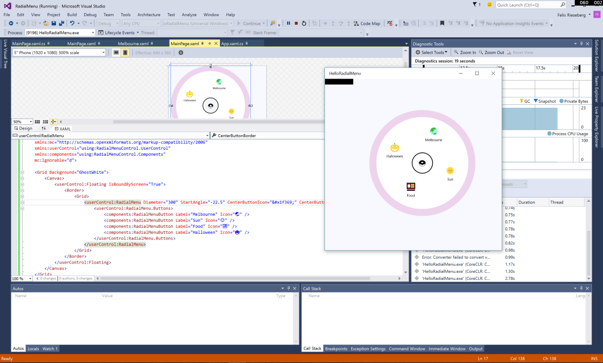
With those basics set, go ahead and build/deploy/run the app by hitting F5. If you’re not seeing the app you’ve just been working on, ensure that your new HelloRadialMenu app is the “StartUp Project” by right-clicking on the project and selecting the “Set as StartUp Project” option.
Adding Submenus
A common use case for radial menus is a toolbox, enabling the user to select a tool. Let’s assume that the Food button should have a submenu, offering the user various food items. To add a simple submenu, simply pass a RadialMenu the a button’s Submenu property.
<userControl:RadialMenu Diameter="300" StartAngle="-22.5" CenterButtonIcon="🍩" CenterButtonBorder="Black">
    <userControl:RadialMenu.Buttons>
        <components:RadialMenuButton Label="Melbourne" Icon="🌏" />
        <components:RadialMenuButton Label="Sun" Icon="🌞" />
        <components:RadialMenuButton Label="Food" Icon="🍱">
            <components:RadialMenuButton.Submenu>
                <userControl:RadialMenu>
                    <userControl:RadialMenu.Buttons>
                        <components:RadialMenuButton Label="Fries" Icon="🍟" />
                        <components:RadialMenuButton Label="Eggs" Icon="🍳" />
                        <components:RadialMenuButton Label="Ice Cream" Icon="🍨" />
                        <components:RadialMenuButton Label="Noodles" Icon="🍜" />
                        <components:RadialMenuButton Label="Burger" Icon="🍔" />
                        <components:RadialMenuButton Label="Pizza" Icon="🍕" />
                    </userControl:RadialMenu.Buttons>
                </userControl:RadialMenu>
            </components:RadialMenuButton.Submenu>
        </components:RadialMenuButton>
        <components:RadialMenuButton Label="Halloween" Icon="🎃" />
    </userControl:RadialMenu.Buttons>
</userControl:RadialMenu>
If you build and run your app now, you will see that the outer rim of your food button automatically became enabled, got a little caret indicating an interaction, and opens up the submenu on button press.
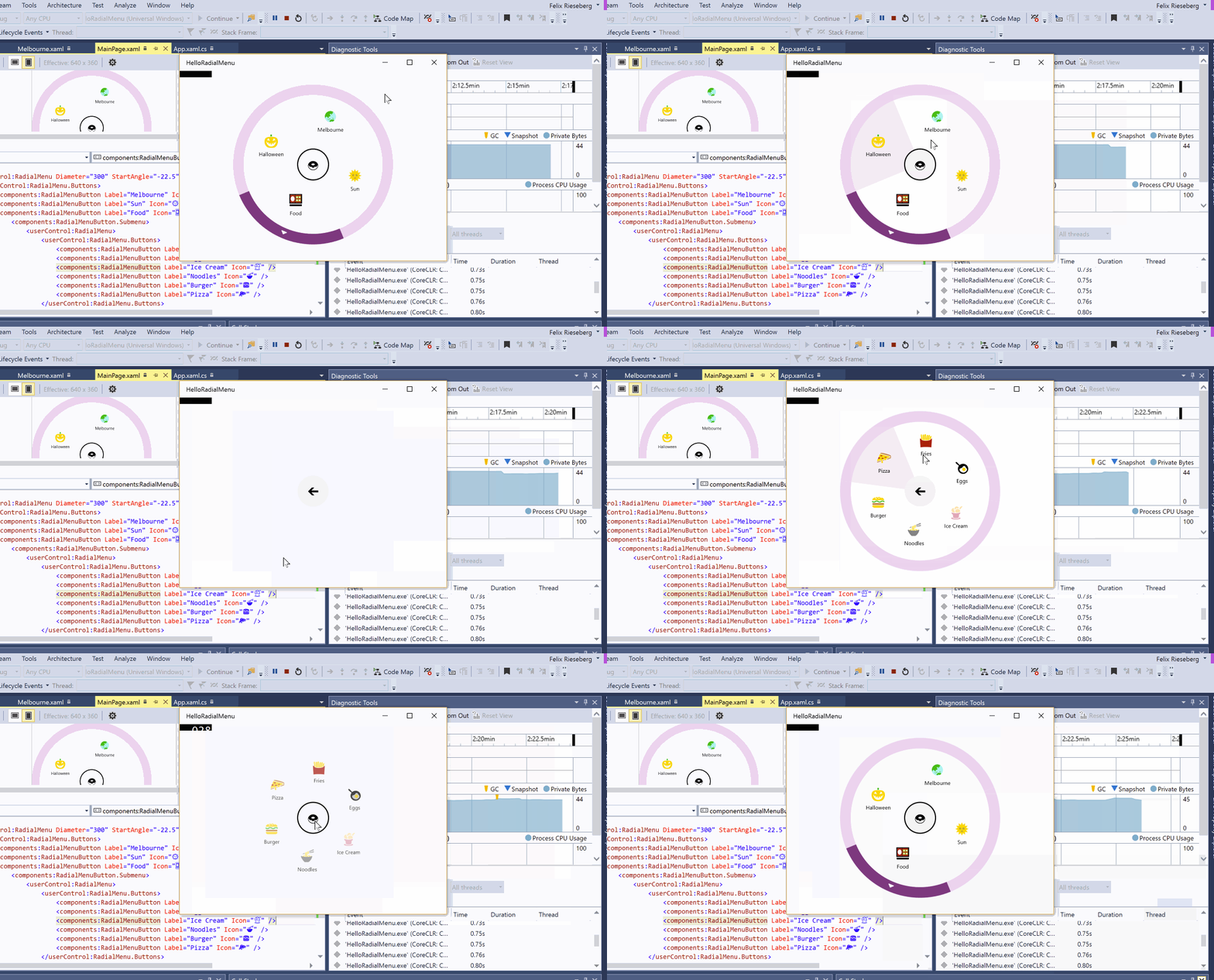
Now, let’s assume that we want to give users the option to choose the diameter of their pizza using an interactive gauge. RadialMenuButtons can host various kinds of custom submenus – the control ships with two kinds, a long list selector and a meter selector. While we could add the meter in XAML, let’s mix things up and do it in code-behind. First, find the pizza button in your XAML file and give it an x:name (for instance PizzaButton) so that we can easily access it from C#.
Then, head over to MainPage.xaml.cs and add a new method to your MainPage class called SetupPizzaMeter. Call it in your MainPage(), right after InitializeComponent(). Also, add a reference to RadialMenuControl.UserControl.
using RadialMenuControl.UserControl;
using System.Collections.Generic;
using Windows.UI.Xaml.Controls;

namespace HelloRadialMenu
{
    public sealed partial class MainPage : Page
    {
        private void SetupPizzaMeter()
        {
        }

        public MainPage()
        {
            this.InitializeComponent();

            SetupPizzaMeter();
        }
    }
}
Let’s add a MeterSubMenu to your pizza button. The basics are obvious: It’s a gauge with a start and end value, from which the user can pick one. In most cases, the intervals between useful values will vary. Take a font size selector as an example: A good selector includes the most common values, but then quickly starts jumping in greater intervals. 6,7,8,9 are there, but the next offered choice after 72 might be 94. The MeterSubMenu enables you to configure intervals, managing all the difficult math behind the scenes.
First, define your intervals by creating a new List<MeterRangeInterval>, filling it with as many MeterRangeIntervals as you want to. Each interval is configured with start and end value, start and end degree – and optionally also a tick interval, which describes the distance between visible tick markers. In our case, we’ll add two:
private List<MeterRangeInterval> PizzaIntervals = new List<MeterRangeInterval>()
{
    new MeterRangeInterval
    {
       StartValue = 5,
       EndValue = 20,
       TickInterval = 1,
       StartDegree = 0,
       EndDegree = 220
    },
    new MeterRangeInterval
    {
        StartValue = 20,
        EndValue = 34,
        TickInterval = 2,
        StartDegree = 220,
        EndDegree = 330
    }
};
Inside SetupPizzaMeter(), we can now add and configure the custom submenu on the pizza button. To get going, you only have to configure the meter’s total start and end values, the start angle, and the length of your gauge meter. Then, pass the intervals to the Intervals property.
private void SetupPizzaMeter()
{
    var pizzaGauge = new MeterSubMenu()
    {
        MeterEndValue = 34,
        MeterStartValue = 5,
        MeterRadius = 70,
        StartAngle = -90,
        MeterPointerLength = 70,
        RoundSelectValue = true,
        Intervals = PizzaIntervals
    };

    PizzaButton.CustomMenu = pizzaGauge;
}
In a real world scenario, somebody would have to be notified when the user’s selected value changes. You can get the SelectedValue from pizzaGauge at any time (it doesn’t have to be visible), but in this example, let’s print a debug line as soon as the user selects a value:
pizzaGauge.ValueSelected += (s, e) =>
{
    var selectedValue = (s as MeterSubMenu).SelectedValue;
    Debug.WriteLine("Value changed to " + selectedValue);
};

PizzaButton.CustomMenu = pizzaGauge;
To test your interactive gauge out, build and run the app. Go to the food submenu and notice how the pizza button now has an enabled outer rim, which opens up the custom menu on button press. Drag the needle to your desired position and release to set the value. Observe the output window to see the value being reported.
Toggle & Radio Buttons
Let’s assume that in our food menu, users can’t click the pizza button as many times as they want to – they can merely choose pizza. Even harsher, they don’t get to combine it with other entrées, but they may optionally select or deselect ice cream. This is simple to implement: Go back to your MainPage.xaml and set the Type property of all food buttons to either Radio or Toggle. In one given radial menu, only one radio button can be selected – while toggle buttons play nice with other selected buttons.
<components:RadialMenuButton Label="Food" Icon="🍱">
    <components:RadialMenuButton.Submenu>
        <userControl:RadialMenu>
            <userControl:RadialMenu.Buttons>
                <components:RadialMenuButton Type="Radio" Label="Fries" Icon="🍟" />
                <components:RadialMenuButton Type="Radio" Label="Eggs" Icon="🍳" />
                <components:RadialMenuButton Type="Toggle" Label="Ice Cream" Icon="🍨" />
                <components:RadialMenuButton Type="Radio" Label="Noodles" Icon="🍜" />
                <components:RadialMenuButton Type="Radio" Label="Burger" Icon="🍔" />
                <components:RadialMenuButton Type="Radio" Label="Pizza" Icon="🍕" x:Name="PizzaButton" />
             </userControl:RadialMenu.Buttons>
        </userControl:RadialMenu>
    </components:RadialMenuButton.Submenu>
</components:RadialMenuButton>
Events
Unless you want to severely disappoint your users, clicking the buttons should trigger some kind of action in your app – so let’s talk about events for a moment. In order for the control to be as flexible as possible, you can bind to all kinds of events. Each RadialMenuButton as well as the center button has events for pointer presses and releases for both the inner and the outer portion (which includes mouse, touch, and stylus interactions).
Let’s assume that we want to print a debug line whenever the user presses the top-level food button. In your MainPage.xaml, find the food button. Make use of Visual Studio’s amazing IntelliSense and let it create a new event handler for the InnerArcReleased event.
<components:RadialMenuButton Label="Food" Icon="🍱" InnerArcReleased="RadialMenuButton_InnerArcReleased">
Open MainPage.xaml.cs and find the freshly minted event handler. In there, simply log that we better start cooking:
private void RadialMenuButton_InnerArcReleased(object sender, Windows.UI.Xaml.Input.PointerRoutedEventArgs e)
{
    Debug.WriteLine("Get cooking!");
}
In order to be fancy, the selected food option should be somehow reflected in the top-level menu. As soon as the user leaves the food menu to go back to the main level menu, we want to check if a food option has been selected – and if so, we want to change the food button icon and label. Open MainPage.xaml and find the RadialMenu for your food options. In there, use IntelliSense to create a new handler for the CenterButtonTapped event. Also, let’s give the food button a x:Name so that we can easily access it from C#.
<components:RadialMenuButton x:Name="FoodButton" Label="Food" Icon="🍱" InnerArcReleased="RadialMenuButton_InnerArcReleased">
    <components:RadialMenuButton.Submenu>
        <userControl:RadialMenu CenterButtonTapped="RadialMenu_CenterButtonTapped">
            <userControl:RadialMenu.Buttons>
                <components:RadialMenuButton Type="Radio" Label="Fries" Icon="🍟" />
                <components:RadialMenuButton Type="Radio" Label="Eggs" Icon="🍳" />
                <components:RadialMenuButton Type="Toggle" Label="Ice Cream" Icon="🍨" />
                <components:RadialMenuButton Type="Radio" Label="Noodles" Icon="🍜" />
                <components:RadialMenuButton Type="Radio" Label="Burger" Icon="🍔" />
                <components:RadialMenuButton Type="Radio" Label="Pizza" Icon="🍕" x:Name="PizzaButton" />
             </userControl:RadialMenu.Buttons>
        </userControl:RadialMenu>
    </components:RadialMenuButton.Submenu>
</components:RadialMenuButton>
In MainPage.xaml.cs, we can now add the logic that will update the icon of the top level food item. Basically, we want to check if the menu’s Pie, the data structure managing all the currently visible buttons, has a selected radio button. If so, we use that selected item’s label and icon to update our food button.
private void RadialMenu_CenterButtonTapped(object sender, Windows.UI.Xaml.Input.TappedRoutedEventArgs e)
{
    var sendingMenu = sender as RadialMenu;
    if (sendingMenu != null && sendingMenu.Pie.SelectedItem != null)
    {
        FoodButton.Label = sendingMenu.Pie.SelectedItem.Label;
        FoodButton.Icon = sendingMenu.Pie.SelectedItem.Icon;
    }
}
To see all that magic in action, build and run the app.
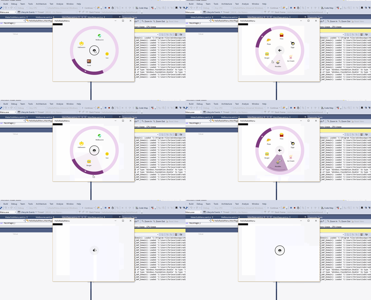
If you just want to see the source code in action, head over to GitHub, where the source code for “HelloRadialMenu” is readily available.
Doing More
The tutorial just covered the basics of the radial menu – depending on your use cases and creativity, you’ll quickly notice that the modularity, opportunity to configure each piece individually, and availability of flexible events makes a large number of scenarios possible. Two small examples would be the custom input – or the long list selector:
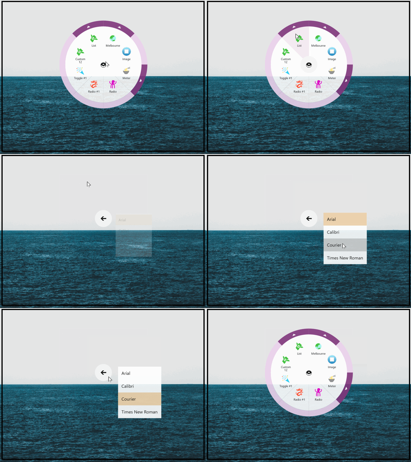

The control has been released using the MIT License and can be used free of charge for both commercial and personal projects (for details, please see the LICENSE). In case you’re wondering about individual properties, methods, and events available on the classes in the control, take a look at the README – they’re all documented there.
