![]() Android developers have been flocking to Material Design since its introduction with the release of Android Lollipop. With the recent update to the Support v7 AppCompat library it has never been easier to add Material Design to target older Android operating systems.
Android developers have been flocking to Material Design since its introduction with the release of Android Lollipop. With the recent update to the Support v7 AppCompat library it has never been easier to add Material Design to target older Android operating systems.
Material Design is much more than just the core theming and styling that you are able to add to your application — it’s animations, layouts, and of course controls. While many controls are available out of the box, there are many custom controls that can spice up your application with even more Material Design. Many of these controls are now available in the Xamarin Component store so you can instantly add them to your Xamarin.Android application. Let’s take a look at a few.
Floating Action Button
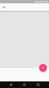
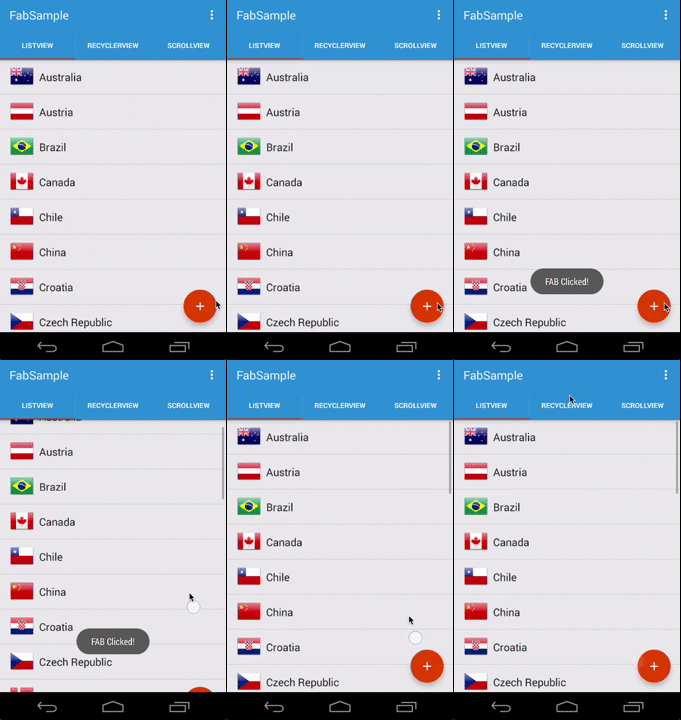
 When developing applications, you often have a main action that your users can perform on a page such as add, edit, delete. The floating action button (FAB) was introduced to enable you to promote your main action with a beautiful and distinguished circled icon floating on the user interface. The floating action button is great because it helps bring context and awareness to the action that you want your users to perform, and you can add it to your Android app with the new Floating Action Button component.
Once you have the component installed, you can add a FAB to any layout by referencing the custom control.
<com.refractored.fab.FloatingActionButton
            android:id="@+id/fab"
            android:layout_width="wrap_content"
            android:layout_height="wrap_content"
            android:layout_gravity="bottom|right"
            android:layout_margin="16dp"
            android:src="@drawable/ic_action_content_new" />
Now you can find the FAB and add a click handler just like any other button.
var fab = root.FindViewById<FloatingActionButton>(Resource.Id.fab);
fab.Click += (sender, args) =>
{
  Toast.MakeText(Activity, "FAB Clicked!", ToastLength.Short).Show();
};
Be sure to read through the getting started guide to see how you can show and hide the FAB with a few simple calls or even attach it to a ListView to have it automatically hide when the list is scrolled.

Pager Sliding Tab Strip
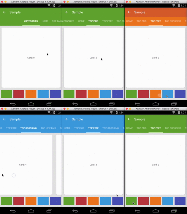
If you are an Android user, you may have noticed the beautiful Tabs that are part of the Google Play Store when browsing. The Material theme provides an updated look and feel to tabs, but it doesn’t introduce an updated View Pager Indicator. This is where the Material Pager Sliding Tab Strip component comes in to enable you to easily add highly customizable and beautiful tabs to your Android app.
After downloading the component, simply add the PagerSlidingTabStrip on top of your ViewPager in your layout.
<com.refractored.PagerSlidingTabStrip
        android:id="@+id/tabs"
        android:layout_width="match_parent"
        android:layout_height="?attr/actionBarSize"
        android:background="?attr/colorPrimary"
        app:pstsPaddingMiddle="true"/>
<!--Set pstsPaddingMiddle to false to start tabs on left-->
<android.support.v4.view.ViewPager
        android:id="@+id/pager"
        android:layout_width="match_parent"
        android:layout_height="0dp"
        android:layout_weight="1"
        tools:context=".MainActivity" />
Then find your ViewPager and PagerSlidingTabStrip and connect them together with any FragmentPagerAdapter.
// Initialize the ViewPager and set an adapter
var pager =  FindViewById<ViewPager>(Resource.Id.pager);
pager.Adapter = new TestAdapter(SupportFragmentManager);

// Bind the tabs to the ViewPager
var tabs = FindViewById<PagerSlidingTabStrip>(Resource.Id.tabs);
tabs.SetViewPager(pager);

For a full sample and to see how to customize the pager sliding tab strip even further, be sure to dive through the documentation and getting started guide for the component.
More Material!
Material Design integration into your Android apps doesn’t stop here. Be sure to read through our Introduction to Material Design, Support v7 AppCompat Library, and the new Android Toolbar. Another great resource are the two presentations that Jérémie Laval and I gave at Xamarin Evolve 2014, Android Material Design from Concept to Implementation Part 1 and Part 2.
