Hello Compose developers,
Over the last two weeks, I’ve given a brief introduction to Relay, as well as talked about some of the tips and tricks I picked up while using the tool. This week, I’ll share my thoughts on the current state of Relay from the developer point of view.
As a reminder, Relay is in alpha, so please go try it out and send the Relay team your feedback!
Favorite features
Even though Relay is very new, I think the team did a great job of building many helpful features into the first versions of the product. Some of my favorites include:
- Validation in Figma plugin
- Transfer of descriptions to header comments
- Custom style and component mapping
- Creation of enums with component variants
- Continuous import
Validation in Figma plugin
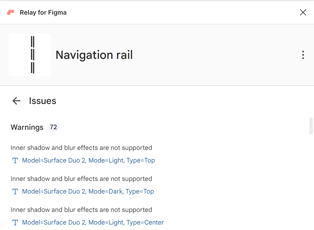
Figure 1. Example of warnings designers can see in Figma when using the Relay for Figma plugin.
I like how the Figma plugin includes error checking, especially related to naming conventions and limitations. I think this cuts out a ton of back and forth between developers and designers, whether it’s about designs facing translation errors or looking different than expected due to Relay’s known limitations.
Transfer of descriptions to header comments
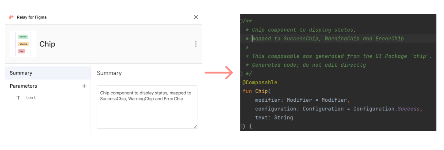
Figure 2. Example of how the summary for a UI package in Figma is transferred to the header comment of the generated composable.
I also really like how any information entered into the description for a UI package or its parameters in Figma will automatically get transferred to the header comments of the generated Compose code. Even though the generated code isn’t checked into source control, I think these small details help with improving code readability and will make it easier for developers to debug any issues.
Custom style and component mapping
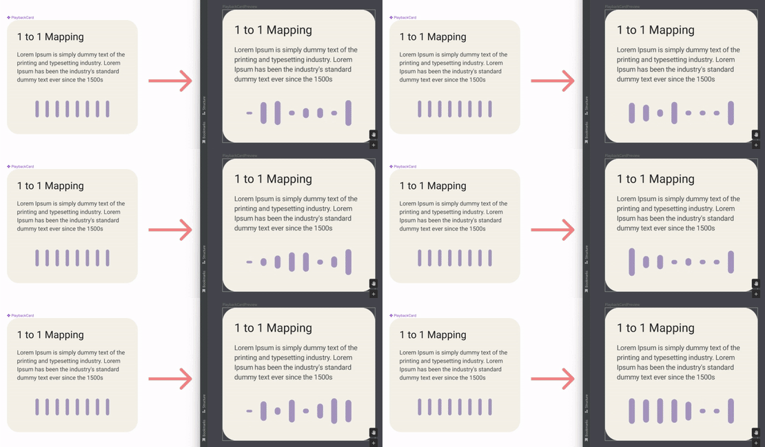
Figure 3. Example from the 1-to-1 mapping tutorial of how component mapping allows for developers to write their own code for complex behaviors, like animation, while still using Relay to generate simpler surrounding UI.
I appreciate how Relay includes lots of customization options, including style and component mapping. Style mapping, which I covered last week, allows you to convert Figma color/typography styles to Compose themes, while component mapping allows you to replace UI package components with existing composables. For instance, if you have a complex animation behavior for a button in a card, you can still create a UI package for the entire card, then just add a mapping file that replaces the static button from Figma with the animated button from your project.
Creation of enums with component variants
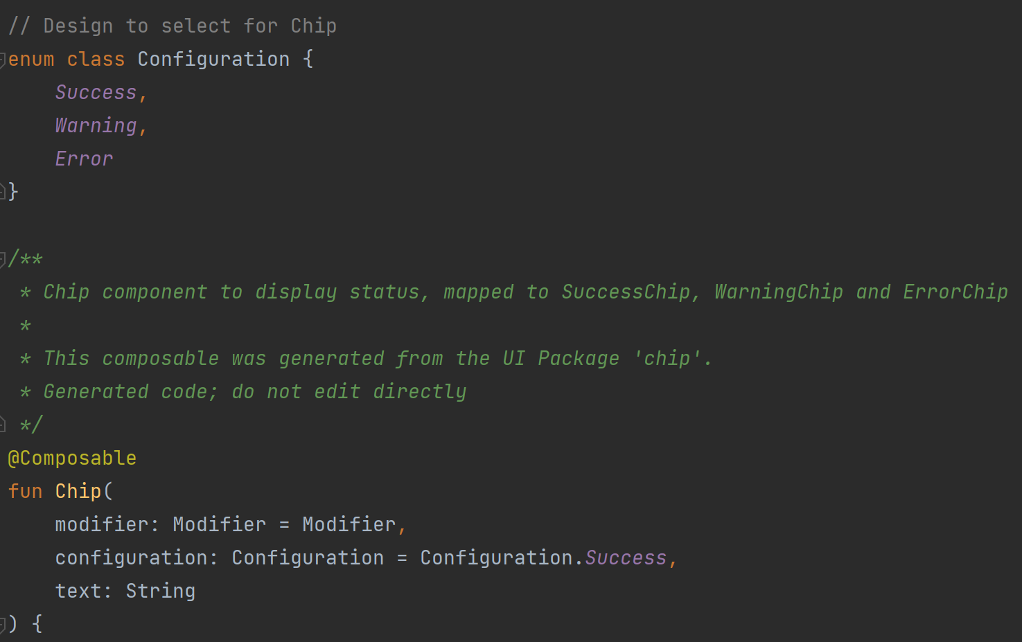
Figure 4. Example of how Relay creates an enum class for components with variants.
When translating a Figma component with variants, Relay will automatically create an enum class to store all possible variants. The variant will also be automatically added as a parameter to the generated composable, as you can see with the configuration parameter in Figure 4, and you can change the variant easily by changing which enum value is passed in. I think this approach is very readable and does a great job of following Compose codestyle!
Continuous import
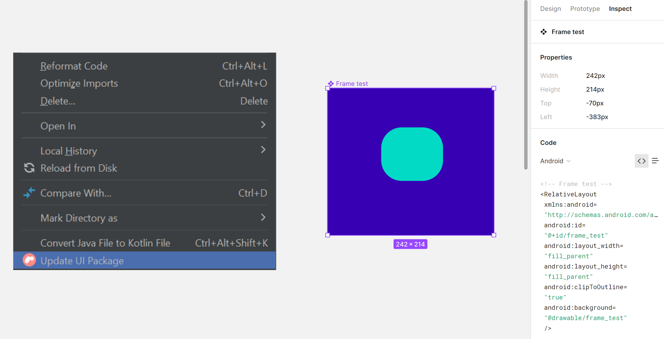
Figure 5. In Android Studio, if you right-click on a UI package, you can use the “Update UI package” option to bring in any new changes from the Figma design file. This is different from the existing Figma to Views conversion available in the “Inspect” tab, which requires you to copy/paste any time a design change is made.
Lastly, I think it was smart that the Relay team set up a workflow that allows for continuous importing. Figma already contains functionality to convert designs to Views in the “Inspect” tab, but here, code is generated directly in Figma and needs to be copy/pasted into projects. With Relay, since code is generated in projects instead of in Figma, you have the functionality to update existing UI packages instantly from Android Studio, instead of having to delete and reimport every time a design is changed. This makes it easier for designers to propagate changes directly to the developers.
Thoughts on the future
As Relay matures, these are some areas I’m excited to see evolve:
- Generated code approach
- Accessibility
- Hardcoding
- Designer expectations
Generated code approach
Although I did say one of my favorite Relay features was the continuous import workflow, in some ways it’s a shame that the Compose code is always generated and shouldn’t be checked into source control.
My main worry is that, even with all of the mapping options available, there are bound to be some cases where Relay doesn’t translate Figma designs perfectly. When that happens, how are we supposed to make edits to the generated composables? In the blog post A Foray Into Relay, the author also brings up some of the risks associated with moving a source-of-truth outside your codebase, including coupling and lock-in. If the Relay plugin breaks, or if the tool is discontinued in the future, then you’ll be stuck with a broken workflow and need to put in extra work to migrate to another tool or revert back to storing composables in your codebase. It’ll be interesting to see what options are available as Relay approaches version 1.0.
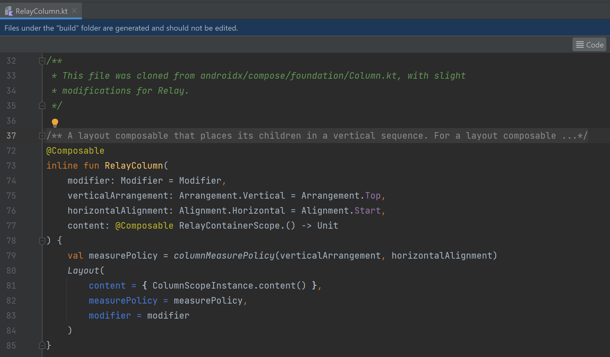
Figure 6. Looking at the code for RelayColumn, we can see that, instead of just wrapping the Column component, they’ve actually copied and modified the measure policy for Column.
Something else I found interesting was that Relay uses Relay-specific versions of composables. The blog post Under the Hood of Relay notes that the components “RelayColumn and RelayRow… strangely do not wrap their compose counterparts.” Taking a closer look at the generated code, we can see that these Relay versions have actually copied the measure policies for these components and made “slight modifications for Relay”. My first thought when seeing that was, “What happens if the measure policy is updated in Column but not yet in RelayColumn?” I think it will be interesting to see how these converge in future.
Accessibility
We’re always interested in accessibility, so we noticed some ‘feature placeholders’ in Relay right away (see Figure 7). Adding accessibility support to future versions of Relay will ensure that both designers and developers start thinking about accessibility early on in the app building process!
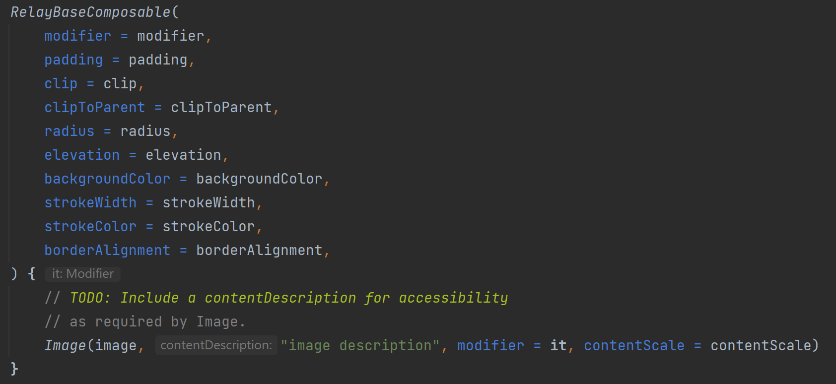
Figure 7. In the alpha version, all images generated by Relay will have the default content description “image description”.
Besides adding accessibility support for visuals, I think Relay would also benefit from adding localization support. Right now, strings are mapped just as string literals, but in the future, it would be super useful to have the ability to 1) refer to string resources, and 2) autogenerate a string resource file. In fact, even though style mapping is already a feature, I think another similarly helpful improvement would be autogenerating a color resource file and/or a custom style mapping template. Even though Relay can map from Figma colors to Material Theme colors, as a developer, you still have to copy over hex color values to your Compose theme by hand. I know it would save me a lot of time if Relay could automatically create a string or color resource file. And for mapping custom styles in Relay, if the tool could generate a half-filled style mapping template, that would definitely save time by eliminating the need to copy color style names from a Figma file.
Hardcoding
As a developer focused on large screens and foldables, another thing I noticed in the generated code was that modifiers are hardcoded with exact sizes using requiredWidth and requiredHeight, and item spacing is often hardcoded, instead of using options like SpaceBetween or SpaceEvenly. This may be fine in some cases, but in general little details like this could lead to unexpected behavior when apps are displayed on different devices. I know this sort of logic is impossible to translate perfectly for all use cases, but I think a good adaptive UI improvement would be making the simple switch to more flexible modifiers, like height instead of requiredHeight.
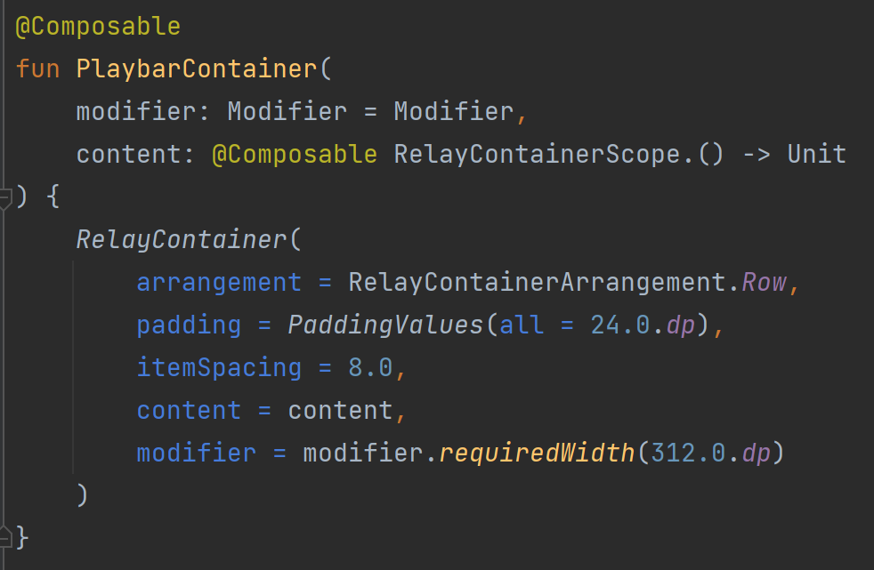
Figure 8. Generated composables in Relay often use the requiredWidth modifier and harcdcoded item spacing to match exact sizes from Figma designs, which could potentially lead to issues with building adaptive UI.
Designer expectations
My last observation is that, in order for the Relay workflow to run smoothly, I think it requires designers to act more like developers and vice versa. Since parameters and composable names are transferred directly from Figma designs, either a) designers will need to learn about proper naming conventions, or b) developers will need to learn how to edit Figma designs.
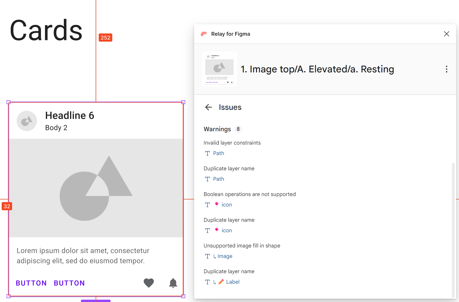
Figure 9. Looking at the Material Design 2 Kit, you can see that the existing Card component has duplicate layer names and other Relay-specific errors.
I’m especially curious to hear what designers think about Relay, because in general, it seems like the workflow requires Figma designs to be formatted in a way that’s stricter than normal. From looking through Figma files for design kits and app designs, I saw that it’s not uncommon (nor an issue) to have duplicate layer names, typos, and a personal style related to which Figma elements are used when. I think that Relay works best when the Figma file is created with code generation in mind, since you may have to do some reorganizing and renaming to make it work for existing designs, but it will be interesting to see if this tool changes the way designers and developers collaborate in the future.
Summary
That’s it for our blog post series on Relay. The Relay team has incorporated so many helpful features into the tool, and this is only the alpha version! I’m really curious to hear from designers and existing teams about their experiences adopting Relay. It’s awesome that Google is working on tackling the handoff problem, and I’m looking forward to seeing how Relay evolves as the year goes on!
Feedback and resources
To learn more about Relay, check out the documentation. You can also provide the Relay team with feedback in Google’s public issue tracker.
If you have any questions, or would like to tell us about your apps, use the feedback forum or message us on Twitter @surfaceduodev.
Finally, please join us for our dual-screen developer livestream at 11am (Pacific time) this Friday – mark it in your calendar and check out the archives on YouTube.

0 comments