
Hello Compose developers,
Last week, I gave a brief introduction to Relay, the new Figma to Compose tool developed by Google. This week, I’ll dive deeper into some tips and tricks I learned when testing out Relay,
As a reminder, Relay is in alpha, so please go try it out and send the Relay team your feedback!
Putting Relay to the test
After following introductory tutorials, my next step in learning Relay was to test it out in a variety of scenarios. Since I’m not a designer, I decided to try out the tool on some existing Figma designs from the Surface Duo Dual Screen Experience Example, the Surface Duo Design Kit, and the Material 2 Design Kit. By working with these different examples, I learned some tips and tricks about 1) when it’s best to use Relay, and 2) how to map styles successfully.
Choose use cases wisely
Going into this learning process, I think my biggest misconception about Relay was that it was going to be some magical tool that could translate any and all Figma designs! Because of this, I was skeptical that the tool would work well, especially in special cases (like building responsive UI for foldables and large screens 😉).
Essentially, I had assumed that Relay could, and should, be used to translate entire screens worth of designs. As a developer, I often build UI one screen at a time, referring to Figma designs like the “Order history list” frame shown in Figure 1. After using the tool more, though, I quickly realized that Relay is not meant to be used like that at all. For one, we wouldn’t want to translate elements like the status bar or device frames. On top of that, it would be very complicated for Relay to try and guess which foundational layouts you want to use, like choosing between TwoPaneLayout and TwoPane, Column and LazyColumn, etc.
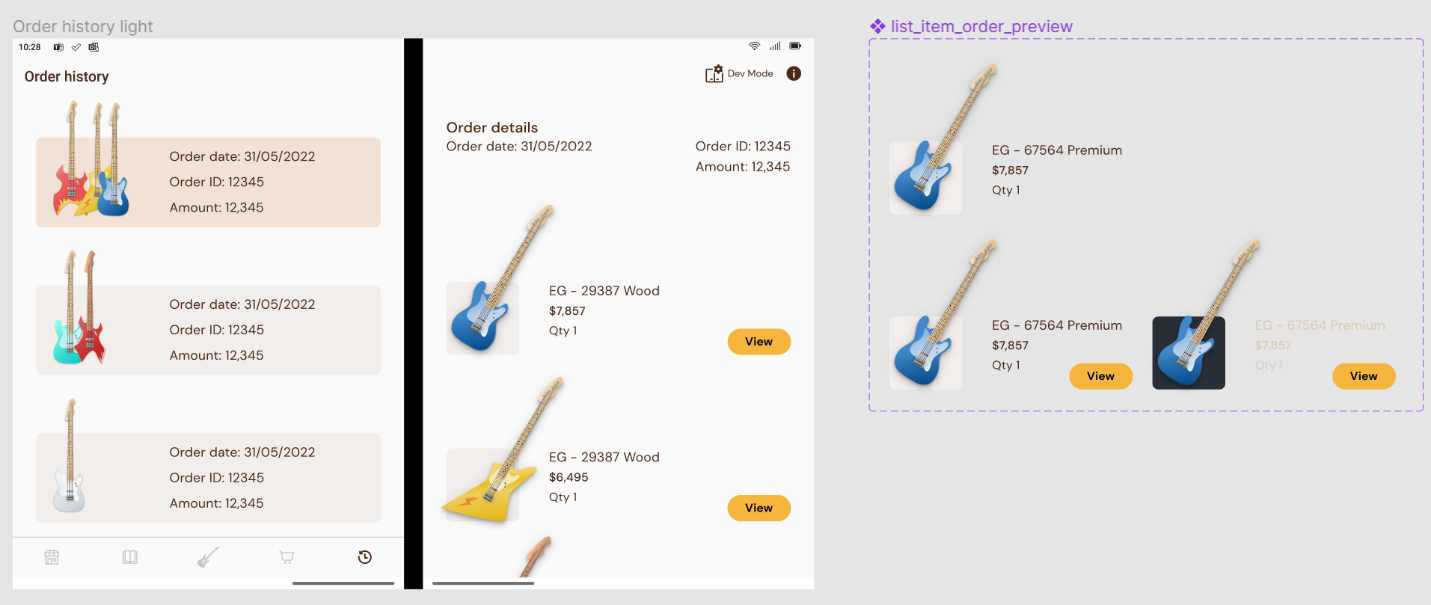
Figure 1. As developers, we often build UI based on an entire screen of design, like the “Order history light” frame. However, with Relay, it makes more sense to build individual UI packages, like the “list item order preview” component.
Instead, I learned that the best use case for Relay is to translate smaller individual UI elements, like the “list item order preview” component in Figure 1. That way, you can incorporate the generated composables into any higher-level layouts or app logic as needed. In fact, I would guess that this is why Relay only allows you to create UI packages from Figma components. I wasn’t very familiar with the distinction between different Figma elements prior to this learning process, but in various design files, I saw that most higher level layers were either frames, groups, or components, which, according to the documentation, “are elements you can reuse across your designs.” So, something like a design mockup for an entire screen may be represented by a frame, but a UI element like a card or button would be represented by a component and thus potentially be a good use case for Relay.
However, it’s important to note that, even if a UI element has been marked as a component by a designer, it still may not be a great use case for Relay! Trying out Relay with Material Design kits was helpful for understanding Relay’s workflow, but in practice, these mappings wouldn’t really be helpful for developers. This is because Relay will translate the Figma component literally, instead of just using the desired component from the Material library.
For instance, when I translated the navigation rail component from the Surface Duo Design Kit, Relay generated Compose code that was basically a column of vector drawables. Did it match the color and spacing of the designs? Sure, but functionality-wise, it’s not going to achieve what we want, so this could be a case for using Relay component mapping or, more likely, just not a case where we would use Relay at all.
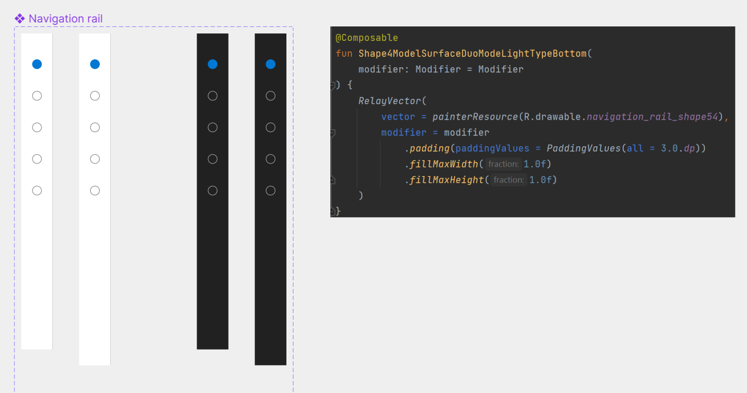
Figure 2. Even if something in a Figma file is a component, it still may not be a good candidate to use with Relay, like this navigation rail component from the Surface Duo Design Kit that is translated as image assets.
So, to summarize, when trying to decide if you should use Relay, consider:
- Can this UI element be treated as a reusable individual package?
- Do I want to translate everything in this UI element?
- Can this UI be represented by basic composables, like Text, Column, and Image, or do I need to rely on specific library components?
Set up designs for style success
Besides making sure to pick your use cases wisely, experimenting with Relay also helped me learn how to map styles correctly.
Again, partly due to my unfamiliarity with Figma, I had some trouble understanding how Relay style mapping worked. I tried building a component from scratch that just contained rectangles, using color fills from the existing Material 2 Design Kit style, but in the generated code, I saw that the elements were actually downloaded as image assets and did not pull from the Material Theme.
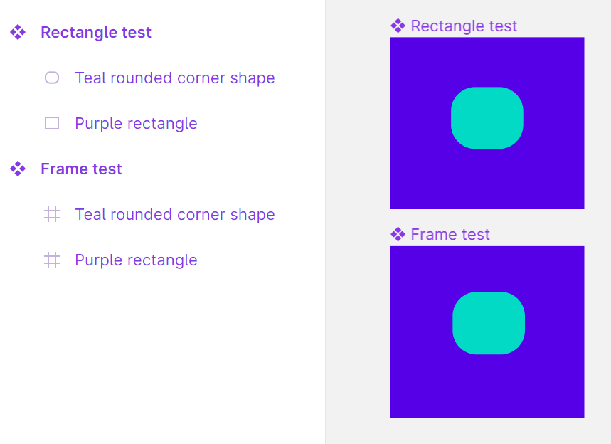
Figure 3. To the untrained (developer) eye, it may not be obvious what makes these two Figma components different, but if you look at the left sidebar, you can see that the top version is made from shapes, while the bottom version is made from frames.
After trying style mapping with an existing component from the design kit, and seeing how the themed colors did correctly transfer, I realized the difference was due to the chosen Figma components. Shapes are treated as vector assets, whereas frames/groups are not, so if you want colors to be mapped successfully to Material Theme colors, keep this distinction in mind! This may be more of a tip for developers than designers, since we’re not really trained in Figma best practices, but it’s good to remember in case any vector designs rely on themed colors that need to change based on light/dark theme.
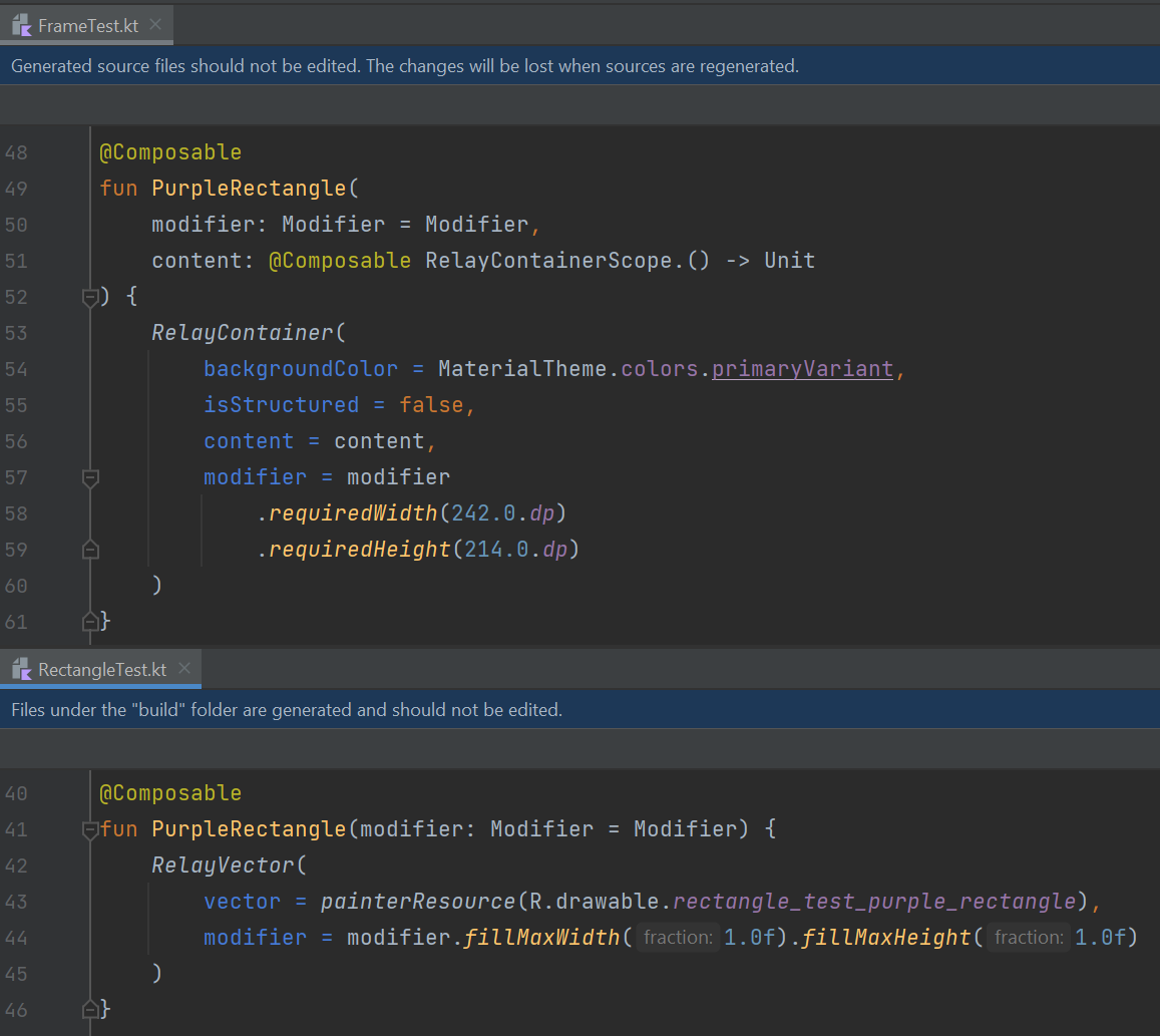
Figure 4. Composables generated by Relay for UI built with frames (top) vs. rectangles (bottom). Even though style mapping was set up in both cases, only the frame version pulls color from the Material Theme, whereas the rectangle version is treated as an image asset.
To learn more about Relay style mapping, check out the documentation. In addition to colors, it also supports mapping text styles. There’s also a cool feature where, even if your design file doesn’t follow the Material 2/3 Design Kit naming conventions, you can set up a custom mapping file between your Figma style and Compose theme.
Even more Relay content next week
I know I said this would be a two-part blog post, but since we have so much Relay content, there’s actually one more post coming next week! We’ll talk about overall impressions of the tool from the developer point of view.
Since this will be a two three-part Relay blog post, we won’t be livestreaming this week, but stay tuned for next Friday when we’ll stream about all three Relay blog posts.
Feedback and resources
To learn more about Relay, check out the documentation. You can also provide the Relay team with feedback in Google’s public issue tracker.
If you have any questions, or would like to tell us about your apps, use the feedback forum or message us on Twitter @surfaceduodev.
Finally, please join us for our dual-screen developer livestream at 11am (Pacific time) next Friday 27th January – mark it in your calendar and check out the archives on YouTube.
0 comments