
Hello Jetpack Compose developers,
This week, we’re super excited to announce the release of FoldAwareColumn! This new component is part of Accompanist, Google’s “sandbox” for experimental Jetpack Compose APIs. The Accompanist Adaptive library already contains the TwoPane component, which we tested out late last year, so FoldAwareColumn will be the second component to join the library.
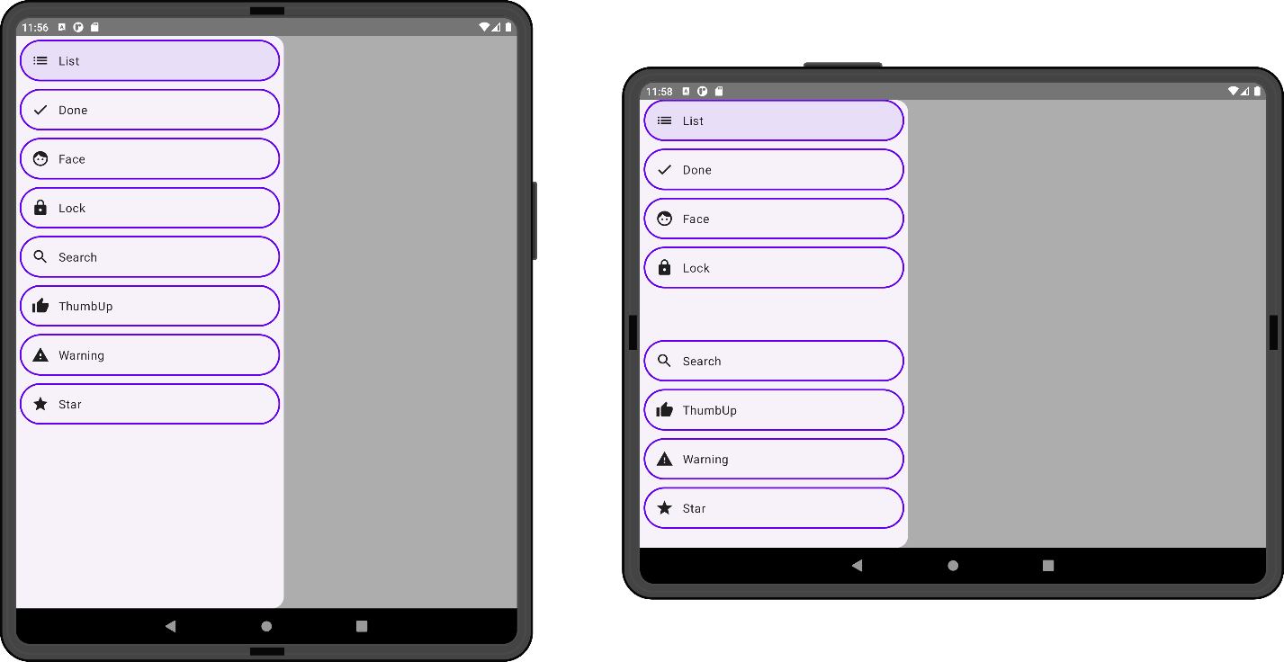
Figure 1. FoldAwareColumn lays out children like a typical Column (left) unless a separating fold is present, in which case it places children around the fold to ensure that visuals and controls are accessible (right).
Component inspiration
We first started talking about FoldAwareColumn when we met last year at droidcon NYC 2022! The original idea was to create a sheet-like component with an enhancement similar to the content drawer in our NavigationRail sample. The original enhancement dynamically animated sheet content to place around a fold, and the behavior looked like this:
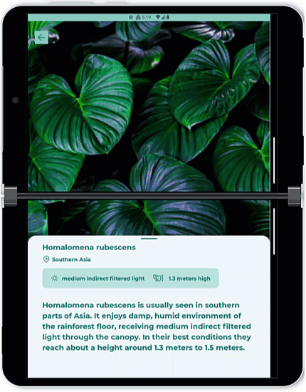 Figure 2.
 FoldAwareColumn was originally inspired by an enhancement in our Navigation Rail sample, which modified a bottom sheet component to place content around a fold.
As we prototyped and thought more about potential applications, we realized that creating a FoldAwareColumn would be more useful than just making one specific enhanced sheet component. That way, FoldAwareColumn can be used inside any other components, like the foundational Row or Column composables.
So, we finally settled on this as the first version of the FoldAwareColumn API:
  fun FoldAwareColumn(
      displayFeatures: List<DisplayFeature>,
      modifier: Modifier = Modifier,
      foldPadding: PaddingValues = PaddingValues(),
      horizontalAlignment: Alignment.Horizontal = Alignment.Start,
      content: @Composable FoldAwareColumnScope.() -> Unit,
  )
Features
The main feature of FoldAwareColumn is that it has the ability to place children around a separating horizontal fold. As a reminder, isSeparating returns true when a device with a flexible screen is folded or if the device has a physical hinge/separation.
In addition to this main feature, the first version of FoldAwareColumn has similar features to Column, as well as some unique features related to fold-aware enhancements:
- Alignment support
-
ignoreFold()modifier -
foldPaddingparameter
Some of these features are made available through FoldAwareColumnScope, which is used just like ColumnScope.
Alignment support
Like the original Column, FoldAwareColumn provides support for setting the horizontal alignment of its children. You can do this either by specifying the horizontalAlignment parameter in the composable or by using the align and alignBy modifiers on children of the layout. These modifiers are made available through FoldAwareColumnScope, and you can see an example in Figure 3 of the three different alignment options: Alignment.Start, Alignment.CenterHorizontally, and Alignment.End.
At this time, the component does not support weight or arrangement due to the additional complications caused by placing the children around the fold. Because of this, FoldAwareColumn will always place children starting from the top of the layout.
Ignore fold modifier
The ignoreFold() modifier is available through FoldAwareColumnScope, and it can be used on any children of the layout to make sure they are placed without taking into consideration any folding features. This means that even if a child overlaps a separating fold, it won’t be moved. This can be especially useful when dealing with children that have large height but can be partially occluded, such as images.
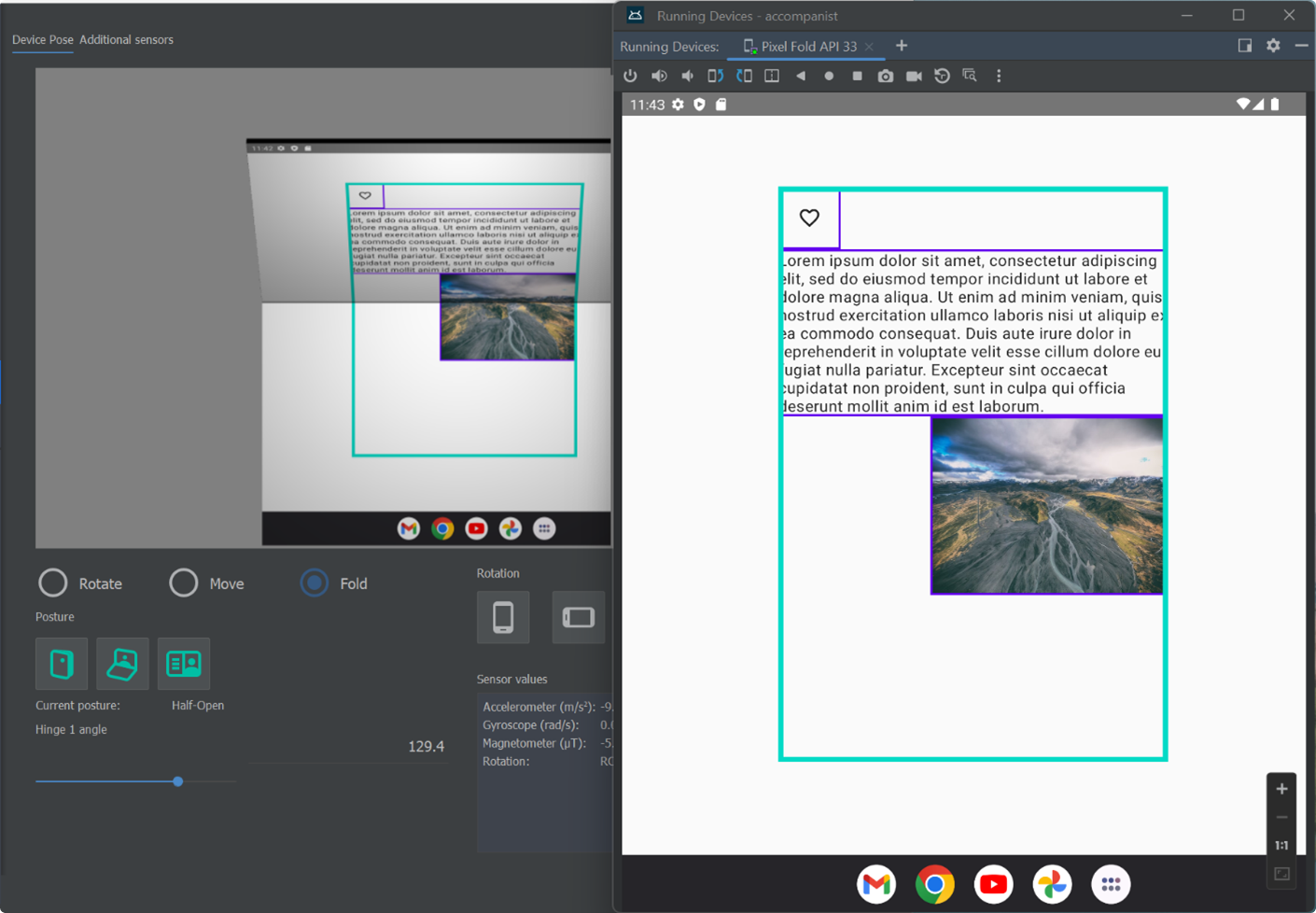
Figure 3. FoldAwareColumn offers support for specifying the horizontal alignment of children, which can be Alignment.Start (heart icon), Alignment.CenterHorizontally (text), or Alignment.End (image). FoldAwareColumnScope also gives you access to the ignoreFold() modifier, which is used on the image to avoid changing its placement, even when a separating fold is present.
Fold padding parameter
When creating a FoldAwareColumn, you can specify the foldPadding parameter to add extra space when adjusting the placement of the layout’s children. This fold padding will only be applied when a separating fold is present. The goal of this parameter is to help you follow foldable design guidelines, which suggest that controls and visuals shouldn’t be placed too close to a fold for optimal user experience.
The parameter is of type PaddingValues, but it’s important to note that only the top and bottom values of the padding will be taken into consideration, since FoldAwareColumn lays out children in a vertical manner.
Add to your project
To start using FoldAwareColumn in your projects, follow these steps:
-
Make sure you have the
mavenCentral()repository in your top-level build.gradle file:allprojects { repositories { google() mavenCentral() } } -
Add dependencies to the module-level build.gradle file (current version may be different from what’s shown here):
implementation "com.google.accompanist:accompanist-adaptive:0.31.4-beta"
-
Also ensure the
compileSdkVersionis set to API 33 and thetargetSdkVersionis set to API 32 or newer in the module-level build.gradle file:android { compileSdkVersion 33 defaultConfig { targetSdkVersion 32 } } -
Call
FoldAwareColumnand pass in all the required parameters:calculateDisplayFeaturesand the composable content. Optionally, you may also specify a Modifier, the horizontal alignment, and the fold padding, of which only the vertical padding values are used. This can be used to ensure that controls and important UI elements aren’t too close to the fold, which will improve the user experience.
For more information, check out the API reference and library samples.
Resources and feedback
All of the code for FoldAwareColumn in available on GitHub in the Accompanist repo.
To learn more about Accompanist and enhancing your apps for foldables, check out these resources:
- Accompanist (google.github.io)
- Learn about foldables | Android Developers
- Support foldable and dual-screen devices with Jetpack WindowManager | Android Developers
If you have any questions, use the feedback forum, file an issue in the Accompanist issue tracker, or message us on Twitter @surfaceduodev.
We will be livestreaming about this update next week! You can also check out the archives on YouTube.
0 comments