Hello Compose developers!
This week, we’d like to talk about the TwoPane layout from Google’s Accompanist Adaptive library!
Not to be confused with our own Microsoft Compose SDK TwoPaneLayout component, TwoPane from Accompanist is a fold-aware UI component that works great for cases when you always want to show two pieces of content.
Accompanist libraries
If you’re unfamiliar with Accompanist, it’s a group of support/utility libraries built for Jetpack Compose. These libraries are considered to be more experimental, which is why they’re not yet part of AndroidX, but according to Google, the eventual goal is to “upstream them into the official toolkit, at which point they will be deprecated and removed from Accompanist”.

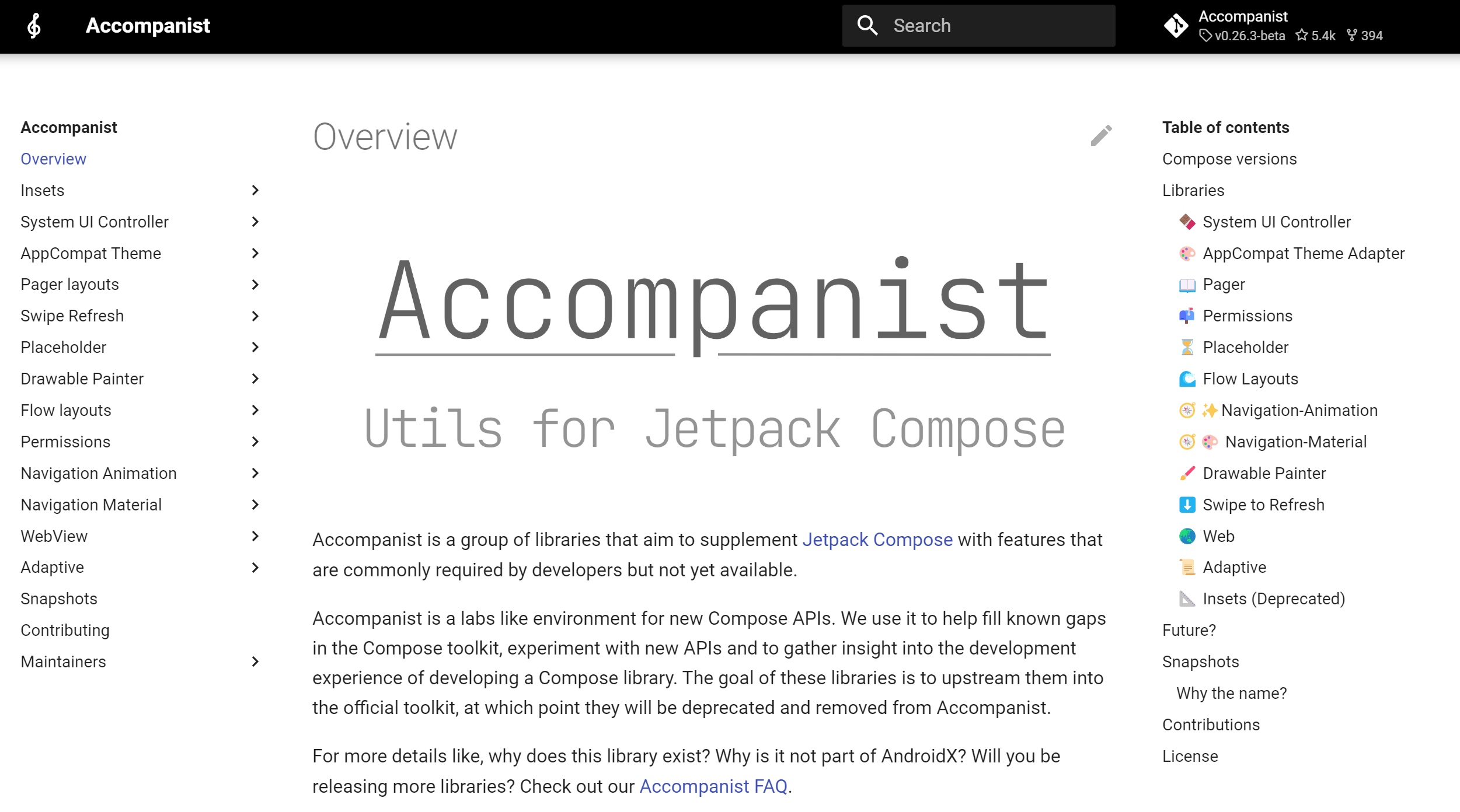
Figure 1. Picture of the Accompanist overview page.
Right now, Accompanist offers the following libraries:
- System UI Controller
- AppCompat Theme Adapter
- Pager
- Permissions
- Placeholder
- Flow Layouts
- Navigation-Animation
- Navigation-Material
- Drawable Painter
- Swipe to Refresh
- Web
- Adaptive
In this blog post, we’ll focus on Adaptive, the last library, but if you want to learn more about the others, you can check out these FAQS or this library review.
Use the TwoPane component
The TwoPane component from the Adaptive Accompanist library helps you place exactly two groups of content on the screen and it uses Jetpack Window Manager to provide foldable support.
For those of you who are familiar with our Microsoft TwoPaneLayout component, you may notice that the main difference here is that TwoPane always shows these two groups of content, whereas with TwoPaneLayout, you show only one group of content at a time when no fold is present. As mentioned in the TwoPane API documentation:
“The TwoPane layout will always place both first and second, based on the provided strategy and window environment. If you instead only want to place one or the other, that should be controlled at a higher level and not calling TwoPane if placing both is not desired.”
You can import the latest version of the Adaptive library in your project:
implementation "com.google.accompanist:accompanist-adaptive:0.26.3-beta"
Note that the latest version depends on Compose 1.3.0-beta02, so you’ll have to make sure all your dependencies are up to date!
TwoPane properties
To use the TwoPane component in your Compose apps, you need to pass Composable content to the first and second slots, as well as specify a TwoPaneStrategy and a list of displayFeatures. There are also other option properties, including a Modifier and a FoldAwareConfiguration.
@Composable()
  fun TwoPane(
    first: @Composable() () -> Unit,
    second: @Composable() () -> Unit,
    strategy: TwoPaneStrategy,
    displayFeatures: List<DisplayFeature>,
    modifier: Modifier = Modifier,
    foldAwareConfiguration: FoldAwareConfiguration = FoldAwareConfiguration.AllFolds
)
TwoPaneStrategy
The TwoPaneStrategy describes how the content will be placed when no fold is detected; you can choose from either vertical or horizontal arrangement, and then you can also pass in an offset or a ratio that describes how much space each group of content will occupy and a dp value for the size of the gap between each group of content. For example, if I want the first content to take up 30% of the screen in a side-by-side arrangement, I would use the following strategy:
HorizontalTwoPaneStrategy(splitFraction = 0.3f)
If instead I wanted vertical arrangement and the first content to always be 300 dp from the bottom of the screen with a gap of 30 dp in between first and second, I would use this strategy:
VerticalTwoPaneStrategy(splitOffset = 300.dp, offsetFromTop = false, gapHeight = 30.dp)

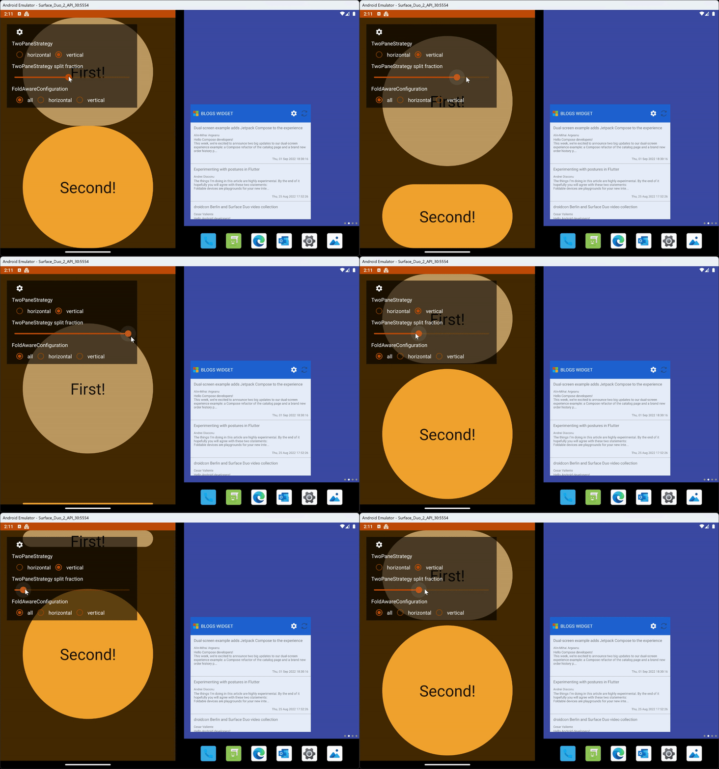
Figure 2. Animation of how TwoPaneStrategy split fraction can affect content layout.
Display features
The Adaptive library provides a handy utility function that will extract the list of display features from your activity using Jetpack Window Manager, so all you need to pass into your TwoPane component is the following:
displayFeatures = calculateDisplayFeatures(activity = this@MainActivity)
FoldAwareConfiguration
The optional FoldAwareConfiguration parameter can be used like the PaneMode from our TwoPaneLayout component, as it lets you control when a fold affects your layout. The configuration can be set to FoldAwareConfiguration.AllFolds, FoldAwareConfiguration.HorizontalFoldsOnly, or FoldAwareConfiguration.VerticalFoldsOnly.

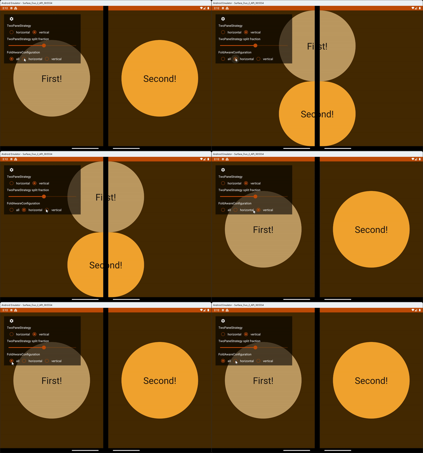
Figure 3. Animation of how the different fold aware configurations affect content layout.
TwoPane sample
To help ourselves understand the library better and the different configuration options, we created a simple TwoPane sample!

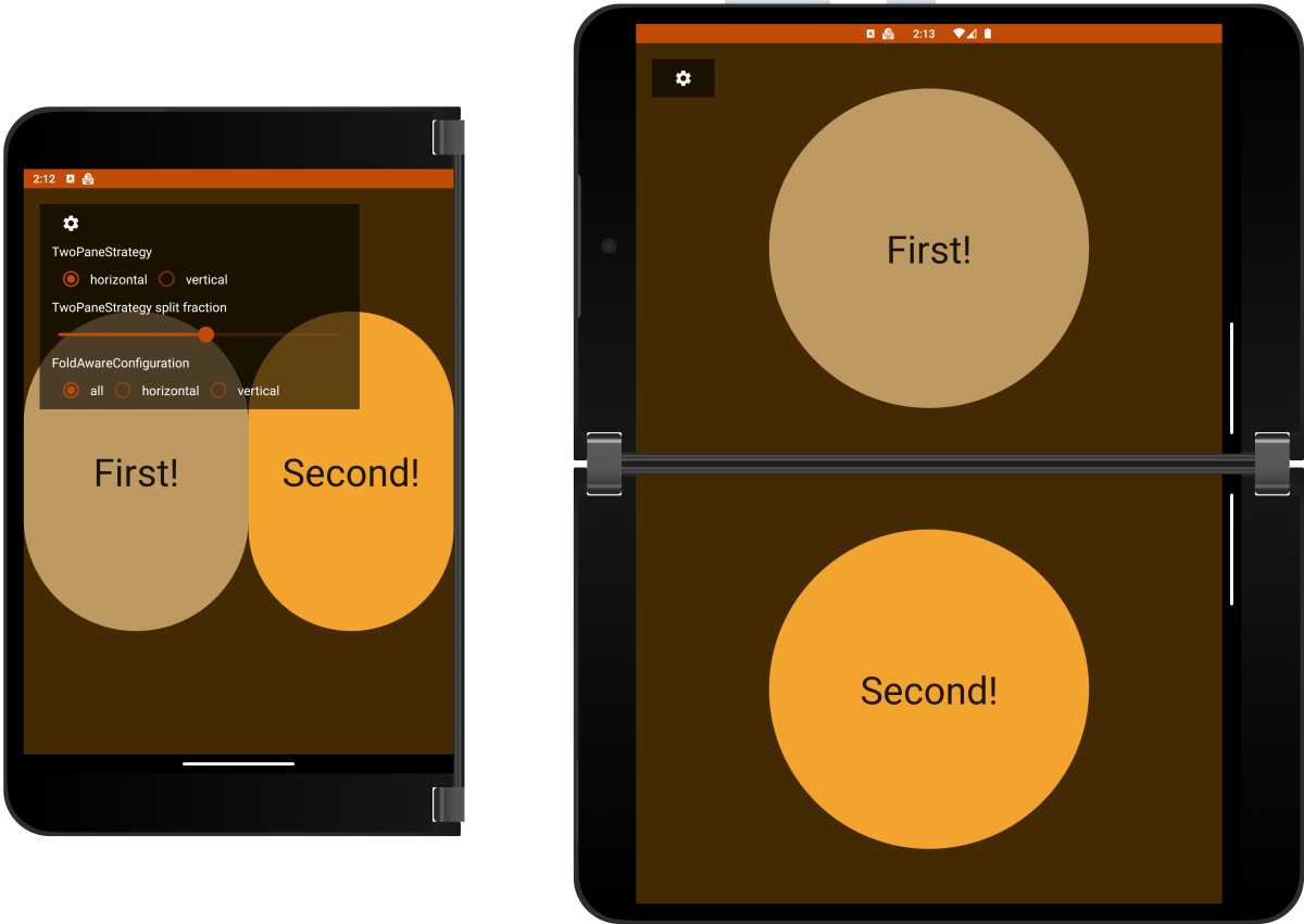
Figure 4. Screenshots of the TwoPane sample.
In the sample, you can change the TwoPaneStrategy and the FoldAwareConfiguration to see how it affects the way content is laid out.
Whether it’s using Jetpack Window Manger, TwoPane, TwoPaneLayout, or any other custom components, we hope you’re taking advantage of all these great foldable Compose resources to enhance your apps!
Resources and feedback
You can read more about Jetpack Compose for foldable devices in the Surface Duo developer documentation.
If you have any questions or would like to tell us about your dual-screen applications, use the feedback forum or message us on Twitter @surfaceduodev.
Finally, please join us every Friday on Twitch at 11am Pacific time to chat about Surface Duo developer topics!


0 comments