
Hello Jetpack Compose developers!
This week, we released a new sample that demonstrates how to use the NavigationRail component with large screen and foldable devices. These guidelines were also introduced recently in the Microsoft Surface Duo Design Kit 2.1.
Create a NavigationRail with Compose
We first blogged about NavigationRail in August, when we described how to use it in a dual-screen sample with XML layouts. As a reminder, the NavigationRail component is used for navigation on large screens and can hold 3-7 app destinations, plus a logo or floating action button.
To add a NavigationRail to your Compose application, follow these steps:
- Add the following dependencies to your
build.gradlefile:ext { composeVersion = "1.1.0-alpha06" navVersion = "2.4.0-alpha10" } implementation "androidx.compose.material:material:$composeVersion" implementation "androidx.navigation:navigation-compose:$navVersion"The component is still in alpha, so make sure to update
composeVersionandnavVersionwith the most recent releases, which can be found at the Compose Material and Navigation pages. You will also have to add the@ExperimentalMaterialApitag to any Composable functions that use NavigationRail or NavigationRailItem. - Create a composable with a NavigationRail that contains NavigationRailItem components. The code snippet below is based on an example from the NavigationRail API reference, but similar code can be found in our sample in GalleryNavWithSelector.kt.
@ExperimentalMaterialApi @Composable fun ExampleNavRail(navController: NavHostController, items: List) { val icons = listOf(Icons.Filled.Home, Icons.Filled.Search, Icons.Filled.Settings) NavigationRail { items.forEachIndexed { index, item -> val currentDestination = navController.currentBackStackEntryAsState().value?.destination NavigationRailItem( icon = { Icon(icons[index], contentDescription = item) }, label = { Text(item) }, selected = currentDestination?.route?.let { it == item } ?: false, onClick = { navController.navigate(item) } ) } } } - Add your NavigationRail composable next to your NavHost by placing them together in a Row.
val navController = rememberNavController()
val items = listOf("Home", "Search", "Settings")

Scaffold(topBar = { TopAppBar(title = { Text("Example Nav Rail App") }) }) {
   Row {
       ExampleNavRail(navController, items)
       NavHost(navController = navController, startDestination = items.first()) {
           items.forEach { item ->
               composable(route = item) { Text(text = item) }
           }
       }
   }
}
Design guidelines for large screen and foldable devices UX
When adding navigation to apps for large screen and foldable devices, we recommend using a combination of NavigationRail and BottomNavigation. In the case of Surface Duo, this means using a navigation rail when the app is spanned and switching to a bottom navigation bar when the app is unspanned.
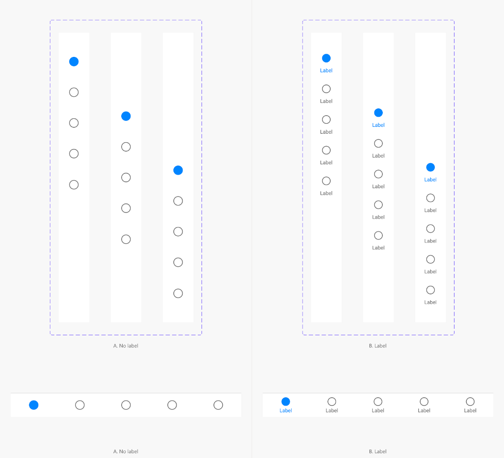
Figure 1: Navigation rail guidelines from the Surface Duo Design Kit 2.1.
To dynamically switch between navigation components based on screen size, use a combination of the Jetpack Window Manager library and other device properties available via LocalConfiguration.current. On Surface Duo and other foldables, you can use Window Manager to check if a hinge is present in the form of a FoldingFeature, while LocalConfiguration.current is useful for checking the size of a device’s screen. To see how we used these two resources in the sample app, check out the SetupUI function in HomePage.kt.
Sample highlights and challenges
Our NavigationRail sample is a nature information catalog with five categories: plants, birds, animals, lakes, and rocks. Each category has multiple items, and each item has a picture and a scientific description. The app uses our custom control TwoPaneLayout and follows the List Detail design pattern, with the “list” being the gallery for the current category and the “detail” being the picture and description of the selected item.
Navigation hierarchy
In our plans for the sample, we decided on the layout designs shown in Figure 2. When it came time to implement the behavior, setting up the navigation was a bit complicated!
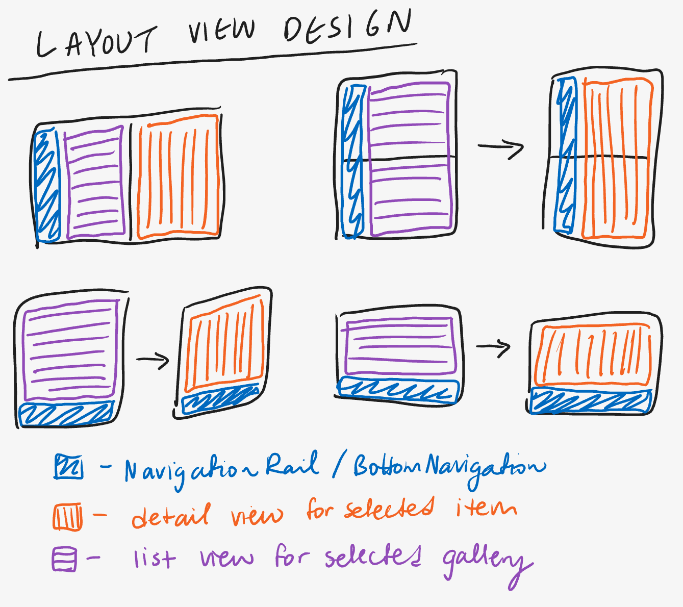 Figure 2: Layout designs for each Surface Duo orientation.
After some thought, we realized that the BottomNavigation/NavigationRail would always be shown in pane 1, and the associated NavHost would only be used to display the different galleries. Even though we would sometimes need to switch between the gallery and item views, it wouldn’t make sense to add the item view to the NavHost as a top-level app destination.
So, the final navigation graph we settled on has two main parts. The first part, as shown in Figure 3, uses the navigation support provided by TwoPaneLayout to switch between the gallery and item views when only one pane is being displayed.
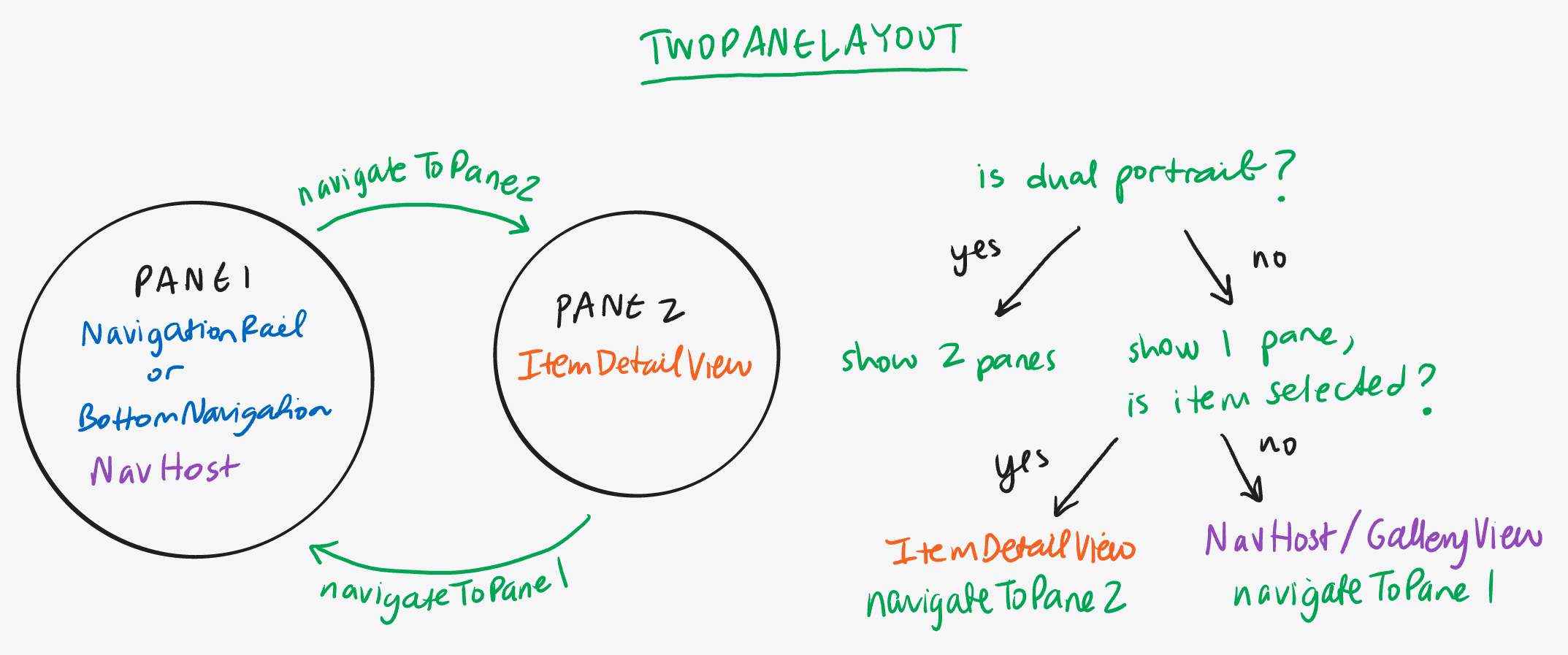 Figure 3: Navigation logic within TwoPaneLayout.
The second part, seen in Figure 4, exists only within pane 1, where a NavHost is connected to the current navigation component to enable switching between the five different gallery categories. One important note is that because the NavHost only exists at the pane 1 level in the layout hierarchy, the app technically had two NavHost instance; one for the single pane container and another for the two pane container. To ensure that both instances were synced, we created a currentRoute variable at the highest level of the hierarchy and checked it when recomposing pane 1.
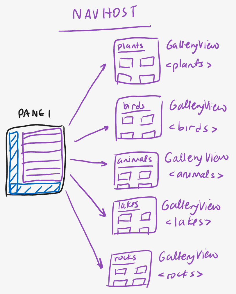 Figure 4: Navigation logic within pane 1 with a NavHost.
Custom components
Another challenge was creating custom components to match the designs for the sample. We found that the Jetsnack sample from the official Compose repository was a great reference for both setting up navigation and adding custom UI components.
The first customization we made was adding a selector to the NavigationRailItem and BottomNavigationItem components. This selector appears behind the icon of the current destination and includes visibility animations (see Figure 5). If you’re interested in the implementation, check out NavRailItemWithSelector.kt and BottomNavItemWithSelector.kt.
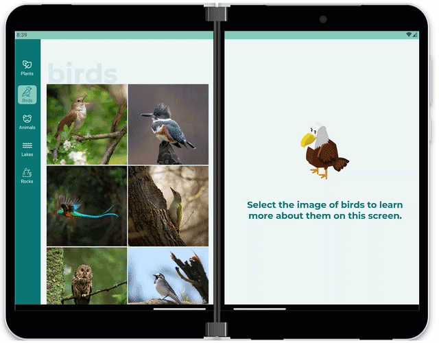 Figure 5: Example of how the selector highlights the current destination in the NavigationRail.
We also created a custom ContentDrawer component that behaves similarly to a BottomSheetScaffold, except with an enhancement that prevents content from rendering under the hinge.
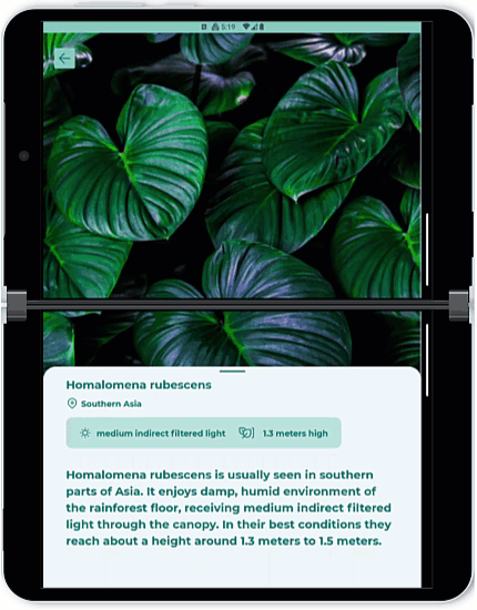 Figure 6: Demonstration of hinge aware ContentDrawer component.
This was achieved by creating a swipeable BoxWithConstraints and adding a Spacer with dynamic height based on swipe progress. The code snippet below was taken from ContentDrawer.kt, and it shows how height was calculated using hinge properties and information from the swipeable modifier.
// Check if a spacer needs to be included to render content around an occluding hinge
val spacerHeight = if (hingeOccludes) {
   val isExpanding = swipeableState.progress.to == DrawerState.Expanded
   val progressHeight = (hingeSize.value * swipeableState.progress.fraction).dp
   if (isExpanding)
       progressHeight
   else
       hingeSize - progressHeight
} else {
   0.dp
}
Resources and feedback
For coding tips, visit the Surface Duo developer documentation , our samples, and Google’s Android large screen development guidance.
If you have any questions, or would like to tell us about your dual-screen apps, use the feedback forum or message us on Twitter @surfaceduodev.
Finally, please join us for our dual screen developer livestream at 11am (Pacific time) each Friday – mark it in your calendar and check out the archives on YouTube.
Attribution
The images used in the Navigation rail sample are licensed under [© eakarat], [© nerudol], [© DedMityay], [© tibor13], [© Harry Collins], [© Tony Baggett], [© WildMedia], [© Vlasto Opatovsky], [© Lakeview Images], [© viktoriya89], [© dudlajzov], [© zkbld], [© muraviov], [© phototrip.cz], [© gpisano71], [© Mike Mareen], [© Fokke], [© ronnybas], [© Piotr Krzeslak], [© shaiith], [© aiisha], [© Andrew Mayovskyy], [© Andrey Armyagov], [© Наталья Босяк] / stock.adobe.com
0 comments