
The 2104.20 release of PIX on Windows includes several usability improvements to the Metrics View in Timing Captures. These usability improvements make it easier to manage the set of metrics that are currently graphed. Metrics analysis is also improved through the ability to customize the minimum and maximum values for the y-axis for each metric.
These usability improvements are provided by a new Active Metrics panel. This new panel lists all metrics that have been added to the graph from either the Selector panel or the Timeline view. The table of graphed metrics includes a checkbox that can be used to toggle whether a given metric is currently graphed. The Active Metrics panel also includes a number of controls that can be used to customize the following aspects of how a metric is graphed:
- line style
- color
- aggregation mode
- minimum and maximum values of the y-axis
The ability to remove a metric from the active list is also provided.
Given the volume of available metrics in a typical title, grouping all active metrics together in a single table makes it easier to manage the set of metrics that are currently graphed.
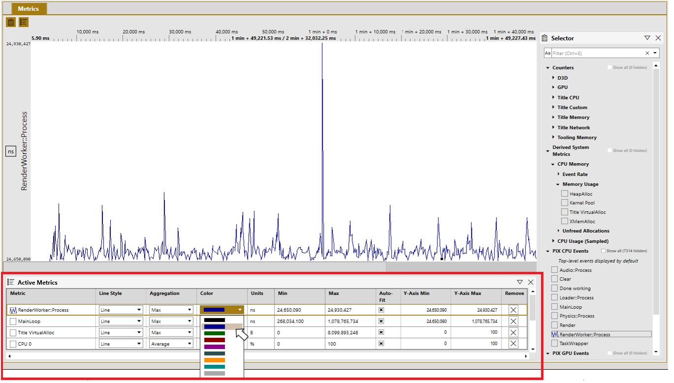
Use the checkbox to the left of a metric to toggle the graph state. Pressing the spacebar while a row is selected also toggles the graph state. The up and down arrow keys can be used to navigate between rows.
Use the Remove button, or the delete key, to remove a metric from the active metrics panel.
Ctrl-A will select all metrics in the table. Using Ctrl-A along with the space bar or delete key is a fast way to toggle the graph state or remove all metrics.
Aggregation Mode
Depending on the volume of data in the capture, the Metrics View may not be able to draw a single point for every value of a metric that was captured. When this occurs, a number of data points will be aggregated together. The tooltip will include the number of points that have been aggregated.
By default, the maximum value of the aggregated metrics will be graphed. This aggregation mode can be changed using the dropdown in the Aggregation column as shown in the following figure.

Customizing the minimum and maximum values for the y-axis
In most cases, the default min and max values of the y-axis are the minimum and maximum values for the metric as seen over the duration of the capture. However, there are some cases, such as CPU Usage (Sampled), in which the default minimum and maximum values are known ahead of time. In these cases, the min and max values of the y-axis are fixed. In the CPU Usage (Sampled) example, the default min and max values would be 0 and 100 respectively.
The default min and max values of the y-axis are also influenced by the set of graphed counters that have the same units. In this case, the min value is the minimum value from across all of the metrics and the max value is the maximum value from across all metrics. For example, consider the following example in which three PIX events are graphed, all will different minimum and maximum nanosecond values.
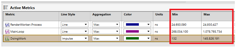
In this case, the minimum value across all three metrics is 132 (from DoingWork) and the maximum value across all three metrics is 1,078,765,734 (from MainLoop). These two values define the default min and the max values for the y-axis for these three metrics.
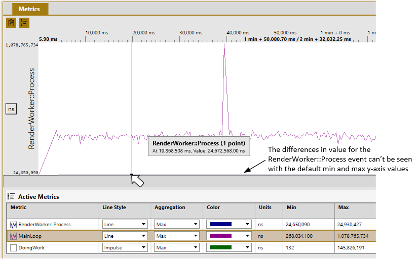
There are cases in which the default min and max values for the y-axis may not be optimal. One such example occurs when the ranges of two or more graphed metrics differ significantly. In this case, the default min and max y-axis may make it impossible to differentiate individual values for some of the metrics. In the following figure, the graph of the MainLoop metric is easily readable, but the graph of the RenderWorker::Process metric appears as a single line at the bottom of the graph.
The min and max values of the y-axis can be customized for each metric to make analysis easier in cases like this. To set custom values for the y-axis, uncheck the Auto fit checkbox. Doing so causes the Y-axis min and Y-axis max fields to be editable. Enter the custom values directly in the edit boxes. In the following figure, the max y-axis value for RenderWorker::Process has been customized such that the graph for that metric is now readable alongside the graph for MainLoop.
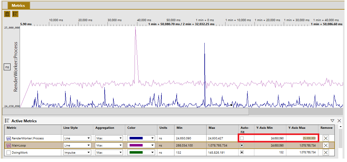
Select the Auto fit checkbox to restore the default min and max y-axis values for a metric.
0 comments