

We are happy to announce the release of the .NET MAUI Community Toolkit v1.3, which is now live on NuGet! This release includes status bar styling functionality, Gravatar image support, prebuilt fade animations, SourceLink support, and numerous bug fixes.
The .NET MAUI Community Toolkit is a community-created library that contains .NET MAUI Extensions, Advanced UI/UX Controls, and Behaviors to help make your life as a .NET MAUI developer easier.
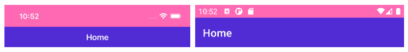
Status Bar Styling
With this release of the .NET MAUI Community Toolkit you now get StatusBarBehavior, which allows you to easily customize the color and style of the status bar on iOS and Android either through code or in XAML. It is implemented as a Behavior meaning you can change it per page or even dynamically in response to user actions or application status.
There are two properties which you can use to control the look of the status bar:
StatusBarColor: allows you to specify the color of the status bar background.StatusBarStyle: allows you to control if the content (text and icons) on the status bar are light, dark or the system default.
Note: These two properties are Bindable, so you can also bind these values from your ViewModels.
Here is an example of how to use these properties in XAML:
<Page.Behaviors>
    <toolkit:StatusBarBehavior StatusBarColor="HotPink" StatusBarStyle="LightContent"/>
</Page.Behaviors>
Or, if you prefer writing your UI’s in C# code:
var statusBehavior = new StatusBarBehavior()
{
    StatusBarColor = Colors.HotPink,
    StatusBarStyle = StatusBarStyle.LightContent
}
this.Behaviors.Add(statusBehavior);
And now, with just a couple of lines of code, you have a beautifully styled status bar that can match the theme of your application.
You can read more about the other features of StatusBarBehavior and see more examples in our docs. Gerald Versluis has also put together a great video demonstrating how to get started.
Gravatar Image Source
A Gravatar (globally recognized avatar) is an image that can be used as your avatar — that is, an image that represents you or your users, such as in a forum post or a blog comment. You can learn more about Gravatar or register your own at the Gravatar website.
With this release of the .NET MAUI Community Toolkit you can easily display Gravatar images next to people’s names or email addresses via the GravatarImageSource.
You can use GravatarImageSource anywhere you would normally use an ImageSource, for example:
<Image>
    <Image.Source>
        <toolkit:GravatarImageSource Email="youremail@here.com" />
    </Image.Source>
</Image>
The Email property specifies the Gravatar account email address. However, there are also properties to determine the default image if the Email is not found on Gravatar as well as inbuilt caching capabilities. All these properties are backed by BindableProperty which means they can be targets for data binding and styled.
Read more about the other features of GravatarImageSource and see more examples in our docs.
Animations
This release of the .NET MAUI Community Toolkit enhances the existing AnimationBehavior capabilities by introducing the FadeAnimation to provide the ability to animate the opacity of a VisualElement from its original opacity to a specified new opacity and then back to the original.
This allows you to specify animations in XAML that respond to user interactions.
<Button Text="Click this Button">
    <Button.Behaviors>
        <toolkit:AnimationBehavior EventName="Clicked">
            <toolkit:AnimationBehavior.AnimationType>
                <toolkit:FadeAnimation Opacity="0.2"/>
            </toolkit:AnimationBehavior.AnimationType>
        </toolkit:AnimationBehavior>
    </Button.Behaviors>
</Button>
In future releases, we will be building on the animations to provide Flip, Rotate, Scale and Shake animations. Contributions are always welcome, so if you are keen to help, see the contributing section below to find out how.
Source Link
Source Link is a technology that providing first-class source debugging experiences for binaries. With this release we have configured our builds to use Source Link, which means if you have Source Link enabled in Visual Studio you can expect an even better debugging experience whilst using the .NET MAUI Community Toolkit. You can find more information about Source Link and how to enable it in this blog post.
Other Fixes
This release also includes numerous bug fixes and code quality improvements. Check out the release notes for a complete list of changes.
Contributing
The .NET MAUI Community Toolkit really is a community effort powered by your contributions. If you would like to contribute, feel free to open issues or let us know about your experience! You can also check out our previous post about Contributing to .NET MAUI Community Toolkit.
Summary
We hope you enjoy the latest release of .NET MAUI Community toolkit. You can find all source code and sample app in our GitHub repo and browse the official documentation.
A massive thank you to all the contributors and don’t forget you can join us live on the 1st Thursday of each month @ 1200 PT, where we live-stream our standups on the .NET Foundation YouTube Channel.
How BlazorWebView accesses extended stored images .show
How about translucent statusbar or transparent ?
maui-linux ?
Still only a long discussion, an outdated repository fork and unmerged pull-request.
Looks like Microsoft is not interested in these theme at all..
To sum up Linux is a platform on our radar but it is not a part of our current scope. David Ortinau - any news?
Came for this as well 😄