

One of four parts
Welcome to part 4 of a four-part series on Supply Chains and Graph Databases. Each part explores different concepts that build upon the examples discussed in the other parts. You can use the following links to navigate directly to each part of the article.- Part One: Understanding Supply Chains
- Part Two: Enabling SQL Graph
- Part Three: Reaping Graph Rewards
- Part Four: Visualizing a Graph ⬅️ You are here
Part 4: Visualizing a Graph
Graph visualization
While whiteboards are useful, a more formal presentation through tools like PowerBI allows for interactive exploration and broader sharing. In the context of graph data, we can leverage a suitable visual: the force-directed graph visual. The force-directed graph visual, which is freely available in PowerBI, is compatible with general graphs. To utilize it, we query our SQL Graph and transform the data into a compatible format.
WITH paths AS
(
  SELECT
    Product.Name AS Product
  , Plant.Name AS Plant
  , Warehouse.Name as Warehouse
  , delivers_to.Miles as PWMiles
  , Center.Name AS Center
  , ships_to.Miles AS WCMiles
  , Store.Name as Store
  , stocks.Miles AS CSMiles
  FROM Product, produces, Plant, delivers_to, Warehouse, ships_to, Warehouse AS Center, stocks, Store
  WHERE MATCH(Product<-(produces)-Plant-(delivers_to)->Warehouse-(ships_to)->Center-(stocks)->Store)
)
, data (Product, Plant, Warehouse, Center, Store, SouceType, SourceName, TargetType, TargetName, Miles) AS
(
        SELECT Product, Plant, Warehouse, Center, Store, 'P', 'P: ' + Plant, 'W', 'W: ' + Warehouse, PWMiles FROM paths
  UNION SELECT Product, Plant, Warehouse, Center, Store, 'W', 'W: ' + Warehouse, 'C', 'C: ' + Center, WCMiles FROM paths
  UNION SELECT Product, Plant, Warehouse, Center, Store, 'C', 'C: ' + Center, 'S', 'S: ' + Store, CSMiles FROM paths
)
SELECT * FROM data
Source type
In your data, theSourceType and TargetType columns contain single letters that represent different types of nodes: P stands for Plant, W for Warehouse, C for Center, and S for Store. This notation will be used in a Force-directed graph in PowerBI, a visualization tool that can display these nodes with customized images. The images can be sourced from the internet or your local network. To create the URL for each image, you’ll start with a base URL from Nodes:Image:Image Url (e.g., ‘https://server/image_’), append the appropriate letter from SourceType, and then add the file extension from Nodes:Image:Image Extension (e.g., ‘.png’). For instance, if the SourceType is ‘P’ (representing a Plant), the final URL would be ‘https://server/image_P.png’. This URL points to the image that will be displayed for the Plant node on your graph. By structuring the SourceType and TargetType columns in this manner, you’re preparing the necessary data for PowerBI to automatically generate the correct image URL for each node type.The MATCH statement Product<-(produces)-Plant-(delivers_to)->Warehouse-(ships_to)->Center-(stocks)->Store describes a series of relationships between different entities in a straightforward query (I hope you agree). This chain illustrates the journey of a product from a plant to a store through various steps, each represented by a directed edge (arrow) with a label that describes the relationship between the two nodes it connects.
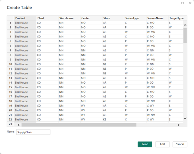
The From and To columns in the resulting data are necessary for the force-directed graph visualization in PowerBI, representing the source and target of each relationship. By the way, this format isn’t specific to SQL Graph or any other graph database; it’s a generic representation that suits the PowerBI visual. Once the data is retrieved, it can be easily fed directly into the PowerBI visual as a straightforward table source.
The Force-directed graph
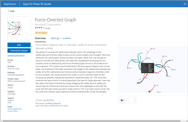
The query does the majority of the necessary work, allowing us to present the raw data in the visual. In our PowerBI report, we locate the Force-Directed Graph visual within the store. This visual functions seamlessly in the PowerBI desktop version and renders smoothly in web browsers as well.
By linking the From and To columns in our table to the Source and Target fields in the visual, we witness the beautiful rendering of our graph. Considering the potential complexity of the entire graph, it may be necessary to apply filters. In the visual, circles represent nodes, while lines depict edges—mirroring our initial whiteboard drawing. The color of the lines signifies the type of source, and their thickness indicates relative distances compared to other visible edges. Suddenly, we have a clear view of our graph and can easily analyze and reason about the relationships within it.
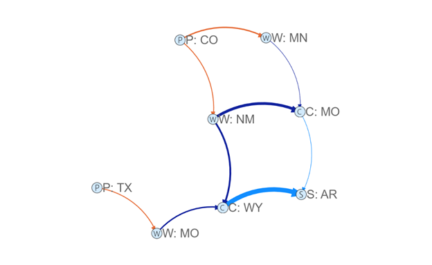
In our visual representation, we observe the interconnectedness of plants (P) and stores (S) within the supply chain. The warehouse (W) receives products from the plants and distributes them to the Distribution Centers (C) responsible for local deliveries. This visualization allows us to easily comprehend the flow of various products, from Bird Houses to Potato Chips. The ability to view the supply chain in this manner is truly remarkable.
Using the Visual more
To focus our analysis, we apply a filter to display only the “Bird House” product and our Arkansas store. With this refinement, our graph becomes even more digestible. We can readily answer questions like, “Which plant is the best source for our product?” However, as we explore further, we uncover another discovery: routing through Missouri proves to be considerably less expensive than through New Mexico. Imagine extending this analysis to incorporate additional factors such as travel time, trucker availability, warehouse capacity, and other shipping costs. Each of these elements could be represented by color and thickness, respectively, enhancing the visual representation.
Architetural choices
Within our graph, we continuously make decisions based on our priorities: faster or cheaper shipping, reliable or unreliable warehouses, contingency plans for plant outages or warehouse disruptions, and even considerations for weather conditions. This decision-making process occurs both programmatically and visually, leveraging the power of our graph representation. The benefits derived from this combination of programmable and visual analysis are truly exceptional.
Finally
Using SQL Graph means you have less ETL and less data movement overall; it’s just Azure SQL. This allows you to maintain the reliability, performance, management, security, and integration capabilities that your team is already familiar with. The true advantage lies in modeling your data to closely align with your business, providing clarity and precision when communicating with stakeholders using their own language and concepts.
With SQL Graph, you benefit from simpler, declarative queries that are easily verifiable. While your models are compatible with graph algorithms, their true value lies in aligning your data with the business and enabling effective communication and discovery that reflects your data structures and business processes.
When modeling or remodeling your data, involve business stakeholders and utilize their language and concepts. Visualize the graph, perhaps through whiteboard sessions, to effectively convey information. Embrace the idea of multiple purpose-built graphs rather than striving for a single all-encompassing graph. Simplify relationships to reduce hops between entities, improving usability and revealing valuable insights. Instead of thinking in terms of isolated systems, view the graph as a high-level representation of all interconnected data. Embrace this approach, roll up your sleeves, and witness the magic unfold.
Conclusion
In this series, we have stepped into the world of graph databases, specifically SQL Graph, in optimizing supply chains and unlocking insights. Along this journey, we have looked into the concept of supply chains and their inherent graph-like nature, discovering how modeling supply chains as graphs can enhance visualization, querying, and discovery.
Part 1
Part 1 introduced us to the concept of supply chains and highlighted the benefits of using graph databases to store and analyze supply chain data. We saw how a supply chain can be represented as a workflow with various steps, and how data generated throughout the process can be collected, analyzed, and leveraged for informed decision-making.
Part 2
Part 2 took us deeper into the practical aspects of creating graph tables and inserting data into them. We explored the simplicity of creating graph tables in Azure SQL, along with the unique features of edge tables and their zero custom columns. We also learned about the special columns underlying nodes and edges, and how edge constraints ensure data integrity in graph relationships.
Part 3
Part 3 focused on the clarity and validation that SQL Graph provides. We witnessed how the declarative join syntax of MATCH brings clarity to complex join operations, making it easier to write, validate, and optimize queries. We also discovered the power of using graphs to validate data and uncover missing relationships, enabling effective communication with stakeholders and fostering discovery.
Part 4
Finally, in Part 4, we explored the visualization aspect of graph databases. We learned how tools like PowerBI, combined with the force-directed graph visual, allow for interactive exploration and sharing of graph data. The visualization of supply chain relationships provided clarity and insight, facilitating analysis and decision-making. We also touched upon architectural considerations and highlighted the advantages of using SQL Graph in the familiar and proven Azure SQL environment.
More information: To learn more about SQL Graph: https://aka.ms/sqlgraph
0 comments