
Premier Dev Consultant Madeline Schenck explorers the cost benefits of an efficient UI.
In Part 1 of this series, I discussed the functionality behind an application I was helping to rebuild and how the less-than-optimal solution was costing the company time and money. A huge area for improvement was the process for adding users to access a document. The application had a number of potential pain points but the most notable were:
- The ‘Add Users’ modal hid the people who were already added
- Users could only give access to one person at a time (average number of people per document was 30)
- Removing a person involved clicking a name and opening another modal to delete.
- Names had to be typed perfectly to match a system the users couldn’t see without the help of suggestions or autofill
- All-in-all took about 10 minutes to set up access to single document
Now that we’ve identified the problems that needed to be addressed, let’s step through how we solved them.
The solution to the first issue seemed simple on the surface: let’s move the modal somewhere else. Or alternatively, move where the names were located on the page underneath. Either way the user would be able to see all the names that were currently added to a document. After looking at the bigger solution and brainstorming more as a team, we ultimately decided we could solve another one of our issues by showing the list of names in the modal itself. From there the user could see everyone that had already been added and they could remove people who had been added on accident or who no longer had access to the document. Instead of having two separate modals with lots of extra clicking around for our user, with one click they could see and edit all users in one view.
That brings us to the next issue of only being able to add one user at a time. Since a good portion of our end users were team managers, we needed to figure out a way to get distribution lists added into the system. That way that managers could type in an alias for their team and in one go give their entire team access to a document.
During a session we had with teammates working on similar experiences, we learned that one of the developers was already working on a solution that would allow us to pull in all of a user’s outlook contact information and distribution lists for the company. He was also building out a similar sort of search feature that would give you suggestions on names and lists based on what you were typing.
Not only did working with this teammate and sharing the code between applications solve our issues of adding more than one user at a time, but it also helped solve another issue. We were able to suggest names in a dropdown so the user didn’t have to perfectly remember how a person’s name was spelled. This addition also let the user type in names in the more natural format of “First Name Last Name.”
Ultimately all together the new site worked similar to this:
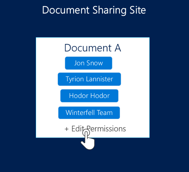
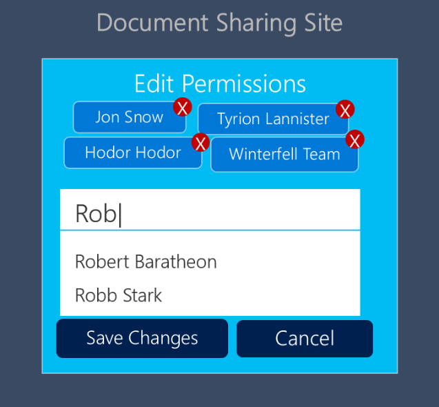
Users would click on the edit permissions button. A modal with all of the users currently part of the document would appear, along with a search box. Users could easily delete users or distribution lists that no longer had access to that document. They could start typing and get suggestions of those names and distribution lists. Everything they needed to do could be done in 1 modal with 2-3 button clicks.
We thought all of these changes would help our users, but we still hadn’t confirmed our hunches, so we went back to the users that we’d talked to before and asked them to test this new system. Their feedback was overwhelmingly positive! After just a few run-throughs, users were spending 4 minutes setting up a single document, cutting the time taken by over half.
Now if we do all of the fun math that we went through in Part 1 of this process and swap our original time of 10 minutes for our new time of 4 minutes, here’s what our calculations look like.
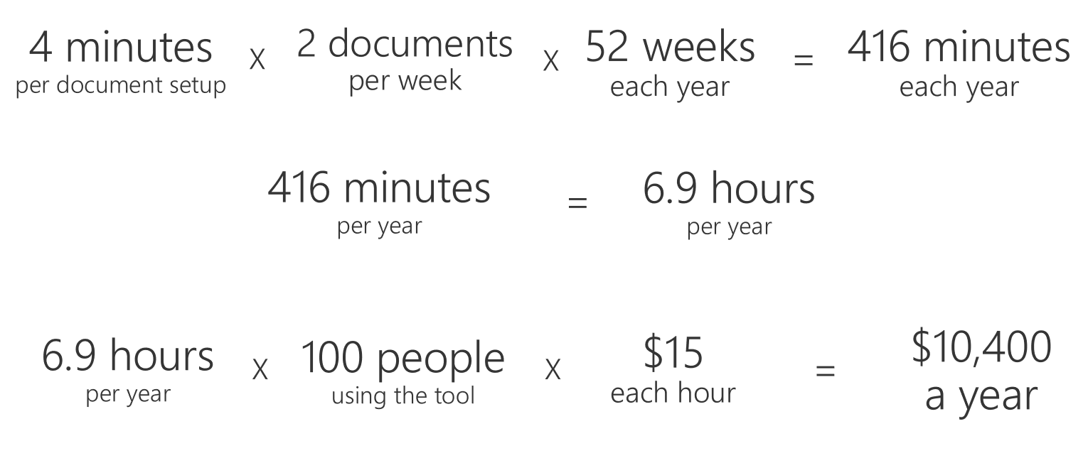
Our total from the initial 10-minute process was $26,000, and our new total is only $10,400. That’s a difference of more than $15,000.
In this particular example, we were lucky that another member of our team was already developing functionality that we could use to solve our distribution list and name auto-suggestion problems, but even if he hadn’t, the ease of use and savings gained from creating an improved UI more than justifies the extra cost of development that would have been needed.
This example illustrates why building a better UI and caring about how your end users is so valuable. Not only can it improve their experience, but it can also save your business time and money. If you’re interested in learning more about the User Centered Design process that I followed to improve this solution, check out other articles on the Premier blog tagged with UX or reach out to your Microsoft Premier resource.
0 comments