
The Cost of Bad UX Part 1: Putting a price on look and feel
Premier Dev Consultant Madeline Schenck takes a look at the cost implications of poor interface design and how it adds up in ways that are not always immediately clear.
One thing that I’ve heard more than a few times while working in UX is that you can’t put a price on look and feel. Personally, I want to clear the air right now and say you absolutely can. It’s not hard, but it does require narrowing your focus to a particular workflow.
A great example of this is a project I worked on where our job was to update an internal document sharing site to a new UI. When the project was handed-off to another developer and myself, there hadn’t been any user research conducted and the initial plan was to develop the site based on a couple of visual mockups that an internal designer had made. By following this particular approach, the UI might be modernized, but because the designers haven’t gotten feedback from their end users, oftentimes many underlying problems with the application wouldn’t get resolved and might actually be built into the new version.
The site worked like this: Anyone could upload a document and add anyone in the company to view it. That person could be a reader, an editor, or an owner and each level had different permissions of what they could do with the document. When a user logged in, they would see all of their latest documents populated on the home page. For the sake of a quick visual, let’s say it looks something like this.
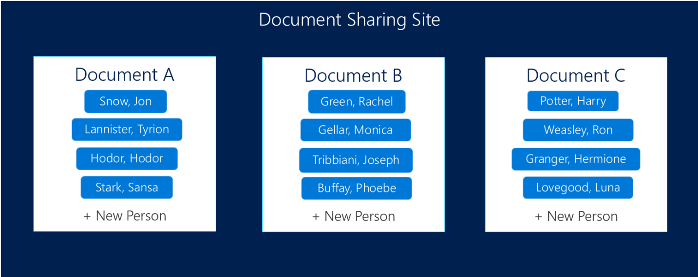
Obviously this is a very simplified view of what the actual website looked like, but it should suffice for what I’m trying to illustrate.
Now let’s say that a project manager needed to share a requirements list with their stakeholders and development team. What they would have to do at this point is upload their document and start adding each person to the document.
In theory, this is as simple as clicking the “+ New Person” button and typing in a name. As we soon discovered, however, it wasn’t quite that easy in practice.
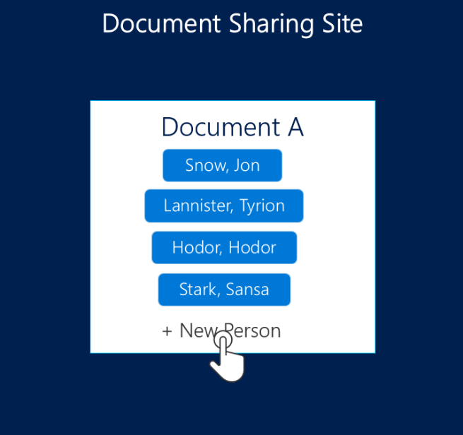
The first issue was that the modal or popup to add a user opened up directly over the list of users that already had access to the document. This was problematic because if the user got distracted at any point, they couldn’t see who was already part of the list.
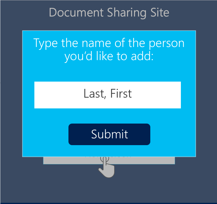
The modal also forced the users to type in the name of the person they wanted to give access to in the format of “Last Name, First Name.” Not only was this format the reverse of how people naturally think of names (at least here in the United States), but the user didn’t have any sort of visual indication if they were spelling a name correctly. They had to submit the name and hope that it got added to the document.
After that, each person had to be added or removed individually. Users would have to: click a button, type a name to be added, hit submit, and then check to make sure that person was actually added to the list. And if you wanted to delete someone, you’d have to click on each name individually to open a modal and click another button to delete. All of that clicking doesn’t seem too bad if you’re only adding one or two people, but it became a lot more time consuming with more people. When my teammate and I started reaching out to end users, we found the people using this application tended to be project managers or team managers. On average these users were adding around 30 team members, devs, analysts, etc. per document. With all these little time-wasting issues and an additional step of setting up permissions on who could edit or only read a document, the whole document creation process ended up taking 10 minutes.
10 minutes doesn’t seem like a whole lot of time for a task you only do every once and a while, but after talking to both people managers and project managers, we learned that people need to share documents on average two times a week. Multiply that by the hundreds of people using the application, and we can start to see the true cost of that 10 minute process.
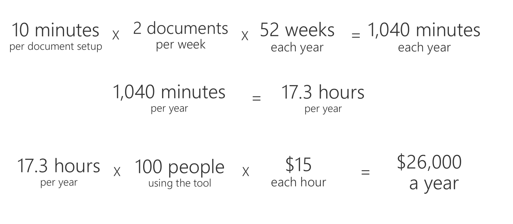
If it takes 10 minutes to follow a process that a user completes twice a week, every week, that’s about 1,040 minutes or 17.3 hours over the course of a year.
We couldn’t get an exact count of users and their estimated hourly wage, so we estimated fairly low. For the purposes of this example, we could safely assume at least 100 people are using the tool and that these people all make at least $15 an hour.
If each of these people are spending 17.3 hours on this specific feature of the tool, it costs the company about $26,000 each year to support the feature the way it was designed when we started this process.
That’s quite a bit of money for a 10 minute process.
Now if you remember, the original goal of this project was to develop the designer’s mockups with no changes. If we would have just followed their new design without making any tweaks, we’d be building all of those problems back into a redesigned UI. While the app might look nicer in the end, it would still be just as costly of a process. Now that we’d identified key issues with the application, it was time to figure out if we could improve it and shrink some of that cost.
Check out how we improved the UX and saved the business money in Part 2: Improving the UI to Shrink Cost.
 Light
Light Dark
Dark
0 comments