
Xamarin.Forms provides a way to build 100% native, cross-platform applications with both a shared logic layer and a shared user-interface layer. Built-in Xamarin.Forms controls also provide a ton of functionality out-of-the-box to create some amazing apps.
That said, mobile app developers are a crazy and creative bunch, and it would be impossible for the Xamarin.Forms engineers to create APIs for the controls that covered every conceivable scenario we come up with. That’s where Xamarin.Forms Behaviors come in!
These little gems of awesomeness allow you to attach additional functionality to a Xamarin.Forms control (actually, any Xamarin.Forms View ) without having to subclass that control or write any messy code in the code-behind page. That’s because Behaviors are written as their own classes, and stand by themselves. Not only that, you can also attach more than one Behavior to a single control!
Write Your First Xamarin.Forms Behavior
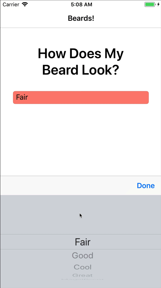
Let’s take a look at how you can build a simple Behavior. This Behavior will attach a validation routine to a Picker control. The validation routine will change the background color of the Picker if the currently selected item’s text is not in a preset list of valid values.
The end result will look like the following (and of course it validates a favored topic—beards!):
Behaviors Methods
To start with, all behaviors must inherit from the Behavior<T> class.
public class SimplePickerValidator : Behavior<Picker>
{
    protected override void OnAttachedTo(Picker bindable)
    {
        base.OnAttachedTo(bindable);
    }

    protected override void OnDetachingFrom(Picker bindable)
    {
        base.OnDetachingFrom(bindable);
    }
}
There are two methods that we override here:
OnAttachedTo: Gets invoked whenever the behavior is attached to thePicker.OnDetachingFrom: Is naturally invoked when the behavior is being removed from thePicker.
Note that a strongly typed Picker is passed in to both methods. This is because we inherited from Behavior<Picker>.
When implementing a behavior, you’ll generally want to handle an event that the host control emits. Inside that event handler, you’ll be able to add the additional functionality, or additional behavior, to the control. So, the OnAttachedTo becomes the place to subscribe to the event, while the OnDetachingFrom becomes the place to unsubscribe from the same event.
This SimplePickerValidator behavior now looks like this:
public class SimplePickerValidator : Behavior<Picker>
{

    protected override void OnAttachedTo(Picker bindable)
    {
        bindable.SelectedIndexChanged += Bindable_SelectedIndexChanged;
    }

    protected override void OnDetachingFrom(Picker bindable)
    {
        bindable.SelectedIndexChanged -= Bindable_SelectedIndexChanged;
    }

    void Bindable_SelectedIndexChanged(object sender, EventArgs e)
    {

    }
}
Implementing
Before implementing the Bindable_SelectedIndexChanged method, there needs to be a way for the calling code, like the XAML page, to specify what the correct values are for this behavior to validate against.
Bindable properties1 to the rescue! That’s right, behaviors can contain bindable properties, just like any other Xamarin.Forms control. Add a property called ValidValues like so:
public class SimplePickerValidator : Behavior<Picker>
{
    static readonly BindableProperty ValidValuesProperty =
        BindableProperty.Create(nameof(ValidValues), typeof(string[]), typeof(PickerColorBehavior));

    public string[] ValidValues
    {
        get => (string[])GetValue(ValidValuesProperty);
        set => SetValue(ValidValuesProperty, value);
    }

    protected override void OnAttachedTo(Picker bindable)
    {
        bindable.SelectedIndexChanged += Bindable_SelectedIndexChanged;
    }

    protected override void OnDetachingFrom(Picker bindable)
    {
        bindable.SelectedIndexChanged -= Bindable_SelectedIndexChanged;
    }

    void Bindable_SelectedIndexChanged(object sender, EventArgs e)
    {

    }
}
Finally, implement the logic of Bindable_SelectedIndexChanged:
void Bindable_SelectedIndexChanged(object sender, EventArgs e)
{
    // Bound and cast to a picker
    if (!(sender is Picker bindable))
        return;

    // Make sure the picker is data bound
    if (!(bindable.ItemDisplayBinding is Binding displayBinding))
        return;

    // Get the binding's path
    var displayBindingPath = displayBinding.Path;

    // Use reflection to get the value of the selected item of the picker
    var selectedItem = bindable.SelectedItem.GetType().GetRuntimeProperty(displayBindingPath);
    var selectedText = selectedItem.GetValue(bindable.SelectedItem);

    // Check to see if everything is valid
    if (ValidValues != null && ValidValues.Contains(selectedText))
    {
        IsValid = true;
        bindable.BackgroundColor = Color.Default;
    }
    else
    {
        IsValid = false;
        bindable.BackgroundColor = Color.Salmon;
    }
}
Here’s what’s going on in the above event handler: because the behavior is checking to see whether the displayed value in a data-bound Picker is equal to a value in an array, you first need to get that value out. You can use reflection to get to the text displayed in a Picker‘s data binding.2
Once the value is in selectedText, check to see if that exists in the ValidValues array.
Adding Behaviors
The very last step is to add this behavior to a control. In XAML, it would look like this:
<Picker Title="Rate Your Beard"
    ItemsSource="{Binding BeardRatings}"
    SelectedItem="{Binding SelectedBeardRating}"
    ItemDisplayBinding="{Binding Description}">

    <Picker.Behaviors>
        <local:PickerColorBehavior
            ValidValues="{x:Static local:BehaviorsPageViewModel.ValidRatings}" />
    </Picker.Behaviors>

</Picker>
Note the
<Picker.Behaviors>property is the collection where this (and any other Behaviors) are added, and that thelocalXAML namespace was defined elsewhere.
That Easy!
With that, you now have a reusable behavior that can be set up to validate whether a selected item is in a preset array. Check out the full working solution in GitHub that demonstrates this behavior, as well as another behavior that adds a command to an Entry control to be fired every time the text changes.
Behaviors can also add commands to controls that don’t already have them. Imagine having a command for the ListView.ItemSelected event; a behavior can do that! More information about creating these types of Behaviors can be found in the documentation. For even more info, check out the episode of the Xamarin Show where James Montemagno and Matt go over the ins and outs of behaviors.
The Xamarin community has contributed several behaviors to an open source project called The Xamarin Community Toolkit. Head there to see even more examples of how behaviors are built, reuse some of the ones there, and contribute your own!
Behaviors allow developers to attach additional functionality to Xamarin.Forms Views, without the need to subclass the View or mess with the code-behind, and to add more than a single behavior to a View. By making your behavior standalone, you can reuse them across all of your applications!
1If you’re using a Behavior in a Xamarin.Forms style, do not use Bindable Properties. Here a <BindableObject, StateInstance> is a better choice.
2An assumption that the binding is of a type Binding is being made here, and that there are not indexers in the binding path, for convenience.