I keep thinking about a tweet that said you should tackle challenging problems and do everything you can to maximize time well spent, so your ecosystem doesn’t have to.
Because once you’re distracted, it can be challenging to get back into the flow of writing code. Developers juggle a massive cognitive overload of different software, links, tools, bookmarks, tickets, pull requests, search engines, and online forums each day.
But that tweet also reminded me of the last several months. For 3 months, I read every comment in Developer Community tickets from the last four years that I could find related to Visual Studio setup and the installer. In the end, the results were a combination of customizing Visual Studio and improving productivity. Your tickets gave ideas for minimizing distractions and putting your coding workflow together in one spot, like a dashboard.
You were brutally honest, and it was incredible.

Customizable dashboard
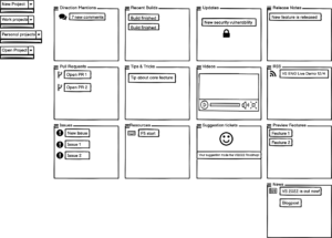
I’m working on an experience that helps you stay on top of what’s important to your code by aggregating personalized content from all your tools and resources. The dashboard aggregates everything you care about into an immediately glanceable and actionable canvas. You get what you need with fewer clicks so that you can be more productive.
It’s a dashboard composed of customizable widgets.
Here are a couple of examples:
- View a direction mention in your Git widget instead of checking and searching email, risking being distracted. Check your team’s burndown and any open issues.
- Easily track your feedback tickets, so you don’t lose them. If your suggestion ticket makes the Visual Studio Roadmap, you’re notified. You’re also notified if your reported bugs and suggestions were fixed in a release.
Feel free to let me know what would make this experience awesome for you in this survey.
- How would you build it?
- What would the dashboard need for you to use it?
- If it doesn’t work, let us know why.
Thank you for writing tickets, and please keep sharing your thoughts with us.
PS Here are some of my favorite customer comments from my analysis:


Hi Misty,
I believe this is a great idea and I can only hope to use this new tool soon. It will truly add value to everyday “play” life for myself and everyone.
-Ray
Thanks, Ray! Happy to hear it and thanks for reading. Feel free to let us know if there’s anything specific you’d like to see in the dashboard.
That sounds like one of the better ideas I’ve heard in a while, so I upvoted it. That’s when I noticed your wording. You’ve likened your suggestion to something in Windows 11. That’s suboptimal. Never tie the fate of your idea to another product that hasn’t gained critical acclaim. At the time of release, approximately 61% of Windows 10 machines couldn’t upgrade to Windows 11. Yet, you’d optimally want this 61% to understand your suggestion and vote for you.
Hey Fleet! Thanks for the Windows 11 stat and for reading the blog post! The dashboard wouldn’t be tied to Win11, only similar.
Dude, is your head on right? There’s nothing in this post that mentions Windows 11, “likened” or not.
P.S. Never take a comment seriously or personally, unless it adds positive value to the context.
I don't see why saying that a new VS feature would have similarities to an OS feature would be "suboptimal". Sure, Windows 11 is not widely used in all PCs, Windows 10 still has that place, however the concept of a widget has a very long history in personal computers, and is currently present in other operating systems, such as Android. It was also present in the past in Windows Vista and 7. Some may argue that Windows 10's live tiles in the Start Menu work in a way like widgets. Windows developers may have seen or heard about widgets,...
Hey Jorge! Thanks for reading and commenting! You’re right and the original inspiration was the Windows Phone and live tiles! We wouldn’t want a dashboard to not feel modern but I do really enjoy the behavior of those tiles and the customizable aspect.
Then kindly refrain from writing purposeless sentences until such time that you do see and are able to make an informed argument against or in favor of my position.
Salty anyone? lol
The feature is not tied to or linked with Windows 11.
The post on the uservoice just says it is similar to a feature Windows 11.
“The widgets are similar to Windows 11 widgets and you choose which widgets or tiles you want.”
Hey Kolappan! Thanks for reading and commenting! You’re right; only similar.
The verb is “liken,” not “link.”
Be sure to wear your glasses before reading someone else’s comment.