
Hello app designers,
At the first Android Dev Summit of 2022 Google announced updated large screen design guidance, gallery, and tips for foldables. These updates included a list of canonical layouts which are complementary to the dual-screen design patterns featured in the Surface Duo developer documentation. Material Design has also been updated, so there is a lot of support for designers looking to create new experiences that go beyond a small phone screen.
This post helps designers and developers looking to build for both foldable and large-screen devices to combine both sources of guidance to create adaptive user experiences. For developers working with cross-platform tools like Flutter, Xamarin, .NET MAUI, or React Native, implementation examples are available on the Surface Duo developer site.
List-detail
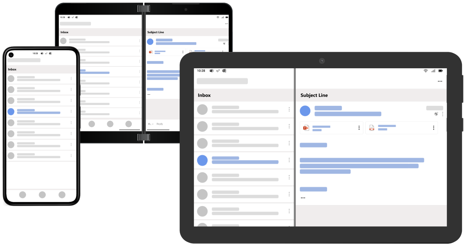
Presenting a list of items – and showing more details for a single, selected item – is extremely common across many types of application including social media, productivity, messaging, reading, media browsing, and more. Here are two different examples of how list-detail might be implemented on a foldable device:
This layout can adapt to smaller and larger screens in easily recognizable ways:
- On phones, the interaction becomes multi-step, where the list typically uses the entire screen and selecting an item leads to the detail using the entire screen, with a back gesture to return to the list.
- On tablets and desktop devices, the list and detail can exist side-by-side but in a split-screen ratio chosen by the developer or user.
The Android list-detail canonical guidance includes tips for building with different tools:
- Compose with TwoPane from the Accompanist library
- Views using SlidingPaneLayout
- Activity Embedding from Jetpack Window Manager
Best practices for this pattern are included in the Surface Duo Design Kit, and samples are available for Views and Compose and other platforms.
Supporting panel
The Supporting panel canonical layout maps to the dual-screen Companion pane pattern – there is a primary view that has is the focus of the task, and a secondary view that contains a tool palette, secondary information, or some other UI elements that are dependent on the primary view.
To adapt to other screen sizes:
- On phones, the secondary view may be below the main view or inside a bottom sheet. Depending on available space, the secondary view could also be summarized (with a subset of the information or controls available) with UI affordances to expose the full view.
- On tablets and desktops, the secondary view is typically smaller than the main view and might be positioned on along the right or bottom edge). The secondary view might be resizable or hidable, depending on the use-case.
The dual-screen gaming controller is a ‘special case’ of the companion pane/supporting panel – on smaller and larger screens the controls are typically overlaid on the gaming portal rather than kept as a distinct view.
The Android supporting panel guidance includes tips for building with view or Compose.
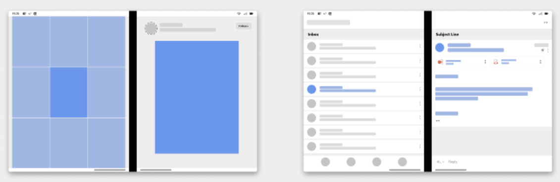
Feed
The Feed canonical layout is well suited to tablets and desktop devices. Feed layouts consist of a grid of content items that can be laid out a variety of ways depending on content type and screen size, from a single column to a multi-column scrolling collection.
A feed could adapt to a foldable device in different ways:
- Display the feed on one side of the fold, and create a list-detail-like view with the selected feed item highlighted on the other side of the fold (.
- Display the feed across the fold, but with the content items laid out to avoid the fold area.
Other dual-screen patterns
Extended canvas, dual-view, and two page design patterns are featured in the Surface Duo Design Kit.
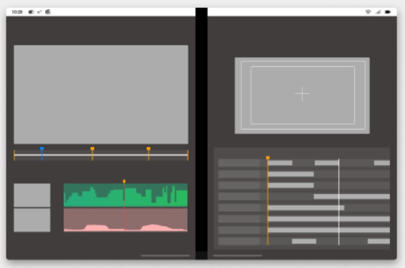
Extended canvas
The extended canvas design pattern works great for use cases like maps, spreadsheets, or drawing surfaces. The key adaptation is to ensure any focus elements on the canvas (like the ‘current location’ on a map), or any palette or interactive elements, are not hidden by the hinge.
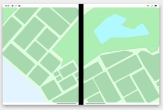
Scaling extended canvas up and down (to phones or tablets and desktops) typically involves just adjusting the size of the viewport, and positioning any markers and palettes within the screen bounds.
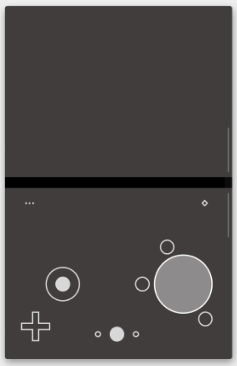
Dual view
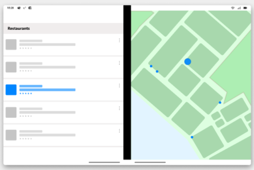
Dual view is defined as “showing two views of the same data”, and is commonly used in one of two ways:
- Synchronized navigation – for example, a listing of restaurants or real estate. One panel contains a scrolling list and the other a map, where the pins or markers are also presented in the list. Panning and zooming the map can filter the data in the list, and selecting a list item can change the focus of the map.
- Comparing information – another use for side-by-side views is comparisons, such as product differences, source code check-ins, or even an editing and preview mode.
On smaller screens this pattern is typically collapsed so that only one of the views is visible, and the other is toggled on or off with a button or tabbed view.
On larger screens, both views are typically shown although the split may be adjustable and not fixed at half the screen.
Two page
Long-form reading is a great application for dual-screen devices, so it makes sense to consider the unique requirements of a two page design pattern.
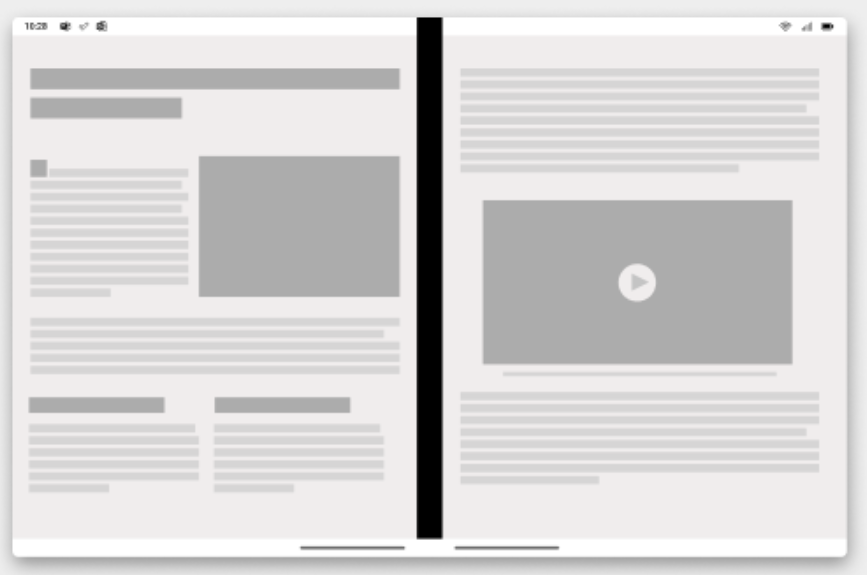
This pattern is also easy to adapt for other screen sizes – on smaller devices just show one page, and on larger devices allow the content to reflow to fill the screen. Some content might make sense to flow even to landscape tablet size, or alternatively the screen could be split to present the same two page layout that is presented on foldables.
Feedback and resources
The Android GitHub org has a collection of samples for their canonical layouts. The Surface Duo team has documentation and samples for all these user experiences, written with View and Jetpack Compose, and also with a variety of cross-platform tools including Flutter, React Native, Xamarin and .NET MAUI.
Finally, please join us for our dual screen developer livestream at 11am (Pacific time) each Friday – mark it in your calendar and check out the archives on YouTube.
0 comments