Hello Compose developers!
This week, we’re excited to announce two big updates to our dual-screen experience example: a Compose refactor of the catalog page and a brand new order history page.
The dual-screen experience example provides an end-to-end experience centered around a travelling guitar salesperson, with options to find fake guitar stores, read a catalog, browse products, place fake guitar orders, and now, view order history.
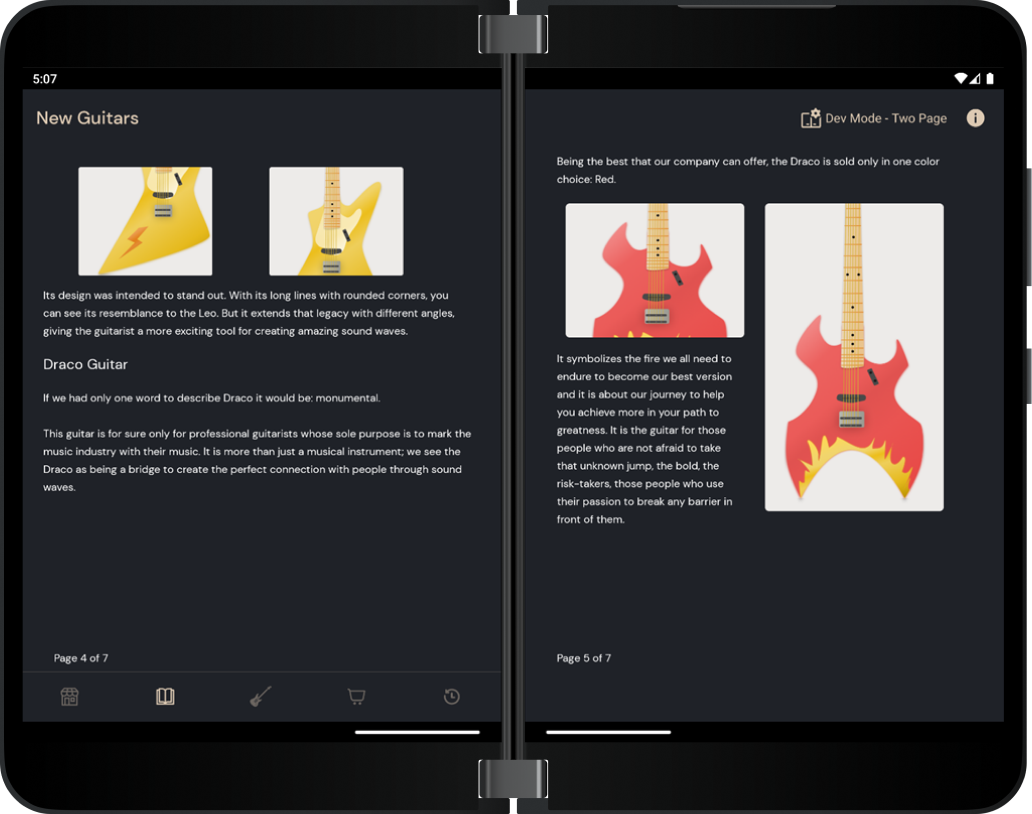
Figure 1. Screenshot of the new catalog page
The main goal of this sample is to highlight the different ways developers can take advantage of the dual-screen/foldable form factor. With these two new Compose additions, we hope that this sample can continue to serve as a great example for an even larger audience of developers. The new version of the app is now available in the Google Play Store!
Catalog page refactor
Before the code refactor, we used fragments for each page.
Now, every page is wrapped with the PageLayout composable function to hold the content of the page, so we don’t have to set up the bottom page number or the constraints every time.
@Composable
fun PageLayout(
    modifier: Modifier = Modifier,
    pageNumber: Int,
    maxPageNumber: Int,
    content: @Composable () -> Unit
) {
    val constraintSet = getMainConstraintSet()

    ConstraintLayout(constraintSet = constraintSet, modifier = modifier) {
        Box(
            modifier = Modifier
                .layoutId(CONTENT_ID)
                .fillMaxHeight()
                .padding(bottom = dimensionResource(id = R.dimen.catalog_margin_normal))
        ) {
            content()
        }
        BottomPageNumber(
            modifier = Modifier.layoutId(BOTTOM_PAGE_NUMBER_ID),
            text = stringResource(
                id = R.string.catalog_page_no, pageNumber, maxPageNumber
            )
        )
    }
}
Within PageLayout composable, and throughout most of the refactor, we decided to use the ConstraintLayout composable function to create our UI screens.
What is ConstraintLayout ?
ConstraintLayout is a layout that is mostly used when building complex layouts. According to the official Android documentation, it “allows you to place composables relative to other composables on the screen.”
When should I use ConstraintLayout in Jetpack Compose?
The documentation recommends using ConstraintLayout when you want to:
– avoid nesting multiple Columns and Rows
– position composable relative to other composables with the help of guidelines, barriers, or chains
Using constraints to place composables
If you have a foldable or a dual-screen device, you can create a vertical barrier and place composables relative to it.
For example, let’s take the fifth page of the catalog from our sample.
This is the layout in dual-landscape orientation:
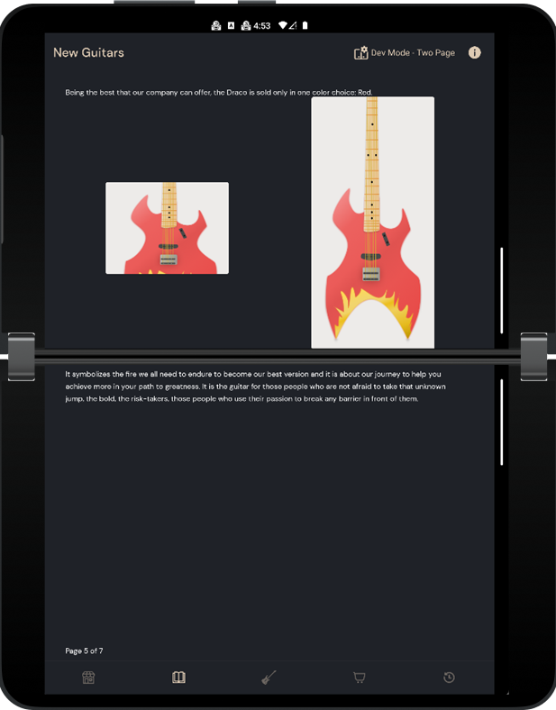
Figure 2. Fifth page of the catalog when viewed in the dual-landscape orientation
And this is the layout for dual-portrait orientation:
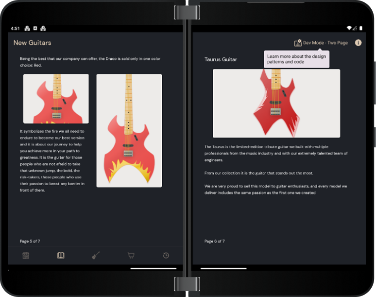
Figure 3. Fifth page of the catalog when viewed in the dual portrait orientation
To create this UI, we used a ConstraintSet to place TextDescription and RoundedImage, which are just some styled Text and Image composable functions. For each item, we need to set a layout ID in order to create a reference to the item and position it in the layout.
modifier = Modifier.layoutId(FIFTH_PAGE_FIRST_TEXT_ID)
In the first step, we are creating the reference for each TextDescription and RoundedImage.
val firstTextRef = createRefFor(FIFTH_PAGE_FIRST_TEXT_ID)
val firstImageRef = createRefFor(FIFTH_PAGE_FIRST_IMAGE_ID)
val secondImageRef = createRefFor(FIFTH_PAGE_SECOND_IMAGE_ID)
val secondTextRef = createRefFor(FIFTH_PAGE_SECOND_TEXT_ID)
In the second step, we are creating the guidelines in order to help us place the composables depending on the layout orientation.
val verticalGuideline = createGuidelineFromStart(0.5f)
val horizontalGuideline = createGuidelineFromTop(0.5f)
Let’s constrain the reference of the first TextDescription. The start position will be linked to the start position of the parent, also for the top position but with a margin.
constrain(firstTextRef) {
     start.linkTo(parent.start)
     top.linkTo(parent.top, topMargin)
}
All good so far, but what if we need to constrain the composable depending on the orientation? Let’s take a close look at the first image reference. We are using the boolean variable isFeatureHorizontal to determine the orientation.
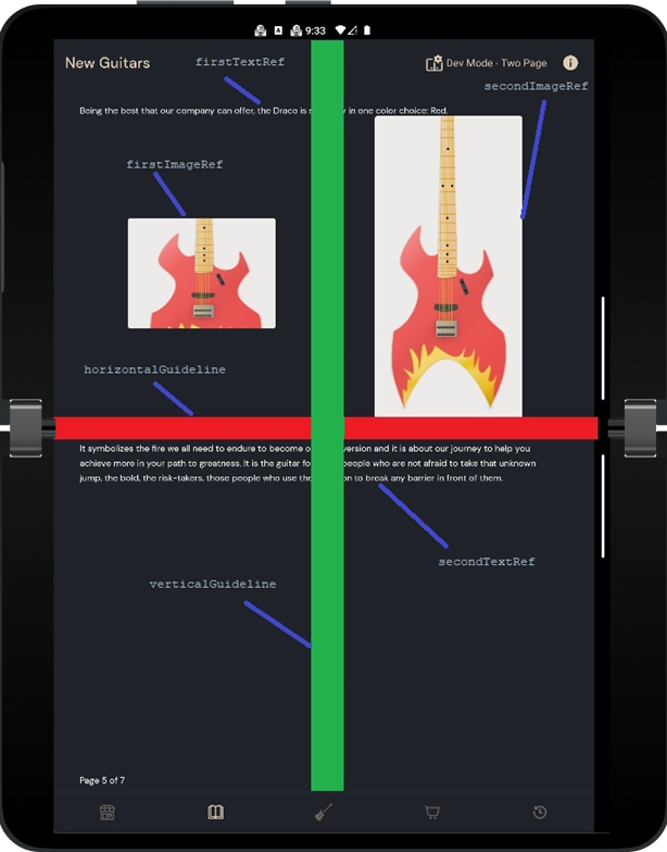
Figure 4. Fifth page of the catalog with vertical and horizontal guidelines highlighted
This is a visual representation of each reference. For better understanding, we have drawn one red line which represents the horizontalGuideline, and one green line which represents the verticalGuideline. Both are invisible, but in our case, we made them visible to see what happens behind the scenes.
constrain(firstImageRef) {
    start.linkTo(parent.start)
    end.linkTo(verticalGuideline)
    if (isFeatureHorizontal) {
        bottom.linkTo(horizontalGuideline)
        top.linkTo(firstTextRef.bottom)
  } else {
        top.linkTo(firstTextRef.bottom, topMargin)
    }
    height = Dimension.preferredWrapContent
    width = Dimension.preferredWrapContent
}
The start of the first image will be linked to the start position of the parent and the end position will be linked to the vertical guideline. This way we make sure that the image is in the center between the start of the screen and the vertical guideline.
If the folding feature is horizontal, the bottom position of the image will be linked to the horizontal guideline and the top position will be linked to the bottom position of the first text. If the folding feature is not horizontal, then we link only the top position to the bottom of the first text with a margin.
After we are done setting up all constraints for the composables, we can pass the ConstraintSet to the ConstraintLayout.
ConstraintLayout(
    constraintSet = constraintSet,
    modifier = modifier
) { }
New order history page
The order history page is a new fifth destination in the app’s bottom navigation bar. In this tab, users can view details from their previous orders, such as date and price, and they can also choose to re-order customized items.
There are three main features of this new page:
- Updated first-run experience (FRE)
- List detail app pattern
- Add to order dialog
Update first-run experience
The tutorial has an updated step after a user has completed their first order. Instead of directing users back to the store’s product page, it now encourages users to check out the order history page to view the receipt from their first order.
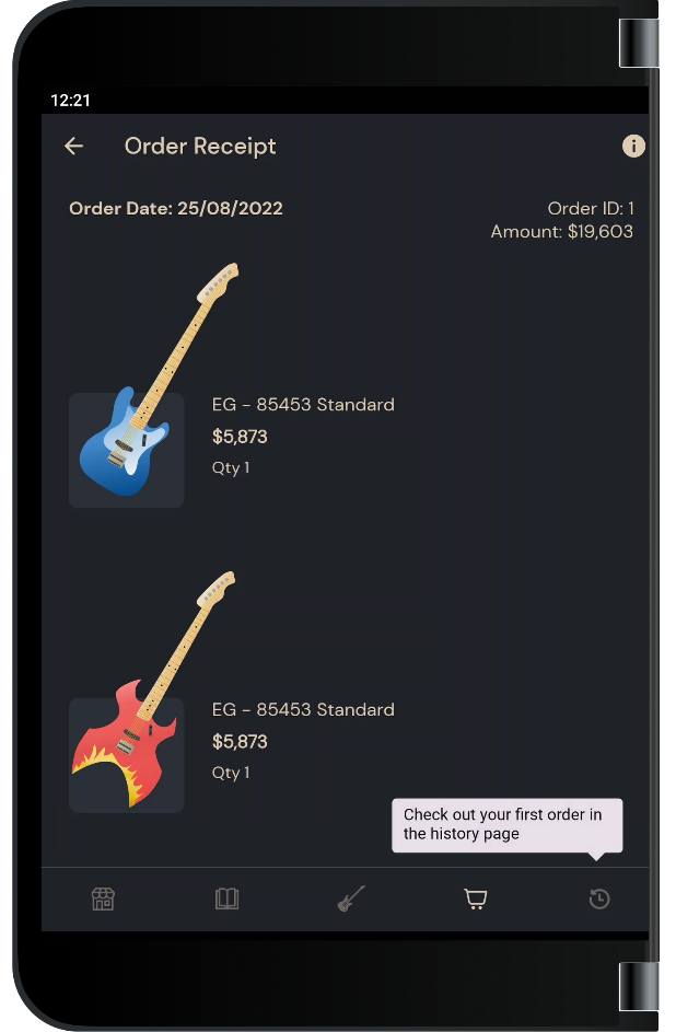
Figure 5. Screenshot of the new step in the app FRE.
List detail app pattern
Like the products page, the order history page uses the list detail app pattern when shown on dual-screen and foldable devices.
In the first pane, a list of previous orders is displayed. The orders are represented by a card that contains a preview of which guitars were in the order, when the order was placed, and how much it cost.
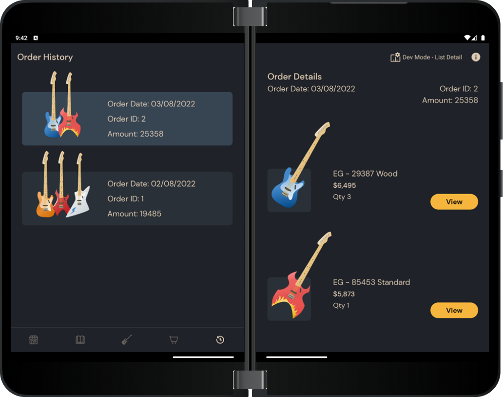
Figure 6. Screenshot of the order history page in dual-portrait mode, with the list pane on the left and the detail pane on the right.
In the second pane, a more detailed view of each order can be accessed by clicking on elements from the list pane. The detail view allows users to see more information about items in their order, including the individual order item names, prices, and quantities.
Add to order dialog
Within the detail pane, users can also click the View button next to an order item to access the Add to order dialog. This dialog displays all the details a user would see on the products page, including name, rating, price, and description.
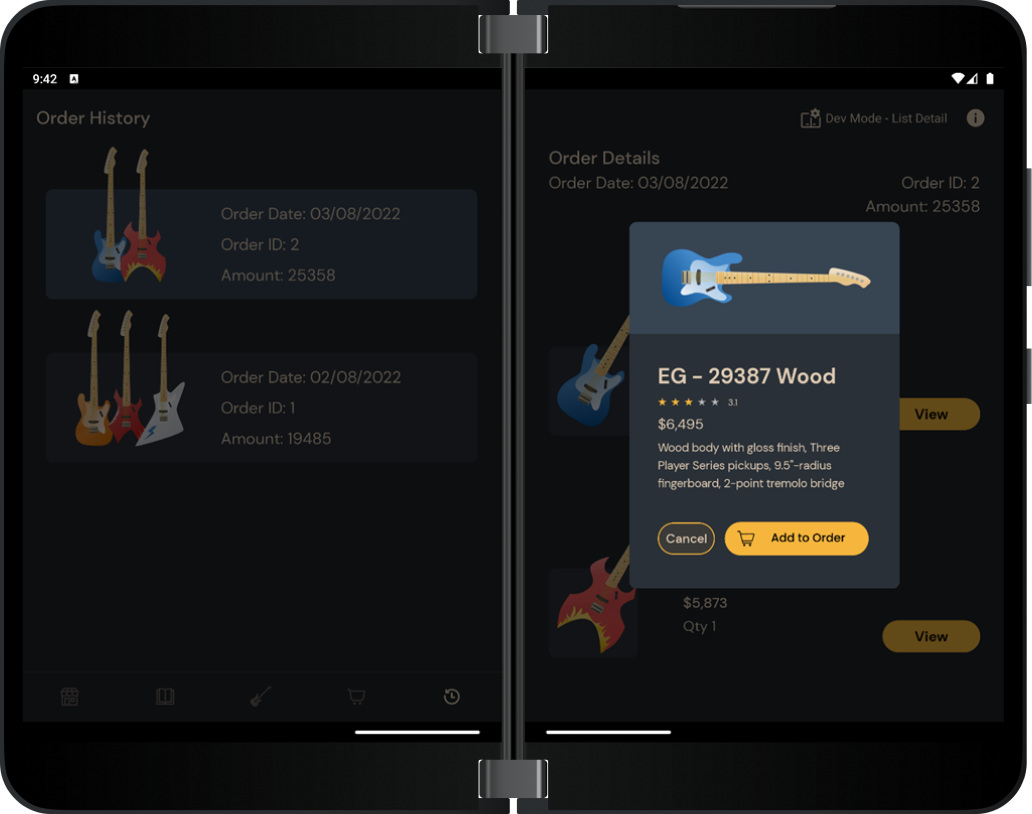
Figure 7. Screenshot of the Add to order dialog.
It also gives users the opportunity to reorder specific items exactly as they were customized. Let’s say, for instance, a customer really enjoyed a guitar from their previous order, and they now need a replacement. Instead of checking their order history for the exact model, body shape, and color, then navigating back to the products page to input all these customizations, all they have to do is click Add to order in the dialog to add the exact same product to their cart!
Lessons learned
We both learned a lot about Compose by making these updates to the dual-screen experience example and we hope this will help you on your Compose learning journey as well! Here are some of our main takeaways from the experience:
Alin: Jetpack Compose is the new way of making UI in Android. The downside of it, as with any new technology, is that you have a learning curve. Coming from the old way of making UI in Android (with XML layouts) can be tough, but here are some lessons and best practices that I encountered:
1) Avoid reading the official documentation of Compose too much. It’s very good to follow the docs, but you must get your hands dirty and code it yourself.
2) Let’s say you have a composable function and you want to use different background colors or different padding depending on which screen you’re on. A best practice is that you provide a default modifier to your composable function in order to make changes to your composable very easy.
3) Don’t use the modifier passed as a parameter to a composable function more than once. It should only be applied to the top-level layout in your function
Kristen: One of the biggest issues I struggled with was rotating the guitar images correctly! I had to do a lot of research and trial/error, and you can see in the code that I actually rotated the guitar images in two different ways: 1) using the graphicsLayer modifier, and 2) using the Canvas composable. Depending on how you want to scale an image and align it with other elements, you can choose between these two options. I used the Canvas composable for the Add to order dialog because it gave me greater control over the size of the composable and how padding was added, but the graphicsLayer modifier ending up working better for simpler situations, like in the detail pane.
Resources and feedback
You can read more about Jetpack Compose for foldable devices in the Surface Duo developer documentation.
If you have any questions or would like to tell us about your dual-screen applications, use the feedback forum or message us on Twitter @surfaceduodev.
Finally, please join us every Friday on Twitch at 11am Pacific time to chat about Surface Duo developer topics!


0 comments