
Hello app designers!
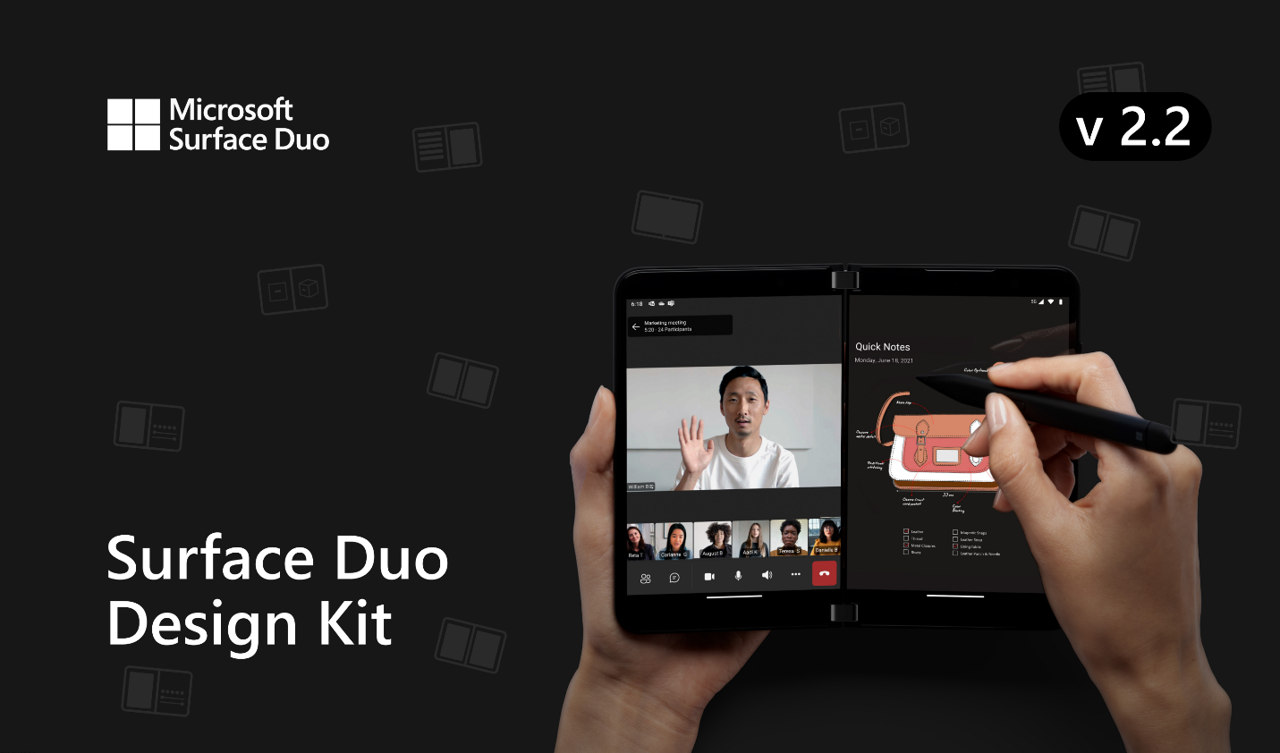
Our Surface Duo Design Kit is now updated to version 2.2. If you haven’t heard of this kit before, Surface Duo Design Kit is the go-to place where you can find all our UX design suggestions and UI components for both Surface Duo and Surface Duo 2. It includes many of the interface components which you can handily grab and use.
About a year ago, we released the Surface Duo Design Kit v2.0, and since then we have been continuously fixing issues, adding new components, and providing more samples to help you use this kit to design your apps. In this v2.2 update, we mainly focus on:
- Surface Duo 2 device frame dimension update
- App bar, Bottom navigation, Navigation bar & Status Bar, Navigation Rail, Persona, Search bar and Snack bars components’ Surface Duo 2 component variants addition
Now, let’s take a closer look at the detail of these updated categories.
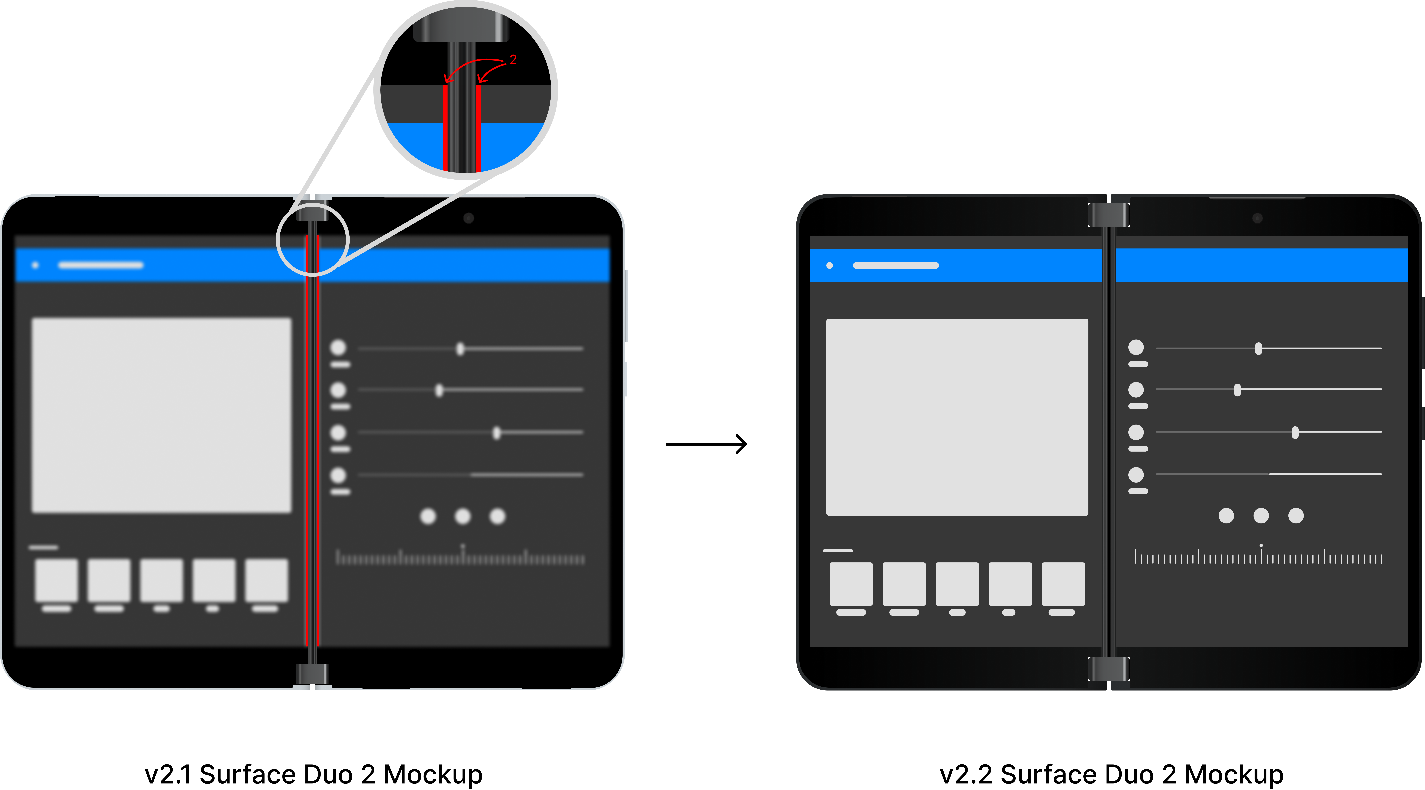
Surface Duo 2 device frame update
Device frames are useful not only for prototyping and mock-ups but also sharing real app screenshots in-situ. With this in mind we updated the Surface Duo 2 device frame for pixel-perfect accuracy! This screenshot shows the minor tweaks required, so that your screenshots look just as they do on a real device:
New Surface Duo 2 component variants
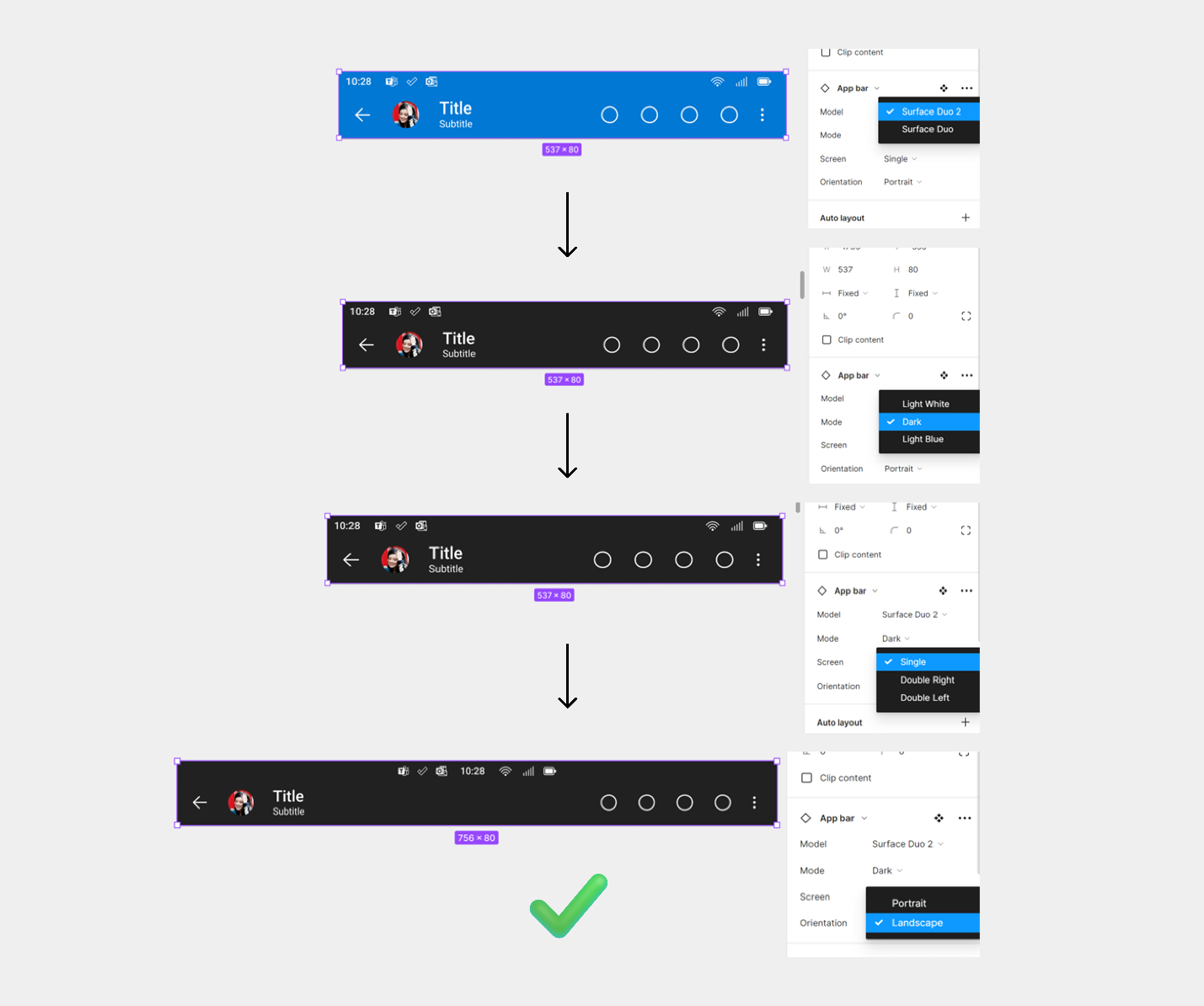
Previously, we provided Surface Duo 2 variants for some of the components in the design kit. In this version, we completed all components with Surface Duo 2 variants and utilized Figma’s component set feature to help you quickly seek out the right model, orientation, theme, and type that you intended to use. I will take the App bar component as an example to showcase the added new variants and organization structure.
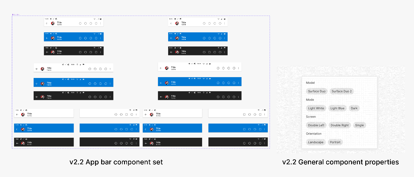
Imagine you are building your app for Surface Duo 2 and want to grab an app bar from our design kit. With the 2.1 version, when you searched for App bar in your Asset panel, there would be a list of 32 very similar app bar thumbnails that would appear with long wrapped names for each one of them to indicate their properties. This organization structure was certainly something we wanted to improve. In v2.2, we utilized Figma’s component set feature making this searching process more straightforward and efficient. Now when you search, there will be only one App bar thumbnail result showing on your Asset panel. And from there, you can choose from the property drop down menus to find what you need.
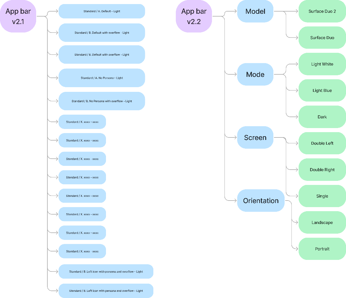
For example, I need a dark theme app bar for Surface Duo 2 in landscape mode. I would select Surface Duo 2 in Model dropdown; Dark in Mode dropdown; Single in Screen dropdown; and Landscape in Orientation dropdown. And there you go! The component is ready for you to fill in with your design contents.
Resources and feedback
We are continuously maintaining and updating our Surface Duo Design Kit. You can find assets via the Surface Duo Design Kit in Figma and in our developer documentation. While we are improving the Design Kit, we would love to hear from you about your experience designing dual-screen experiences for Surface Duo and Surface Duo 2. Please reach out to us on Tech Community or find us on Twitter @surfaceduodev.
You can also live chat with us on Twitch this Friday, on September 9th at 11am PST, where you can ask questions about this new version 2.2 of our Surface Duo design kit or any other aspect of designing and developing dual-screen apps for Surface Duo devices!
0 comments