
In previous posts, we’ve talked about building Android apps for Microsoft Surface Duo using Kotlin & Java, C# with Xamarin, React Native, Unity, and Flutter. Microsoft is also working hard to bring new capabilities to the web so that websites and embedded web experiences can also adapt to the Surface Duo and other dual-screen devices.
Proposals: CSS primitives and window segments
There are currently two proposals being considered:
Today’s post shows how these features might work and explains how you can test them today to provide feedback and plan for future dual-screen web experiences.
Please note that the proposed APIs are a work-in-progress and subject to change at any time.
UPDATE: The CSS examples below were updated on 7th June, 2021 from
spanningtoscreen-spanningto reflect changes in the standards proposal. References tofold-right,fold-bottomenvironment variables were removed. The dual-screen CSS documentation is up-to-date.
CSS primitives
The proposed media additions would look like this in a CSS file:
@media (screen-spanning: none) {
   // styles when browser is not spanned
}
@media (screen-spanning: single-fold-vertical) {
   // styles applied in double-portrait (wide) mode
}
@media (screen-spanning: single-fold-horizontal) {
   // styles applied in double-landscape (tall) mode
}
The styles contained in each spanning clause would be applied, depending on the web browser’s screen position, and would automatically be updated as the device is rotated or the web browser is spanned or unspanned.
The proposal also includes predefined CSS environment variables such as fold-top, fold-left, fold-width, and fold-height, which can be used to reason about the size of each screen segment.
Window segments
The window segments proposal adds a getWindowSegments method that returns the number of “panes” available for rendering. By default, it will return one element, but if there are multiple elements in the array, the web browser is spanned across two screens and you query the dimensions of each. An example JavaScript usage is shown here:
const screenSegments = window.getWindowSegments();
if (screenSegments.length > 1 ) {
   // now we know the device is a foldable
   // it's recommended to test whether screenSegments[0].width === screenSegments[1].width
   // and we can update CSS classes in our layout as appropriate
   document.body.classList.add('is-foldable');
   // other changes as required for layout
}
Note that these proposals are still being discussed and can be explored further in this issue for the spanning media feature. The links and samples provided below are available to experiment with and provide feedback on.
Testing in a browser
While the proposals work their way through the standards process, it is possible to test an implementation of these ideas using the spanning-css-polyfill and windowsegments-polyfill. There is a photo-gallery example with a panel that simulates dual-screen devices in any modern browser. Click the left-most icon to enable a dual-screen experience in the browser:

Figure 1: foldable configurator for testing
Click the third icon to expand the configurator and preview a Surface Duo-specific experience:
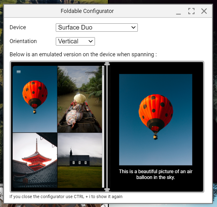
Figure 2: simulating the Surface Duo web experience
You can also use the polyfills with your own website. Follow these instructions to add the configurator for testing, and keep in mind these proposal may change in the future.
Testing with the WebView
Android app developers can use the polyfill implementations in HTML that is hosted in an Android application WebView. Instead of the configurator shown above, you can use Java or Kotlin to detect the application state and directly set the spanning behavior for the WebView, thereby simulating browser support.
Two samples using this technical implementation can be found on GitHub. The code shown below interacts with the WebView to control the CSS behavior (it relies on our Surface Duo SDK ScreenHelper class to respond to spanning and rotation):
private void UpdateSpanning()
{
    int rotation = ScreenHelper.getRotation(this);
    String spanning = "none";
    int foldSize = 0;
    if (isDuo && screenHelper.isDualMode()) {
        Rect hinge = screenHelper.getHinge(rotation);
        switch (rotation) {
            case Surface.ROTATION_90:
            case Surface.ROTATION_270:
                foldSize = (int) (hinge.height() / 2.5); // height is returned in pixels, CSS wants in dp
                spanning = "single-fold-horizontal";
                break;
            default:
                foldSize = (int) (hinge.width() / 2.5); // height is returned in pixels, CSS wants in dp
                spanning = "single-fold-vertical";
                break;
        }
    }
    webView.evaluateJavascript(String.format("(window[\"__foldables_env_vars__\"]).update({spanning: '%1$s', foldSize: %2$s})", spanning, foldSize), null);
}
Example: floating boxes
The first example consists of four boxes shown in this HTML snippet:
<div class="content">
    <div class="blue">1</div>
    <div class="yellow">2</div>
    <div class="pink">3</div>
    <div class="green">4</div>
    <div class="fold angled stripes"></div>
</div>
An excerpt of the CSS shows that by default each div style is given a height, width, and color, but no other layout information. The @media spanning styles are only applied when the app is spanned:
.green {
    height: 100px;
    width: 100px;
    background-color: green;
    text-align: center;
}
@media (spanning: single-fold-vertical) {
   .green {
       position: absolute;
       left: calc(env(fold-left) + env(fold-width));
       bottom: 0;
       background-color: green;
   }
}
This behavior is demonstrated in the following screenshots – on a single screen the boxes are rendered in the order they are declared, but when the app is spanned (and the Java code sets the correct spanning value), the boxes are absolute positioned according to the @media styles:

Figure 3: Single-screen HTML with no position style applied
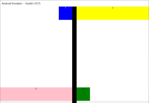
Figure 4: Spanned app with single-fold-vertical media spanning styles applied
Example: reading experience
The second example provides a reading experience implemented for dual-screens. In double-portrait mode, a book-like reading experience is available, but in double-landscape mode, the article scrolls vertically (the same experience as a single-screen device):
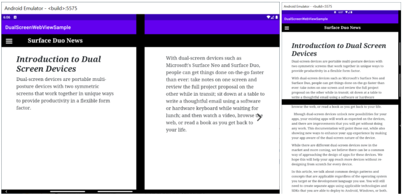
Figure 5: double-portrait and double-landscape reading experience
Feedback
I hope these examples inspire you to test out the dual-screen proposals and start to imagine how web-based dual-screen experiences could be applied to your online apps. Keep an eye on the proposals and the dual-screen web experiences documentation for the latest updates.
Remember these APIs are still a work-in-progress.
We’d love to hear from you! Please leave us feedback using our feedback forum, or message me on Twitter or GitHub.
0 comments