
Hello dual-screen web developers!
Microsoft Edge version 97 included the dual-screen web APIs that have been in preview since last year. Now Microsoft Surface Duo users with the latest Edge will get an enhanced web experience automatically when sites have implemented the CSS or JavaScript dual-screen APIs. Visit the dual-screen web documentation for more information on the APIs, as well as how to test on devices, emulators, and using desktop browser developer tools!
Today’s post discusses the APIs you can use to adapt your content to dual-screen devices using either CSS or JavaScript.
Dual-screen CSS
The CSS support for Surface Duo is a combination of dual-screen-aware media queries and environment variables:
- Media queries – the dual-screen-aware media queries define styles that are only applied to the page when being viewed on a specific device layout, such as two viewports side-by-side as in the screenshot below.
- Environment variables – the dual-screen-aware environment variables describe the dimensions of each viewport, when more than one viewport is present. These values can be used to position elements relative to the hinge or fold between the viewports.
This example shows a real-world implementation of the colored boxes absolutely positioned section of the Foldables explainer:
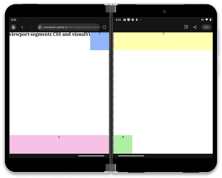
Figure 1: Colored boxes example in Microsoft Edge on Surface Duo 2
Dual-screen media queries
CSS media queries provide a way to selectively apply styles when the browser or device matches one or more rules. Examples include specifying styles only for the print media type, or styles that apply at different viewport widths. The dual-screen support available in Microsoft Edge extends this capability to detecting how many viewport segments exist, so that styles can be applied only when viewing on a dual-screen device.
There are two media expressions available – one that applies to the viewports side-by-side and another when the viewports are vertically arranged. This can be helpful when implementing different dual-screen UX patterns based on the device’s posture – for example you might wish to create a book-like reading experience when the screens are side-by-side, but treat both screens as endless scrolling content in the vertical posture.
The CSS syntax for these device postures matches the number of segments in a horizontal or vertical direction:
@media (horizontal-viewport-segments:2) {
  /* styles for side-by-side */
}
@media (vertical-viewport-segments:2) {
  /* styles for vertical layout */
}
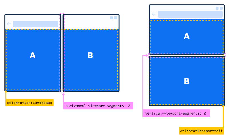
Figure 2: viewport-segments media expressions
The expressions can be combined, such as this CSS which detects a viewport that has exactly two segments that are side by side (although no currently shipping devices require this level of specificity):
@media (horizontal-viewport-segments: 2) and (vertical-viewport-segments: 1) {
  /* styles for side-by-side */
}
Notice that when Surface Duo is vertically oriented, the top viewport segment (A) is smaller than (B) because of the address bar. You should never assume that the two segments are the same size, but instead use the environment variables explained below to determine the size of each area.
Dual-screen environment variables
Once you’ve decided to customize the page layout based on multiple viewport segments, you’ll want to position elements to adapt to the device’s orientation and hinge position. The dual-screen web support includes size additional environment variables that you can incorporate into your style sheets, which describe the dimensions of each viewport segment:
env(viewport-segment-width x y)
env(viewport-segment-height x y)
env(viewport-segment-top x y)
env(viewport-segment-left x y)
env(viewport-segment-bottom x y)
env(viewport-segment-right x y)
The values are indexed, with the ‘top left’ viewport in any orientation always being 0 0. Figure 3 illustrates the correct indexes for the viewports in each device posture.
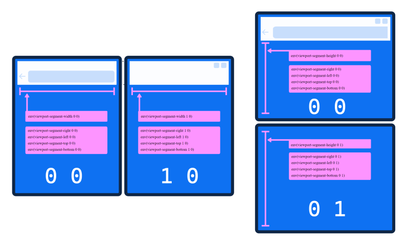
Figure 3: viewport-segment environment variables
These values are only available when used inside a viewport segments expression, but you can use the environment variable’s fallback parameter to set the default:
env(viewport-segment-width 0 0 300px)
JavaScript
The dual-screen JavaScript support is exposed via a new window property visualViewport, and its segments property. When segments is not null it will return an array of rectangles that describes the bounds of the two screens, which you can use to align elements on the page and avoid the obscured hinge area on some devices. This simple function shows the segment values in the console:
function printWindowSegments() {
   const screens = window.visualViewport.segments;
   if( segments && segments.length > 1 ) { // device has a hinge or fold
      console.table(screens);
    }
}
window.addEventListener("resize", () => { // recalculate when size changes (could be spanned or unspanned)
    printWindowSegments();
});
printWindowSegments();
The JavaScript console.table method makes it easy to visualize the value of the segments property, and also to see the difference between testing on a Surface Duo 2 device where the address bar reduces the size of the first viewport and developer tools in the browser which does not simulate the address bar, and uses the dimensions of the original Surface Duo, as shown in Figure 4.
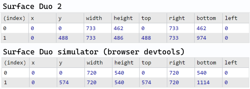
Figure 4: JavaScript console output (device versus devtools)
Learn more at An Event Apart
Join Stephane Stimac the An Event Apart online conference to learn more about Design and Development Considerations for Dual Screen Devices on Monday April 18th.
You can register online for the Spring Summit that runs from April 18th – 20th.
Resources and feedback
These dual-screen capabilities have also been exposed in Angular and React.
Check out the Surface Duo developer documentation and past blog posts for links and details on all our samples.
If you have any questions, or would like to tell us about your dual-screen websites or PWAs, use the feedback forum or message us on Twitter @surfaceduodev.
Finally, please join us on Twitch on Friday 11th March at 11am Pacific time to discuss this post.
0 comments