My name is Jorge Pereira and I am a developer at Microsoft. For the past few months I’ve been working on a Windows 8 app along with a small team of developers from the Visual C++ team, we call it Project Code Name Austin.
Austin is a digital note-taking app for Windows 8. You can add pages to your notebook, delete them, or move them around. You can use digital ink to write or draw things on those pages. You can add photos from your computer, from SkyDrive, or directly from your computer’s camera. You can share the notes you create to other Windows 8 apps such as e-mail or SkyDrive.
When we sat down to create it, we wanted to build a very simple digital replacement to the real paper notebooks people carry around to meetings at work, to school, around the house, where they scribble things and take quick notes.
Another very important goal of this app is to showcase the power of the native platform and C++, and some of the new features in Visual Studio 2012 such as automatic code vectorization and C++ AMP. Austin aims to demonstrate with real code the kind of device-optimized, fluid and responsive user experience that can be built with our newest native tools on the Windows8 platform.
For that reason, we are making the majority of the source code available for download here. We also plan to publish a series of blog posts here in the Visual C++ Team Blog talking about our experience building it, and some of the technologies we used.
Austin doesn’t aspire to be a full-featured note-taking app such as OneNote. It doesn’t give you a way to organize your notes other than by their position in the book, it also doesn’t enable typing or searching. These were all conscious decisions. We believe in the beautiful simplicity of just a pen and a piece of paper, and that’s what we tried to recreate with it. Much of the inspiration and code for the Austin app draws from an earlier project code-named Courier.
I’ve been using Austin for a while for many things. For example, I took a photo of a corner in my garden and then drew right over it the vegetable garden box I planned to build. I use it to make my shopping lists and to write cooking recipes and snap photos as I make them. Sometimes, I find it easier to draw something and email it instead of typing a bunch of text. I also use it to write my thoughts when I am coding.
It’s amazing how useful just a pen and a paper are by themselves. But when you take that concept to the computer realm and expand it to do things like add photos and annotate them right on the spot, and digitally share what you create, then the possibilities are endless.
This is a page of notes I wrote while sorting out my thoughts before I rewrote some of Project Austin’s camera code:
And this is a sketch of my vegetable garden:
But a video is worth a thousand sketches! We put together this to introduce Austin:
(you can download the video in mp4 format using this link)
Why we built it
We built Austin with two main goals in mind. First, we wanted to build a fully functional real-world app that’s actually useful and high quality. Second, we wanted to demonstrate the power of C++ and the Window 8 platform, and showcase some of the new technologies delivered by our team in Visual Studio 2012, such as C++ AMP and automatic code vectorization. We wanted to use DirectX to create an immersive, fluid user interface that’s built as a 3D scene with lights, shadows, and a camera so that pages can be viewed from different angles.
A bit of history to help you understand the origins of Project Austin…
C++
When I started working on Austin, I hadn’t written C++ code in over 7 years because I was mostly coding in C#. Since one of the goals of Project Austin was to showcase how to write “modern” C++, I spent quite some time reading through several classic and newer C++ books, trying to get an idea about what writing proper, “modern” C++ code is. (I pulled out my Stroustrup book, which had been on my shelf since school!) I also got great help from some of the experts on the team—after all, there are some obvious advantages of being surrounded by the team of people that build the Visual C++ compiler. The result of this was a set of coding guidelines and style that we used throughout the code.
We use the C++ Standard Library extensively, for strings, collections, and smart pointers. We barely have any “naked” C++ pointers in the code; instead we use smart pointer types such as std::shared_ptr and Microsoft::WRL::ComPtr. We use the RAII pattern extensively, we don’t check HRESULTs, instead we do most of our error handling using exceptions. We don’t explicitly call new or delete when we create or destroy objects. Our coding conventions are inspired by the BOOST library.
Of course, I am sure we do lots of silly things, or things we could do better or differently, but we in the team are all pretty happy with the way the code is written and how productive we are. Despite being a part of the C++ team, I am by no means a C++ expert, so this source code isn’t meant to dictate the canonical way to do things in C++. They do represent our effort at using the language the best way that works for us, and in that respect, it’s been a great success.
Architecture
Austin’s code is conveniently structured with common functions grouped in a library (code named “baja”), inspired by modern modularity design principles. This library started as a basic toolkit that contained facilities such as a call-stack walking, tracing, and asserts. Later it grew to provide a graphics engine, a math library, storage, and wrapping around the underlying operating system for things like input and a main app loop.
Austin’s code and libraries are a work in progress. It is a toolkit built by a team building a real app, with all its flaws and shortcomings. It’s not an “official” Microsoft library in any way. We are giving away this code with no guarantees or promises about it whatsoever—use it at your own risk! We may keep evolving it and adding or changing functionality.
Technology
Austin is built mostly on C++, and we use a lot of STL and some BOOST. We also use C++/CX to interface with the Windows Runtime and XAML to display some user interface elements. The following is a list of some of, what we think, are the most interesting parts of Austin. We’ll be posting more detailed articles on most of these in the upcoming weeks.
3D graphics and user interface
Our graphics engine is built on DirectX. The graphics engine gives us a simple scene graph, cameras, lights, a very simple “effects” library with some basic shaders, materials, fonts, and some simple geometry. Overall, it hides a lot of the DirectX lower-level complexity from the rest of the app.
This picture shows a page in Austin from a different camera perspective than normal. It shows the “viewport” (the blue rectangle), the reference grid, the light source, and the coordinate origin.
As mentioned above, Austin integrates with XAML, which we use for display part of the user interface such as menu fly-outs, buttons and so on. It uses the SwapChainBackgroundPanel to render our 3D scene, which includes the notebook’s pages, photos, ink strokes, and background. We use XAML for the settings menu, the app bar, and the rest of the user interface.
Storage
We use the Extensible Storage Engine (ESE) as our storage engine. ESE is a fairly low-level storage engine where you manipulate tables and indices rather than use higher-level SQL statements. ESE is used as the storage engine in many Microsoft products. We found it super-fast and efficient, and it’s included in Windows 8.
Ink
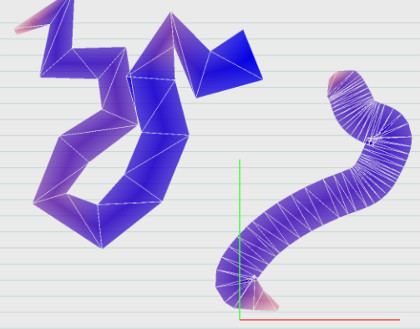
We used a home-grown approach to displaying digital ink because we wanted to draw ink on 3D pages, and we wanted absolute control over it so that we could eventually do things like bleed the ink onto the paper and change its lighting based on the paper grain. The initial implementation of the ink used a geometry shader to generate the mesh, but we ended up moving that code to the CPU when the logic became a bit too complex for my limited HLSL coding skills. So currently, the mesh is generated in the CPU, then the vertex buffers are sent to the GPU for rendering using a pixel shader.
This picture shows our first (geometry shader-based) ink implementations. Notice the mesh that forms the ink stroke:
Ink smoothing
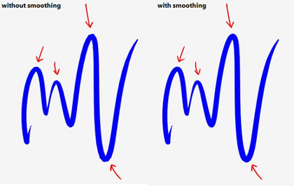
Another interesting feature of Austin is its ink smoothing. As the user moves the stylus, finger, or mouse pointer over the screen, the points, pressures, and velocities are captured and eventually make it to our app. We use these points to generate the mesh that forms an ink stroke. However, if the user moves the stylus very fast, the distance between these points can be noticeable, and the ink stroke shows straight sections that make it look not that great. In this example you can see the difference, especially around the sharper corners of the stroke. It’s subtle but it makes a difference. This code is also vectorized for an extra performance boost.
Navigation and scalability
Another important feature we wanted to give Austin is the ability to browse through many pages of the notebook in a fast and scalable way. We put a great deal of effort into this—loading the data from ESE asynchronously in multiple threads using the Parallel Patterns Library (PPL), generating page thumbnail textures, caching some of the view data, and using DirectX deferred rendering to avoid interrupting the UI thread and causing a jarring input experience.
Paper simulation
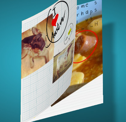
Austin gives you several ways to navigate your pages. You can view them in a 3-row grid or in a single-row list, or you can view them “stacked” on top of each other. In this third mode, when you swipe across the screen, the page reacts and turns like an actual physical page. Getting this page curling right was also an interesting piece of work. We started by using a physics engine to try to simulate the paper but it ended up looking too much like cloth. Eventually, we wrote some code inspired by [1] that wraps the paper around a “virtual”, invisible cone that changes form as the user swipes the finger across the screen. The results of this much simpler approach look great.
This picture shows how a page looks like when curled:
C++ AMP
When the paper mesh is deformed, we need to calculate the normal vectors of its vertices so we can apply the shading properly. We used C++ AMP to write code that runs on the CPU and also on the GPU. (The WARP or reference device runs C++ AMP code when a compatible GPU is not available.) The performance boost was fantastic. We plan to re-write more parts of Austin using C++ AMP.
Shadows and post-processing effects
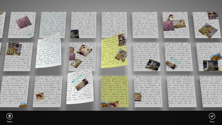
One last interesting piece of Austin is the way it renders its shadows. I am not a very experienced graphics programmer so I had to put a lot of effort into making this look good while having a good performance. The pages cast shadows on to the background and then we apply some post-processing filters in the GPU to make things even more interesting. The results look great and they are super-fast.
This picture shows a few pages in Austin, casting shadows on the background. There’s a Gaussian blur filter applied on the shadows, as well as a radial darken filter on the entire background to give it more depth.
And that’s all for now! We will be writing more about Austin and Project Baja because we want to share our experience building this app with everyone.
References
[1] L. Hong, S.K. Card, and J. Chen, “Turning Pages of 3D Electronic Books”, in Proc. 3DUI, 2006, pp.159-165.


0 comments