
With over 40 pages, layouts, and controls built into the Xamarin.Forms library, you are sure to find something to fit your needs when building out native mobile apps on iOS, Android, and Windows Phone. One of the key features that I love about Xamarin.Forms is that you are able to not only completely customize each built in-control, but you can extend and mix-and-match platform specific APIs and custom controls. This means that if you have been building and using custom controls in your Xamarin apps you are still able to re-use them in your Xamarin.Forms mobile apps with the concept of a custom renderer. 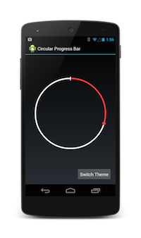
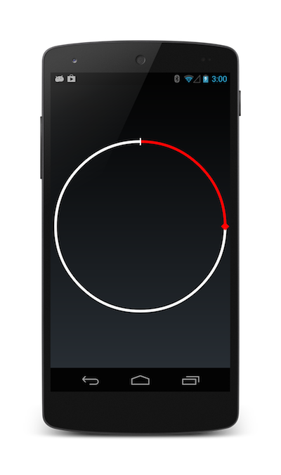
Over the past 3 years I have built out a lot of custom controls and one of my favorite has to be this circular progress bar. It has the look and feel of the built in Android stop watch, but I re-wrote it in C# as part of my Xamarin.Android Toolkit. Of course I want to re-use this control and others in my Xamarin.Forms apps, so let’s take a look at how to take this pre-existing custom control and make a custom renderer for it.
Xamarin.Forms Control
There are two main parts to implementing a custom control with a renderer.
- Create your own custom Xamarin.Forms control with bindable properties.
- Create a renderer in each platform that will be used to display the custom control and subscribe to property changed notifications.
This means that you can give your custom controls new functionality with the built-in data binding system in Xamarin.Forms. In my shared code project I am going to create a new control that will be used in my pages and layouts called CircularProgress and this will inherit from Xamarin.Forms.View.
using Xamarin.Forms;
namespace CustomProgressBar.CustomControls
{
  public class CircularProgress : View
  {
    ...
  }
}
Bindable Properties
The real magic is to implement the two way data binding with custom properties in this class. I can create these with the BindableProperty class which describes what the property is and knows how to trigger a PropertyChanged Notification. Here I will implement just a few such as if the progress bar is indeterminate, the current progress, and what color the bar is.
//Bindable property for the progress color
public static readonly BindableProperty ProgressColorProperty =
  BindableProperty.Create<CircularProgress,Color> (p => p.ProgressColor, Color.Red);

//Gets or sets the color of the progress bar
public Color ProgressColor {
  get { return (Color)GetValue (ProgressColorProperty); }
  set { SetValue (ProgressColorProperty, value); }
}
...
Notice here that I am using the Color property, which is a Xamarin.Forms specific color, that I am setting to Red as the default. I would do the same for other properties that I wan to bind to.
Circular Progress Renderer
With my new Xamarin.Forms control in place I can now implement the platform specific renderer in my Xamarin.Android project, which I will call CircularProgressRenderer. Each Xamarin.Forms control has a custom renderer that you can inherit from if you are customizing a built in control. However since this is completely custom View I am going to inherit from ViewRenderer.
namespace CustomProgressBar.Droid.Renderers
{
  public class CircularProgressRenderer
    : ViewRenderer<CircularProgress, HoloCircularProgressBar> {
    ...
  }
}
This type of renderer on Android inherits from View, which means Xamarin.Forms will handle all of the size calculations and normal properties of a standard Android View. All I have to do now is create my custom control and tell the renderer to display it. I can do this in our OnElementChanged method where I have access to two very important properties.
- First is the Element, which is our Xamarin.Forms CircularProgress control I created earlier with custom properties.
- Second is the Control which I am able to set to whatever I would like with the SetNativeControl method.
Since ViewRenderer is templated, which you can see when I inherited from it my Element and Control already have the correct type of the Xamarin.Forms control and native control that I will be using. This means I will not have to do any casting, which is very nice.
protected override void OnElementChanged (ElementChangedEventArgs<CircularProgress> e){
  base.OnElementChanged (e);

  if (e.OldElement != null || this.Element == null)
    return;

  var progress = new HoloCircularProgressBar (Forms.Context) {
    Max = Element.Max,
    Progress = Element.Progress,
    Indeterminate = Element.Indeterminate,
    ProgressColor = Element.ProgressColor.ToAndroid(),
    ProgressBackgroundColor = Element.ProgressBackgroundColor.ToAndroid(),
    IndeterminateInterval = Element.IndeterminateSpeed };

  SetNativeControl (progress);
}
Here I am creating a new HoloCircularProgressBar from my own personal library of controls and when created I set all of the controls properties to the Xamarin.Forms control that I created and have access to before I call SetNativeControl. To get the control to show up in the actual view all I need to do is set a special ExportRenderer so Xamarin.Forms knows that my Android project has implemented this control.
[assembly:ExportRenderer(typeof(CircularProgress), typeof(CircularProgressRenderer))]
namespace CustomProgressBar.Droid.Renderers
{
  ...
}
With that in place if I setup my main page in my App.cs and use my new CircularProgress control it now shows up and renders my HoloCircularProgressBar!
return new ContentPage {
  Content = new CircularProgress {
    Progress = 25
  }
};
Handling Property Changes
I can also listen for property changed notifications in my custom control. This means I can react to any action users are performing when interacting with the Xamarin.Forms control. To do this all I need to do is override the OnElementPropertyChanged method, which is triggered whenever any bindable property is changed. The arguments that get passed in contain the property name that changed and I just need to compare it with the properties I set to update the custom control.
protected override void OnElementPropertyChanged (object sender, PropertyChangedEventArgs e) {
  base.OnElementPropertyChanged (sender, e);
  if (this.Element == null || this.Control == null)
    return;

  if (e.PropertyName == CircularProgress.IndeterminateProperty.PropertyName) {
    Control.Indeterminate = Element.Indeterminate;
  } else if (e.PropertyName == CircularProgress.ProgressProperty.PropertyName) {
    Control.Progress = Element.Progress;
  }
  ...
}
Bringing it all together
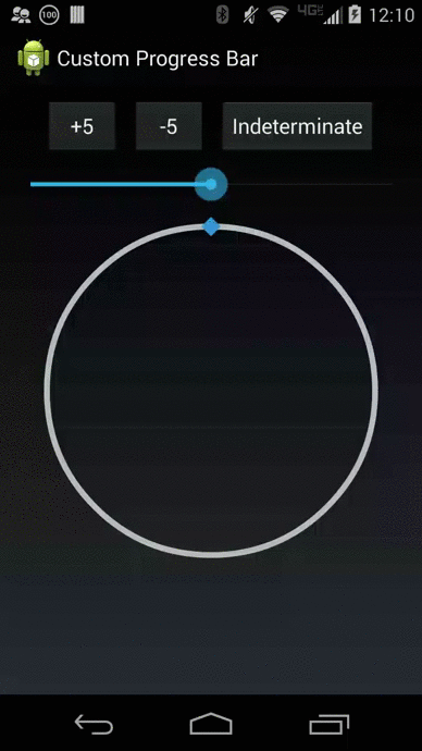
With this code in place, I can now add a few more controls to my page that will allow me to manipulate the control directly. For instance I can add a few buttons to increase or decrease the progress, set it to indeterminate, and even bind a Slider control to change the speed.
var increase = new Button { Text = "+5" };
var decrease = new Button { Text = "-5" };
var indeterminate = new Button { Text = "Indeterminate" };

increase.Clicked += (sender, args) => progressBar.Progress += 5;
decrease.Clicked += (sender, args) => progressBar.Progress -= 5;
indeterminate.Clicked += (sender, args) => progressBar.Indeterminate = !progressBar.Indeterminate;

var slider = new Slider (50, 150, 100);
slider.ValueChanged += (sender, args) => progressBar.IndeterminateSpeed = (int)slider.Value;
 That is it! A fully functional and custom data bound circular progress bar all in around 100 lines of code! Here is what it looks like in action.
To learn more about customizing your Xamarin.Forms controls and applications be sure to read our thorough documentation and you can download the full source code for this project from my GitHub including a complete XAML example.