
Build Custom Controls with the Xamarin Designer for iOS
One of the most exciting features of the Xamarin.iOS designer is its support for rendering custom controls at design-time. This allows developers to build reusable UI functionality that can be modified in the designer in a first class manner, just like controls from UIKit.
Changes made to custom controls are reflected directly in the designer without the need to redeploy the app. What’s more, control developers can expose properties that can be edited directly within the Property Pad.
Designable Control Requirements
The code to build a control or view that is usable from the designer is very similar to that of a control intended for use directly in code, with a few additional requirements:
- The class must inherit from UIView or UIViewController. Other classes inheriting from NSObject must implement System.ComponentModel.IComponent to be available in the designer’s toolbox.
- The class must be decorated with the RegisterAttribute.
- The class must have a constructor that takes an IntPtr.
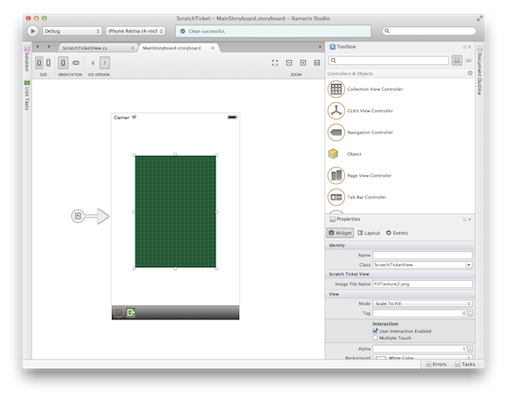
The following code snippet shows an example of a UIView subclass that meets these requirements:
[Register("ScratchTicketView")]
public class ScratchTicketView : UIView
{
  public ScratchTicketView (IntPtr p) : base(p)
  {
  }
  ...
}
The code that creates the view can take advantage of any iOS techniques, such as overriding Draw, implementing touch methods, adding drawing code with Core Graphics, etc.
Design-time Properties
Properties can be made available in the designer’s Property Pad. When changed in the designer, such properties can be made to update how a control is rendered.
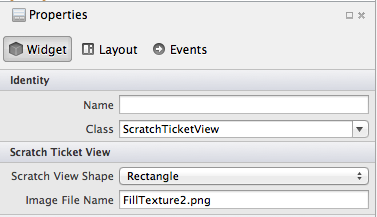
For example, the following property changes the image used in a control:
[Export("ImageFileName"), Browsable(true)]
public string ImageFileName {
  get {
    if (String.IsNullOrWhiteSpace (imageFileName))

    return defaultImageFileName;

  else if (UIImage.FromBundle(imageFileName) != null)

    return imageFileName;
  else
    return defaultImageFileName;
  }
  set {
    imageFileName = value;
    SetNeedsDisplay ();
  }
}
By decorating the property with ExportAttribute and BrowsableAttribute, the property is made available at design-time.
Notice the setter calls SetNeedsDisplay, which will result in the Draw method being called, so that the view is updated in the designer just like it would be at runtime.
The code in the Draw method’s implementation can then use the ImageFileName property as needed to affect what is rendered. In this case, the image is used as part of some Core Graphics code.
public override void Draw (RectangleF rect)
{
  base.Draw (rect);

  using (CGContext g = UIGraphics.GetCurrentContext ()) {

  g.SetFillColor ((UIColor.FromPatternImage (UIImage.FromBundle (ImageFileName)).CGColor));
  ...
}
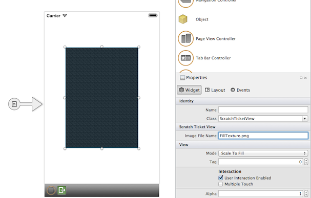
Using an Enumeration as a Property
The above example set a string property. Say we want to set a property to an enum. Doing so results in a drop-down within the Property Pad.
For example, consider the following property that allows the view’s shape to be set to either a rectangle or a circle.
public enum Shape
{
  Rectangle,
  Circle
}
...
[Export("ScratchViewShape"), Browsable(true)]
public Shape ScratchViewShape {
  get {
    return shape;
  }
  set {
    shape = value;
    SetNeedsDisplay ();
  }
}
This property results in the a drop down that can be used to set the shape at design-time:
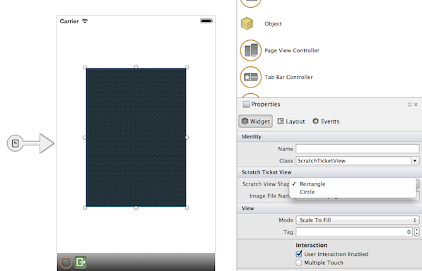
Then, to make the property actually change the shape, we make use of it again within the view’s implementation:
if (ScratchViewShape == Shape.Rectangle) {
  g.FillRect (rect);
} else {
  g.AddArc (rect.Width / 2, rect.Height / 2, rect.Width / 2, 0, (float)Math.PI * 2.0f, true);
  g.FillPath ();
}
Now, when the user changes the property at design-time, the designer immediately reflects the change:

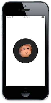
When run, whatever changes set in the designer are applied, resulting in our nice scratch ticket control:
Making custom controls work well with the designer is very straight-forward, enabling reusable UI code on iOS to be more powerful than ever before. For more information on working with the designer, be sure to check out the designer section in our documentation.
The code from this post is available in my GitHub repo.
Discuss this blog post in the Xamarin Forums
 Light
Light Dark
Dark
0 comments