Xamarin.Forms is fantastic for quickly shipping a single code base to multiple platforms and devices. As soon as you are present on all those different screens, you need to make sure your UI looks as you expect, and even adapt the layout for your specific goals. FlexLayout makes this easier than before and provides new options for you to space and distribute your UI to suit different dimensions.
Let it Flow
Children placed in a FlexLayout container will flow in either a horizontal row or a vertical column, also called the main axis. This is set via the Direction property. Using this property alone, the container behaves very much like a StackLayout. Here is a login page that does this very thing.
<FlexLayout class="body">
    <FlexLayout class="login-container">
        <Label Text="Login" class="logo"/>
        <FlexLayout class="login-form">
            <Entry Placeholder="UserName"/>
            <Entry Placeholder="Password" IsPassword="true"/>
            <Button Text="Log in"/>
        </FlexLayout>
    </FlexLayout>
</FlexLayout>
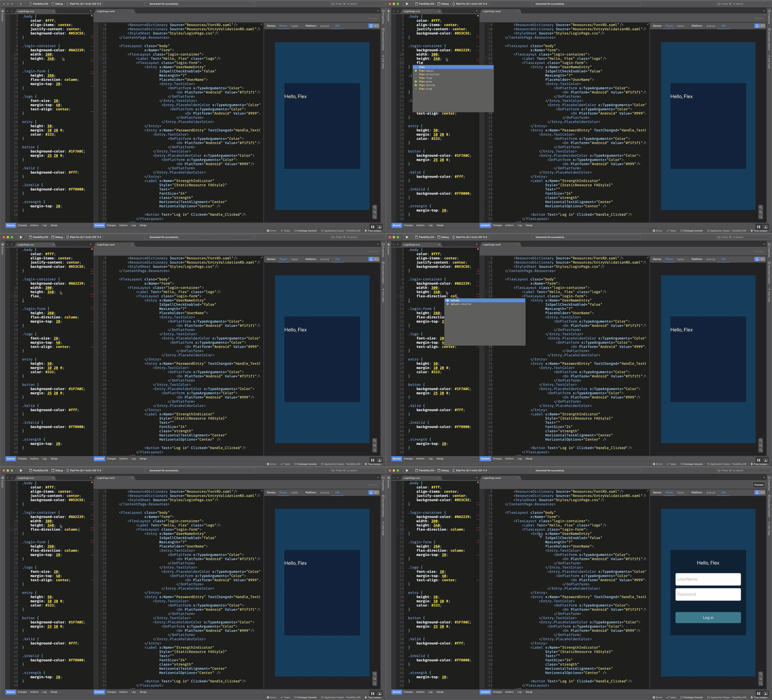
The inner layout stacks a label and entry form vertically by setting the flex-direction css property to column.
.login-container {
    background-color: #803A3F44;
    width:300;
    height:380;
    flex-direction: column;
}
Note: If CSS isn’t your preference, these properties are all available in XAML and C# as well.
<FlexLayout Direction="Column" ...>.
In addition to column and row (default), you can also flip the order of the children by using “ColumnReverse” and “RowReverse”. Let’s see a StackLayout do that!
Notice how the login form is centered in the screen. This is something FlexLayout makes really easy by using align-items to center within the chosen direction axis (in this case the Y or vertical axis), and justify-content to distribute the children items to the center of the container (in this case along the other axis).
.body {
    align-items: center;
    justify-content: center;
    color: #fff;
    background-color: #16222a;
}
Pull down this sample from GitHub (https://github.com/davidortinau/flexibility) and try out those properties to see how the login view will change and adapt.
Wrap It To Go
Now that you see how FlexLayout will flow the content of your view, what about when your content overflows the width or height? This is when you can take advantage of wrapping. You can choose from several options:
- wrap
- nowrap
- reverse

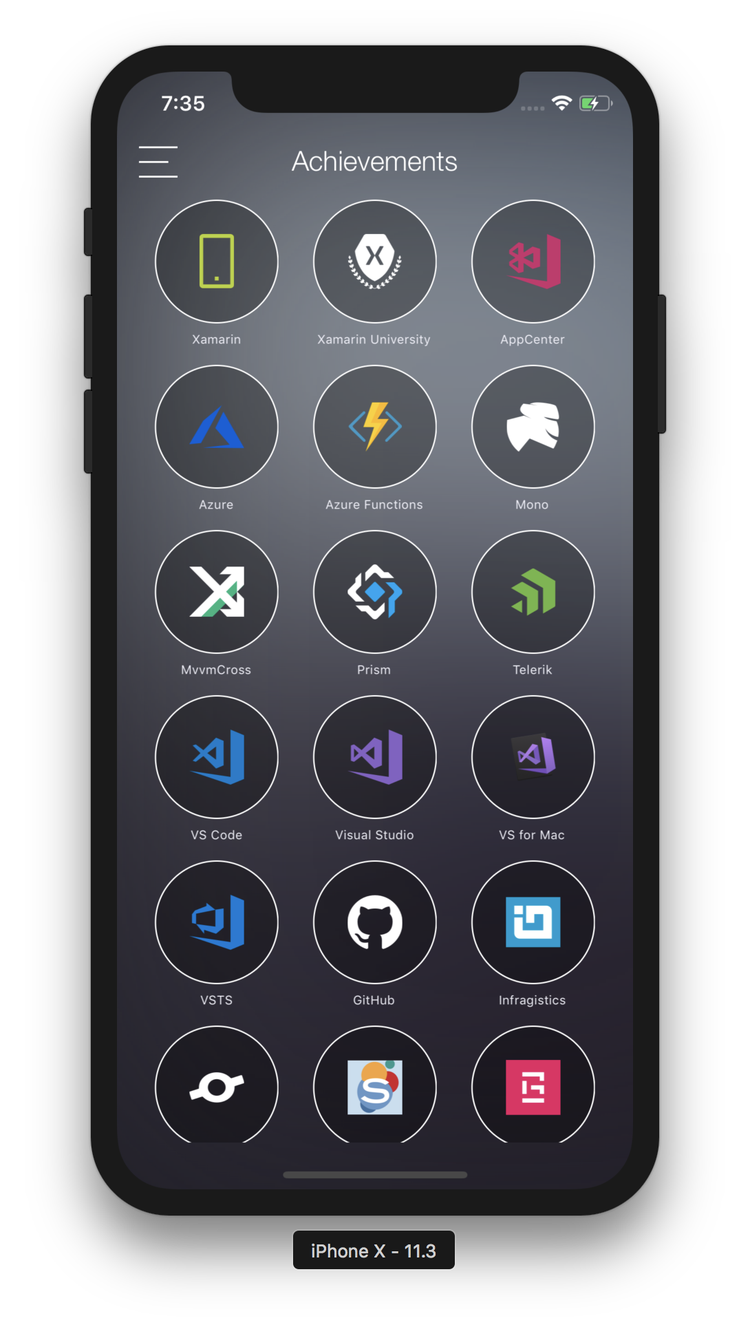
Let’s say your app has a grid of achievements like those displayed in the Conference Vision demo app from Build 2018. You populate the container with a series of the same item and want to make sure they wrap in a flow direction.
<FlexLayout class="container">
    <local:AchievementView class="item" BindingContext="{Binding Achievements[0]}" />
    <local:AchievementView class="item" BindingContext="{Binding Achievements[1]}" />
    <local:AchievementView class="item" BindingContext="{Binding Achievements[2]}" />
    ...
</FlexLayout>
.container {
    flex-direction: row;
    flex-wrap: wrap;
    justify-content: space-between;
}
Just like you used justify-content in the previous example to center the login container within the view, you can use that property here to evenly space the content. Choose from:
| Center | Indicates that child elements will be grouped toward the center of the parent. |
| End | Indicates that child elements will be justified to the end of the line. |
| SpaceAround | Indicates that child elements will be spaced with one unit of space at the beginning and end, and two units of space between them, so that the elements and the space fill the line. |
| SpaceBetween | Indicates that child elements will be spaced with equal space between units and no space at either end of the line, so that the elements and the space fill the line. |
| SpaceEvenly | Indicates that child elements will be spaced to have the same space between each element as there is between the beginning and end elements and the nearest edges of the parent. |
| Start | Indicates that child elements will be justified to the start of the line. |
Source: Docs
Explore more of how FlexLayout is used in the Conference Vision app from the source on GitHub: https://github.com/microsoft/ConferenceVision.
Positioning In Space
Building on those examples, let’s explore a more advanced layout where you want to space content proportionally. Back in the Flexibility sample, there’s a photo page that wraps photos but also sizes them by percentage. Let’s say you want to have 3 images per row by default, but occasionally you want a full-width image, or images 2 per row? You can use the flex-basis property to see that by position.
.photo {
    flex-basis: 33.33%;
    height: 100;
}

.half {
    flex-basis: 50%;
    height: 150;
}

.full {
    flex-basis: 100%;
    height: 200;
}
Basis is how much space the item takes up relative to the main axis. In this case we are working along the X-axis (flex-direction: row). Basis may be expressed in device pixels or percentages, making this extremely powerful for responsive layout. Assigning the classes above to the images in the container, you can position them in this cool-looking grid.

<FlexLayout Style="{StaticResource flex}">
    <Image Source="m_01.jpg"
            class="photo"
            Aspect="AspectFill" />

    <Image Source="m_02.jpg"
            class="photo"
            Aspect="AspectFill" />

    <Image Source="m_04.png"
            Aspect="AspectFill"
            class="photo" />

    <Image Source="m_03.png"
            Aspect="AspectFill"
            class="photo, full" />

    <Image Source="m_05.jpg"
            Aspect="AspectFill"
            class="photo" />

    <Image Source="m_06.jpg"
            Aspect="AspectFill"
            class="photo" />

    <Image Source="m_07.jpg"
            Aspect="AspectFill"
            class="photo" />

    <Image Source="m_08.jpg"
            Aspect="AspectFill"
            class="photo, half" />

    <Image Source="m_09.jpg"
            Aspect="AspectFill"
            class="photo, half" />

    ...
</FlexLayout>
For an additional example of using basis to achieve the “holy grail” layout, check out this Grid page sample.

Advanced Layout
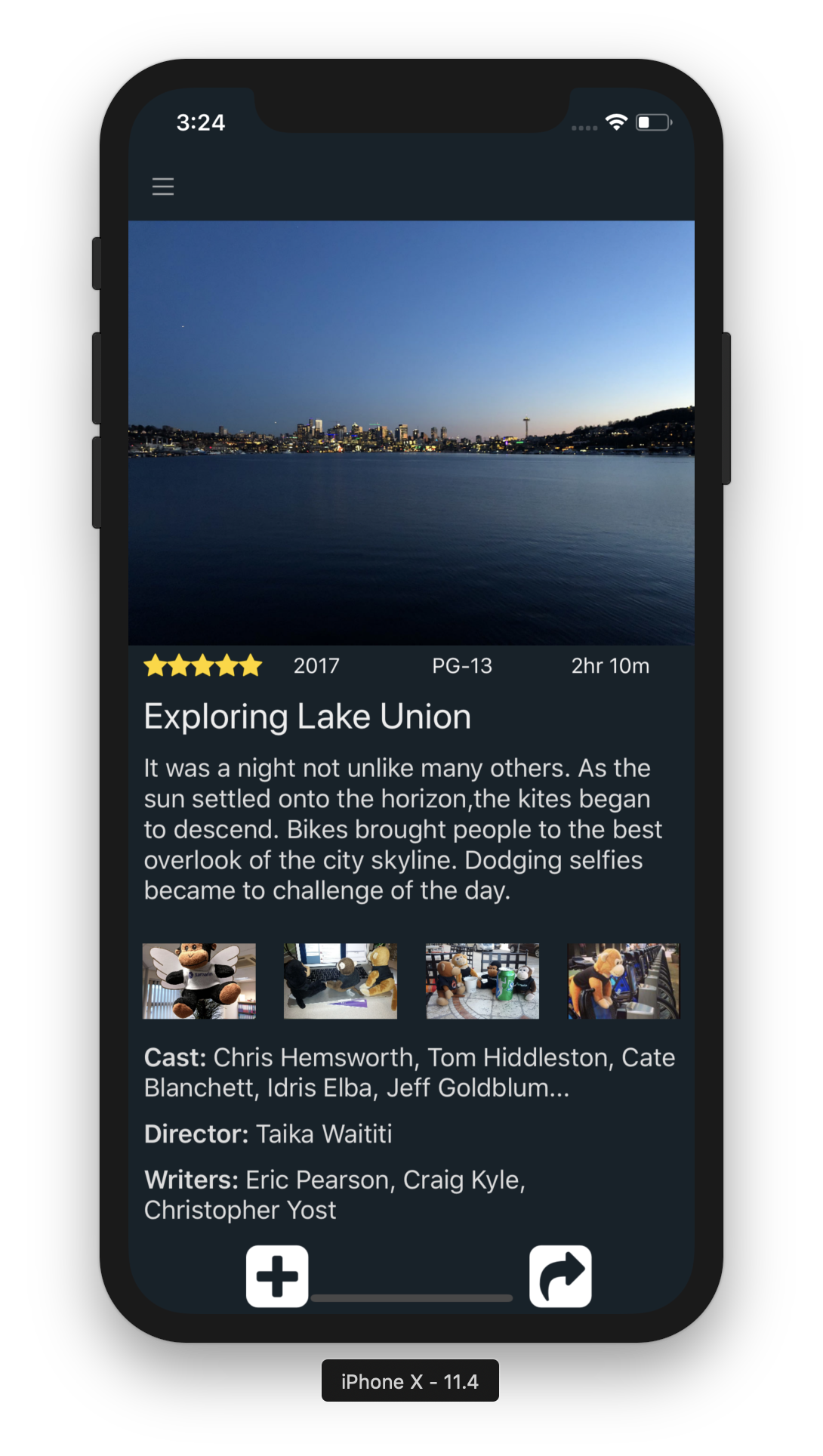
FlexLayout can also be used for more advanced and inconsistent layouts such as this page. You can build on the same methods above to easily achieve this. Below is a layout that wraps rows and uses a trick to line things up. To force a line break, add an empty element with a basis of 100%.

<FlexLayout class="container">
<Image class="poster" Source="seattle.jpg"/>
<Label Style="{StaticResource FAStyle}" class="popularity" Text="" />
<Label class="year" Text="2017" />
<Label class="rating" Text="PG-13" />
<Label class="length" Text="2hr 10m" />
<Label class="title" Text="Exploring Lake Union" />
<Label class="description" Text="It was a night not unlike many others. As the sun settled onto the horizon, the kites began to descend. Bikes brought people to the best overlook of the city skyline. Dodging selfies became to challenge of the day."/>
<Image Source="m_11.jpeg"
Aspect="AspectFill"
class="photo"
/>
<Image Source="m_12.jpg"
Aspect="AspectFill"
class="photo" />
<Image Source="m_13.jpg"
Aspect="AspectFill"
class="photo" />
<Image Source="m_14.jpg"
Aspect="AspectFill"
class="photo"/>
<Label class="description">
<Label.FormattedText>
<FormattedString>
<Span Text="Cast: " FontAttributes="Bold" />
<Span Text="Chris Hemsworth, Tom Hiddleston, Cate Blanchett, Idris Elba, Jeff Goldblum..." />
</FormattedString>
</Label.FormattedText>
</Label>
<Label class="description">
<Label.FormattedText>
<FormattedString>
<Span Text="Director: " FontAttributes="Bold" />
<Span Text="Taika Waititi" />
</FormattedString>
</Label.FormattedText>
</Label>
<Label class="description">
<Label.FormattedText>
<FormattedString>
<Span Text="Writers: " FontAttributes="Bold" />
<Span Text="Eric Pearson, Craig Kyle, Christopher Yost" />
</FormattedString>
</Label.FormattedText>
</Label>
<Label class="action" Style="{StaticResource FAStyle}" Text=""/>
<Label class="action" Style="{StaticResource FAStyle}" Text=""/>
</FlexLayout>
.container {
    align-items: start;
    align-content: start;
    flex-wrap: wrap;
    justify-content: space-around;
}

.poster {
    flex-basis: 100%;
}

.summary {
    background-color: black;
    flex-direction: row;
    justify-content: spacebetween;
    height: 20;
    margin: 10;
}

.popularity {
    color: gold;
    margin: 5 10 0;
}

.year, .rating, .length {
    font-size: 14;
    color: #f1f1f1;
    margin: 5 10 0;
    flex-grow: 1;
}

.break {
    flex-basis: 100%;
    height: 0;
}

.spacer {
    flex-basis: 100%;
    height: 0;
}

.title {
    color: #eee;
    font-size: 24;
    margin: 10;
    flex-basis: 100%;
}

.description {
    color: #ddd;
    margin: 10,0,10,10;
    flex-basis: 100%;
}

.action {
    color: #FFFFFF;
    font-size: 48;
    margin: 0 0 0 10;
}

.photo {
    flex-basis: 20%;
    height: 50;
    margin: 15 0;
}
There are a few other properties that will come in very handy as you start using FlexLayout, namely Grow and Shrink. Those properties do just what they say, sort of. Grow defaults to 0 and any positive number will take up that available space along the main axis. This is useful if you want something to consume available space left over by the siblings on that axis. Shrink, on the other hand, will do the opposite. Setting this to 0 will make sure it doesn’t shrink if siblings try to take up more space, whereas setting this to a positive number will allow that element to surrender space to other elements.
Notice the .year, .rating, .length elements have flex-grow: 1; which forces them to take up as much space as they can along that line evenly, giving it a nice spacing and pushing the popular stars to the left. Play around with those properties on these layouts and see how things adapt.
Adapting to Tablet Layout
When designing layouts for not only a variety of mobile screen dimensions but also tablets, you can get very far with the flexibility of FlexLayout and use of percentages to set the basis. There will come a time when you need to have a different layout that is slightly adjusted to suit another size of the screen, usually tablet or desktop. For this need, you can take advantage of OnIdiom. This little helper, similar to OnPlatform, let’s you specific divergent behavior or styling based on the idioms: desktop, phone, tv, and watch.
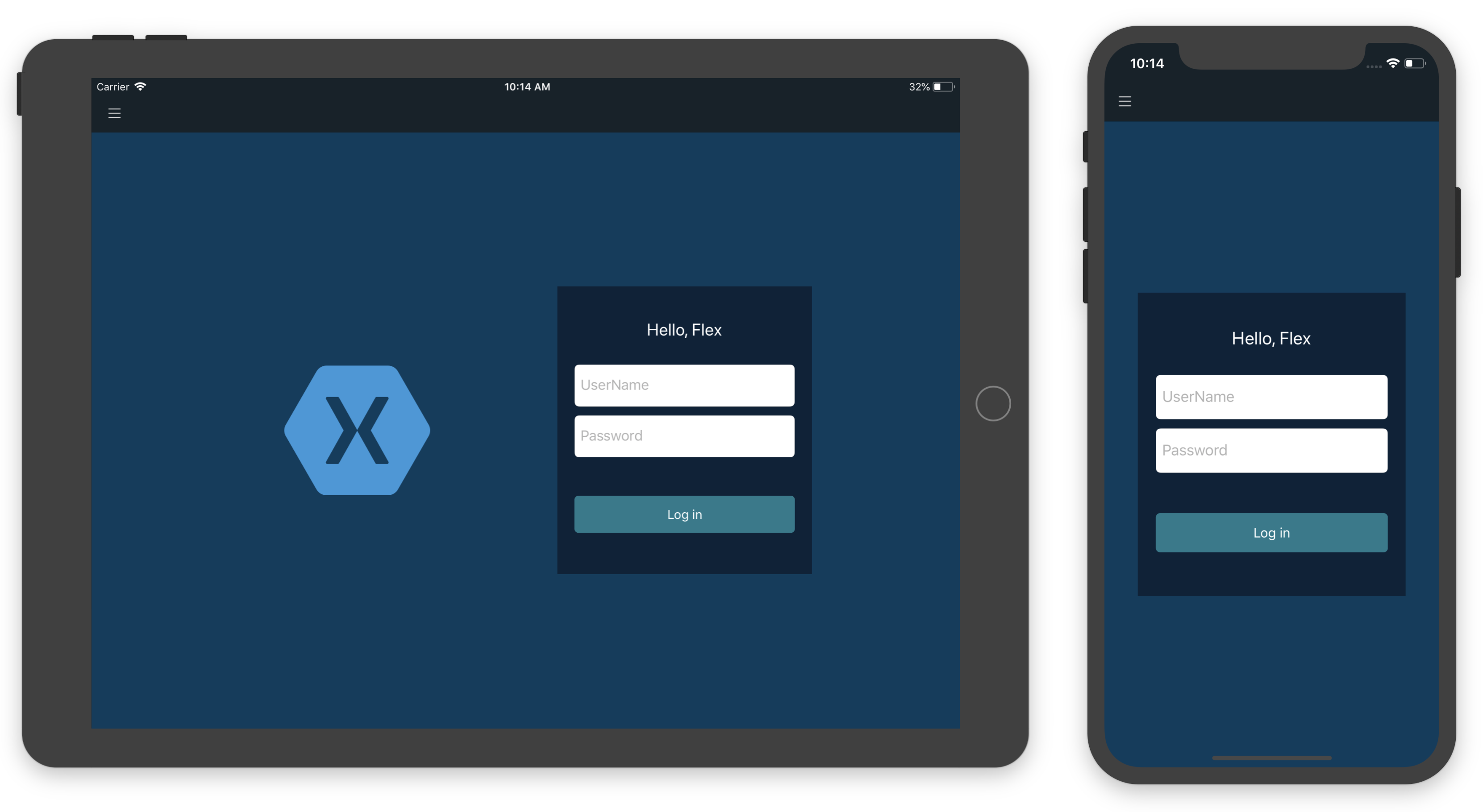
Take the first sample of the login page above, and consider how you could move the login form to the right of the screen on a tablet while introducing an image on the left.

In this layout, introduce a new Image just before the login form, and use the margin to provide a little space. To make sure this only appears on tablet, use OnIdiom to set the visibility accordingly.
<FlexLayout class="body"
            x:Name="Form">
    <Image Source="xamagon"
            Aspect="AspectFit"
            WidthRequest="275"
            Margin="0,0,100,0"
            IsVisible="{OnIdiom Tablet=true, Phone=false}"
            />
    <FlexLayout x:Name="LoginForm"
                class="container">
        <Label Text="Hello, Flex" class="logo"/>
Note: This
OnIdiomsyntax is new in Xamarin.Forms 3.2.0, so make sure to update to the latest pre-release in order to use that. For older example ofOnIdiomcheck out the unit test sample here.
When using justify-content: center the FlexLayout will space things out for you nicely. This will make the layout look great!
Start Flexing Today With Xamarin.Forms
Update your projects to Xamarin.Forms 3.1.0 today via your Visual Studio NuGet package manager to enjoy the latest stable release with FlexLayout. And if you want to get all the newest improvements, check out the Xamarin.Forms 3.2.0 pre-release with that nice OnIdiom syntax and so much more.
Explore the samples used here and others created by the amazing docs team.

