


The Microsoft Fluent design language provides a unified framework to create and deliver more productive, consistent, and accessible applications. The Fluent design principles have been applied across familiar products like Microsoft 365 and we’ve been using those principles in the IDE to make targeted improvements to real problems. We’re excited to share these early designs so we can incorporate your feedback into making Visual Studio the best IDE for developers. We’ve created a new Developer Community Ticket tracking the improvements we’ve made to the command shelf, menus, tool window chrome, and document tabs where you can share comments and suggestions as we iterate on bringing these experiments to a future preview release.
The current visual language (which hasn’t been updated since Visual Studio 2012) has limitations for many customers. These limitations include small and crowded controls that can be difficult to interact with, visual noise which makes it difficult to focus or identify the active area, and inconsistent state indication that can cause distractions and confusion. Inconsistent visual design makes it harder to predict common control behaviors, creating an environment that is potentially difficult to navigate.
Our new UI updates focus on three main pillars: cohesiveness, accessibility, and productivity.
- Cohesiveness: It is important to make sure these updates balance a new, refreshed look and feel with the familiarity of the Visual Studio our customers already know. By aligning with Fluent, Visual Studio will look and feel more seamless with the rest of the operating system and other Microsoft products.
- Accessibility: It is important that the updates follow our accessibility best practices and make the product easier to use. This manifests in several ways, including: adjusting target sizes to make them easier to use while maintaining information density, using color more intentionally to decrease visual noise and draw attention to the active areas of the IDE, and using lighter weight controls to make it easier to distinguish different actions.
- Productivity: The UI updates work towards creating more consistent experiences, making it easier to navigate the product with confidence by reducing the amount of time it takes to get familiarized with the UI. Our updates also work to reduce cognitive load and mental fatigue, making Visual Studio a more comfortable work environment.
How this appears in the product
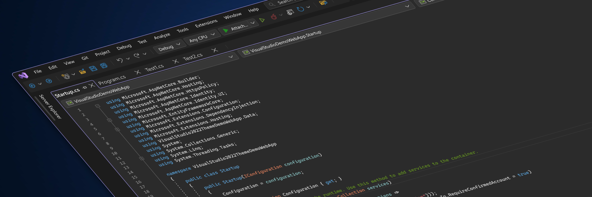
Toolbars

Above: Visual Studio 17.6 toolbar, Below: Proposed toolbar
We know that cognitive load is reduced by minimizing visual clutter, which is often achieved by increasing the amount of spacing between controls. We also know that developers want as much space as possible for their coding environment. Balancing these two attributes against each other is a tricky proposition. To that end, we’re increasing the perception of space by using lighter weight control styling to reduce cognitive load. We’re also making minimal increases in target size to reduce the likelihood of accidentally activating the wrong control.
Menus
Left: Visual Studio 17.6 menu UI; Right: Proposed menu UI
Similar to toolbars, we’re exploring adjustments to spacing, alignment, and color application to reduce visual noise and cognitive load. This makes it easier to read each item and navigate through our menus. While working on menu styling, we noticed these changes are impacting the length of our menus, which has previously been a source of feedback. We’ll continue to look for other ways to improve our menus.
Active region styling
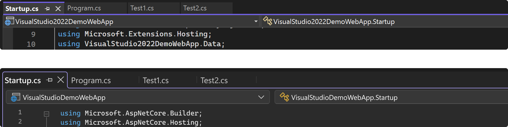
Above: Visual Studio 17.6 document tabs, Below: Proposed document tabs
Left: Visual Studio 17.6 tool window chrome, Right: Proposed tool window chrome
It can be difficult to locate the active area when there are many tool windows open in the IDE. We’re now using colors and spacing more intentionally to reduce unnecessary visual noise. This way the active part of the UI stands out, making it easier to recognize. The examples above show how the updates impact document tabs and tool window chrome.
These design changes are still a work in progress and we’re hoping to make them available publicly soon. To get involved and see more concepts as we continue to explore this work, please follow the Developer Community Ticket for updates and discussion.
Hi I have a request
and I hope any one from Microsoft Team See That and Make it in new UI
my request : (( if Can add option for custom image for new item in toolbox and show the name of item under the image ))
I have a visual memory that helps me search and increase productivity by seeing the shapes of elements faster than reading their names
and thank you for any one will see my request and make it hapen.
compare:
– visual studio: most stable & powerful
– vscode: clean & just work for .net dev(the new c# dev kit is good)
– rider: clean(with the new ui) & powerful
so, for the ui part, just copy vscode & rider new ui:
– less button!
– less panel!
– less edge/line, more flat
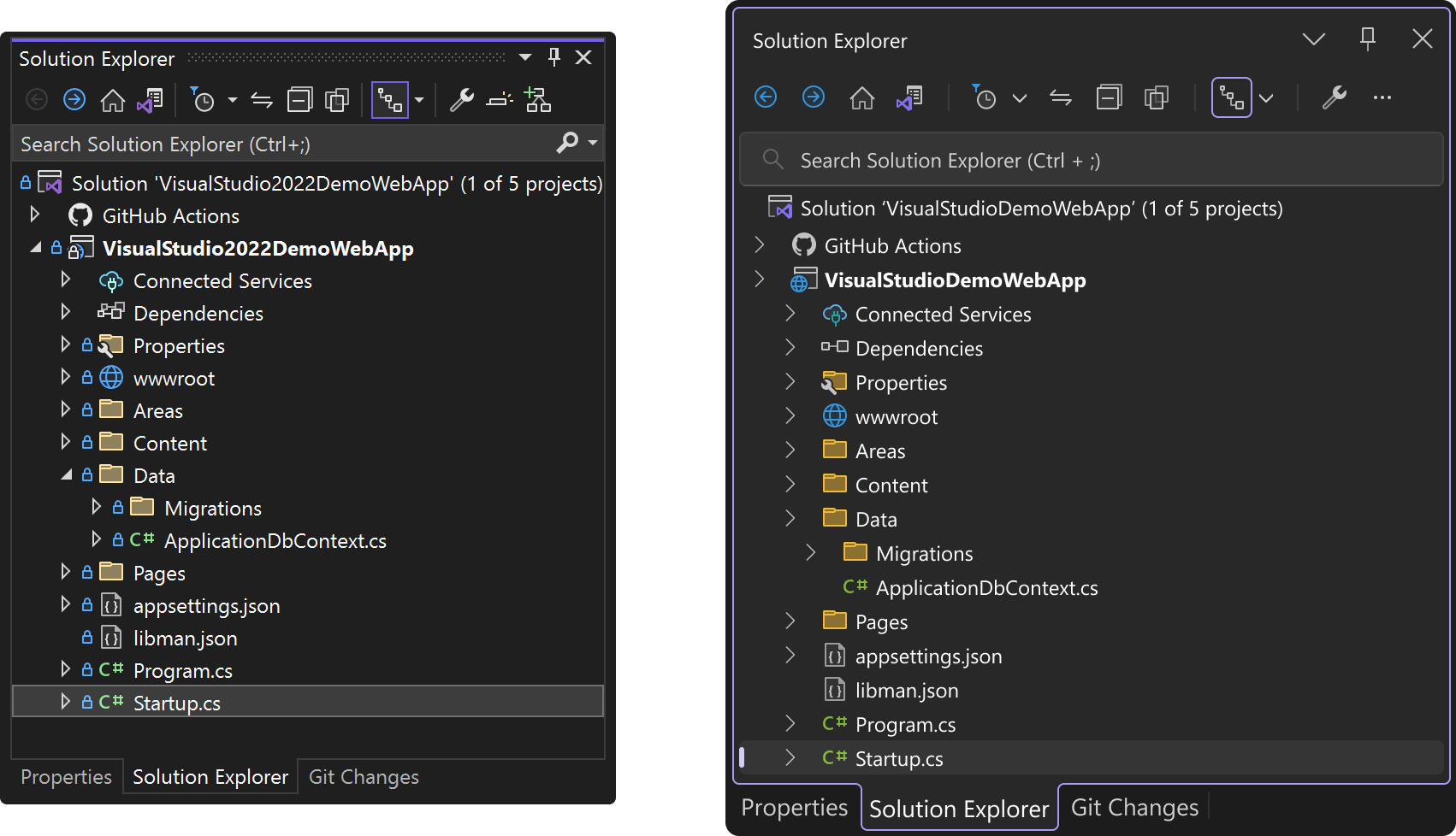
I believe an important addition to consider would be the inclusion of file icons within the document tabs. As someone who often works with multiple tabs open simultaneously, it can become challenging to differentiate between various file types such as JSON, XML, and CS files since they all appear identical without icons. It's worth noting that VS Code already offers this feature, which greatly enhances the user experience. Consequently, it would be highly beneficial if Visual Studio could incorporate similar file icons in its document tabs.
Additionally, another feature that could greatly improve the usability of Visual Studio is the implementation...
I'm all in favour of UI design changes if they are configurable. As a .Net developer for 20 years, I have become quite used to the look and feel of my editor. So much so, that everytime I install a new major release of Visual Studio I dread to see what has changed and what I have to now get used to (again).
As someone that swtiches between using Visual Studio on a small screen laptop (when mobile) and a monitor (when at home or office), I currently have issues with menus scrolling or only partial toolbars being...