Revamped Project Properties UI

McKenna Barlow

In Visual Studio 2022 we are improving your experiences around navigating and modifying your project’s properties. The world of .NET is in a very different place than it was a few years ago. With a growing diverse user-base and increasingly cross-platform projects, we decided that the Visual Studio project properties were due for a much-needed re-vamp.

We want to share with you some improvements in the following areas:

  1. Theming and UI Updates
  2. Search
  3. Property Evaluations
  4. Improved Conditional Configurations

This new project properties experience is turned on in our latest preview for C# SDK style projects. The new UI will become the default in the official Visual Studio 2022 release.


Visual Studio Theming:

Immediately upon opening your project’s properties you will notice our revamped, modern, and fresh new UI.

Image clean new ui

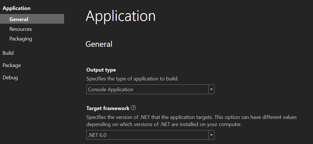
The new look is not just intended to be pleasing to the eye, but you’ll also find that we designed it to highlight important and commonly used properties. This will make it easier for you, whether you are new to Visual Studio of have been using Visual Studio for a long time, to find exactly what you are looking for.

A request that we frequently heard was for the project properties to match theming with the rest of Visual Studio. The previous project properties UI was outdated and did not match the more modern look of the rest of the editor.

The last time we updated the look of the project properties UI was before you had the ability to change the Visual Studio theme! Because of this, an obvious flaw of the old UI was the lack of appropriate theming to match the rest of Visual Studio. The good news is that with the new Project Properties, you can use dark mode in peace! The new project properties will match the theming that you have chosen for the IDE without distracting bright UI elements unexpectedly popping up during your workflow.

Side by side of old and new UI
This side-by-side comparison shows the old project properties dialog on the left and the new one on the right, both with Visual Studio in dark mode. As you can see, the new UI is much easier on the eye and reacts appropriately to changes in the Visual Studio theme.


Search and Property Discoverability:

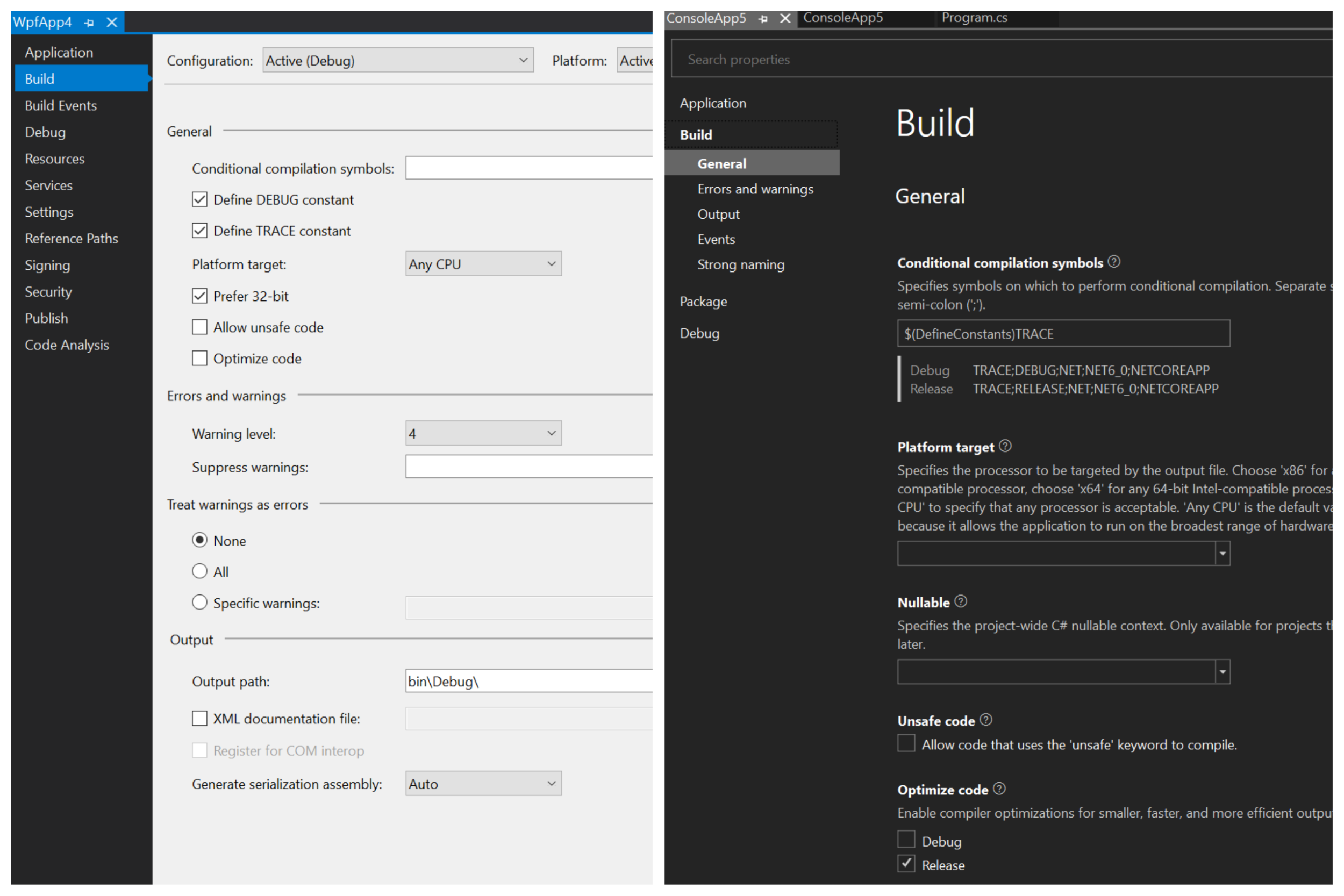
Another highly requested feature, one that will make life easier for new and experienced developers alike, is the search function in the project properties. Just search for any property or value and your search term will be highlighted in the UI and you will be able to locate and edit the field immediately.

Screenshot showing highlighting search terms in search results

Previously you would have to sift through the various tabs in the properties dialog to find the property you were looking for. Search now simplifies this process. The ability to search for a specific property allows for clean new UI which seamlessly scrolls between tabs so that you no longer need to open multiple windows and switch from tab to tab to locate a property field.

As before, property changes also automatically save to the project file when your code is run, so there is no need to hit a save button before leaving the page. This way, complex property changes will not be lost if you navigate away prematurely.

In this new update we have streamlined the project properties to be property-centric and distilled the UI down to its essential components. As a part of this effort, the launch profiles editor been moved to its own UI where it will be easier for you to manage many profiles at once.

When originally designed, the project property pages were created as a central place for generalized configuration of one’s project. However, the complexity of launch profiles continues to scale up, with most developers adding and deleting profiles and utilizing multiple configurations. It became necessary to reconsider what fit into the project properties experience, and we ultimately concluded that it was time that launch profiles deserved its own dedicated UI outside of the project properties. Long term we believe this will be a clearer experience for users. We are working on intuitive gestures to launch that UI directly to improve Launch Profiles discoverability. In the meantime, the Launch Profiles UI can be accessed by Debug >MyProject Debug Properties at the bottom of the drop-down or by clicking the drop-down on the left of the start-up projects in the toolbar.


Screenshot showing the location of launch profiles in the debug dropdown


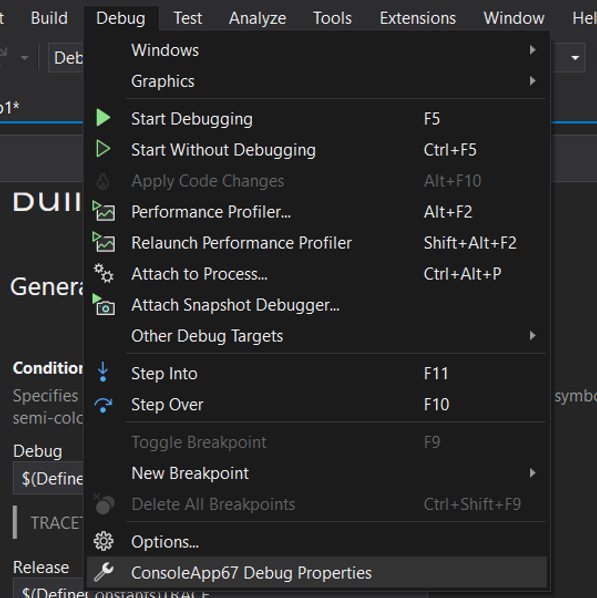
For discoverability within the project properties, for your convenience, the Launch Profiles dialog may also be accessed via the hyperlink in Debug Settings in the Project Properties.


Image Figure 6 8211 locating launch profiles 2


Property Evaluations:

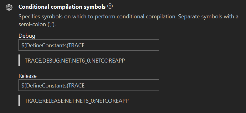
The new project properties UI also displays evaluated property values. Properties for which there is an evaluated value will show the evaluation underneath in shadow text, differentiating it from the property labels surrounding it.

Screenshot example of an evaluated property preview

This change makes it much easier to understand evaluated values without having to spend time debugging or unnecessarily jumping through code. We have done our best to enable you to fix issues quickly by making all the information you will need available and simple to discover in the project properties UI.


Conditional Configuration Improvements:

The last exciting feature we want to highlight is improved conditional configurations. There are multiple dimensions across which a project in Visual Studio may be configured: Configuration (e.g. debug/release), Platform (e.g. AnyCPU, x86, ARM), and target framework (e.g. .NET Framework 4.8, .NET Standard 2.0, .NET 6). It’s now possible to specify property value along any of these dimensions — a given property may vary its value by configuration, platform, or target framework.

To support this complexity, we have made it much easier to keep track of these configurations and see how properties vary. Previously you would have to toggle configurations in the drop-down list and monitor for values that changed. This made it difficult to tell if a given configuration applied to all conditions or just one without going through all of them manually.


Screenshot of UI for configuring conditional configurations


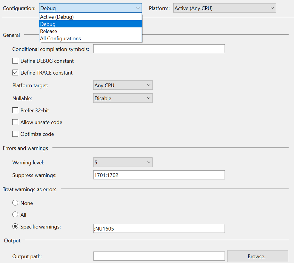
Now if you want to have separate configurations for debug or release builds, for example, you no longer must change them in separate windows and toggle between the conditions to view the setting for each conditional configuration. For properties for which this type of configuration is possible, such as in the screenshot below, hovering over the little gear icon in the top left corner gives the option to vary the value by configuration. Selecting this option will add fields where you will be able to edit the property value for each configuration, in this case, for both debug and release builds.


Screenshot of an example of conditional configurations setup

Our new UI enables you to see if there are conditional configurations with just a glance at the project properties. It is also much clearer what the value is for a given configuration. You may continue to add conditions directly in the code itself, which will be reflected in the UI after saving.


What do you think?

As always, we appreciate you taking the time to check out what we have been working on, and we are very excited to finally share out some of these long-awaited changes.

One of the things we are most excited about is that our new data-driven UI will allow us to add value to our customers faster and react more quickly to changes in the platform. Now we will be able to easily ship new updates and react more swiftly to customer feedback.

If you haven’t looked at your project’s properties in a while, give them a look in this new experience, search around, see the evaluated values, and more! Then let us know what you think!

34 comments

Discussion is closed. Login to edit/delete existing comments.

  • Lukas 0

    This looks very promising, good work! Will this be made available for C++ as well, or is it C# exclusive?
    Especially messing with conditional compilation and other per-configuration settings is even more important in C++ projects.

    • Drew NoakesMicrosoft employee 0

      Hi Lukas. For now this is only available for SDK-style C# projects. We will roll it out to other project types and languages over time.

  • Max Mustermueller 0

    I don’t mind UI changes if functionality remains the same. But it looks like you once again simplified everything and by simplifying I mean you removed a lot of stuff. For example I cannot see “Prefer 32bit” in your comparison screenshot in the new UI.

  • cs 0

    Would love to see ability to have a “1 page” view of all project settings, which could then be printed, or saved as a json file.

    This would help in situations where you are editing multiple projects/solutions, and are manually trying to get them to have a consistent set of settings….often projects deviate in different ways from the initially generated project files.

    Yes, “shared/inherited” property pages can often be a way to have some kind of consistent properties, but not always desirable to do that, and even then they can be overridden, and then projects can deviate from what you want.

    Would be nice if you tried to use/follow the behaviour that VSCode uses for it’s settings pages…i.e. navigation, scrolling through…..provides some kind of familiarity – and DO show a tree view.

    Even better would be a way to compare/diff project settings between different projects.

    • Drew NoakesMicrosoft employee 0

      Hi cs. The easiest way to share properties between multiple projects is to use a Directory.Build.props file. Doing so allows you to specify a set of properties once and have them picked up by multiple projects automatically, which is much easier than manually copying settings and trying to keep them in sync over time. You can read more about that here:

      https://docs.microsoft.com/en-us/visualstudio/msbuild/customize-your-build?view=vs-2019#directorybuildprops-and-directorybuildtargets

      We made a conscious effort to align the new Project Properties UI with VS Code’s Settings UI as much as possible, so I believe the areas you call out should already be covered.

  • Bas van Harten 0

    Can’t try it out right now, just hoping that the performance of the new Project properties UI has improved since it was in preview in VS 2019. (Several seconds for a small & simple .NET project is in my opinion way to much and just editing the project files directly is then a much better option 😒).

    • Drew NoakesMicrosoft employee 0

      Hi Bas. Performance has been improved since VS2019, so please try it out when you get a chance and let us know what you think.

  • Simon Mourier 0

    I’ve tested it and my first reaction was pretty bad as I thought it was just an loooong list of properties. Then I understood I could get directly to an (invisible) anchor in that long list, by just clicking on the left headers/groups. Ok, I still don’t see the benefit as a user, and not saying the old system couldn’t/shouldn’t be improved. But what I think is still bad is this system only use a very small portion of the available space in the Visual Studio document Window. So it’s still a very long vertical list with plenty of space lost on the right… Would it be possible to (maybe with an option) use more space, like just stacking all properties in the window, and let them wrap maybe, or arranging them in (possibly a fixed set of) columns? It really starts like the revamped “New project dialog” which is awful.

    • Greg Sohl 0

      I think I agree with what you are saying Simon. A long scrolling list instead of a good chunk of information at a glance may be good for the uninitiated. But for experienced VStudio-ers will be a step backwards.

      The search capability seems good, but is basically necessary because you can’t see a lot at a glance.

    • McKenna BarlowMicrosoft employee 0

      Hi Simon,

      Thanks so much for the feedback. We’re currently working with some designers to orient the property labels and fields in a way that leaves much less blank space on the right and creates clearer delineations between the various sections of the project properties. Visible anchors and section header highlights are in the works. If you would like to be involved in the longer term design decisions related to fixing the spacing and layout of each section, please reach out to collaborate, as we definitely want the opinions of experienced developers to be heard as we settle on a pleasing AND functional layout for project properties.

    • Brecht Laitem 0

      I totally agree with the comment that a lot of realestate is lost on the right. For me personally, this makes it harder to just browse the possible settings I can change. Ok, if you know what to look for you can just use the search (which is great), but sometimes you just want to browse for possible settings you can change without knowing what to look for. With using a long list, this makes this a lot harder.

  • Dan Guthrie 0

    It’s great to see this aspect of VS getting attention but my first reaction is that the information density is far too low for experienced developers. The new abilities and features for dealing with modern complexity of apps is amazing but I would be far more enthusiastic if it was tailored a bit more toward the experienced developer and show more information at once.

    • McKenna BarlowMicrosoft employee 0

      Hi Dan,

      I hear you on that — we are trying to address this particular issue with our design team and work together to tailor the project properties UI to be easier to navigate and in an intuitive layout that is less sparse than it currently is in this preview. Do you have any particular properties or pieces of information that you feel are hidden or could be better highlighted to improve the experience for experienced developers like yourself?

  • cs 0

    Having a node/section, which allows a developer to pin/group their “favourite” properties together and show on one page could help with cutting out the burden of cycling through pages of properties.

    A similar way to pin favourites in the Tools | Options dialog would be handy too.

    • McKenna BarlowMicrosoft employee 0

      Thanks for the suggestion. We are continuously looking for ways to simplify the properties experience for developers who know exactly what they are looking for. The ability to “favorite” properties is definitely one way to approach this. The feedback is appreciated.

      • cs 0

        What I would suggest is a special “choose favourites” mode which toggles the display of a checkbox (or star control) just prior to every property/control defined in the options list….a user can then tick whatever properties they want as favourites…then come out of “choose favourites” mode…this is instead of having some “permanent” indicator/selector for “favourites” which might be distracting.

  • Vladislav Antonyuk 0

    It’s hard to find the property during scrolling. It is not clear which category the property belongs to.

    • Drew NoakesMicrosoft employee 0

      Hi Vladislav. Properties are in the same categories as the old UI, though I totally understand there are years of muscle memory associated with the old UI. Have you tried the search function? It can be helpful to discover what category a property belongs to so you can more quickly find it in future.

  • Praveen Potturu 0

    From the screenshots it doesn’t appear to support configuring multiple target frameworks. Any plans on adding that feature?

    • Drew NoakesMicrosoft employee 0

      Hi Praveen. I’d like to call out two points around your question. Hopefully they’re helpful.
      1. The old UI only supported configuring a given property by configuration (Debug/Release/…) and platform (AnyCPU/x86/…). The new UI allows also you to vary a property’s value by target framework for multi-targeting projects.
      2. The ability to toggle between single-targeting and multi-targeting is limited by a technical issue that currently requires reloading the project, which we don’t think creates a great experience for users. Until we can fix that, the recommended approach is to manually edit your project file and change TargetFramework (singular) to TargetFrameworks (plural). You will be prompted to reload the project. After that point, the Project Properties UI will display a text box into which you can manually edit the set of target frameworks. We hope to make this process smoother in a future release.

  • Michal Žůrek 0

    I also do not like new design. Previous one was comapact. Look at screnshot comparing old and new design. Previous settings shown 16 fields while new design shows only 6 of them at the same sized area. I consider new design 62.5% worse. (1 – 6/16).

    I also like separate pages rather then one long page. Similarly I do not like new navigation menu. If you want to do treeview do it as a normal treeview which is user expandatable and prevent doing this crazy things which you have implemented. The menu which you have implemented change component locations on click because it collapse previously expanded menu entry (in fact collapsing was not requested by user) and expand some other new menu. If you want to retain current design I recommend just letting all entries expanded whole time.

    New features like hints can be integrated to the old design in more compact way like having small help button near to field or just implementing tooltip.

    • Drew NoakesMicrosoft employee 0

      Hi Michal, and thanks for the thoughtful feedback. We hear you on the property density being lower. This was a conscious decision with the goal of creating better alignment between Visual Studio and Visual Studio Code. The layout of properties and the navigation via the “tree view” behaves in much the same way as VS Code’s does.

      We have discussed the ability to toggle to a denser layout, possibly by hiding property descriptions, which would increase the number of properties on screen. Support for per-configuration values and the display of evaluated values does mean we cannot reach the same property density as the old UI. We are very happy to hear your feedback and ideas on how we can further improve this experience.

      • Chuck Ryan 0

        “This was a conscious decision with the goal of creating better alignment between Visual Studio and Visual Studio Code. The layout of properties and the navigation via the “tree view” behaves in much the same way as VS Code’s does.”

        That explains so much.

        This will likely go the same way it usually does. MS will push this alien design into VS, no matter what feedback we give, and we will have to wait years for enough current team members to be shuffled off before we can move back towards something sensible.

  • Reginald Sarpong 0

    In fact, you have done a good work. I have been very happy since I started testing this new version (VS 2022).
    But Microsoft Report Viewer RDLC haven’t been added to the package. Please do so. Thanks.

  • hitesh davey 0

    Before revamping the major UI design at least share the UI prototype screenshot on GitHub and have views of other developers working outside MS.

    Visual Studio is becoming less visual and more like a search and find tool. You are trying to mimic VS Code project property style screen design. This idea is not pleasing at all. First, you messed up with the NEW project dialog box and now the project property window. The old project property screen was only lacking a dark theme otherwise it was well and good.

    Once again you are asking the user to search whereas in the previous design it was all appearing right options in the right place and just by looking at the screen you may know what options are available. Kindly don’t bring VSCode ideas to VS. Too much screen space is wasted and one needs to scroll to find the property to set/reset.

    • Steven Rasmussen 0

      Yah… I tend to agree with this. I’m not really “enjoying” the new “one-page” layout. Really hard to wrap my head around this and creating new “muscle memory” will be really hard since it’s just a huge scrollable page. The search bar really becomes the only way to utilize this somewhat efficiently.

      • John Goldsmith (visualsignals ltd) 0

        Agreed. The change has made it much harder to see the component parts.

        The visual grouping that used to be achieved with line dividers has been lost with the headings only and the distance between and heading and the preceeding section is exactly the same as the following space, which it is meant to be part of. More air between (at the end of) sections please. I think some indenting of the property items would also help here.

        Grouping also used to occur by having two columns, for example, with Assembly name and Default namespace on the same line. On a large screen you now just end up with a sea of white.

        The treeview also hides sub-items on the non-selected items which, for me, is a good way loosing all context and forces me to use the search textbox, which I don’t want to do.

  • Stephen Kaylor 0

    Looks like a good direction to move in overall. Wouldn’t the information density issue be improved if you just removed the boatload of informational text in between the labels and the controls? The (?) icon is still there and its job should be to provide a panel containing that info on click/hover.

    • Drew NoakesMicrosoft employee 0

      HI Stephen, thanks for the feedback. We are considering adding an option to control visibility of description text in a future version.

  • Mike Andrews 0

    This looks great, would it be possible to one day get command line parameters editable/viewable multiline? 🙏🙏🙏
    Editing lots of our microservice command line args in launchSettings.json all in one line is a bit painful.

Feedback usabilla icon