Those following the Visual Studio 2013 launch may have noticed that we’ve taken your UserVoice feedback seriously and brought more Productivity Power Tools into the core Visual Studio experience.
We selected the all-time favorites: Enhanced Scrollbar, Move-line and Brace Completion; polished and improved them for prime-time. Once we wrapped up work on Power Tools 2013, we started discussing what we’d like to deliver in the next round of Productivity Power Tools.
One theme you’ve seen us pursue over the last two releases is the idea of ‘Information at your fingertips’. We’d like to help you stay focused on your code, by letting you take common actions without having to shift your attention to other tool or document windows to get the job done.
Four new features that demonstrate this theme are Solution Explorer Errors, Structure Visualizer, Peek Help, and Ctrl+Click To Peek.
Solution Explorer Errors
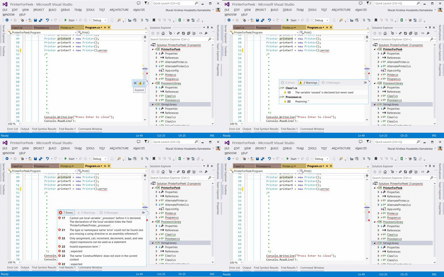
Solution Explorer now visualizes what you see in the error list by placing error indications directly on the Solution hierarchy. Creating an error while you code will quickly surface it on Solution Explorer, giving you an early warning system, even if the error list window isn’t open.
This feature is powerful not only because it surfaces errors on the file you’re editing, but the cascading effects of that error across the entire solution.
Another element we focused on was locality. Errors on Solution Explorer are contextual to the nodes they’re on. Hovering over a file with errors will reveal a filtered view of errors relevant only to that file.
Structure Visualizer
Once we integrated Enhanced Scrollbar into Visual Studio 2013, we started looking at how we leverage Map Mode to help power users.
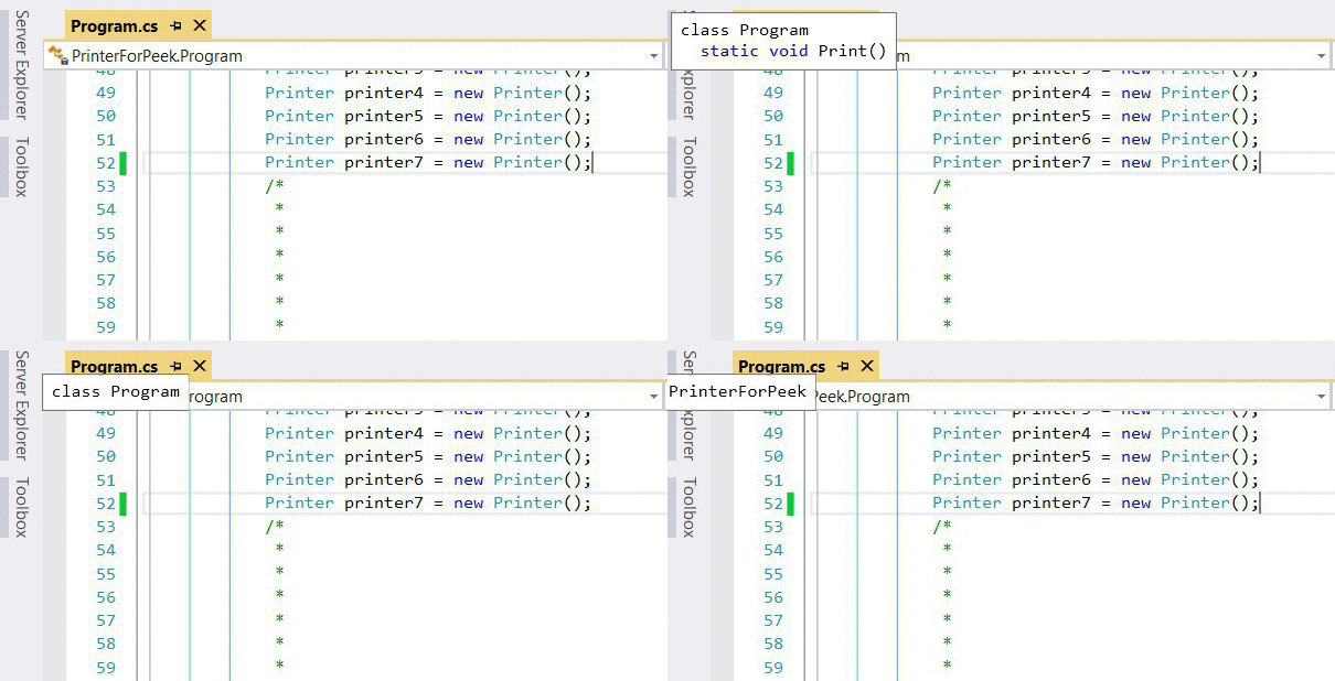
With Structure Visualizer, we visually represent scope directly on the scrollbar, answering a couple of helpful questions at every glance:
- Where am I in the method relative to its beginning and end?
- Where do I need to scroll to get to the next method?
- Which blocks are too big and might benefit from breaking up into smaller pieces?
We also unobtrusively and contextually show you brace openers as a lightweight popup to minimize the uncertainty and ambiguity of which block a specific brace is closing.
With our extensible model, we can’t wait to see where the community will take the concept of overlaying data over the scrollbar.
Peek Peek Peek!
We love Peek Definition, and we’ve been following your comments on it through social media and Send-A-Smile. Peek allows developers to consistently surface information that is meant to be persistent for a short amount of time.
We think of Peek as a window that helps you understand the context you’re in while connecting more dots to your current investigation.
With Productivity Power Tools 2013, we’ve enabled two new experiences that leverage Peek: Help and Ctrl+Click for definitions.
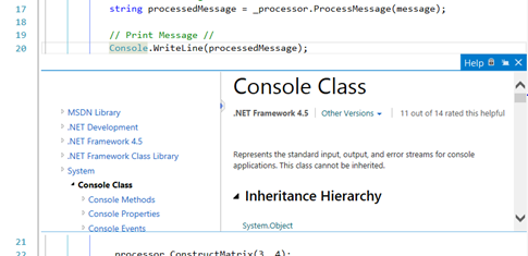
With Peek-Help (Alt+F1), you can quickly glance at MSDN documentation and hit ESC to get back to your code. Because documentation pages surface very specific information, and traversing links there is less common, Peek is a good vehicle to bring the information into view:
With the positive reception of Peek, we’ve also changed the default behavior of Ctrl+Clicks to now open up in peek, allowing you a quick mouse-driven experience for digging into your code.
Explore more goodness
There’s tons more new stuff in Productivity Power Tools 2013: Double click to maximize windows, Timestamp margin, Quick tasks – Edit Present On, HTML Copy improvements, Recently Closed Documents, Match Margin and a cleaned up Power Commands context menu.
Make sure you grab the extension and tell us what you think!
 |
Ala Shiban (@AlaShiban) – Program Manager, Visual Studio Editor Ala is passionate about people and technology that empowers us. He’s been on a PC since the Commodore64 days. Having worked with C, C++, VB, C#, Java, JavaScript and MATLAB, he combines his cross-language and platform insights to continue improving the developer experience on Visual Studio. |


0 comments