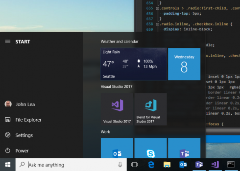
Developers like you live with the Visual Studio icons every day: clicking on them multiple times, staring at them side by side on the taskbar, and seeing them attached to project files. So when we update them, it’s a big deal. After all, icons matter. For pictures that are at most just under a centimeter wide on a normal display (or under half an inch, for those of you who aren’t British like me), icons are huge. They pack a lot of meaning into a small space. They offer clues as to what kind of experience you’ll have with the application the icon represents. Some icons even establish an emotional connection: they make you feel something about something.
We’ve started rolling out a new series of icons to represent the Visual Studio product family. The classic purple infinity shape that you already know and recognize is sticking around. But you might say it’s gotten a promotion of sorts: the purple infinity by itself now represents the entire suite of products you’ve come to rely on. That includes our flagship Visual Studio IDE, Visual Studio Team Services, Blend for Visual Studio, and Visual Studio Mobile Center. The family also includes a macOS-style icon for Visual Studio for Mac, and a new icon for Visual Studio Code that will be revealed soon.
But the infinity symbol by itself isn’t enough. One of the problems our users have brought up for some time is not being able to tell different versions of Visual Studio products apart. For example, we had light blue icons for both Visual Studio Code and Visual Studio Team Services. That’s our fault, not yours. Even our own designers couldn’t always tell you which blue was which, and why. That got confusing for us, which meant it had to be confusing for you.
So we literally went back to the drawing board, if you’ll forgive the pun. We had a friendly competition among multiple design teams across three continents working on and iterating different concepts for the icon set. Icons for a major product family like Visual Studio should be visually attractive, but the requirements don’t stop there. They have to effectively communicate to a worldwide audience.
We faced several challenges designing this new icon set. Because the infinity shape has such strong brand recognition in the developer space, we wanted the new icons to look and feel as if they were an extension of that brand. To achieve this, the new icon set needed to be in the same style as the existing infinity shape. Deconstructing the infinity shape, it fits onto an underlying grid with two-point perspective. It’s got a thin vertical line on the left and a thick vertical line on the right, and the shape as a whole is made entirely of straight lines and strong angles that could be created by folding a ribbon. Finally, one of the most crucial directives our designers had was to follow was to use only a single flat color for each icon. Each new icon had to follow all these rules, using only one color, straight lines, ribbon folds for all corners, and trying to retain a thin vertical line on the left and a thick vertical line on the right. Different but similar. It wasn’t an easy task, even for some of the best artists and designers in the industry.

Within these constraints and with the objective of building a whole icon set that conveys a sense of family, I’m quite proud of what our designers have accomplished. Most importantly, this new icon set has the familiar feeling of a Microsoft product family that’s part of the existing Microsoft brand. This familiar feeling is hard to pin down, but it’s essential. As I mentioned earlier, the purple infinity symbol is still around. In its classic dark purple, it now represents the whole Visual Studio family of products. In a lighter hue and with a stylized border, it represents our main IDE. You’ll absolutely know what to expect when you click on it. That’s a good thing.
The stylized border in the refreshed Visual Studio IDE icon is used in our other updated product icons as well. But instead of having to remember which icon is Visual Studio Code and which icon is Visual Studio Team Services based solely on color, each product icon now includes a unique pictogram that captures the individual flavor of each product. As each icon gets finalized and hard-coded into our different products, you’ll be able to tell that Blend and Code are both Visual Studio products, but are not the same thing. You’ll be able to tell the difference between Visual Studio Mobile Center and Visual Studio Team Services, and at the same time see that they’re part of the same product family.
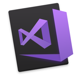
If you’re using Visual Studio for Mac, you’ll notice that the new product icon combines elements of both macOS and Windows visual design. We’ve used the purple infinity symbol, and set it against the common macOS pattern of a rotated rectangle. To make it pop on the macOS Dock, the Visual Studio for Mac icon has some added shading and detail.
Ultimately, the reason we put so much time and energy into refreshing these icons was to make your job easier. We always want you to be confident when you click on one of our icons, so you can get down to coding and focus on what you really want to focus on: making the best software in the world. Did we get it right? Tell us at UserVoice or use the Send Feedback tool in Visual Studio.


0 comments