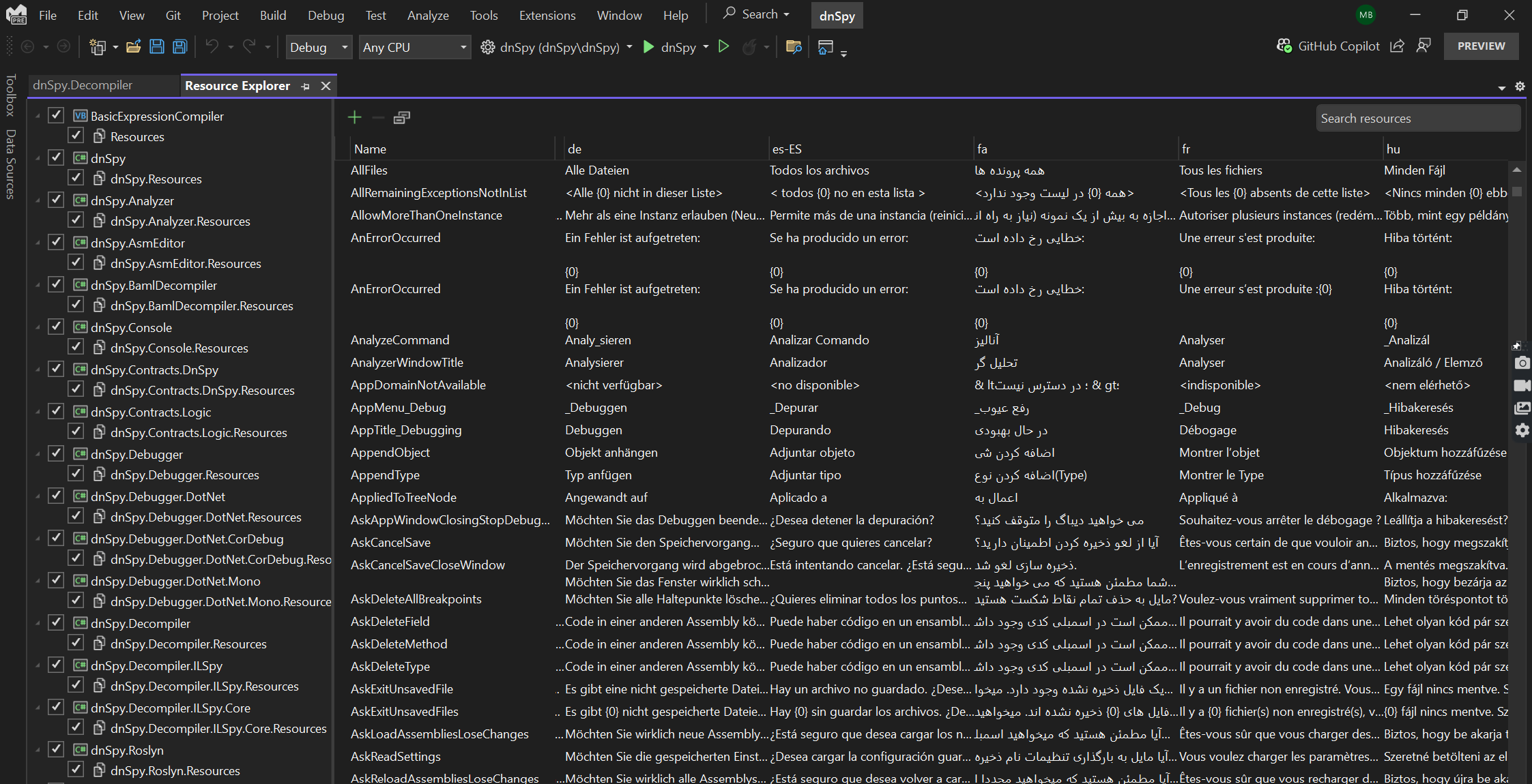
With the recent revamp of Visual Studio’s Resource Explorer, developers are in for a treat! We’re thrilled to unveil the reimagined Visual Studio Resource Explorer, and trust us, it’s a game-changer.
Developers who manage resources in Visual Studio will be delighted to learn that we have finally updated our out-of-the-box resource management experience to better accommodate the needs of the modern .NET developer. This update will make it easier and faster for developers to manage resources in their .NET applications. Here’s the lowdown:
The Pain Points We Crushed:
Let’s rewind. The old Resource Editor had its quirks – no search, no filters, and a data grid that felt like a maze. If you manage sprawling solutions with gazillions of resources, you know the struggle. And don’t get us started on the one-file-at-a-time limitation – a real buzzkill for multilingual apps. Plus, that window? Not zoom-able. Not theme-friendly. Not cool.
In the new Resource Explorer design, we have tackled these common issues and introduced several new features that will make your resource management workflows in Visual Studio much more productive. As you can see when we compare the two experiences, we’ve bridged the gaps in the old experience and sprinkled in delightful new features to boost your productivity. Get ready for a more modern and convenient resource management journey.
Feature Comparison:
Feature |
NEW Resource Explorer |
LEGACY Resource Editor |
| Grid View of Resources | ✅ | ✅ |
| Add/edit/delete resources | ✅ | ✅ |
| Search | ✅ | ❌ |
| Single view for resources across solution | ✅ | ❌ |
| Edit multiple resource files at once | ✅ | ❌ |
| Edit multiple locales at once | ✅ | ❌ |
| Dark mode and VS theme support | ✅ | ❌ |
| string.Format pattern validation | ✅ | ❌ |
| Warnings and validation of resource data | ✅ | ❌ |
| Combined view for string and media resources | ✅ | ❌ |
| Datagrid zoom-ability | ✅ | ❌ |
What’s new in the update?
Loading multiple files:
The cornerstone of this update is the ability to load multiple files and view all localizations at once within the same view. When you open the new Resource Explorer, you’ll find a comprehensive overview of all the resources you’ve stored alongside the locales for each file. You can even configure which locales are visible in the datagrid. This streamlined interface allows you to compare translations side by side and even edit them in place. No more toggling between different screens or hunting for specific files—the new design brings everything together, making localization management a breeze.
Search and Filter:
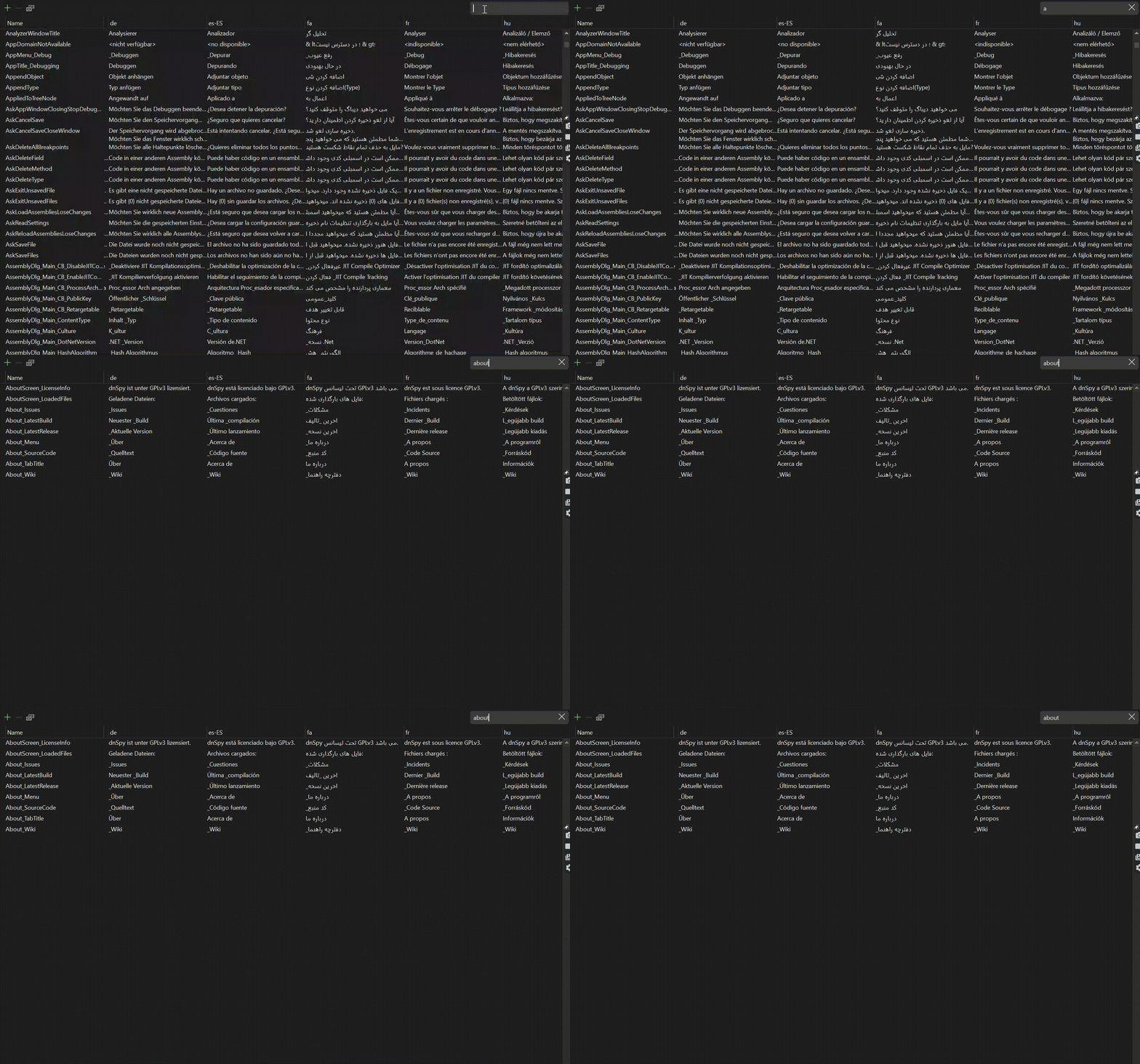
One of the most highly requested features we are delighted to deliver on is search. Our search isn’t confined to a single file, either. It dances across different .resx files, highlighting every occurrence of your search term. Need that elusive translation string? Found! Want to track down a specific locale? Done! It’s like having a resource detective at your service.
You also have the option of selecting a subset of files to search. Whether it’s specific locales, resource groups, or just a corner of your project, you can ensure your search precision.
Comments:
Each translation of a resource now has its own comment, all visible at once in the datagrid. Imagine this: You’re working on an app that supports multiple languages, and you stumble upon a quirky phrase that needs tweaking. With individual translation comments, you can provide context, backstory, or even a friendly reminder to your future self.
It’s also common that the translator isn’t the same person managing the app’s resources. Maybe it’s a third-party service or a colleague from another team. No need to worry about misunderstandings of translation context because comments bridge the gap. The translator can leave notes, explanations, or caveats right alongside the translations. It’s like having a virtual sticky note attached to each string, making collaboration seamless. Keep an eye out for familiar UI – we’ve borrowed a leaf from the UX playbook of other beloved apps (hello, Excel!). When you explore translations, be on the lookout for the small icon in the corner of each cell.
Validation and Warnings:
The new Resource Explorer now warns you if you are missing translations or have issues with your placeholder values.
Missing Translation warnings: Localization just got smarter. If your app supports multiple languages, missing translations can be a headache. Our revamped Resource Explorer now detects those gaps and issues targeted warnings. Whether it’s a label, button, or tooltip, we’ve got your back.
Placeholder Validation: Ever accidentally left a resource field blank or mis-formatted, only to discover it during deployment? Fear not! Our new placeholder validation feature ensures that you never miss a beat. As you create or modify resources, we’ll nudge you to fill in those essential details. No more surprises during runtime – placeholders keep you on track!
Accessibility and UI changes:
At Microsoft we understand technology – that’s why we continue to innovate, create, and design in a way that gives everyone the ability to achieve more. As part of this redesign we have made a handful of accessibility and UI changes that will be appreciated by developers of all abilities.
Accessibility and Assistive Technologies: We’ve fine-tuned every pixel to ensure compatibility with screen readers and assistive technologies. Everyone deserves an inclusive coding experience!
Zoom: No more squinting at the tiny grid view trying to decipher resource details. Our new grid view provides precision at your fingertips with the built-in zoom capabilities – simply use your mouse wheel or keyboard shortcuts to zoom in and out.
Dark Mode: Say goodbye to eye strain! Our revamped Resource Explorer now boasts a sleek dark mode that’s easy on the eyes. Whether you’re all-too familiar with late-night coding sessions or you simply prefer a more stylish interface, the dark theme sets the stage for focused productivity. Dive into your resource management tasks with confidence, knowing that your eyes are well taken care of.
What this version doesn’t include:
This first release of the revamped Resource Explorer does not include CSV import and export functionality, automatic translations, or a way to integrate your own translation engines directly into the designer. For these, and many more advanced features, we recommend ResXResourceManager. This Visual Studio extension, created and managed by a key developer community contributor, will always be the best-in-class resource management experience and includes many state of the art features outside of the scope of what we offer out-of-the-box in Visual Studio. If you already use this extension for your resource management in Visual Studio, no need to change anything – it will still work as usual with the new update.
Where to find it:
The revamped Resource Explorer is now on by default in the 17.11 Preview 2 and later versions of Visual Studio. You can open the designer either by double clicking on your Resources folder in the Solution Explorer, or by navigating to View > Other Windows > Resource Explorer.


0 comments