
Hello (future) Jetpack Compose developers!
This week, we want to talk about how to get started on building applications with Jetpack Compose. A few of us on the Surface Duo Developer Experience team recently began learning Compose, so we’d like to share some advice and resources with you.
To read more about the work we’ve been doing with Compose, check out our NavigationRail, TwoPaneLayout, Compose for foldables, and Compose on Microsoft Surface Duo blog posts.
Overview
For those of you who are unfamiliar with Compose, it’s a declarative UI toolkit that acts as a replacement for the XML layouts you may have used in the past. You can build an application from start to finish using only Compose, but it’s also possible to use a combination of Compose and traditional views if that better suits your needs. Since Compose is still relatively new, there are both stable and alpha releases available, so some features may still be under experimental APIs.
Using Compose has many benefits, including reducing the amount of code required to build a layout and increasing the readability of a program. To read more about the structure of Compose and see tips on how to get started, check out the official Jetpack Compose documentation. In this blog post, we’ll share some more personalized tips on what we found effective when starting out.
Codelabs and tutorials
The first step for us was getting familiar with the new syntax and terminology through the official documentation and codelabs. At the very least, we highly recommend completing these two activities:
Lambda expressions are also a huge part of the syntax in Compose, so we recommend brushing up if you don’t have a lot of experience with them.
Depending on what you want to build in the future, there are more specific codelabs that dive deeper into different topics. The Layouts codelab and State codelab are good follow-up lessons, but you can also browse other options in the Jetpack Compose pathway.
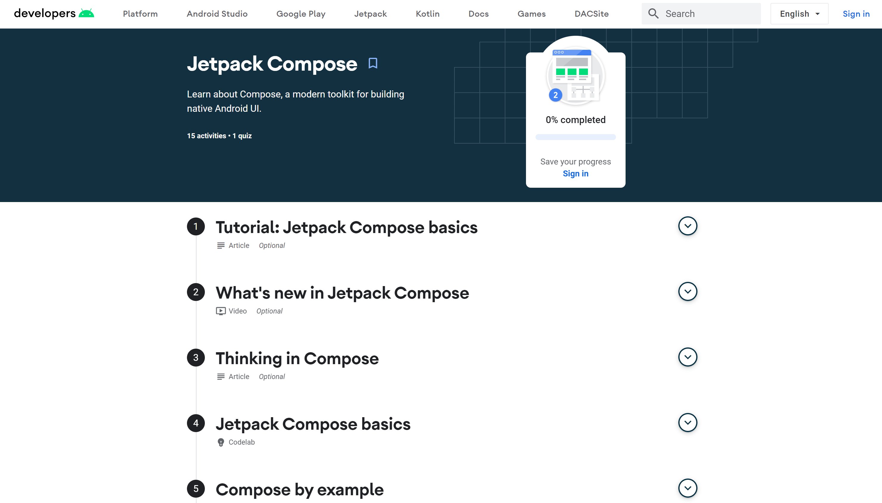
Figure 1: Jetpack Compose pathway
Hands-on practice
Once you’re familiar with basic Compose concepts, the next step is to try some hands-on practice. It’s simple enough when the codelabs provide the code for you, but it gets a little harder when you have to design and build the layouts yourself!
Convert
The easiest way to start practicing is to try converting an existing project of yours. That way, you can fully focus on how to write the UI layer in Jetpack Compose since the other layers are already there and you know how your designs should look. In the process of translating the View-based UI to Jetpack Compose, you may find that the Android UI components we are used to were re-written or modified, so you may need to use other attributes instead. In some cases, such as that of RecyclerView, you can even see how Compose eliminates the need for boilerplate code. When creating a layout using LazyColumn or LazyRow, there is no longer a need for an Adapter or a ViewHolder implementation.
Create
When you feel comfortable converting XML-based layouts to Compose layouts, the next step is writing new features from scratch using composables. This will help you get used to the new mentality, like trying to think in a new language, or in our case, a new paradigm. It’s really important to understand what happens behind the scenes so you can fix issues that might appear and have performant layouts.
In addition, creating new features gives you a good chance to get more familiar with the Compose API. For instance, you’ll find that modifiers are essential for setting up the appearance and behavior of every UI element. The official Compose samples are a good reference for seeing how different effects can be achieved, and they also demonstrate best practices, such as how to make your components reusable.
We also have our own Surface Duo Compose samples repository, which contains samples that showcase how to use Compose to create the different dual-screen app patterns.
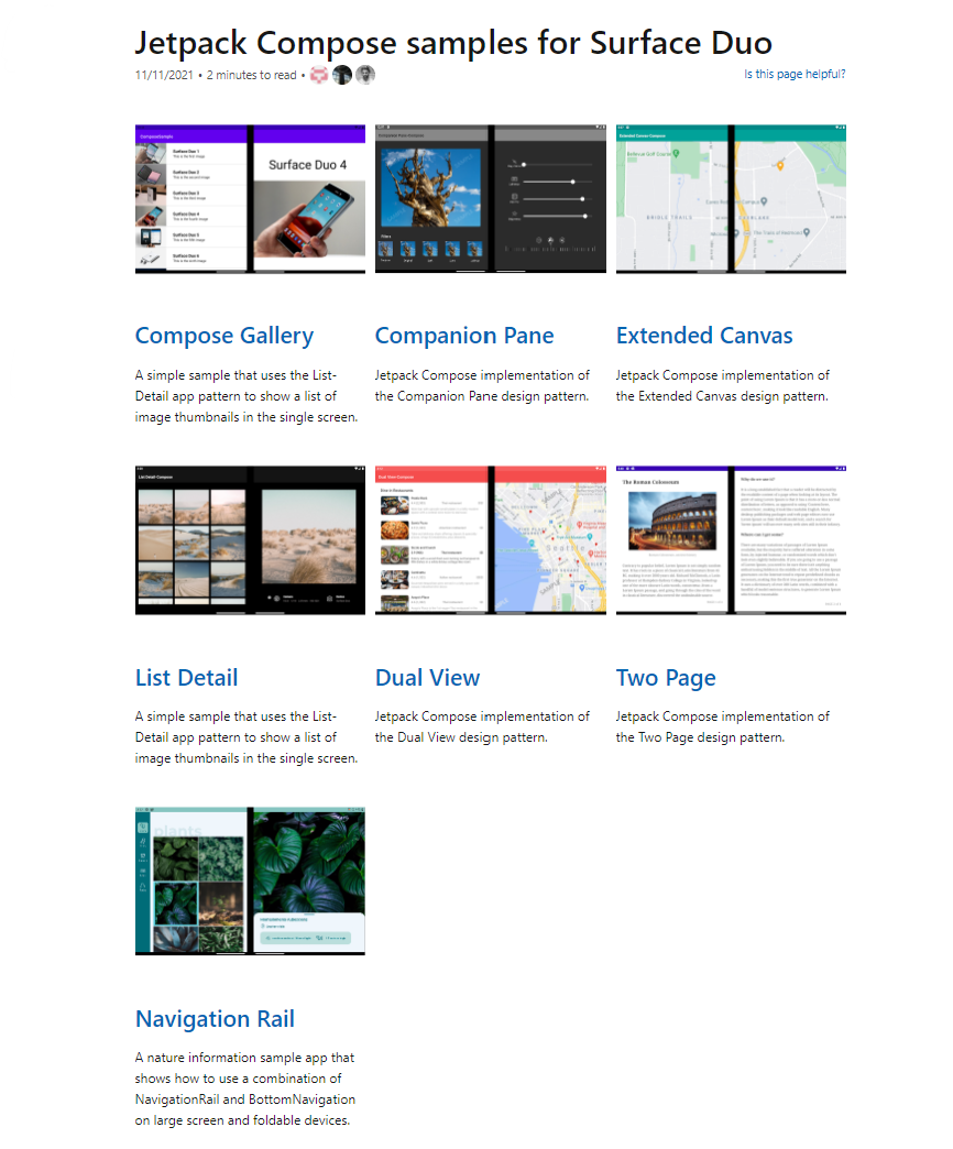
Figure 2: Surface Duo Compose samples repository
Large screen and foldable support
And of course, it wouldn’t be a true Surface Duo Blog post without some foldable support tips 😉
Just like in our Kotlin samples, we highly recommend using Jetpack Window Manager. With this library, you can extract information about foldable devices, such as span state, hinge thickness, and hinge angle. Soon you’ll also be able to use JWM for large screen support, thanks to the new WindowSizeClass concept that was introduced at Android Dev Summit 2021. Until this new version of the library is released, we recommend using LocalConfiguration.current or Window Manager’s computeCurrentWindowMetrics to determine screen size and orientation. The code snippet below, taken from our TwoPage sample, uses JWM 1.0.0-beta03 and LocalConfiguration.current to set up layouts:
const val SMALLEST_TABLET_SCREEN_WIDTH_DP = 585

@Composable
fun SetupUI(windowInfoRep: WindowInfoRepository) {
   // Density of the display
   val density = LocalDensity.current.density

   // Foldable device information
   var isAppSpanned by remember { mutableStateOf(false) }
   var viewWidth by remember { mutableStateOf(0) }
   var hingeThickness by remember { mutableStateOf(0) }
   var isHingeHorizontal by remember { mutableStateOf(false) }

   LaunchedEffect(windowInfoRep) {
       windowInfoRep.windowLayoutInfo
           .collect { newLayoutInfo ->
               val displayFeatures = newLayoutInfo.displayFeatures
               isAppSpanned = displayFeatures.isNotEmpty()
               if (isAppSpanned) {
                   val foldingFeature = displayFeatures.first() as FoldingFeature
                   val vWidth: Int

                   if (foldingFeature.orientation == FoldingFeature.Orientation.VERTICAL) {
                       isHingeHorizontal = false

                       // Vertical hinge: page width is equal to position of left side of hinge
                       // bounds rect and hinge thickness is width of rect
                   	   vWidth = foldingFeature.bounds.left
                       hingeThickness = foldingFeature.bounds.width()
                   } else {
                       isHingeHorizontal = true

                       // Horizontal hinge: page width is equal to position of top side of hinge
                       // bounds rect and hinge thickness is height of rect
                       vWidth = foldingFeature.bounds.right
                       hingeThickness = foldingFeature.bounds.height()
                   }

                   // Convert page width from dp to pixels using display density
                   viewWidth = (vWidth / density).toInt()
               }
           }
   }

   val smallestScreenWidthDp = LocalConfiguration.current.smallestScreenWidthDp
   val isTablet = smallestScreenWidthDp > SMALLEST_TABLET_SCREEN_WIDTH_DP
   val isLandscape = LocalConfiguration.current.orientation == Configuration.ORIENTATION_LANDSCAPE

   // Show two panes ("dual mode") if device is a tablet and in landscape orientation, then
   // readjust page width to be half of the screen size
   val isTabletDualMode = isTablet && isLandscape
   if (isTabletDualMode) {
       viewWidth = LocalConfiguration.current.screenWidthDp / 2
   }
   // Show two panes ("dual mode") if foldable device is spanned and has a vertical hinge
   val isDualPortraitMode = isAppSpanned && !isHingeHorizontal
   // Show two panes if tablet & dual mode or foldable & dual mode
   val isDualScreen = (isDualPortraitMode) || isTabletDualMode

   // Set up layouts with foldable/large screen information
   val pages = setupPages(viewWidth)
   PageViews(pages, isDualScreen, hingeThickness / 2)
}
Our team also built a custom control, TwoPaneLayout, that takes two composables and automatically places them depending on the state of a device. When a fold is detected, both composables will be shown on either side of the hinge. Otherwise, just one composable, or pane, will be shown at a time. Using TwoPaneLayout reduces the amount of Window Manager code you need to write, especially if the only information you need to check is span state.
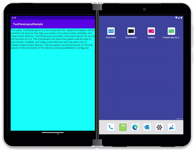
Figure 3: Demo of TwoPaneLayout on Surface Duo 2 emulator
When it comes time to test your application, don’t forget to try it out with different screen sizes and orientations to make sure it looks good on large screens and foldables. When we test our samples, we make sure that everything runs smoothly on the following emulators:
- Surface Duo 2 emulator
- 6.7 Horizontal Fold-in
- 7.6 Fold-in with outer display
- 8 Fold-out
- Pixel C
Summary
Overall, we’ve found Compose to be very readable, and it’s a lot easier to find the properties/attributes that need to be changed to achieve a particular design. Even though it’s still pretty new, Compose already has a lot of support for different UI concepts, and we’re looking forward to seeing what comes next in the future. If you’re just starting out, we recommend you take the time to learn the new syntax/mentality and complete some hands-on practice, and don’t forget that there are plenty of resources out there to assist you in your learning:
- Jetpack Compose Overview
- Jetpack Compose pathway
- Official Compose samples
- Surface Duo Compose samples
- Surface Duo Compose SDK
- Testing in Jetpack Compose
- Compose Material API reference
- Compose Animation API reference
Resources and feedback
For coding tips, visit the Surface Duo developer documentation , our samples, and Google’s Android large screen development guidance.
If you have any questions, or would like to tell us about your dual-screen apps, use the feedback forum or message us on Twitter @surfaceduodev.
Finally, please join us for our dual screen developer livestream at 11am (Pacific time) each Friday – mark it in your calendar and check out the archives on YouTube.
0 comments