
Hello Android developers!
Google just announced the first release candidate for Compose on 07/01. We are getting one big step closer to stable this month! In previous blogs, Jetpack Compose on foldable and dual-screen development and Jetpack Compose on Microsoft Surface Duo, we mentioned that there are two main steps you can implement to develop or enhance your application to leverage these new form factors using this new UI toolkit:
- Integrate Jetpack Window Manager to detect the information of the device and the bounds of the hinge/folding line.
- Update the UI based on the device orientation and the information from Jetpack Window Manager.
TwoPaneLayout preview
Today we are introducing a new library, TwoPaneLayout, which can help you simplify this implementation. You can easily integrate the library when using Compose to build a two-pane layout. TwoPaneLayout provides a layout container to hold two different layouts horizontally or vertically. It will switch automatically based on the device orientation. The two panes will be placed side-by-side according to the hinge (width may not be zero) on a dual-screen device or the folding line on a foldable device, if the layout parameter “weight” is not configured, otherwise the two panes will be divided based on the parameter configuration.
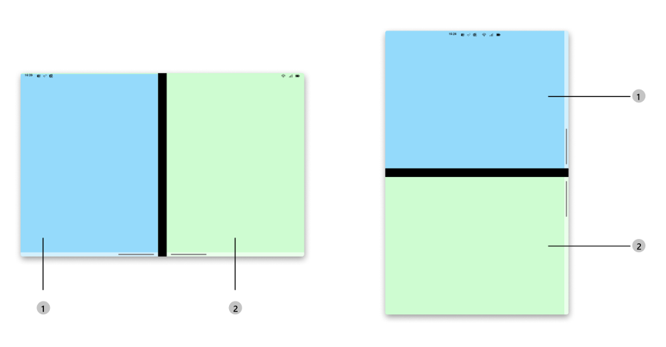
Figure 1: TwoPaneLayout on Foldable/Dual-screen devices
When the foldable and dual-screen devices become unfolded or unspanned, or the app is running on a regular single-screen device, the two-pane layout would be converted to a single-pane layout without any extra effort. And we also scale the library to support large-screen devices, such as a tablet, which can provide a split-view style to enable multi-tasking on one large display area.
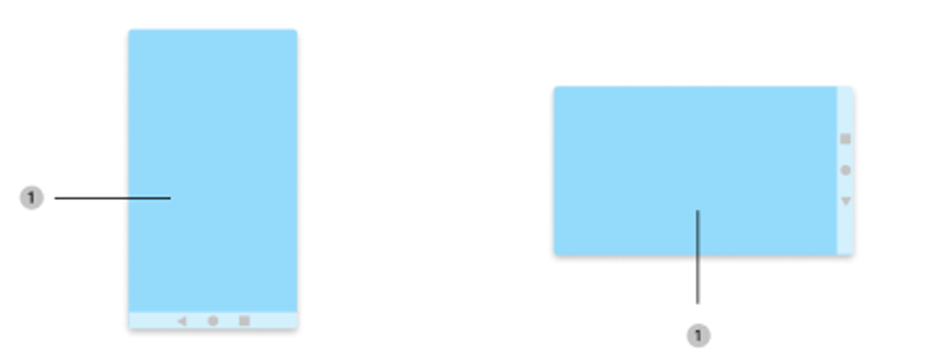
Figure 2: TwoPaneLayout on single-screen device
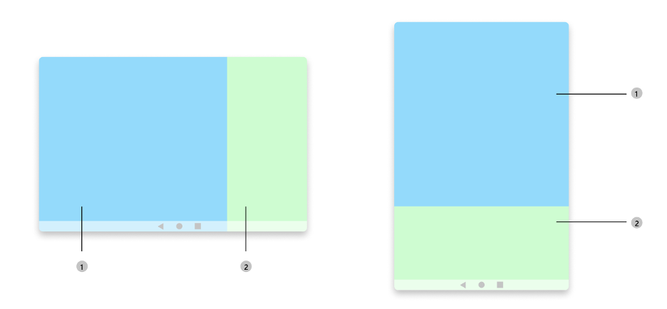
Figure 3: TwoPaneLayout on large-screen device (such as a tablet)
Two-pane layout can be used in many scenarios on foldable, dual-screen, and large-screen devices, including list detail, dual view, companion pane, and the three design pattern we mentioned before. With them, the applications can display list and detail content, or content with control, or list and map at the same time, regardless of the device orientation.
Try it out!
The TwoPaneLayout is very easy to use. You can integrate it into your Android Studio project in four steps:
-
In the top-level build.gradle file, make sure you have mavenCentral() repository
repositories { google() mavenCentral() } -
In the module-level build.gradle file, add the following dependency
implementation "com.microsoft.device.dualscreen:twopanelayout:1.0.0-alpha02"
-
Also ensure the compileSdkVersion and targetSdkVersion are set to API 30 or newer in the module-level build.gradle file.
android { compileSdkVersion 30 defaultConfig { targetSdkVersion 30 } ... } -
Start building your layout using TwoPaneLayout with just one line of code. Then you can have two different customized layouts showing side-by-side or above-and-below, or a single prioritized layout.
Here is a small code sample to demonstrate the use of TwoPaneLayout:
TwoPaneLayout {
    Text(
        text = stringResource(R.string.first_pane_text),
        modifier = Modifier.fillMaxSize().background(color = Color.Cyan)
    )
    Text(
        text = stringResource(R.string.second_pane_text),
        modifier = Modifier.fillMaxSize().background(color = Color.Magenta)
    )
}
There are two child elements which are two Composable text labels created and placed inside TwoPaneLayout. The library will position the elements based on the order, which means the first element will be placed in the first pane and the second element will be placed in the second pane. Since no “weight” is configured, the first child element will be prioritized in the single-screen mode.
If running the sample on a single-screen device, foldable, or dual-screen device, such as Surface Duo, or a tablet, you can see the two panes will be displayed accordingly based on the device type, state, and orientation without any code changes.
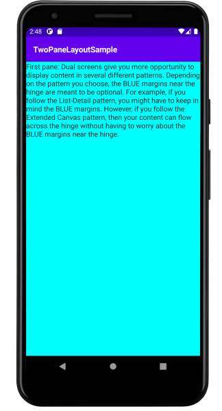
Figure 4: Sample without “weight” configured on a single-screen device
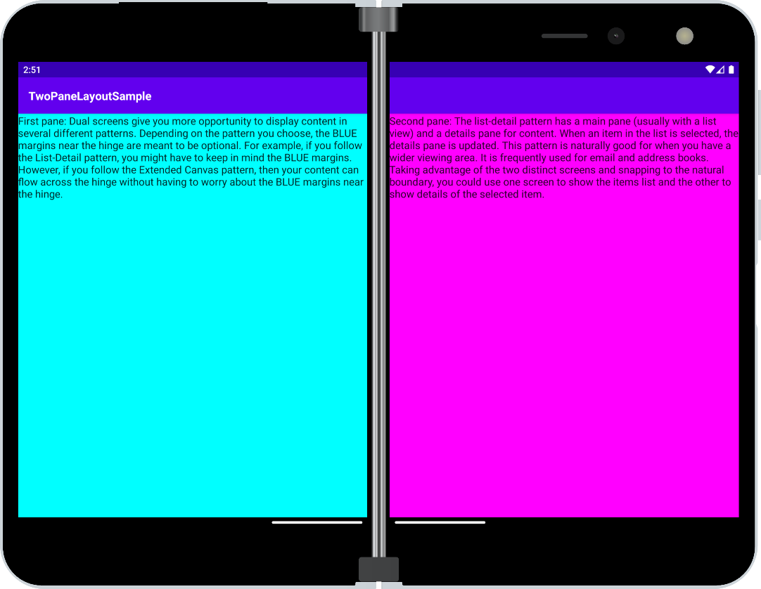
Figure 5: Sample without “weight” configured on a dual-screen device (Surface Duo)
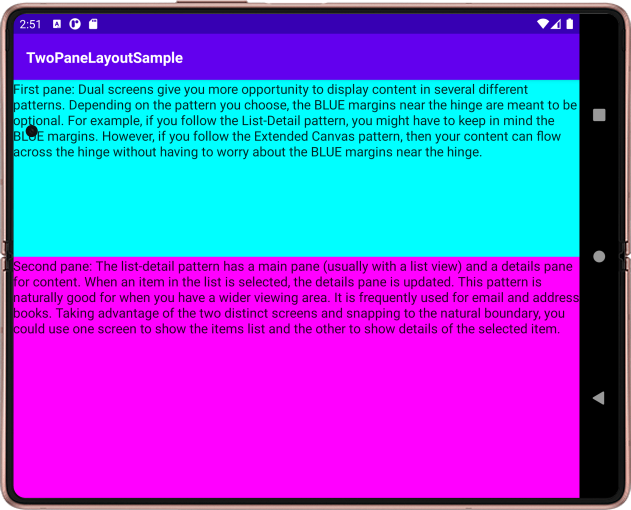 Figure 6: Sample without “weight” configured on a foldable device rotated 90 degrees
If we updated the above code by adding the layout parameter weight, the two panes will be adjusted proportionally based on that. And in the single-screen mode, the element with higher weight will be prioritized to show.
TwoPaneLayout {
    Text(
        text = stringResource(R.string.first_pane_text),
        modifier = Modifier.fillMaxSize().background(color = Color.Cyan).weight(.3f)
    )
    Text(
        text = stringResource(R.string.second_pane_text),
        modifier = Modifier.fillMaxSize().background(color = Color.Magenta).weight(.7f)
    )
}

Figure 7: Sample with “weight” configured on a single-screen device
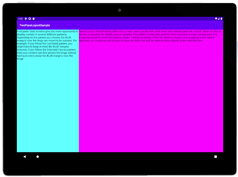
Figure 8: Sample with “weight” configured on a large-screen device (tablet)
Resources and feedback
The source code here is available on GitHub; we’d love to hear your feedback or contributions to the project.
Check out the Surface Duo developer documentation and past blog posts for links and details on all our samples.
If you have any questions, or would like to tell us about your apps, use the feedback forum or message us on Twitter @surfaceduodev.
You can also chat with us on Twitch on Friday, July 16th at 11am PST, where you can ask questions about Jetpack Compose or any other aspect of developing dual-screen apps for the Surface Duo!
0 comments