
Hello Android developers!
Accessibility is an important step in the design and development flow of any Android application. Ensuring that everyone can use it in any situation will make the experience better, and the app will benefit from having an extended and diverse audience. When you design your app with accessibility in mind, you ensure that people with disabilities understand your application better, benefit from increased user satisfaction and will receive feedback from a diverse user base.
An important feature of large screens and foldable devices is the extra space, which helps improve productivity. Users will be able to navigate through your application efficiently only if it is built with accessibility in mind, so you should consider all kinds of disabilities – be it situational (very bright or very dark environments, cannot use audio) or physical impairments.
We recently improved the accessibility of our Dual-Screen Experience Example application and would love to share with you the steps we followed. We will dive more into how to enhance accessibility for View-based layouts, but these concepts can also be used for an application developed with Jetpack Compose. To learn more about the differences in attributes and implementation, you can refer to the Jetpack Compose accessibility page.
How to get started
There are multiple tools out there to help you get started with testing the accessibility of your Android application.
-
This tool connects your computer to your testing environment, displays what issues are found, and generates a report. This is extremely useful in case you want to use emulators or devices with multiple screens, since you will be able to develop and control your test devices on the same machine.
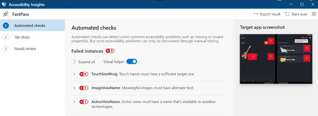
Figure 1: Accessibility Insights checking an application displayed on a dual-screen emulator -
Accessibility Scanner and Google Play Store report
In case you would only like to work with the device under test, this application can be downloaded from Google Play Store and has the option to create a report by taking screenshots through a bubble button. This is based on the Accessibility Test Framework, which is integrated in the latest versions of Android Studio and generates warnings directly on the layouts. If you are using Google Play Store to distribute your application to users, the framework is also integrated in the pre-launch report that is generated after uploading a release.
-
Accessibility in Espresso testing
To identify accessibility issues early in the development flow, you can include AccessibilityChecks in your Espresso tests, and it makes a test fail when an issue is detected. For instance, we created a custom AndroidJUnitRunner class where we can add settings which apply to all UI tests at the same time (also sets up the HiltTestApplication so we can easily control the components we need inside the tests).
class HiltJUnitRunner : AndroidJUnitRunner() {
    override fun newApplication(
        classLoader: ClassLoader?,
        name: String?,
        context: Context?
    ): Application =
        super.newApplication(classLoader, HiltTestApplication::class.java.name, context).apply {
            MapConfig.TEST_MODE_ENABLED = true
            AccessibilityChecks.enable()
        }
}
In build.gradle (app), we just declare this new custom class to be used for instrumentation tests:
android { defaultConfig { testInstrumentationRunner "com.microsoft.device.samples.dualscreenexperience.HiltJUnitRunner" } } -
Android Studio lint warnings
Besides the Android Test Framework layouts integration, Android Studio also generates lint warnings when content labelling has not been added to components which usually need it (such as ImageView, ImageButton). Just make sure your layouts do not include AppCompat widgets directly, because those do not generate any warnings and should only be used for custom views. If the top-level activity / dialog is provided by AppCompat, it automatically includes compatible widgets.
-
Accessibility services
Manually testing your app using accessibility services such as TalkBack and SwitchAccess is important so you can understand the way your layouts are explained to people with disabilities. They demonstrate if someone can easily navigate through your app and reach all the views in the correct order.
Minor changes make a significant difference
After creating a list with all the issues found using the tools described in the previous section, we started implementing the improvements.
Content labelling
The first step was to make sure that all widgets either include contentDescription or the android:importantForAccessibility= "no" attribute. The latter is mostly used for illustrations which do not bring any additional information, so they can be skipped by accessibility services.
It’s important to have content labels, but it’s even more important that they are descriptive, so anyone can understand what they represent. For instance, in RecyclerView components, we mostly show the values of an item’s details. This information isn’t useful without context, so it’s more helpful to include both the label and the value in the contentDescription. Keep in mind that the type of component is already added to the content description by accessibility services (such as “button”).
As an example, this is how we create our StarRatingView component, which is attached to the product items. The stars are illustrations, so we declared that they are not important for accessibility, while for the text we added a more descriptive content label (“Rating: <value>”):
for (index in MIN_STARS until STAR_COUNT) {
    addView(
        AppCompatImageView(context).apply {
            id = getStarImageId(index)
            setImageResource(R.drawable.ic_star_empty)
            gravity = Gravity.CENTER_VERTICAL
            importantForAccessibility = IMPORTANT_FOR_ACCESSIBILITY_NO
        },
        LayoutParams(heightView.dpToPx(context), heightView.dpToPx(context)).apply {
            marginEnd = starMargin.dpToPx(context)
        }
    )
}
addView(
    TextView(context, null, 0, R.style.GoldText).apply {
        id = textViewId
        text = ratingValue.toString()
        textSize = heightView
        contentDescription = context.getString(R.string.rating_with_label, ratingValue.toString())
    },
    LayoutParams(LayoutParams.WRAP_CONTENT, LayoutParams.WRAP_CONTENT).apply {
        marginStart = starMargin.dpToPx(context)
    }
)
Furthermore, it is important to have unique contentDescription values to prevent confusion. We encountered a case where two About labels appeared on the same screen while referring to different elements, one being about the About Store tab, while the other meant the About App menu item. To fix this, we extended the contentDescription values to make them specific to the section they were included in.
Another thing to consider is invisible elements. Even if an element is invisible to users, you may still want it to be recognized by accessibility services. In the Dual Screen Experience example, we set the title of the dialog we are showing to confirm an order even though it is not visible (because we used dialog.requestWindowFeature(Window.FEATURE_NO_TITLE)). This way, it won’t show on the screen, but it can still be read by accessibility services.
Color contrast
We worked together with our designer to match the device system theme to the Dual-Screen Experience Example application, which initially had only dark mode support. We wanted to offer both options to users – light theme and dark theme, to accommodate multiple preferences, various light sensitivities, and to be sure the app can be used in any environment. The main thing to keep in mind is that you need to consider the color contrast ratio of your elements – for example, the background and foreground of an ImageView, or the color of TextView components compared to their backgrounds. The W3C (World Wide Web Consortium) recommends a contrast ratio of at least 3:1, and you can find more details on the W3C constrast page.
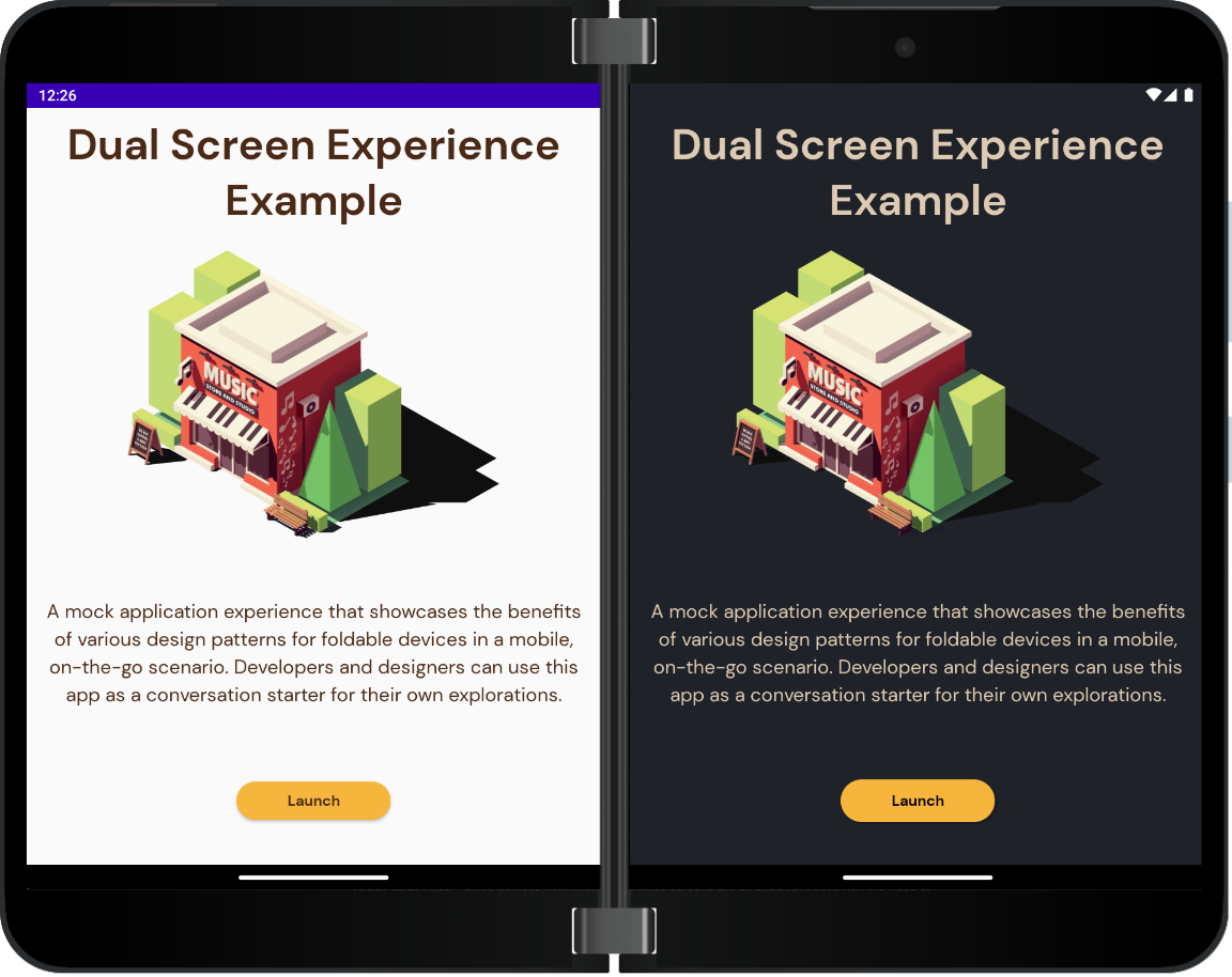
Figure 2: Light theme vs Dark theme for the Launch Activity
Important aspects for dual-screen devices
When talking about dual-screen, foldable, and large screen implementations, we often use Views or Fragments side-by-side so we can display more content and take advantage of the whole display area. From an accessibility point of view, it is important to check that on normal single-screen devices, the implementation does not add the components on top of each other, because that means a lot of noise for the accessibility services and the application becomes hard to understand. Inside the accessibility testing tools, this appears as with the following warning: “Multiple clickable items share this location on the screen.”.
Starting with the 1.0.0-alpha3 version, our Foldable Navigation component uses the replace() function for the Fragments instead of the add() one. This means that accessibility services will only take into account the current destination of the Navigation component and its layout, without including the startDestination of the navigation-graph. The Dual-Screen Experience Example already uses the latest version of this control, so you can try it out inside the app.
Touch target size
Since devices with multiple or large screens are all about productivity, we need to ensure that we use the minimum recommended touch target size for clickable items, which is 48x48dp according to the Material Design Accessibility guidelines. This ensures that everyone can easily and quickly trigger the actions they need. There are multiple ways to enlarge the touch target area without changing the appearance of content:
-
Adding
paddingsorinsets(insets can be added when the component has a custom drawable for the background) -
Declaring minimum width and height and letting the widget decide its own actual size (by using
android:minWidth/android:minHeightattributes orapp:layout_constraintWidth_min/app:layout_constraintHeight_minif the parent is a ConstraintLayout) - Using a TouchDelegate or moving the click listener to the parent of the widget
-
Have the TextViews use an
android:textSizeorapp:autoSizeMinTextSizeof minimum12sp
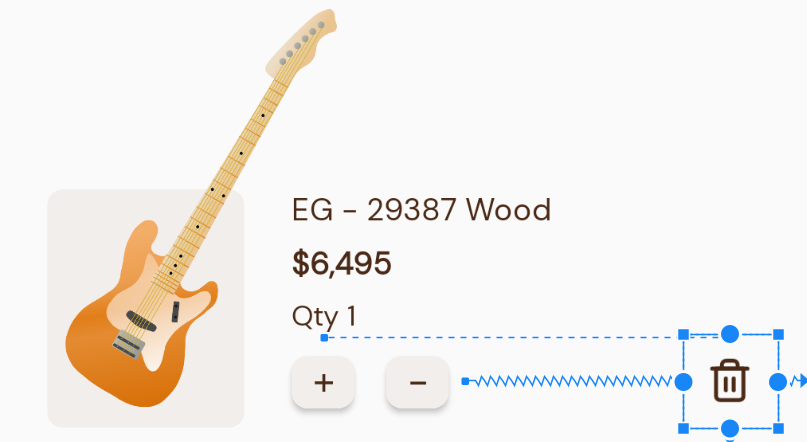
Figure 3: ImageButton with padding which complies with the minimum target touch size
Grouping views
In order to increase efficiency when using accessibility services, multiple views which describe a single object can be grouped in a container so that their label is read only once. When the device has a larger screen, having a smaller number of grouped views makes the navigation faster. That means that the container needs to have the android:screenReaderFocusable attribute (or android:focusable for apps with support for API level 27 and lower) and a good description (either the descriptive labels of the children or a custom summary).
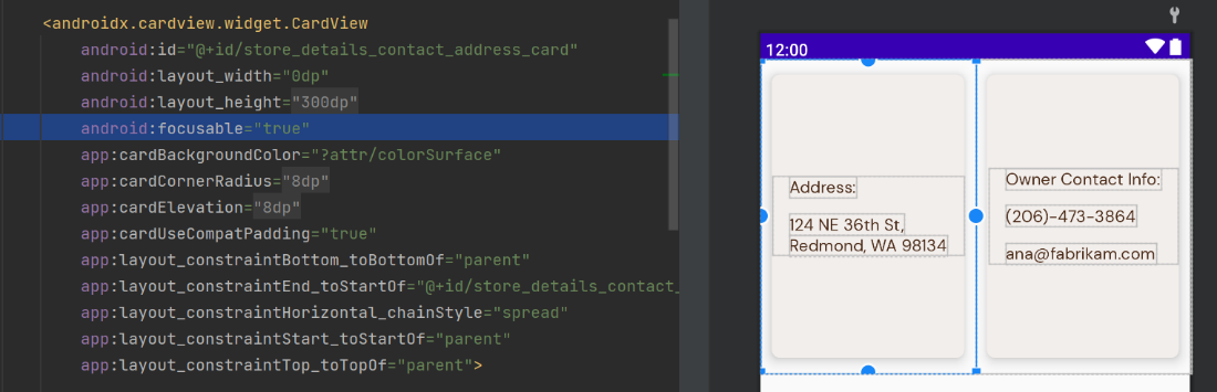
Figure 4: Grouping views in Android Studio by adding the focusable attribute on a CardView
Focus order
Usually, the focus order generated by default is the same as the natural way of visualizing the UI elements on the screen. In case you would like to control the logical order without adding other containers, there are some attributes you can use, such as android:accessibilityTraversalBefore and android:accessibilityTraversalAfter. For example, in the Sign & Confirm Order dialog, we wanted to keep the colors in a separate container from the ink stroke width control, so the generated order was InkStroke button > Reset button > InkColor buttons. However, we also wanted to keep the Ink controls together, so we added the attribute to the Reset button to have focus after the colors.
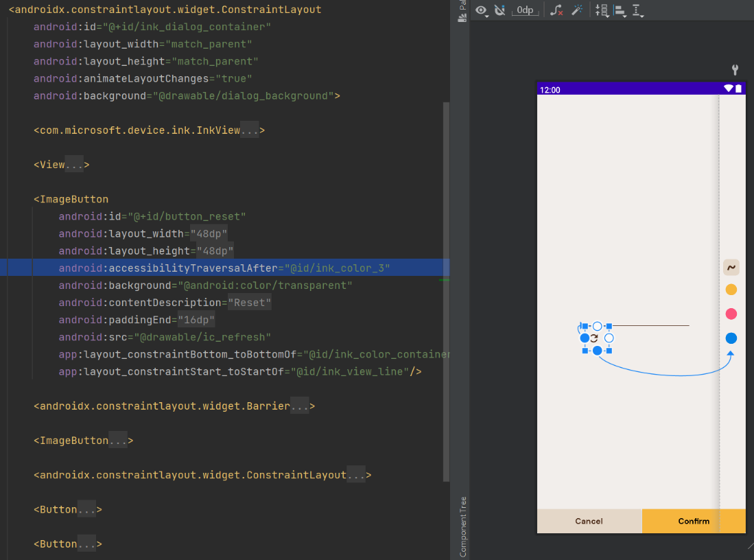
Figure 5: Changing the focus order in Android Studio for an ImageButton using the android:accessibilityTraversalAfter attribute
Accessibility in custom controls and views
When creating custom components, the recommended way is to extend an existing Android widget which already has improved accessibility support. Some of our Foldable controls (BottomNavigationView, TabLayout) use this exact approach, so they behave similarly to the Android components developers are already used to.
If you prefer to create a custom view yourself, there are multiple improvements you can make:
-
Use
Android attributesfor the state (for example, if you need to change the UI or know when a view is selected, use theisSelectedattribute) -
Keep the
focusableandclickableattributes up to date when the state of a custom view changes -
Describe custom states with
ViewCompat.setStateDescription()(do not forget to test using Accessibility Services and check for double labelling) -
Send
AccessibilityEventswhen an action is triggered (to change the default implementation of the View) -
Replace the click action label used by Accessibility Services with something more specific and descriptive using
ViewCompat.replaceAccessibilityAction(for example, this will replace the word “activate” from TalkBack’s announcement of a clickable view “Double tap to <activate>”)
For example, in our CustomizeCardView component, we use the following functions for selecting and unselecting an item. The replaceClickActionLabel function uses the ViewCompat.replaceAccessibilityAction mentioned above and modifies TalkBack’s announcement to “Double tap to select”.
  fun unselect() {
      isSelected = false
      isClickable = true
      setCardBackgroundColor(ContextCompat.getColor(context, android.R.color.transparent))
      cardElevation = unselectedCardElevation
      contentDescription = buildContentDescription()
      replaceClickActionLabel(this, resources.getString(R.string.select_action_label))
  }

  fun select() {
      isSelected = true
      isClickable = false
      setCardBackgroundColor(MaterialColors.getColor(this, R.attr.colorSurface))
      cardElevation = selectedCardElevation
      contentDescription = buildContentDescription()
      replaceClickActionLabel(this, null)
  }
Resources and feedback
We are continuously improving the Dual-Screen Experience Example, so we would love to have you try it out by installing it from Google Play Store and tell us your feedback! You can find the code of the application on Github and can join a discussion or create an issue. You can also check out the code for the SDK components here.
If you have any questions or would like to tell us about your dual-screen applications, use the feedback forum or message us on Twitter @surfaceduodev.
Finally, please join us every Friday on Twitch at 11am Pacific time to chat about Surface Duo developer topics! This week you can also catch us on Twitch on Friday May 6th at 13h00 in Europe, so if you’re in that region of the world please drop in with your accessibility questions.
0 comments