
Hello! Flutter 3 was announced last week, and we have good news to share with you. The foldable support that we contributed to Flutter is now released in the latest stable branch. Let us dive into what this means for you. We will first go over the new API that you can use and then review what else Flutter now does for you out of the box.
What are Display Features?
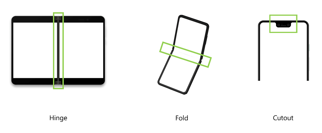
Display features are parts of the display that create a visual distortion and can create a logical separation in the screen space. Our focus is on the hinge of the Surface Duo, but that is not the only type of display feature that Flutter knows about. The folding area on the Surface Galaxy Fold and the notch or cutout on many smartphones are also display features.
For developers that work with both Android and Flutter, it is worth noting that Flutter display features are a bit different from Android display features. In Android, cutouts and display features are different concepts. Since Flutter works at a higher level, unifying the two concepts under one API was important.
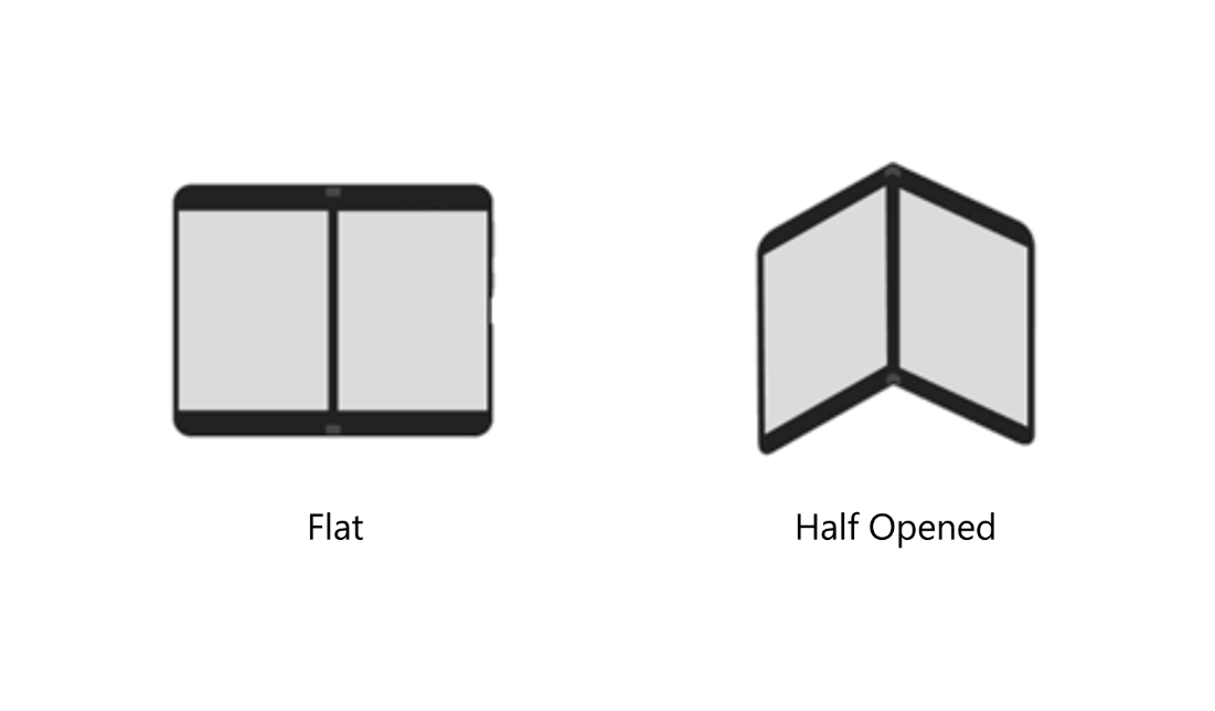
Until now, screens rarely made a shape other than a 2D plane. When a screen has a hinge or fold display feature, it can change shape. These shapes are called postures. When it looks like a book or laptop, the posture is half-opened. When the screen is continuous, the posture is flat.
Now that we went through the types of display features and what properties they might have, there is enough context for me to show you the structure that the DisplayFeature class has:
class DisplayFeature {
  final Rect bounds;
  final DisplayFeatureType type;
  final DisplayFeatureState state;
}
The bounds represent the location and size of the display feature on the screen. The type and state are direct representations of the images above.
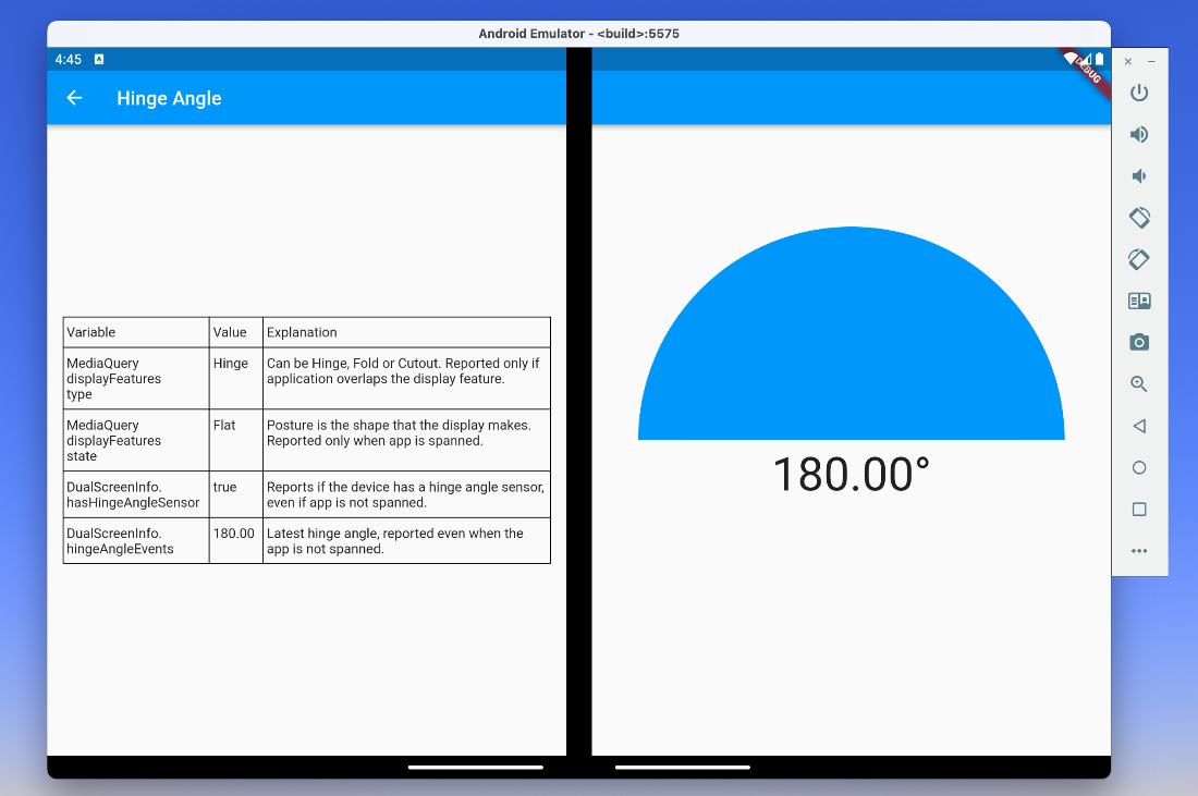
MediaQuery has a new property
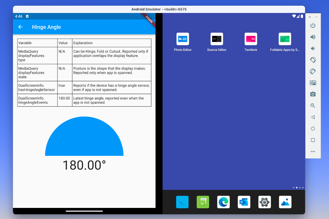
The way you access information about display features is through MediaQuery.of(context).displayFeatures. This is a new property, and it is a list. It is empty for devices that do not have any display features. For the Surface Duo, you can expect this list to have one item when your app is spanned across both screens and be empty when your app is in single-screen mode.
The app behavior should be the same in single-screen mode as on a candy bar smartphone. Therefore, no display feature is reported. Another way of thinking about it is that only display features that overlap your rendering area are reported.
On foldable devices that also have a cutout, you can expect the list to have two display features, one for the folding area and one for the cutout. If you rely on display features in many parts of your codebase, we recommend creating higher-level functions or widgets that help you with your specific enhancements. For example, checking the list to see if there is a hinge on the device could look like this and can be accessed through MediaQuery.of(context).hinge:
/// Extension method that helps with working with the hinge specifically.
extension MediaQueryHinge on MediaQueryData {
  DisplayFeature? get hinge {
    for (final DisplayFeature e in displayFeatures) {
      if (e.type == DisplayFeatureType.hinge)
        return e;
    }
    return null;
  }
}
Batteries included
Some things simply work without you needing to do anything. For example, dialogs and popups were made aware of existing display features. They avoid overlapping them.
Dialogs, for instance, typically show in the middle of the screen. This would not be good when your app is spanned, since the dialog would overlap the hinge. To fix this, the default behavior for dialogs now is to show on the first screen. The default behavior depends on Directionality and puts the dialog on the left for left-to-right layouts or on the right on right-to-left layouts.
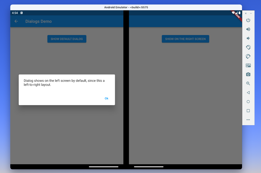
You have control over this behavior if you want to do something different. If you need finer control over this, you can use the anchorPoint parameter. This is like a target on your display. The screen containing the target is the screen that renders the dialog. The anchorPoint parameter is newly added to showDialog and similar methods and is optional. What we think is particularly cool about this parameter is that you can easily show the dialog on the same screen that the user last interacted with. For example, you can create a helper widget or method that gives you the location on the screen of the button that led to showing the dialog.
showDialog(
  context: context,
  anchorPoint: Offset(1000, 1000), // New and optional parameter.
  builder: …,
);
If instead of using showDialog, you use custom popup routes and the navigator directly for rendering dialogs, you should wrap your routes with DisplayFeatureSubScreen. Without doing this, your dialogs will overlap the hinge.
class _MyRoute<T> extends PopupRoute<T> {
  @override
  Widget buildPage(...) {
    return DisplayFeatureSubScreen(
      child: ..., // previous content of buildPage
      anchorPoint: ..., // optional
    );
  }
}
Popup menus just work
Popup menus, such as those in the following image, are also now aware of display features and avoid overlapping them. There is no change that you need to make since these contributions were made to showMenu, which is then used by PopupMenuButton.
What happened to TwoPane
Since other parts of the framework did not depend on TwoPane we were able to make it part of the dual_screen package. This way, we can iterate on it quicker and be a bit more opinionated on how it behaves. We have another blog article planned for diving into details about TwoPane and what else you can find in the dual_screen package. Stay tuned for more (a good reason to follow us) and in the meantime, you can read the package description.
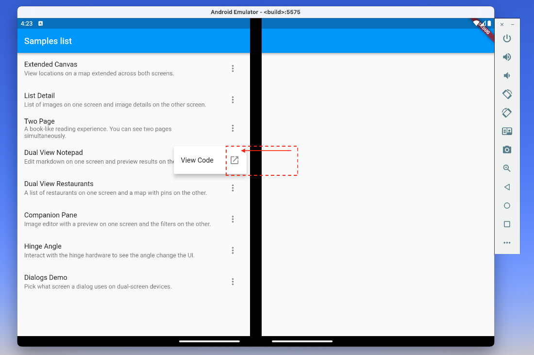
Samples used in this article
To give the new features a try you can quickly clone our Flutter foldable samples and simply run the app. All the screenshots in this article are of our sample apps running in the Surface Duo Emulator. We recommend our Surface Duo emulator as a target device since it simulates the hinge display feature. Use the foldable devices available in Android Studio to simulate a fold display feature.
Call to action
-
If you are on the
stableflutter channel, runflutter upgrade. - Download the Surface Duo emulator.
- Clone the Flutter foldable samples and run it.
- If you have any questions or would like to tell us about your apps, use the feedback forum or message us on Twitter @surfaceduodev.
- Finally, please join us for the dual screen developer livestream this Friday at 13h00 Central European Time and replay at 11am (Pacific time) – mark it in your calendar! You can also check out the archives on YouTube.
0 comments