Hello Jetpack Compose developers,
Last week, we did some Compose animation work to build a typing indicator in a chat app. For our next blog series, I’ll be diving into more animation topics with a project inspired by Nicole Terc’s Composable Sheep talk from droidcon NYC. Her composable sheep talk series inspired me to work on my own colorful and playful animated garden project while learning Compose Multiplatform!
Inspiration
For those of you who haven’t had a chance yet, I’d highly recommend watching the original Compose Sheep talk. There’s also a Composable Sheep sequel from droidcon London, where Nicole and Tasha partner up to show us some even cooler animation (and mathematical) concepts.
I used the sample repositories from these talks as reference for my own investigations:
- nicole-terc/composable-sheep (github.com)
- drinkthestars/composable-sheep-sketches: Funky composable sheep 😎 🐏 (github.com)
Like the original sheep project, we’ll be using the Compose Graphics libraries (ex: Canvas, DrawScope…) and animation APIs to draw our projects frame by frame. All of the code covered today can be referenced in the Animated garden part 1 PR.
Draw a flower
In order to start growing my garden, the first step was to figure out how to draw a flower. In DrawScope, you have access to many different functions for drawing text, shapes, and images.
To build a basic flower, we need two basic parts: the petals and the center of the flower. To draw these, we’ll use the DrawScope methods drawOval and drawCircle.
After some experimentation, I found the ideal sizes and colors for the first flower in my garden – a sunflower 🌻! The code to draw this flower is simple:
  private val Brown = Color(0xFF742C0D)
  private val Yellow = Color(0xFFF8D314)

  @Composable
  fun Sunflower() {
      Canvas(Modifier.size(100.dp)) {
        drawSunflower()
      }
  }

  fun DrawScope.drawSunflower() {
      drawPetals()
      drawCenter()
  }

  fun DrawScope.drawCenter() {
      val radius = 20f

      drawCircle(color = Brown, radius = radius, center = center)
  }
  fun DrawScope.drawPetals() {
      val numPetals = 8
      var angle = 0f
      val size = Size(width = 30f, height = 75f)

      repeat(numPetals) {
        rotate(angle) {
            drawOval(
                  color = Yellow,
                  topLeft = Offset(center.x - size.width / 2, center.y),
                  size = size
              )
          }
        angle += 360 / numPetals
      }

  }
Some subtle but important details from the code snippet:
-
When using
Canvas, you must provide a size modifier, otherwise it will default to zero and your drawings will not be shown - Order matters in drawing operations – since we want the center shown above the petals, we have to make sure to draw it last
-
In
DrawScope, you gain access to fields likecenterandsizethat are really helpful for making calculations
No respectable garden has only one flower, so of course we have to add some code to grow the garden:
  @Composable
  fun MyGarden() {
      LazyVerticalGrid(
          modifier = Modifier.fillMaxSize(),
          columns = GridCells.Adaptive(100.dp)
      ) {
        items(8) {
            Sunflower()
          }
      }
  }
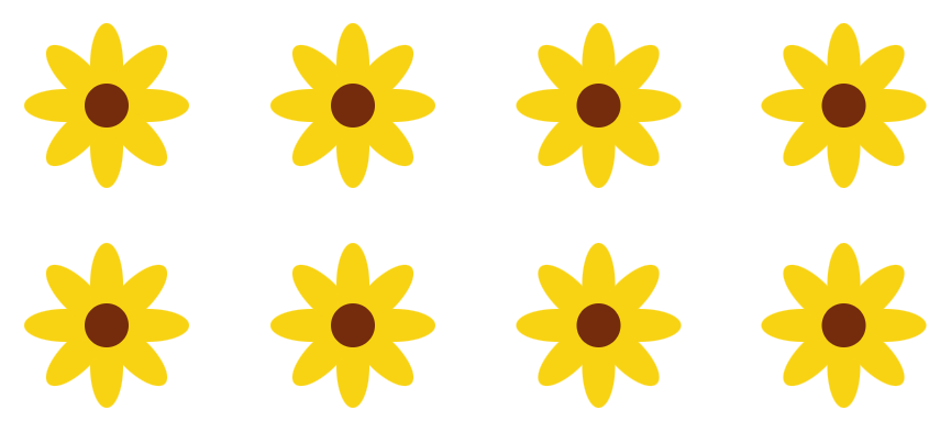
And with that, we have a nice basic garden full of sunflowers 😊

Add an animation canvas
The next step to beautifying our garden is adding some animations. To set up our animations, the first thing we need to do is copy over a simplified version of the Sketch composable from the composable-sheep-sketches repo:
  @Composable
  fun Sketch(
      modifier: Modifier = Modifier,
      targetValue: Float,
      animationSpec: AnimationSpec<Float>,
      onDraw: DrawScope.(Float) -> Unit
  ) {
      val animationState = remember { AnimationState(0f) }

    LaunchedEffect(targetValue) {
        while (isActive) {
              animationState.animateTo(
                  targetValue = targetValue,
                  animationSpec = animationSpec,
                  sequentialAnimation = true
              )
          }
      }
    Canvas(modifier = modifier) {
        onDraw(animationState.value)
      }

  }
This will allow us to draw our animations frame by frame. Now, instead of wrapping our drawings with Canvas, we’ll use Sketch, and in the onDraw method you can see that you’ll have access to the animationState value. The targetValue and animationSpec parameters will allow you to customize the speed and style of animation, as you will see in later examples.
Build a basic animation
Now that we have the animation canvas set up with the Sketch composable, we can start to build some fun animations for our garden.
In all basic animations, we’re essentially choosing one property to change over time. Once you’ve decided on a property, you can figure out what values you want to animate in between, how quickly the value should change, if the animation should repeat, etc.
For our first basic flower animation, we’ll be trying to animate the size of the flowers. To do that, we’ll have to:
- Update the flower drawing logic
-
Connect the
drawSunflowermethod to the animation canvas
Update drawing logic
To change how big the flowers are drawn, we’ll have to change the code in two places:
-
The
radiusparameter when we calldrawCirclefor the center of the flower -
The
sizeparameter when we calldrawOvalfor the petals of the flower
To ensure that the center and petals grow at the same rate, we can describe the size as a percentage instead of a specific value. This way, we won’t need to keep track of two different size values and we can easily create an animation state that varies between 0f and 1f.
I like the size of the basic sunflowers from the previous section, so let’s say we want to animate between zero up to the hardcoded sizes from earlier. To achieve that, the updated drawSunflower method would look like this:
  fun DrawScope.drawSunflower(sizePct: Float) {
      drawPetals(sizePct)
      drawCenter(sizePct)
  }

  fun DrawScope.drawCenter(sizePct: Float) {
      val radius = 20f * sizePct

      drawCircle(color = Brown, radius = radius, center = center)
  }

  fun DrawScope.drawPetals(sizePct: Float) {
      val numPetals = 8
      var angle = 0f
      val size = Size(width = 30f, height = 75f) * sizePct

      repeat(numPetals) {
        rotate(angle) {
            drawOval(
                  color = Yellow,
                  topLeft = Offset(center.x - size.width / 2, center.y),
                  size = size
              )
          }
        angle += 360 / numPetals
      }
  }
You can see the only differences are that we now have the sizePct float parameter, which will be our animation state that changes between 0f and 1f, and that we multiply the radius and size values by this percentage.
Connect to animation canvas
The last step is to animate our sunflowers is to call drawSunflower inside our new Sketch animation canvas and pass along the animation state.
Let’s take a look at the Sketch composable’s parameters:
  @Composable
  fun Sketch(
      modifier: Modifier = Modifier,
      targetValue: Float,
      animationSpec: AnimationSpec<Float>,
      onDraw: DrawScope.(Float) -> Unit
  )
We have some typical composable parameters, including a modifier and a content parameter (onDraw) with the DrawScope receiver and Float parameter that will give us access to the animation state.
The targetValue parameter controls the end value of the animation state (the start value is always 0f in our examples). For our sizePct animation state, we want the animation state to vary between 0f and 1f, so we’ll set targetValue to 1f.
The animationSpec parameter lets you customize animation behavior, such as how quickly the animation state changes over time, if it repeats, etc. You can read more about the different options in the Customize animations documentation, but for our purposes, we’ll be using infiniteRepeatable to infinitely loop our animation and tween to describe our animation behavior.
Both functions accept three parameters:
  @Stable
  fun <T> infiniteRepeatable(
      animation: DurationBasedAnimationSpec<T>,
      repeatMode: RepeatMode = RepeatMode.Restart,
      initialStartOffset: StartOffset = StartOffset(0)
  ): InfiniteRepeatableSpec<T>

  @Stable
  fun <T> tween(
      durationMillis: Int = DefaultDurationMillis,
      delayMillis: Int = 0,
      easing: Easing = FastOutSlowInEasing

  ): TweenSpec<T>
Let’s try calling these functions with their default behavior and see what the flower animation looks like:
  @Composable
  fun AnimatedSizeSunflower() {
      Sketch(
          modifier = Modifier.size(100.dp),
          targetValue = 1f,
          animationSpec = infiniteRepeatable(animation = tween())
      ) { sizePct ->
        drawSunflower(sizePct = sizePct)
      }
  }

Not bad! However, I have a few tweaks I want to make:
-
Slow down the animation
To do this, we’ll update the
tweencall with a longerdurationMillisvalue. -
Have the flower shrink as well as grow
We can update the
infiniteRepeatablecall by setting therepeatModetoRepeatMode.Reverse. That way, the flower will grow, then shrink, instead of restarting the growing animation each time. -
Add a pause in between growing and shrinking
We can also address this by updating the
tweencall, this time by setting thedelayMillisparameter to a non-zero value. This will add a delay before the animation starts. -
Change the rate at which the flower grows and shrinks
For this, we’ll investigate different values for the
easingparameter in thetweencall. There are many easing options available for use, and you can experiment with them (and read up on Material Design) to find out which one works best for your use case.
After some experimentation, I settled on the following values for our animation spec:
  @Composable
  fun AnimatedSizeSunflower() {
      Sketch(
          modifier = Modifier.size(100.dp),
          targetValue = 1f,
          animationSpec = infiniteRepeatable(
              animation = tween(durationMillis = 800, delayMillis = 50, easing = LinearOutSlowInEasing),
              repeatMode = RepeatMode.Reverse
        )
      ) { sizePct ->
        drawSunflower(sizePct = sizePct)
      }
  }
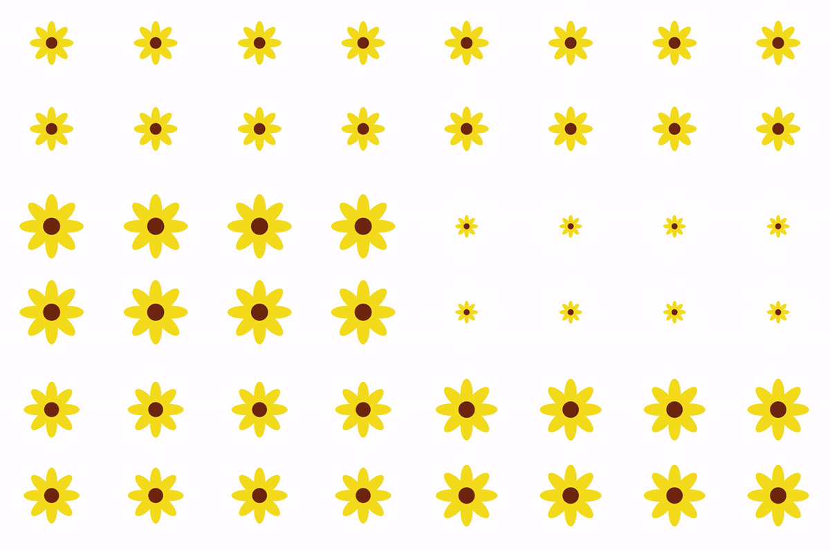
Take a look at the garden now:

So now, you know more about graphics in Compose, creating a frame-by-frame animation canvas, and building basic animations! Next week, we’ll dive into animating more flower properties (hint: 🌈) to make our garden even cooler 😎
Resources and feedback
The content covered today is part of PR #1 in the animated-garden repo.
To learn more about Jetpack Compose animations and creative coding, check out these resources:
- nicole-terc/composable-sheep (github.com)
- drinkthestars/composable-sheep-sketches: Funky composable sheep 😎 🐏 (github.com)
- Composable Sheep – A Compose Animations Journey
- Composable Sheep – The Creative Coding Epilogue
- Graphics in Jetpack Compose
- Animations in Jetpack Compose
- Customize animations in Jetpack Compose
If you have any questions, use the feedback forum or message us on Twitter @surfaceduodev.
We won’t be livestreaming this week, but you can check out the archives on YouTube.


0 comments