
In the previous post, we discussed a brief intro into Windows Performance Analyzer (WPA) and its feature set. WPA can display trace data in a wide array of formats, most of which are pre-configured as presets designed for drilling into specific data points.
Here is one for example: WPA’s CPU Usage (Sampled) table has a few different presets, each reconfigures the view of both table and graph data.

This blog post is the first of a multi-part series that goes into detail on how to configure the table and graph views to create your own presets:
- Configuring column options for tables (Aggregation/Format/Sort/Text Alignment) – Part 1
- Configuring columns for graphing (Line/Bar/Gantt) – Part 2
- Quick saving presets and profiles – Part 3
Column Options
Depending on the column’s data type, WPA can configure each column with one or more of the following options:
- Aggregation
- Sort
- Format
Each set of options can be configured by either right clicking on the column header, or visiting the View Editor. Let’s dig into what each one of these options mean and the different ways to configure them.
Aggregation
When combined with the Pivot (Gold) Bar, can be powerful tool in understanding large data sets at a glance. WPA will calculate the selected aggregation of all individual rows inside the pivot group on the fly as you expand/collapse, filter row data, and adjust the timeline zoom.
- Average (Avg)
- Count
- Max
- Min
- Sum
- Unique Count
- Weighted Average (Weighted Avg)
As an example: open a trace captured with WPR’s General Profile and expand ‘System Activity’ and “double click” the Process Table in the ‘Graph Explorer‘. In the below table screenshot has aggregations applied to three different columns: Duration [Sum], Start Time [Min], and End Time [Max]. For each pivot/group to the left of the gold bar, the rows are calculated based on the aggregation selected. In the below table screenshot, ‘Transient’ is expanded to show the aggregated values for each sub group.
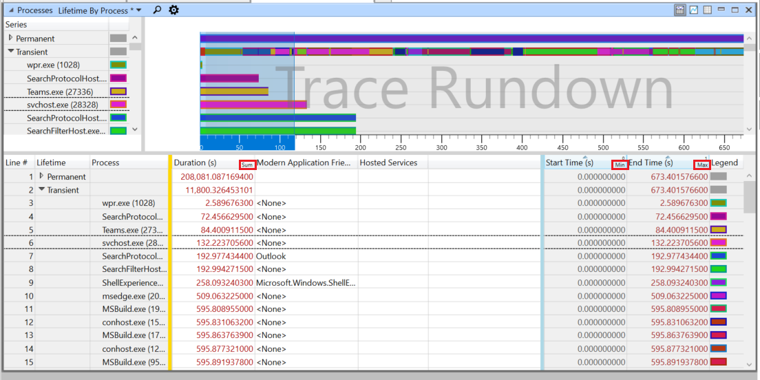
Each column can be configured with a different aggregation, which is especially useful for views that incorporate CPU, Memory, and Disk usage. The best way to get a feel for the power of aggregations is to open a table and play around with changing column aggregation modes and expanding/collapsing pivot groups. So before continuing, I encourage you to jump in and try things out!
Sort
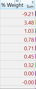
Columns in tables can be quickly sorted by clicking the column header. If you would like to sort the data based on it’s absolute value, simply hold CTRL key while clicking while clicking the column header to toggle.
| Ascending | Descending | Ascending (Absolute) | Descending (Absolute) |
 |
 |
 |
 |
Format
Column formats can hep present data in easier-to-read ways by doing things like changing the number of decimals in a floating point number, the time unites of time-based data, and the base (hex? decimal? go crazy) of a integer data point.
Supported Formats:
| Time | Nanoseconds
Microseconds Milliseconds Seconds |
| Numeric | Decimal
Hexadecimal |
| Floating Point (%) | Decimal Places (group/non group) |
| Size (Bytes) | Bytes
Kilobytes Megabytes Gigabytes |
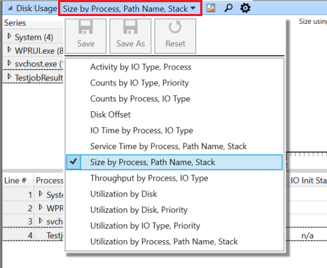
As an example, open a trace captured with WPR’s General Profile and expand ‘Storage’ and “double click” Disk Usage in the ‘Graph Explorer‘. Switch to the ‘Size by Process, Path Name, Stack’ preset by clicking the drop down in the table’s title bar:
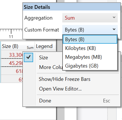
The Size column is displayed as Bytes by default. By right clicking on the column header, the format can be configured:
Conclusion
I hope this post give quick overview on how to configure columns to ease analysis in WPA. If you want to learn more, there are many more scenarios we did not cover that can be found at Microsoft Docs.
Keep a look out for Part 2 of this series where we dig into configuring the table columns for different graphing techniques!
How can I graph my own Start/Stop events (which, for instance, give me DURATION_MSEC in PerfView) in a time line graph? Is that possible?