

If you do a search online for WPA, you might find information for protecting your Wi-Fi, but that is a different type of WPA.
In the performance & diagnostics space WPA stands for Windows Performance Analyzer, a friendly but intricate UI that allows for developers and analyst to deep dive into performance traces captured on Windows (and beyond…but more on that in a future post 😊). Its great for discovering why CPU utilization is high? How much memory is being used in the system per process? Why does WPA itself use so much memory?
WPA has siblings that help record traces on Windows, Windows Performance Recorder (aka WPR) and XPerf. All these tools are available in the Windows Performance Toolkit (WPT), can be fetched directly from the Windows Software Development Kit or Windows Assessment and Deployment Kit. If you would just like to use WPA and your running on Windows 10, you can fetch it directly from the Microsoft Store.
Since the paragraph above just listed a bunch of acronyms, might be good to have a cheat sheet:
- WPR – Windows Performance Recorder Command-line application
- WPA – Windows Performance Analyzer
- WPT – Windows Performance Toolkit
- SDK – Software Development Kit
- ADK – Assessments and Deployment Kit
We hope that this blog and future posts help engineers, analyst, or anyone interested in performance/diagnostic data understand how to better understand our tooling platform
- Software engineer who wants to diagnose his/her apps or drivers.
- Program manager who wants to profile performance of apps or drivers.
- Testers who wants to measure performance of apps or drivers.
- Someone who likes to poke around new tools.
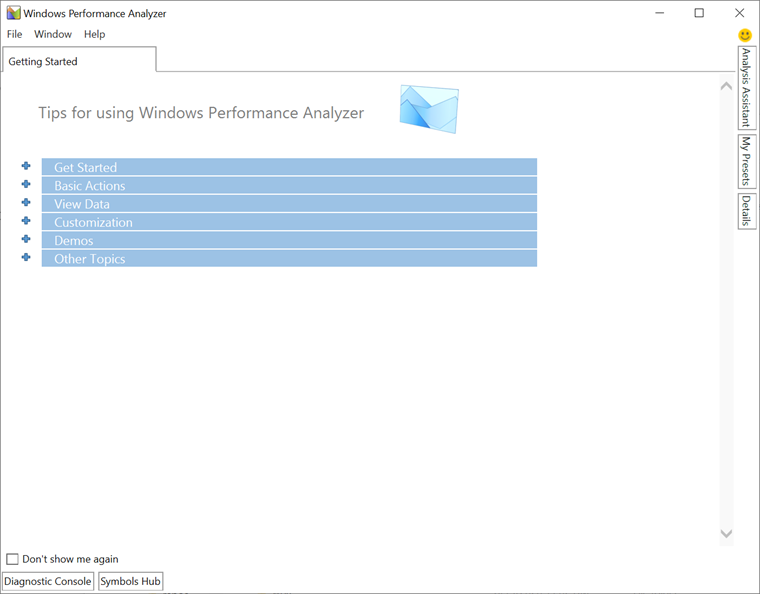
Getting Started
Before we get started using WPA, you may want to check out the WPR Intro blog post.
WPA by default creates a “Getting Started” tab. Here you can learn about basics such as how to drag and drop graphs, configure presets, etc. We will cover some of these concepts in this intro.
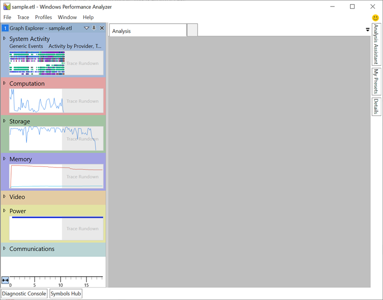
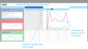
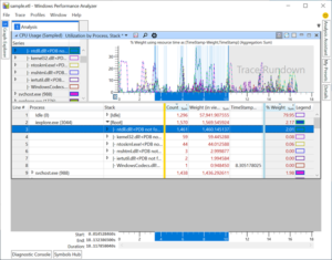
Let’s go ahead and load up a trace by going to File -> Open, WPA will then process the trace and display the available tables in the ‘Graph Explorer’. The ‘Graph Explorer’ consists of a few different categories, each category contains a Key Performance Indicator (KPI) which represents the type of graph and table data that is available.
By dragging and dropping a graph to the analysis view, we can get a more detailed view of the table data. Multiple graphs can be dropped into an analysis view, the timelines will be sync between them. By default, each dropped item will be in Graph and Table mode, where Graphs represent the primary way to visualize and tables detail the recorded data in a tabular form.
Graphs can have many different configuration modes depending on the table configuration:
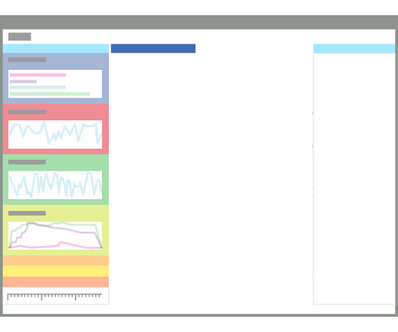
The data table is divided in a three areas: keys (grouping), data, and graphing:
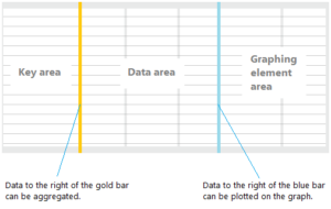
Keys (Grouping)
The Keys area represents how we aggregate/group the data, when multiple rows have the same value for a column, we will group the data together. Multiple columns can be dropped (or configured via the View Editor) to the left the gold bar.
To learn more about the ‘Gold’ bar and aggregating, please see: MSDN WPA – Key Area
Data
The data section between the Gold and Blue bar represents the aggregated value (if enabled on the column), or the row values if the group is expanded.
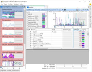
For example, using the ‘CPU Usage (Sampled)’ table, we can see the data columns:
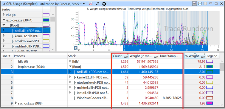
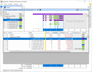
Also, notice how the graph will highlight the areas when selecting a row in the table are in sync, data shown in the table will be what is graphed.
Aggregation
We briefly mentioned aggregation previously, each column can be configured for aggregation. In the previous image, notice ‘Count’, ‘Weight (in view)’, and ‘% Weight’ are configured with ‘Sum’ aggregation.
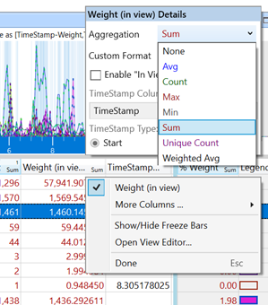
To change aggregation, simply right click on the column header:
Graphing
Based on the configuration of the table, the graph will dynamically change. For example, using the CPU Usge (Sampled) graph/table, we can change the graphing column from ‘% Weight’ to ‘TimeStamp’ by dragging and dropping. Doing this will change the graph mode to ‘Gantt’, where each diamond represents the time the CPU sample occurred.
 ⇒
⇒
To learn more about graph configurations, please see: MSDN WPA – Graphing
Time Selection, Highlighting, & Zoom
WPA offers the ability to select time ranges and perform zoom operations. When selecting, the corresponding table data will also be selected.
Once an area has been selected (either by the graph or table), right clicking on the graph will give an option to Zoom into the specified time viewport.
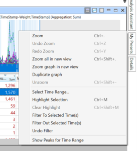
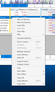
Or, right clicking on the table will allow for filtering (and other operations) on the data.
Closing
We touched on a few basics today, but will be continuing the series focusing on different areas such as View Editor, Presets, Graph configurations, and beyond.
Further reading:
0 comments