When you drill through many of the charts from the Application Insights overview page, you get to a detailed view that we call Metrics Explorer (ME), which is the focus of this series of blog posts. In each post of this series, I’ll cover a different set of metrics, explaining what they represent and how to instrument your code to capture them.
We have a number of blogs already on getting started with Application Insights, so I did not want to repeat it here, but I strongly encourage you to go through these videos and documentation on getting started:
- Getting started with Application Insights
- Application Insights – Start monitoring your app’s health and usage
Setting up client performance metrics
How long does it take to load your web page, and which parts of the process take the most time? If you’re wondering which pages are slow to load and why, look at the client performance metrics.
These metrics are measured in your web page, and you have to add a snippet of JavaScript to each page, or to a master page. There are detailed instructions in this video and in this help page. But if you added Application Insights when you created a new web app project, it will already be set up for you.
As soon as you run your application either locally (clicking F5) or on the server after publishing the website, you should start seeing data almost immediately in your application’s overview page in the Azure portal.
Drill through from Overview
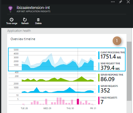
The Application Health section on the overview page is a lens into your application’s health as we have defined it by the set of metrics related to performance, load and failures.
The top section (1) shows key indicators of the client-side performance.

Click it to get to the detailed performance blade. This blade is a Metrics Explorer view that we’ve initialized with a relevant set of charts.
What’s in Metrics Explorer?
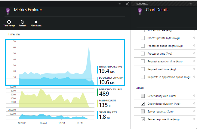
The layout of Metrics Explorer is always the same, although the content of the parts depends on how you got there.
The top chart (2) in Metrics Explorer is always the bigger version of the chart that you clicked through from Overview page.
**Subsidiary charts **(3) of related metrics. With the client performance overview, we’ve chosen to show server response times, browser exceptions and page views. I would certainly love to get feedback on what set of metrics you would like to see here.
Grids (4). In this case, the first grid shows you average browser page load time by base URL. We also give you the count of the hits for the page. The second grid gives you the browser exceptions by file name.
As you play around with the ME and drill through I would love to get feedback as to what type of information in the drill through would be more useful: what charts/metrics and what kind of grids.
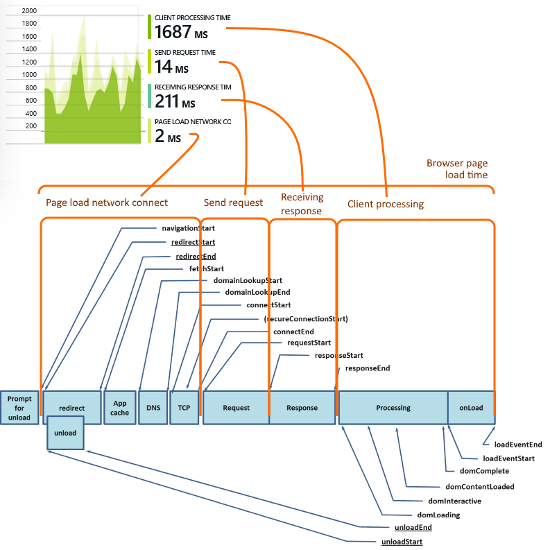
What do the client timing metrics mean?
It is a stacked chart which breaks the total page load time into the standard navigation timing steps defined by W3C.

Customizing a chart
Select it and you’ll see the list of standard metrics that you can choose from. (The grids and segmented charts, like the client performance metrics chart, are currently read only, but will be editable in the next release.)
You can customize the type chart i.e. (Line, Area or Bar), or select additional metrics you want to chart. In future, you’ll be able to add charts, segment charts and much more.
How are metrics categorized?
Client: Metrics that reflect the performance measured in the client browser, for example browser page load time.
Failures: Exceptions at server or browser: failed requests or failures in calls made to external dependencies.
Performance counters: System performance counters like process CPU, processor time.
Server: Performance or load measured at the server such as server response time, or the time spent in external dependencies.
Usage: Reflecting how the users make use of the application, such as sessions and page views.
Each metric appears with its default aggregation in parenthesis. For example, the default aggregation for Server response time is average. In future you’ll be able to select other aggregations like min/max or percentiles.
Why are some of the metrics greyed out?
Good question. Only metrics that have the same scale and aggregation types can appear on the same chart. As soon as you select one metric, the others with different aggregation types and scales are disabled. So if you want to enable all the metrics, deselect them all. Again I would love to get your feedback on this whether this is helpful or not.


0 comments