
Since we started down the path of building an online service a couple of years ago, I have learned a lot. One of the things I’ve learned a lot about is measuring the health of a service. I don’t pretend to have the only solution to the problem so I’m happy to have anyone with a differing opinion chime in.
For the purpose of this post, I’m defining the “quality of a service” as the degree to which it is available and responsive.
The problem
The “traditional way” of tackling this problem is what’s called “synthetic transactions”. In this approach, you create a “test agent” that is going to make some request to your service over and over again every N minutes. A failed response indicates a problem and that time window is marked as “failing”. You then take the number of failed intervals and divide by the total number of intervals in a trailing window, let’s say 30 days, for instance, and that becomes your availability metric.
So what’s wrong with this? Let me start with a story…
When we first launched Team Foundation Service, we had a lot of problems with SQL Azure. We were one of the first high scale, interactive services to go live on SQL Azure and, in the process, discovered quite a lot of issues (it’s much better now, in case you are wondering). But, 3 or 4 months after we launched the service, I was in Redmond and was paying a visit to a couple of the leaders of the SQL Azure team to talk about how the SQL Azure issues were killing us and I needed to understand their plan for addressing the issues quickly.
As I walked through the central hallway on their floor, I noticed they had a service dashboard rotating through a set of screens displaying data about the live service. As and aside, this is a pretty common practice (we do it too). It’s a good way to emphasize to the team that in a service business, “live-site” is the most important thing. I stopped for a few minutes to just watch the screens scroll by and see what it said about their service. Everything was green. In fact, looking at the dashboard, you’d have no clue there were any problems – availability was good, performance was good, etc, etc. As a user of the service, I can assure you, there was nothing green about it. I was pretty upset and it made for a colorful beginning to the meeting I was headed for.
Again, before everyone goes and says “Brian said, SQL Azure sucks”. What I said is 2 years ago it had some significant reliability issues for us 🙂 . While it’s not perfect now, it works well and I can honestly say that I’m not sure we could run our service easily without it. The high scale elastic database pool it provides is truly fantastic.
So how does this happen? How is it that the people who run the service can have a very different view on the health of the service than the people who use the service? Well, there are many answers but some of them have to do with how you measure and evaluate the health of a service.
Too often measurements of the health of a service don’t reflect the experience customers actually have. The “traditional” model that I described above can lead to this. When you run synthetic transactions, you generally have to run them against some subset of the service endpoints, against some subset of the data. Further, while it’s easy to exercise the “read” paths, the “write” paths are more tricky because you often don’t actually want to change the data. So to bring this home, in the early days of TFService, we set up something similar and had a few synthetic transactions that would login, ping a couple of web pages, read some work items, etc. That all happened in a test account that our service deliver team created (because, we couldn’t be messing with customer accounts, of course). Every customer of our system could, theoretically be down and our synthetic transactions could still be working fine.
That’s the fundamental problem with this approach in my humble opinion. Your synthetic transactions only exercise a small subset of the data (especially in an isolated multi-tenant system) and a small subset of the end-points, leaving lots of ways for missing the experience your customers are actually having.
Another mistake I’ve seen is evaluating the service in too much of an aggregate view. You might say 99% of my requests are successful and you might feel OK about that. If all those failures are clusters on a small number of customers, they will abandon you. And then the next set and so forth. So you can’t blur your eyes too much. You need to understand what is happening to individual customers.
A solution
OK, enough about the problem, let’s talk about our journey to a solution.
One of the big lessons I learned from the very beginning was that I wanted our primary measure of availability to be based on real customer experience rather than on synthetic transactions (we still use synthetic transactions, but more on that later). Fortunately, for years, TFS has had a capability that we call “Activity logging”. It records every request to the system, who made it, when it arrived, how long it took, whether or not it succeeded, etc. This has been incredibly valuable in understanding and diagnosing issues in TFS.
Another of the lessons I learned is that any measure of “availability”, if you want it to be a meaningful measure of customer experience needs to represent both reliability and performance. Just counting failed requests leaves a major gap. If your users have to wait too long, the system can be just as unusable as if it’s not responding at all.
Lastly, any measure of availability should reflect the overall system health and not just the health of a given component. You may feel good that a component is running well but if a user needs to interact with 3 components, to get anything done, only one of them has to have a problem to cause the user to fail.
Our first cut at an availability metric was to count requests in the availability log. The formula was availability = (total requests – failed requests – slow requests) / total requests. For a long time, this served us pretty well. It did a good job of reflecting the kinds of instability we were experiencing. It was based on real user experience and included both reliability and performance. We also did outside in monitoring with synthetic transactions, BTW, but that wasn’t our primary availability metric.
Over the past 6 months or so, we’ve found this measure increasingly diverging from what we believe the actual service experience to be. It’s been painting a rosier picture than reality. Why? There are a number of reasons. I believe the primary phenomenon is what I’ll call “modified behavior”. If you hit a failed request, for a number of reasons, you may not make any more requests. For instance, if you try to kick off a build and it fails, all the requests that the build would have caused never happen and never get the opportunity to fail. As a result, you undercount the total number of requests that would have failed if the user had actually been able to make progress. And, of course, if the system isn’t working, your users don’t just sit a beat their heads against the wall, they go get lunch. In this model, if no one is using the system, the availability is 100% (we’ll, OK, actually it’s undefined since the denominator is also 0, but you get the point) 🙂 .
We’ve been spending the last several months working on a new availability model. We’ve tried dozens and modeled them over all our data to see what we think appropriately reflects the “real user experience”. In the end, nothing else matters.
The data is still measuring the success and failure of real user requests as represented in the activity log. But the computation is very different. One additional constraint we tried to solve for was we wanted a measure that could be applied equally to either an individual customer to measure their experience or to the aggregate of all of our customers. This will ultimately be valuable when we do get into the business of needing to actually provide refunds for SLA violations.
First, like traditional monitoring, we’ve introduced a “time penalty” for every failure. That is to say, if we get a failure than we mark an entire time interval as failed. This is intended to address the “modified behavior” phenomenon I described above. It changes the numerator from a request count to a time period. We need to change the denominator to a time period as well to make the math work. We could have just used # of customer or users multiplied by # of intervals in a month but that really dampens the availability curve. Instead we wanted the denominator to reflect the number of people actually trying to use the service and the duration in which they tried. To do that, we defined an aggregation period. Any customer who uses the service in the aggregation period gets counted as part of the denominator. So, let’s look at the formula.
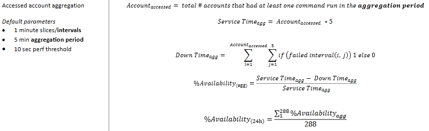
In English the process works like this:
For each customer who used the service in a 5 minute aggregation period, count the number of minutes they experienced a failure (failed request or slow request). Sum up all those 1 minute failing intervals across all customers that used the service. Subtract that from the number of customers who used the service in the 5 minute aggregation period multiplied by 5 minutes. That gives you the number of “successful customer minutes” in that 5 minute aggregation period. Divide that by the total customer minutes (number of customers who used the service in the 5 minute aggregation period multiplied by 5 minutes) and that gives you a % of customer success. Average that over all of the 5 minutes aggregation periods (288 in 24 hours) in the window to get a % availability.
We’re still tweaking the values for 1 min intervals, 5 min aggregation period, 10 sec perf threshold.
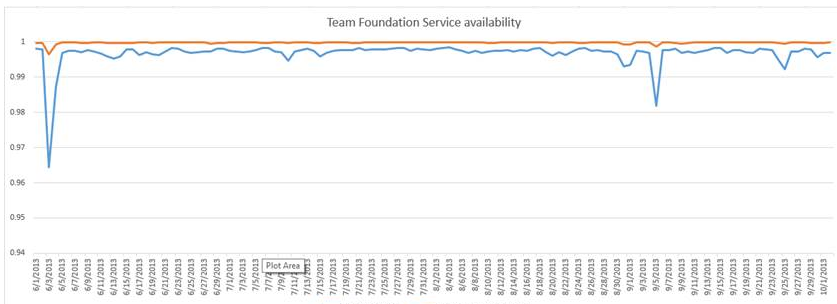
Of all the models we’ve tried, this model provides a result that is reasonably intuitive, reasonably reactive to real customer problems (without being hyperactive) and more closely matches the experience we believe our customers are actually seeing. It’s based on real customer experience, not synthetic ones and captures every single issue that any customer experiences in the system. To visualize the difference, look at the graph below. The orange line is the old availability model. The blue line is the results of the new one. What you are seeing is a graph of the 24 hour availability numbers. It will dampen a bit more when we turn it into a 30 day rolling average for SLA computation.
There’s a saying “There are lies, damn lies and statistics”. I can craft an availability model that will say anything I want. I can make it look really good or really bad. Neither of those are, of course, the goal. What you want is an availability number that tells you what your customers experience. You want it to be bad when your customers are unhappy and good when your customers are satisfied.
Is that all you need?
Overall, I find this model works very well but there’s still something missing. The problem is that no matter where you put your measurement, there can always be a failure in front of it. In our case, the activity log is collected when the request arrives at our service. It could fail in the IIS pipeline, in the Azure network, in the Azure load balancer, in the ISP, etc, etc. This is a place where we will use synthetic transactions because you are primarily just testing that a request can get through to your system. We use our Global Service Monitor service to place end points around the world and execute synthetic transactions every few minutes. We have some ideas for how we will integrate this numerically into our availability model but won’t probably do so for a few months (this is not one of our real problems at the moment).
When I first started into this space, the head of Azure operations said to me – outside in monitoring (what GSM, Keynote, Gomez, etc do) just measure the availability of the internet and “test in production” – running tests inside your own data center measures the health of your app. I thought it was insightful. I think you still need to do it but it’s important to think about the role it plays in your overall health assessment strategy.
A word about SLAs
I can’t leave, even this ridiculously long post, without a word about SLAs (Service Level Agreements). An SLA generally defines the minimum level of service that a customer can expect from you. The phenomenon I’ve seen happen in team after team is, once the SLA is defined, it becomes the goal. If we promise 99.9% availability in the SLA then the goal is 99.9% availability. My team and others have heard me rant about this far too many times, I suspect. The SLA is not the goal! The SLA is the worst you can possibly do before you have to give the customer their money back. The goal is 100% availability (or something close to that).
Of course all of these things are trade offs. How much work does it take to get the last 0.0001% availability and how many great new features could you be providing instead. So, I’ll never make my team do everything that is necessary to never have a single failure. But we’ll investigate every failure we learn of and understand what we could do about it to prevent it and evaluate the cost benefit, knowing the issue and the solution. Right now, I’m pushing for us to work towards 99.99% availability on a regular basis (that’s 4.32 minutes of unexpected downtime a month).
Sorry for the length. Hopefully it’s at least somewhat useful to someone out there 🙂 As always, comments are welcome.
Brian
Very helpful post! All of the image links are broken, however. Can that please be fixed? Thank you!