Today, we are shipping Xamarin.Forms 4.6 with a host of quality improvements, including several new feature previews. With more controls available “in the box” than ever before, it has never been easier to quickly build quality mobile apps.
Visual and Material Design
In 3.6, we introduced Visual. A simple API for quickly swapping out the default control renderers. To help you achieve a consistent look-and-feel between iOS, we also shipped the Material Design controls from Google to match the default Android experience.
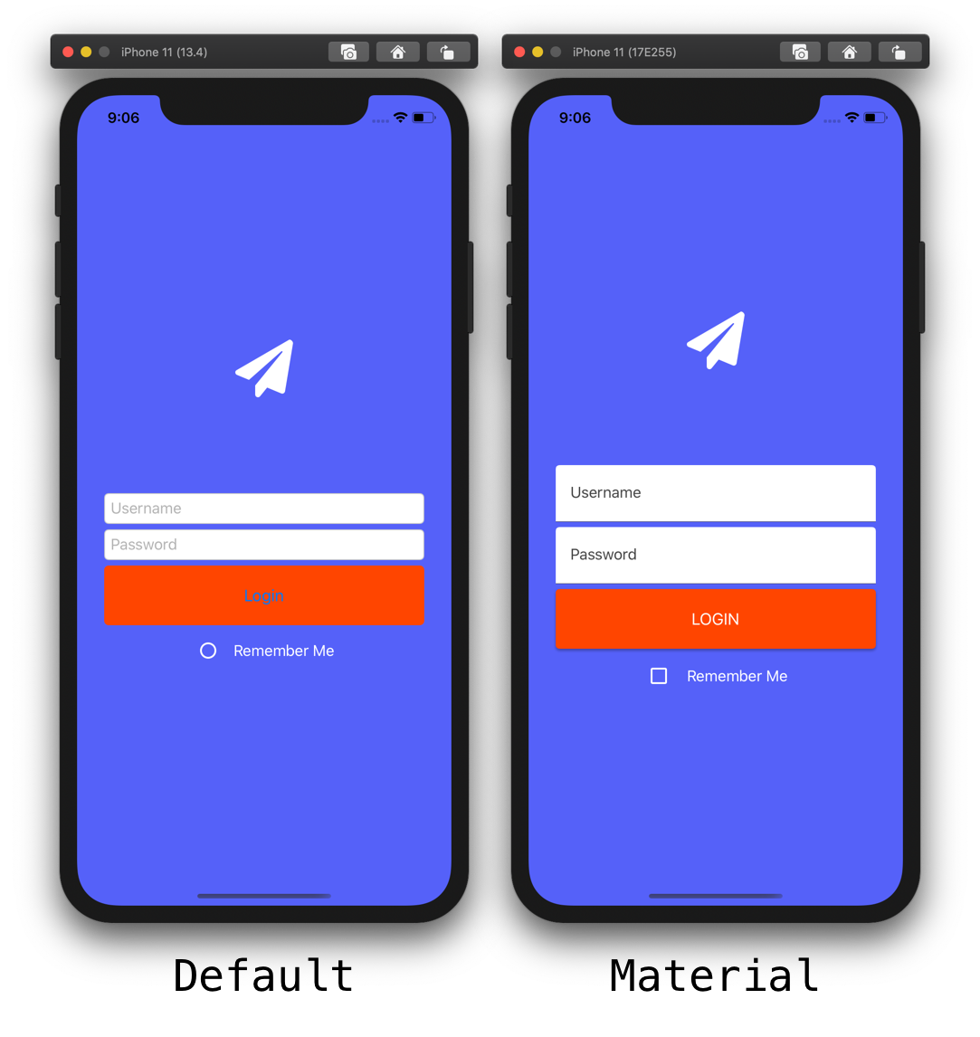
Now in 4.6, we are updating the bindings to Google’s library. We have improved the styling support for things like, setting a button’s ‘Disabled’ text color. The latest library also removes the reference to Apple’s deprecated UIWebView.
Shell Fly-out Styling
Shell vastly simplifies standing up your application menu structure. Whether using tabbed navigation or a Fly-out menu. To make styling easier, the fly-out item templates have exposed both style classes. As well as element names to implement your designs on the icon, text, and container.
| Flyout Item Part | Style Class Name | Element Name |
| Text | FlyoutItemLabelStyle | FlyoutItemLabel |
| Icon | FlyoutItemIconStyle | FlyoutItemIcon |
| Container | FlyoutItemLayoutStyle |
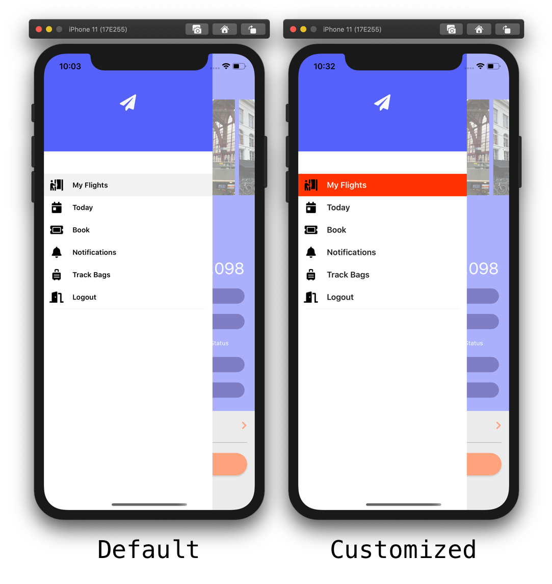
Take advantage of the VisualStateManager to style each state of the fly-out item template.
<Style
            TargetType="Layout"
            ApplyToDerivedTypes="True"
            Class="FlyoutItemLayoutStyle">
            <Setter
                Property="HeightRequest"
                Value="44" />
            <Setter
                TargetName="FlyoutItemLabel"
                Property="Label.FontSize"
                Value="16" />
            <Setter
                TargetName="FlyoutItemLabel"
                Property="Label.TextColor"
                Value="{StaticResource TextOnLightColor}" />
            <Setter
                TargetName="FlyoutItemLabel"
                Property="Label.HeightRequest"
                Value="44" />
            <Setter
                Property="VisualStateManager.VisualStateGroups">
                <VisualStateGroupList>
                    <VisualStateGroup
                        x:Name="CommonStates">
                        <VisualState
                            x:Name="Normal">
                            <VisualState.Setters>
                            </VisualState.Setters>
                        </VisualState>
                        <VisualState
                            x:Name="Selected">
                            <VisualState.Setters>
                                <Setter
                                    Property="BackgroundColor"
                                    Value="#FF3300" />
                                <Setter
                                    TargetName="FlyoutItemLabel"
                                    Property="Label.TextColor"
                                    Value="White" />
                            </VisualState.Setters>
                        </VisualState>
                    </VisualStateGroup>
                </VisualStateGroupList>
            </Setter>
        </Style>
Provide your own template design. Then combine that with these new capabilities for even more customization.
Navigating Back
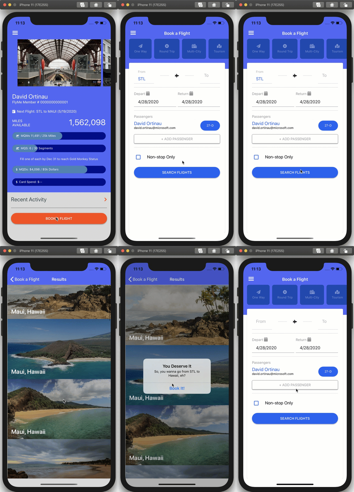
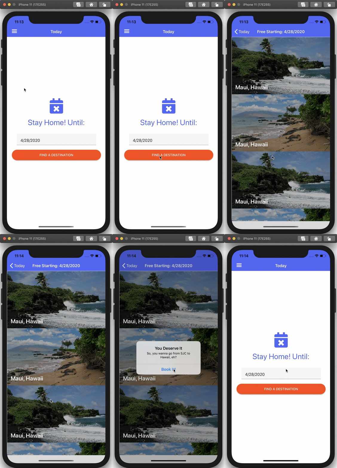
Often the native platform provides a back button to return to the previous page. However, in some cases (such as modal navigation), it is not clear what the previous route was. In Xamarin.Forms 4.6, use a simple shortcut to jump back to the last navigation state of your application. Do this by using the URI “..”. Consider the below flight results page that is opened from several places within the app:
 |
 |
public class TodayViewModel : BaseViewModel
{
    public Command FindLocationsCommand { get; set; }

    public DateTime HomeUntilDate { get; set; } = DateTime.Today;

    public TodayViewModel()
    {
        FindLocationsCommand = new Command(FindLocations);
    }

    private async void FindLocations()
    {
        await Shell.Current.GoToAsync($"results?start={HomeUntilDate.ToString("yyyyMMddHHmmss")}");
    }
}
In order to go back, provide your own close or cancel button that calls this navigation:
await Shell.Current.GoToAsync("..");
Just like that! The navigation rewinds a step to where you just were. All still using the same convenient URI navigation provided by Shell.
The Future: Preview Features
We are shipping fast and often to tighten the feedback loop with you. Also to make sure we are delivering the most impactful features. One way we do this is by shipping new features under an Experimental Flag. All while we are finalizing the API. This helps us to merge valuable community contributions faster, and then polish them within the product. To get started with these features, add the following flag(s) to your App.xaml.cs constructor:
Device.SetFlags(new[] {
    "RadioButton_Experimental",
    "AppTheme_Experimental",
    "Markup_Experimental",
    "Expander_Experimental"
} );
RadioButton
Thanks to the original work from Andrei Nitescu later completed by Gerald Versluis, we are introducing the new RadioButton control. As an experimental control, the work to finalize the API is ongoing. Although, you can start taking advantage of it today! To group radios together, just add a GroupName:
<StackLayout>
    <RadioButton GroupName="Size" Text="Small" />
    <RadioButton GroupName="Size" Text="Medium"/>
    <RadioButton GroupName="Size" Text="Large"/>
</StackLayout>
To retrieve the selected value, subscribe to the CheckedChanged event:
void RadioButton_CheckedChanged(object sender, EventArgs e)
{
    RadioButton rb = sender as RadioButton;
    if(rb.IsChecked)
        Debug.WriteLine($"You chose: {rb.GroupName} : {rb.Text}");
}
Expander
Andrei Misiukevich has contributed a container control that hides/reveals content, aptly named Expander. The API for this control follows the WPF predecessor and is easy to use:
<Expander FlexLayout.Basis="100%" Margin="0,0,0,10">
    <Expander.Header>
        <StackLayout Orientation="Horizontal" Margin="0,0,0,6">
        <Image Source="{StaticResource IconTodaySm}">

        </Image>
        <Label Text="Next Flight: STL to MAUI (5/19/2020)"
                TextColor="White"
                FontSize="14"/>
            </StackLayout>
    </Expander.Header>

    <Grid>
        <Grid.ColumnDefinitions>
            <ColumnDefinition Width="14"/>
            <ColumnDefinition Width="*"/>
        </Grid.ColumnDefinitions>

        <BoxView
            Grid.RowSpan="6"
            WidthRequest="4" BackgroundColor="White"
                    VerticalOptions="Fill"
                    HorizontalOptions="Center"/>
        <Label
            Grid.Row="0"
            Grid.Column="1"
            Text="11:20 AM - Depart STL"/>
        <Label
            Grid.Row="1"
            Grid.Column="1"
            Text="4:05 PM - Arrive SFO"/>
        <Label
            Grid.Row="2"
            Grid.Column="1"
            Text="4:45 PM - Depart SFO"/>
        <Label
            Grid.Row="3"
            Grid.Column="1"
            Text="10:30 PM - Arrive HNL"/>
        <Label
            Grid.Row="4"
            Grid.Column="1"
            Text="11:00 PM - Depart HNL"/>
        <Label
            Grid.Row="5"
            Grid.Column="1"
            Text="11:45 PM - Arrive OGG"/>
    </Grid>

</Expander>

C# UI Extensions
The popular CSharpForMarkup method extensions from Vincent Hoogendoorn are also now part of Xamarin.Forms 4.6. While XAML is much beloved, it is not for everyone. Certainly not the only way to write your UI. C# UI extensions enable you to write your UI using a fluent syntax. Couple this with a C# hot reload, such as LiveSharp, or Andrei Misiukevich’s Hot Reload, to have a very productive experience. Below is an example layout using a few of these new extensions, such as Rows.Define(), Row(), Center(), Margins(), and Bind():
public class BagTrackerPage : ContentPage
{
    Color BgClr = Color.FromHex("#FFFFFF");

    Style<Label> LabelStyle = new Style<Label>(
        (Label.TextColorProperty, Color.White)
    );
    private BagTrackerViewModel _vm;

    public BagTrackerPage() => Build();

    void Build()
    {
        BindingContext = _vm = new BagTrackerViewModel();

        Style<Frame> FrameStyle = new Style<Frame>(
            (Frame.HasShadowProperty, true),
            (Frame.BorderColorProperty, Color.FromHex("#333333"))

        );

        Style<Entry> EntryStyle = new Style<Entry>(
            (Entry.BackgroundColorProperty, Color.Transparent)
        );

        Resources = new ResourceDictionary();
        Resources.Add(LabelStyle);
        Resources.Add(FrameStyle);
        Resources.Add(EntryStyle);

        Title = "Track Your Bags";

        Content = new Grid()
        {
            RowDefinitions = Rows.Define(
                            (Row.Title, 44),
                            (Row.Content, Star),
                            (Row.Push, Star)
                        ),
            RowSpacing = 0,
            Padding = new Thickness(30),
            BackgroundColor = Color.White,
            Children = {
                new Label
                            {
                                Text = "Search by",
                                FontSize = 24,
                                TextColor = Color.FromHex("#333333")
                            }
                .Row(Row.Title),


                            new Frame
                            {
                                CornerRadius = 0,
                                Padding = 12,
                                Content = new StackLayout
                                {
                                    Spacing = 12,
                                    Children =
                                    {
                                        new Entry
                                        {
                                            Placeholder = "Bag Tag #"
                                        },
                                        new Entry
                                        {
                                            Placeholder = "File Reference #"
                                        },
                                        new Entry
                                        {
                                            Placeholder = "Last Name"
                                        },
                                        new Button
                                        {
                                            Text = "SEARCH",
                                            HeightRequest = 66,
                                            StyleClass = new string[] {"actionButton" },
                                            CornerRadius = 0,
                                            FontSize = 18
                                        }
                                        .Margins(top: 20)
                                        .Bind(nameof(_vm.SearchCommand))

                                    }
                                }
                            }.Row(Row.Content), // Frame
                            new Image
                            {
                                Source = new FontImageSource
                                {
                                    FontFamily = (OnPlatform<string>)Application.Current.Resources["FontAwesome"],
                                    Glyph = IconFont.Suitcase,
                                    Size = 88,
                                    Color = Color.LightGray
                                }
                            }
                            .Center()
                            .Row(Row.Push)


                }
        };
    } // Build

    enum Row { Title, Content, Push }
}
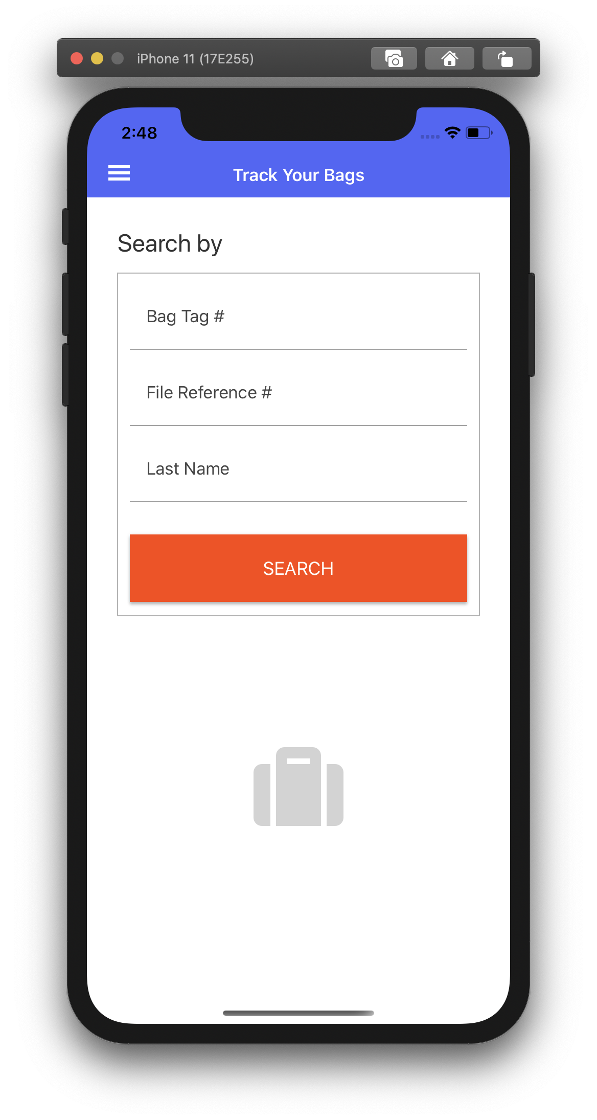
For more information, check out the complete documentation by Vincent.
Font Embedding
In 4.5, we introduced font embedding, adding fonts to your cross-platform applications. Now in 4.6, we have improved the implementation to handle fonts more consistently. Including added FontImageSource support. To get started, add a font to your library project as an embedded resource. Then, add an assembly tag reference (like below) to inform the compiler about the font. This can be done in the AssemblyInfo.cs, or in any used *.cs file.
[assembly: ExportFont("fa-solid-900.ttf")]
Reference the font by file name or static resource:
<OnPlatform x:Key="FontAwesome"
            Default="fa-solid-900.ttf"
            x:TypeArguments="x:String"/>

<FontImageSource x:Key="IconTabBook"
                FontFamily="{StaticResource FontAwesome}"
                Glyph="{x:Static local:IconFont.TicketAlt}"
                Size="{StaticResource SizeTabIcon}"
                Color="{StaticResource ColorTabIcon}" />
See It In Action
Watch James Montemagno on The Xamarin Show to see it in action!
Get Started Today
Update your projects from your favorite NuGet package manager today! Take advantage of this latest release. Share your projects and progress with us online.
Of course, we crave your feedback. Please open issues on GitHub for any additional enhancements or issues to discuss. For more information on this release check the resources below.


This is great stuff.
How can I update Visual Studio with the latest templates?
I know I can use the Nuget Package manager to update my solution, but I don’t want to have to do that every time. I want to replace the default Xamarin.Forms template in Visual Studio.
Thank you,
Mike
Just read this. Let me attach it to a project i am currently building
Above it states the UIWebView was dropped in this version. Wasn’t it dropped in 4.5?
It would be great if you guys can get Dark Mode solved in the next release. Just using a simple, default Entry control will end up not working in iOS DarkMode (it just looks like white on white text). Just a vote of encouragement to maybe start with the simple controls and use-cases and build outwards because that current Spec you have open for Dark Mode is massive. Thanks for continuing to provide a great library.
Yeh, the app themes are close and we are working through a few known issues. The key known issue today with AppThemeColor is runtime updating with XAML. Exiting and reloading your app should update throughout all controls, however I’ll certainly take your note and make sure we look at each control.
If you are blocked and need a complete solution today, I’ve implemented it using dynamic styles and platform hooks in a few apps:
* https://github.com/davidortinau/Xappy/tree/master/Xappy/Xappy/Styles
* https://github.com/davidortinau/ThemeGallery/tree/master/ThemeGallery/ThemeGallery/Styles
Font Embedding does not work on UWP.
Really? That’s sad. Seems like UWP is falling behind every time, behind iOS and Android Support.
well, it “sort of” works – people seem to have different results depending on the fonts they’re using, which means there’s something specific to the implementation that makes it not work with all fonts.
bonus points: see that sample project from David Ortinau where they show off these features? as it is, the UWP project doesn’t even run, and if you fix the code error that allows it to run, the embedded font does not work. not even on Xamarin’s own sample project to show the features.
Does setting “Experimental flags” mean that the controls cannot be used in a app thats going to be released in the AppStore soon ? Do I have to wait for these flags to be lifted ? I can’t seem to find the answer to this anywhere in all the documentation ..
@Srinath You can release apps using experimental features, I used FastRenderers in released apps for at least 6 months before they were finalised. But, you may find the interface changes during development (this happened for CollectionView IIRC) so you need to decide if having the new feature now is worth possibly having to rewrite the code in future. There may also be bugs in experimental features so extra testing is advisable.
@Srinath Experimentals because the development of those features is not yet completed. Nothing prohibits you from using them in Production Apps, you will only be advised that as experimental they could have not the expected behavior in some cases. That will depend on you if whether you feel comfortable with the current state of the development or nop.
Is it that the XF version you use in the master branch, after you published this nice article, has not been released yet? 🙂
Branch is updated. You can get nightly releases here https://github.com/xamarin/Xamarin.Forms/wiki/Nightly-Builds
It does work. Thanks a lot!