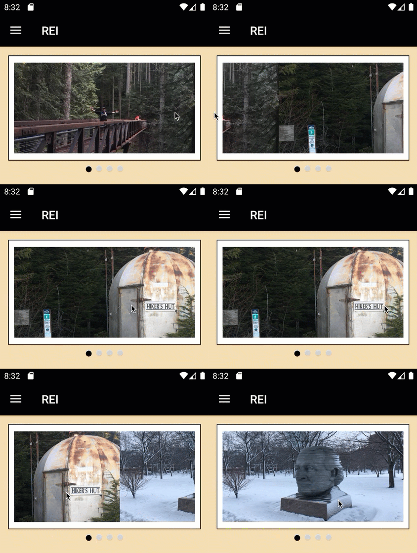
We were speaking with a customer last year that builds dozens of mobile applications every year. They said, “We cannot remember the last time we made a mobile app that did NOT include a carousel view.” Many of you have expressed almost identical sentiments to us. So, we are very pleased to introduce a new CarouselView control in Xamarin.Forms 4.4.0. Along with this we also have IndicatorView for displaying the pages or items in the carousel. As well as SwipeView for providing contextual actions to any element in a CollectionView. The release theme of getting things moving would not be complete without showcasing the new GIF animation support for images. Let’s begin right there.
Xamarin.Forms 4.4 Features
GIF animations are a great and simply way to add animation to your app for better user feedback, calling attention to some action or detail. It’s also great for cat GIFs, of course. The Image is all you need along with the new IsAnimationPlaying property to enable and disable playback.
Animations will loop by default. To stop an animation, set IsAnimationPlaying to false.

<Image Source="https://cataas.com/cat/gif?type=sq" IsAnimationPlaying="True"/>
Just like that you have animations! This is ideal for smaller images, and especially those embedded in your application. Looping settings in the GIF image are respected. Make sure you are using fast renderers on Android for the best experience.
CarouselView and IndicatorView
Built upon the same base control as CollectionView, the new CarouselView makes it simple to add rich carousels to your app no matter whether you’re scrolling horizontally or vertically. Just as you get with CollectionView you get:
- ItemsLayout
- ItemsSource
- ItemTemplate
- EmptyTemplate

<CarouselView HeightRequest="160">
    <CarouselView.ItemsSource>
        <x:Array Type="{x:Type x:String}">
            <x:String>h01.jpg</x:String>
            <x:String>h02.jpg</x:String>
            <x:String>h03.jpg</x:String>
            <x:String>h04.jpg</x:String>
        </x:Array>
    </CarouselView.ItemsSource>
    <CarouselView.ItemTemplate>
        <DataTemplate>
            <Image Source="{Binding .}"/>
        </DataTemplate>
    </CarouselView.ItemTemplate>
</CarouselView>
You also get some carousel specific properties for controlling things such as the distance the previous and next items should “peek” into view.

<CarouselView PeekAreaInsets="50"
              ...>
Advanced Tip: In the example above you’ll also note that the previous and next items are scaled and offset. You can achieve this today with a behavior and doing the layout modifications on scroll. When we ship 4.5 you’ll instead be able to use visual states to more easily do this.
To add an IndicatorView you position it wherever you like and then associate it to the CarouselView by name:
<CarouselView x:Name="walletCarousel">
// implementation here
</CarouselView>
<IndicatorView
  IndicatorColor="LightGray"
  SelectedIndicatorColor="Black"
  IndicatorSize="10" HorizontalOptions="Center"
  IndicatorView.ItemsSourceBy="walletCarousel"/>

CarouselView and IndicatorView, refer to the documentation.
Note: The previously released NuGet Xamarin.Forms.CarouselView (Preview) will be archived and no longer released. If you were using this control, you may remove the NuGet and update your code namespace. We worked to keep the API consistent, but you may need to adjust a few things. GitHub
SwipeView
This control is typically found within a list of items for allowing the user to swipe in any direction to reveal context buttons for common actions like edit or delete. In order to use this control, just wrap it around whatever element you wish to add the behavior to, and specific your SwipeItems. By default a SwipeItem takes a title and an icon, plus a command or click handler. If you wish to add something more complex, you can do that via a template.

<SwipeView>
<SwipeView.RightItems>
<SwipeItems Mode="Execute">
<SwipeItem Text="Favourite" Command="{Binding Favourite}">
<SwipeItem.Icon>
<FontIconSource Glyph=""/>
</SwipeItem.Icon>
</SwipeItem>
</SwipeItems>
</SwipeView.RightItems>
<!-- Swipeable content -->
<Frame>
// content here
</Frame>
</SwipeView>
The above sample and more were blogged by our talented team member Javier Suarez Ruiz.
You can also use platform-specifics to control the swipe transition mode on Android and iOS. For more details about SwipeView, refer to the documentation.
Contributors
Even before the massive turnout for Hacktoberfest we had a lot of fantastic contributions in the pipeline that are now appearing in Xamarin.Forms 4.4.0. Check out these great improvements from 34 of your fellow developers. Highlights include:
- Use named sizes with FontImageSource – @tuyen-vuduc
- Scaling animation methods ScaleXTo and ScaleYTo – @sthewissen
- Letter-spacing – @KSemenenko
- Placeholder text alignment – @krdmllr
Get Started with Xamarin.Forms 4.4 Today
To get started with Xamarin.Forms 4.4, update or install from your favorite NuGet package manager. The transition from 4.3.0 is smooth. If you are updating from a previous version, take note that Xamarin.Forms and Xamarin.Essentials now depend on Android Support 28.0.0.3. So you will want to update those together along with any other packages you use that might depend on the Android Support libraries.
Make sure to enable the new preview features using SetFlags if you wish to use them. To do this globally for all platforms in your solution, add the following in your App.xaml.cs:
public App()
{
    InitializeComponent();

    Device.SetFlags(new[] {
        "CarouselView_Experimental",
        "IndicatorView_Experimental",
        "SwipeView_Experimental"
    } );

    MainPage = new AppShell();
}
We will be watching GitHub for your feedback on these preview controls between now and our next version, 4.5 when we expect to move them swiftly out of this preview state.
Quick Links:
- Release Notes – lots of quality improvements including Shell and CollectionView
- Animated GIFs
- CarouselView
- IndicatorView
- SwipeView
- Carousel Gallery
Should you find any issues in the Xamarin.Forms 4.4 release, please file them on GitHub along with a simple reproduction demonstrating the issue.
To see what’s coming next, check out our feature roadmap.

Wow, this are really interesting views. Especially the SwipeView, Xamarin is showing me some love and I would probably check it out. Great post
thanks for post
When using this control, the project will make an error <IndicatorView
This is awesome and all, but… who do you main in Smash Ultimate? I’m a big fan of SwipeView now 😉
Is there any plugin for an image viewer? or will be there an update for it?
Mostly, looking for the option to zoom.
Did anyone try out that Swipe example? It does not compile – there are several issues:
closes with
FontIconSource does not exist (but does for Windows UWP).
SwipeItem.Icon does not accept FontImageSource
SwipeItem without Background renders the Content again als background.
Here is code that runs ok:
https://pastebin.com/Qx35AmYY
Reto, I’m sorry you’re having trouble running the demo. Please file an issue on the samples GitHub so we can take a look. I just ran it and wasn’t able to reproduce the problems.
Is the new CarouelView ready for production? unfortunately with updating to 4.4, the control we are using in production no longer works
Mohamed, if you’re wanting to use it in production to replace the existing one, then I recommend waiting one more release for when we remove the preview status.
Compared to the carousel you use now, do you get all the features and behavior you need in the new one? If not, what’s missing?
Wish I could use it but I can’t update until the text alignment bug on Android is fixed. Hope the next version fixes it.
Great stuff David, just a small typo – your SwipeItems demo code opens with SwipeView.RightItems but closes with SwipeView.LeftItems in the XAML.
Thanks! Fixed.
Looks fantastic!
Excellent David.
Some questions:
1- what is IndicatorTemplate in IndicatorView? Can I define my own template for the single indicator?
2- in IndicatorView, how can I set ItemsSourceBy in c#?
1- YES, you can provide your own design. Gallery Code
2- Like this