Over the years traditional desktop applications have excelled at rendering large amounts of data on large multi-monitor configurations by leveraging beautiful dashboard and graphing controls from .NET vendors. The enterprise landscape has evolved into a bring your own device workplace and enterprise applications have also started to evolve to adjust for this shift. It is now up to development teams to reimagine their applications from a point and click mouse experience to a beautiful touch based mobile experience that can deliver a truly native experience on each platform. Mobile users desire easy content consumption with simple touch interactions and blazingly fast native performance to fully immerse them visually. They want to get to the data they are most interested in and get to that data quickly.

With Xamarin you can create beautiful native experiences for all types of mobile application including bringing these dashboards to mobile devices. We understand that mobile developers need to deliver alluring apps for enterprises and consumers by embracing native platform features while still being highly productive in their development environment. We have a rich ecosystem of components and controls to get developers up and running immediately with highly performing, visual, and customizable controls that meet business requirements. This of course includes dashboards that you can bring to your applications.

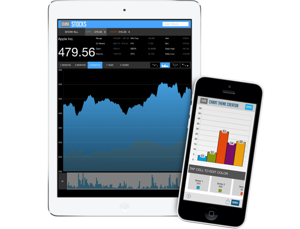
One of these controls is from Infragistics who published their NucliOS component on the Xamarin Component Store, featuring over 40 different charts optimized for mobile. NucliOS has a wide range of controls to help visualize and analyze large volumes of data ranging from advanced scientific and financial charts, data grids, pie charts, radial gauges, and more. They even have a free iOS app to browse all of the controls featured in NucliOS, which is available on the Apple App Store.
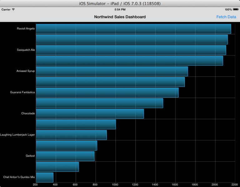
NucliOS has tons of awesome controls, which I can’t attempt to show off in just a single post. So, for this example I am going to get you started by showing you how to make a bar chart using the IGChartView control. You can then take it from there to completely customize it as it can render more than 40 different chart types!
Getting Started
To get started with NucliOS controls you can either purchase the component from the component store or elect for the “Try” option to start a free trial right away.

After you have the component we can started by setting up a data source for the bar chart.
Identify a Data Source
We will need some sort of data source to feed into our chart. For this example I am going to use something very familiar, Microsoft’s Northwind Database. Northwind is exposed as an oData Service with all sorts of sample data including employees, customers, orders, and products. I will consume this oData feed using the Simple.oData.Client portable class library, which handles connecting to and fetching the data to create a dashboard displaying sales for products based on their categories.
Here is what my Model looks like for the data:
 public class SalesByCategory {
    public SalesByCategory ()
    {
        ProductName = new List ();
        ProductSales = new List ();

    }
    public List ProductName{
        get;
        set;
    }

    public List ProductSales{
        get;
        set;
    }
}
Next up I will create a simple helper method that will query Northwind and grab the top 15 selling products by category:
 async Task GetDataAsync() {
    var client = new ODataClient("http://services.odata.org/Northwind/Northwind.svc/");
    var salesData = await client.For ("Sales_by_Categories").Top(15).OrderBy("ProductSales").FindEntriesAsync();

    SalesByCategory salesByCategory = new SalesByCategory();
    foreach (var sale in salesData) {
        salesByCategory.ProductName.Add (NSObject.FromObject(sale["ProductName"].ToString()));
        salesByCategory.ProductSales.Add (NSObject.FromObject(sale["ProductSales"].ToString()));
    }
    return salesByCategory;
}
With this data I can visualize it by feeding it into an IGChartView with the help of IGCategorySeriesDataSourceHelper :
var data = await GetDataAsync ();
// set data source
IGCategorySeriesDataSourceHelper barSeriesSource = new IGCategorySeriesDataSourceHelper();
barSeriesSource.Values = data.ProductSales.ToArray();
barSeriesSource.Labels = data.ProductName.ToArray();
Create Axises
We are going to create a 2D chart, so I will set the X and Y axis to chart the data of the product’s sales and product name respectively.
// Create axis types and add it to the chart
IGNumericXAxis xAxisBar = new IGNumericXAxis ("xAxis");
IGCategoryYAxis yAxisBar = new IGCategoryYAxis ("yAxis");
Create Series
As mentioned earlier, I am going to plot this data in a bar series. To do this will set it’s data source from which we created earlier with the help of IGCategorySeriesDataSourceHelper
// decide on what series need to be displayed on the chart
IGBarSeries barSeries= new IGBarSeries ("series");
barSeries.XAxis = xAxisBar;
barSeries.YAxis = yAxisBar;
// set the appropriate data sources
barSeries.DataSource = barSeriesSource;
Putting it all together
Now all we have to do is set the IGChartView axis, series, and location to finalize the visualization our data.
var chart = new IGChartView(this.View.Bounds);
chart.AutoresizingMask = UIViewAutoresizing.FlexibleHeight | UIViewAutoresizing.FlexibleWidth;
chart.AddAxis(xAxisBar);
chart.AddAxis(yAxisBar);
chart.AddSeries(barSeries);
 this.View.Add(chart);
That’s it! We now have a beautiful visualization of our data.

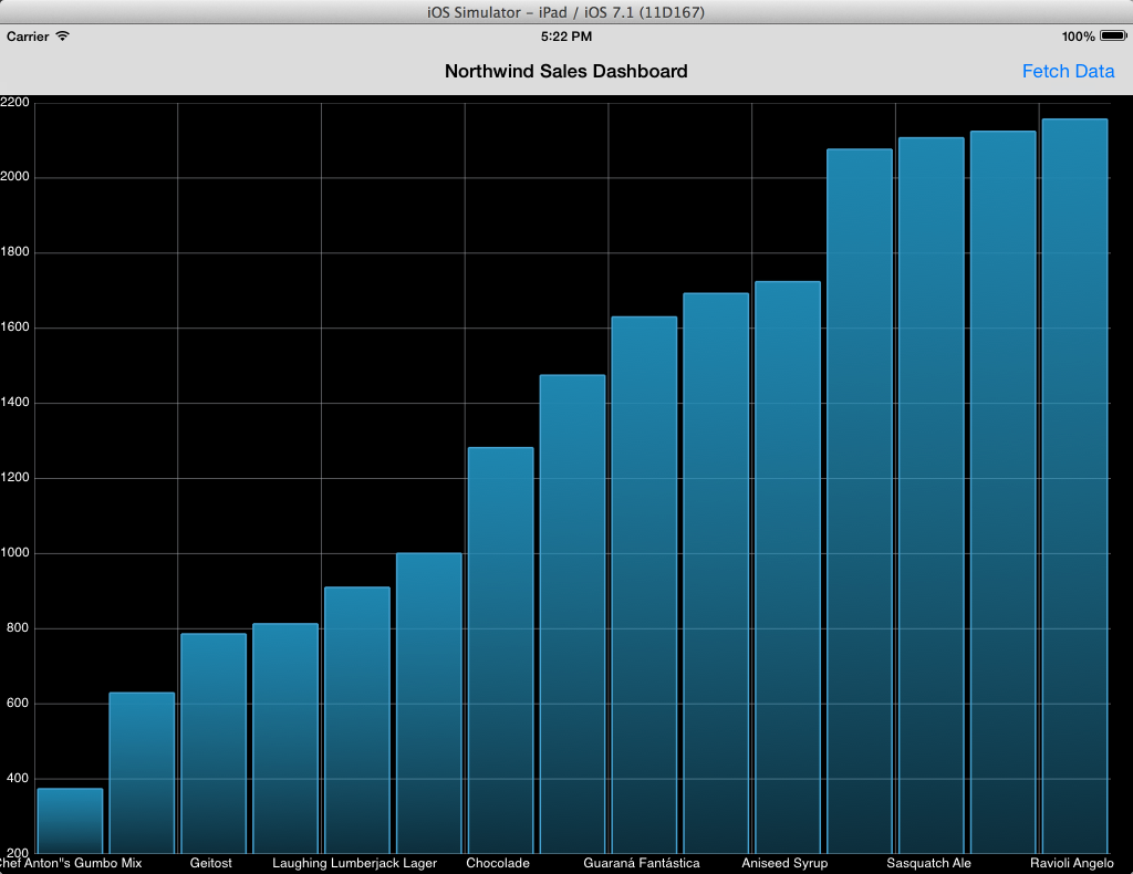
The IGChartView can be completely customized and changed with just a few lines of code. In fact, I can change this into a Column Series by simply changing my X and Y axis and setting up the chart as an IGColumnSeries:
var xAxisBar = new IGCategoryXAxis ("xAxis");
var yAxisBar = new IGNumericYAxis ("yAxis");

var columnSeries = new IGColumnSeries ("series");
columnSeries.XAxis = xAxisBar;
columnSeries.YAxis = yAxisBar;

You can download all of this source code to try it for yourself from GitHub.
