
To provide backwards compatibility for new features and controls in Android, Google regularly releases a set of support libraries that developers can integrate into their application. You might already be very familiar with Support Library v4, which gives developers that want to provide support all the way back to Android 1.6 (v4) with features such as Fragments, ViewPager, DrawerLayout, and so much more. One lacking feature of the v4 Library was the use of the Action Bar, which there have been a few libraries providing backwards compatibility for, such as LegacyBar and ActionBarSherlock. While these both provide great Action Bar replacement for targeting pre-HoneyComb devices, Google has recently released Support Library v7, now available on the Component Store, which adds a few nice features including ActionBarCompat. The only requirement is that your application must have a minimum target of Android 2.1 (v7) to use the Support Library.
Recently, Support Library v7 AppCompat has been updated for material design. See our full blog post on how to integrate AppComps’s latest version add material design and the new Toolbar to your app.

Support Library v7 is split into multiple components including AppCompat, GridLayout, and MediaRouter (component coming soon). GridLayout allows you to create and arrange user interface elements using a grid of rows and columns similar to the Grid in Windows Store/Phone. MediaRouter Library includes MediaRouter, MediaRouteProvider and additional media classes for Google Cast. These libraries provide functionality for controlling the routing of media channels and streams from an Android device to external screens, speakers, and other destination devices.
By far the most exciting addition in v7 is the AppCompat library, which adds not only the ActionBar and ActionBarActivity, but also the ShareActionProfider, which allows a standardized sharing action such as sharing text or images from inside the Action Bar.
Getting Started:
To get started with Support Library v7 you will need to simply add the Support Library v7 AppCompat from the Component Store into your Android App.
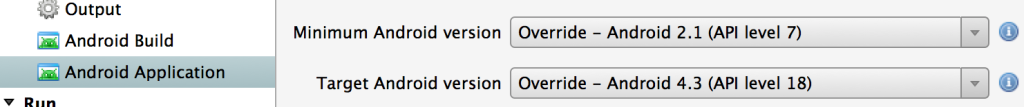
Once you have the Support Library component added we can now adjust the minimum and target version numbers for our a\Android application under the project properties. Since we added Support Library v7 we are able to set our minimum to API 7 and set the target to the current android API version of 18.
Adding an Action Bar to your application is now as easy inheriting from “ActionBarActivity” instead of “Activity“:
public class MainActivity : ActionBarActivity
Styling your Action Bar in AppCompat is a little bit different as now there are unified themes including:
Holo: @style/Theme.AppCompat Holo Light: @style/Theme.AppCompat.Light Holo Light with Dark Action Bar: @style/Theme.AppCompat.Light.DarkActionBar


You can set these themes in the attributes when creating your Activity:
[Activity (Label = "ActionBarCompat", Icon = "@drawable/ic_launcher", Theme = "@style/Theme.AppCompat.Light", MainLauncher = true)]
Adding Actions:
Android Action Bar items are defined in your Menu xml files. If you have created menus before you can simply update your xml files as there are a few key differences. First, is that you will want to update your icons so they are the correct size for the Action Bar. You can use Google’s Android Asset Studio to generate these new icons. Second, is that there are new specific attributes on the menu items that define Action Bar specific functionality such as “showAsAction”, which is used to determine which items are always in the Action Bar or if they are in the over flow. Here is an example of setting this:
<menu xmlns:android="http://schemas.android.com/apk/res/android"
      xmlns:app="http://schemas.android.com/apk/res-auto" >
    <item android:id="@+id/action_edit"
          android:title="@string/edit"
          android:icon="@drawable/ic_action_content_edit"
          app:showAsAction="ifRoom"/>
  <item android:id="@+id/action_save"
          android:title="@string/save"
          android:icon="@drawable/ic_action_content_save"
          app:showAsAction="always"/>
</menu>

The most important part here is that I added a custom “xmlns” definition of xmlns:app=”http://schemas.android.com/apk/res-auto” which is used by Android to find where the property is located when we use it in “app:showAsAction”.
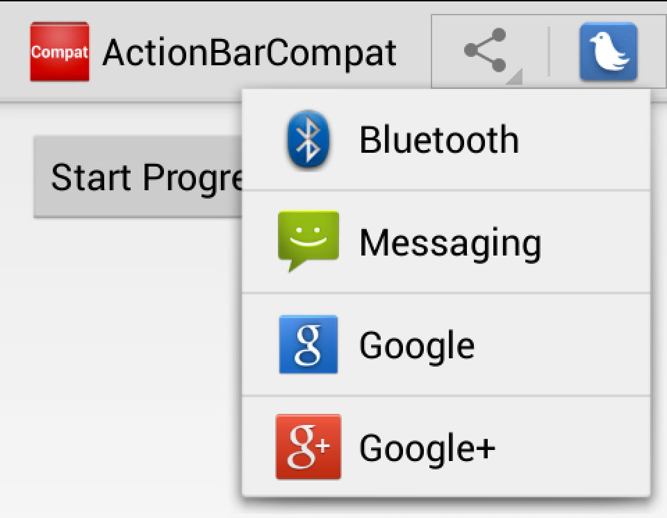
Share Action Providers:
One great native feature is the ShareActionProvider, which allows you to add an item to the Action Bar that will display a list of applications that can handle a specific share intent, such as sharing text or images.
You can add this to your Menu xml by specifying the actionProviderClass attribute:
<item android:id="@+id/action_share"
          android:title="@string/share"
          app:showAsAction="always"
          app:actionProviderClass="android.support.v7.widget.ShareActionProvider"
          />
We will then get reference to this ShareActionProvider when we create the menu and specify the Intent for it to use:
ShareActionProvider actionProvider;
public override bool OnCreateOptionsMenu(IMenu menu)
{
  this.MenuInflater.Inflate(Resource.Menu.main_menu, menu);

  var shareItem = menu.FindItem(Resource.Id.action_share);
  var test = MenuItemCompat.GetActionProvider (shareItem);
  actionProvider = test.JavaCast<ShareActionProvider>();

  var intent = new Intent(Intent.ActionSend);
  intent.SetType("text/plain");
  intent.PutExtra(Intent.ExtraText, "ActionBarCompat is Awesome! Support Lib v7 #Xamarin");

  actionProvider.SetShareIntent (intent);

  return base.OnCreateOptionsMenu(menu);
}
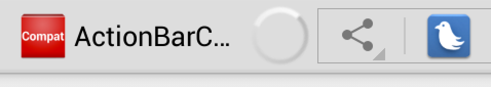
ProgressBar in Action Bar:
Showing a spinning indeterminate ProgressBar is a great way of notifying your users that you are loading information into your view. You are now able to add this functionality into the ActionBarCompat with just a few lines of code. You will have to request the WindowFeatures.IndeterminateProgress feature and then set the visibility of the ProgressBar
Here I have setup a button that will toggle the ProgressBar on and off:
bool indeterminateVisible;
protected override void OnCreate (Bundle bundle)
{
  base.OnCreate (bundle);

  // Needs to be called before setting the content view
  SupportRequestWindowFeature((int)WindowFeatures.IndeterminateProgress);

  // Set our view from the "main" layout resource
  SetContentView (Resource.Layout.Main);

  SetSupportProgressBarIndeterminate (true);

  var button = FindViewById<Button> (Resource.Id.progress_button);
  button.Click += (sender, e) => {
    // Switch the state of the ProgressBar and set it
    indeterminateVisible = !indeterminateVisible;
    SetSupportProgressBarIndeterminateVisibility(indeterminateVisible);
    // Update the button text
    button.Text = indeterminateVisible ? "Stop Progress" : "Start Progress";
   };
}
This is just a peek at some of the features of Support Library v7. After you have installed the components make sure that you read the documentation and the sample application showing off a lot more features. For a full sample of the code here feel free to download it from GitHub and get ActionBarCompat integrated into your app today!