
Over the past year we’ve been working on a couple of “big things” that enable you to create more performant applications on more platforms. With our latest stable release, version 2.4.0, we introduced performance optimized renderers on Android, nicknamed Fast Renderers. While faster platform renderers are a clear win, you really start to see the big gains using them in combination with a new feature, debuting in 2.5.0, called Layout Compression. Not to be eclipsed by those performance focused boosts, we’re also releasing Forms Embedding in this preview. We’re excited to take these improvements off the pages of our public roadmap and put them into your hands. Read on for details on how you can start benefiting from these fantastic improvements, and much more.
Big Thing 1: Layout Compression
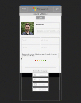
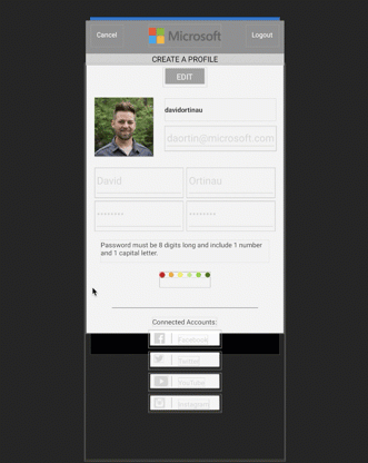
When optimizing a layout for performance, whether for the purpose of smoother animation or speed of rendering, you quickly learn the value of having a flat view hierarchy. Take this page for example:
<?xml version="1.0" encoding="utf-8"?>
<ContentPage
xmlns="http://xamarin.com/schemas/2014/forms"
xmlns:x="http://schemas.microsoft.com/winfx/2009/xaml"
xmlns:local="clr-namespace:ProfileLayout"
x:Class="ProfileLayout.ProfileLayoutPage"
xmlns:views="using:ProfileLayout.Views"
xmlns:controls="clr-namespace:ImageCircle.Forms.Plugin.Abstractions;assembly=ImageCircle.Forms.Plugin.Abstractions"
xmlns:converters="using:ProfileLayout.Converters;"
Title="Profile"
BackgroundColor="#F3F3F3">
<ContentPage.Resources>
<ResourceDictionary>
<converters:InvertedBoolConverter x:Key="InvertedBoolConverter"/>
<!-- Global Colors -->
<Color
x:Key="primaryColor">#303030</Color>
<Color
x:Key="secondaryColor">#C9AE98</Color>
<Color
x:Key="validationColor">#FF3F56</Color>
<Color
x:Key="callToActionColor">#4E8B4F</Color>
<Color
x:Key="accentColor">White</Color>
<Color
x:Key="darkAccentColor">#7c6a5c</Color>
<!-- Global Sizes -->
<x:Double
x:Key="mediumTextSize">20</x:Double><x:Double
x:Key="smallTextSize">14</x:Double><x:Double
x:Key="standardPadding">10</x:Double>
<!-- Global Element Styles -->
<Style
TargetType="Entry">
<Setter
Property="HeightRequest"
Value="44" />
<Setter
Property="TextColor"
Value="{StaticResource darkAccentColor}" />
</Style>
<Style
TargetType="NavigationPage"><Setter
Property="BarBackgroundColor"
Value="{StaticResource primaryColor}" /></Style><Style
TargetType="Frame"><Setter
Property="BackgroundColor"
Value="{StaticResource accentColor}" /><Setter
Property="Padding"
Value="{StaticResource standardPadding}" /><Setter
Property="HasShadow"
Value="False" /><Setter
Property="OutlineColor"
Value="{StaticResource secondaryColor}" /></Style><!-- Label Styles --><Style
x:Key="switchLabel"
TargetType="Label"><Setter
Property="TextColor"
Value="#999999" /><Setter
Property="VerticalOptions"
Value="Center" /><Setter
Property="HorizontalOptions"
Value="FillAndExpand" /></Style><!-- Button Styles --><Style
x:Key="callToActionButton"
TargetType="Button"><Setter
Property="BackgroundColor"
Value="{StaticResource callToActionColor}" /><Setter
Property="TextColor"
Value="{StaticResource accentColor}" /><Setter
Property="FontSize"
Value="{StaticResource mediumTextSize}" /></Style>
<Style
x:Key="primaryButton"
TargetType="Button">
<Setter
Property="BackgroundColor"
Value="{StaticResource primaryColor}" />
<Setter
Property="TextColor"
Value="{StaticResource accentColor}" />
<Setter
Property="FontSize"
Value="{StaticResource smallTextSize}" /></Style>
<Style
x:Key="nakedButton"
TargetType="Button">
<Setter
Property="BackgroundColor"
Value="Transparent" />
<Setter
Property="TextColor"
Value="{StaticResource accentColor}" />
<Setter
Property="BorderColor"
Value="Transparent"/>
<Setter
Property="BorderWidth"
Value="0"/>
<Setter
Property="FontSize"
Value="{StaticResource mediumTextSize}" /></Style>
<Style
x:Key="whiteClearButton"
TargetType="Button">
<Setter
Property="BackgroundColor"
Value="Transparent" />
<Setter
Property="BorderColor"
Value="{StaticResource accentColor}" />
<Setter
Property="BorderWidth"
Value="1" />
<Setter
Property="TextColor"
Value="{StaticResource accentColor}" />
<Setter
Property="FontSize"
Value="{StaticResource smallTextSize}" />
</Style>
<Style
x:Key="secondaryButton"
TargetType="Button"><Setter
Property="BackgroundColor"
Value="{StaticResource secondaryColor}" /><Setter
Property="TextColor"
Value="{StaticResource accentColor}" /><Setter
Property="FontSize"
Value="{StaticResource smallTextSize}" /><Setter
Property="FontAttributes"
Value="Bold" /></Style><Style
x:Key="footerButton"
TargetType="Button"><Setter
Property="BackgroundColor"
Value="{StaticResource secondaryColor}" /><Setter
Property="TextColor"
Value="{StaticResource accentColor}" /><Setter
Property="FontSize"
Value="{StaticResource smallTextSize}" /><Setter
Property="FontAttributes"
Value="Bold" /><Setter
Property="HorizontalOptions"
Value="FillAndExpand" /></Style>
</ResourceDictionary>
</ContentPage.Resources>
<ContentPage.Padding>
<OnPlatform x:TypeArguments="Thickness" iOS="0,0,0,0" Android="0,0,0,0" />
</ContentPage.Padding>
<ContentPage.Content>
<StackLayout
Spacing="0"
VerticalOptions="FillAndExpand"
HorizontalOptions="FillAndExpand">
<AbsoluteLayout
BackgroundColor="#909090"
HorizontalOptions="FillAndExpand"
HeightRequest="60">
<AbsoluteLayout.Padding>
<OnPlatform x:TypeArguments="Thickness" iOS="0,20,0,0" Android="0,0,0,0" />
</AbsoluteLayout.Padding>
<Button
Margin="10,10"
FontSize="12"
Text="Cancel"
BackgroundColor="Transparent"
Command="{Binding CancelCommand}"
Style="{StaticResource nakedButton}"/>
<Image
AbsoluteLayout.LayoutBounds="0.5, 0.5, 0.36, 0.7"
AbsoluteLayout.LayoutFlags="All"
BackgroundColor="Transparent"
HeightRequest="36"
Source="microsoft_gray.png" />
<Button
IsVisible="{Binding IsLoggedIn}"
Margin="10,10"
BackgroundColor="Transparent"
AbsoluteLayout.LayoutBounds="1, 0, AutoSize, AutoSize"
AbsoluteLayout.LayoutFlags="PositionProportional"
FontSize="12"
Text="Logout"
Command="{Binding LogoutCommand}"
Style="{StaticResource nakedButton}"/>
</AbsoluteLayout>
<Label
HorizontalOptions="FillAndExpand"
BackgroundColor="#D1D1D1"
HeightRequest="22"
TextColor="#000000"
FontSize="14"
HorizontalTextAlignment="Center"
Text="{Binding Title}"/>
<ScrollView HorizontalOptions="FillAndExpand" VerticalOptions="FillAndExpand">
<StackLayout
Spacing="0"
VerticalOptions="FillAndExpand"
HorizontalOptions="FillAndExpand">
<Button
Margin="0,10,0,0"
IsVisible="{Binding CanEdit}"
Text=" EDIT "
Style="{StaticResource primaryButton}"
BackgroundColor="#9B9B9B"
HeightRequest="35"
HorizontalOptions="Center"
Command="{Binding ToggleEditModeCommand}"
/>
<Button
Margin="0,10,0,0"
IsVisible="{Binding IsEditing}"
Text=" EDITING "
BackgroundColor="#9B9B9B"
Style="{StaticResource primaryButton}"
HeightRequest="35"
HorizontalOptions="Center"
Command="{Binding ToggleEditModeCommand}"
/>
<StackLayout
Margin="20"
Spacing="20"
HorizontalOptions="FillAndExpand"
Orientation="Horizontal">
<StackLayout
Spacing="10"
Orientation="Vertical">
<controls:CircleImage
x:Name="ProfilePic"
Source="david.jpg"
BorderThickness="3"
BorderColor="#9B9B9B"
Aspect="AspectFill">
<controls:CircleImage.WidthRequest>
<OnPlatform x:TypeArguments="x:Double"
iOS="104"
Android="104"
WinPhone="104"/>
</controls:CircleImage.WidthRequest>
<controls:CircleImage.HeightRequest>
<OnPlatform x:TypeArguments="x:Double"
iOS="104"
Android="104"
WinPhone="104"/>
</controls:CircleImage.HeightRequest>
</controls:CircleImage>
<Button
IsVisible="{Binding CanSave}"
Text="Change Photo"
Style="{StaticResource nakedButton}"
FontSize="12"
BorderColor="Transparent"
BorderWidth="0"
BackgroundColor="Transparent"
TextColor="#303030"
>
</Button>
</StackLayout>
<StackLayout
Spacing="10"
HorizontalOptions="FillAndExpand"
Orientation="Vertical">
<Entry
IsVisible="{Binding IsLoggedIn, Converter={StaticResource InvertedBoolConverter}}"
HorizontalOptions="FillAndExpand"
Placeholder="Username"
Text="{Binding Username}"
x:Name="UsernameEntry" />
<Label
IsVisible="{Binding IsLoggedIn}"
Text="{Binding Username}"
TextColor="#303030"
FontSize="12"
FontAttributes="Bold"
HeightRequest="40"
VerticalTextAlignment="Center"
/>
<Entry
IsEnabled="{Binding CanSave}"
x:Name="EmailEntry"
HorizontalOptions="FillAndExpand"
Placeholder="Email"
Text="{Binding UserEmail}" />
</StackLayout>
</StackLayout>
<Grid Margin="20, 0, 20, 0">
<Grid.RowDefinitions>
<RowDefinition Height="53" />
<RowDefinition Height="53" />
<RowDefinition Height="60" />
<RowDefinition Height="28" />
<RowDefinition Height="*" />
<RowDefinition Height="45" />
</Grid.RowDefinitions>
<Grid.ColumnDefinitions>
<ColumnDefinition Width="1*"/>
<ColumnDefinition Width="1*"/>
</Grid.ColumnDefinitions>
<Entry
Grid.Row="0" Grid.Column="0"
IsEnabled="{Binding CanSave}"
x:Name="FirstNameEntry"
HorizontalOptions="FillAndExpand"
Placeholder="First Name"
Text="{Binding FirstName}" />
<Entry
Grid.Row="0" Grid.Column="1"
IsEnabled="{Binding CanSave}"
x:Name="LastNameEntry"
HorizontalOptions="FillAndExpand"
Placeholder="Last Name"
Text="{Binding LastName}" />
<Entry
Grid.Row="1" Grid.Column="0"
IsEnabled="{Binding CanSave}"
x:Name="PasswordEntry"
IsPassword="true"
HorizontalOptions="FillAndExpand"
Placeholder="Password"
Text="{Binding UserPassword}" />
<Entry
Grid.Row="1" Grid.Column="1"
IsEnabled="{Binding CanSave}"
x:Name="ConfirmPasswordEntry"
IsPassword="true"
HorizontalOptions="FillAndExpand"
Placeholder="Confirm Password"
Text="{Binding ConfirmUserPassword, Mode=TwoWay}" />
<Label
Grid.Row="2" Grid.ColumnSpan="2"
IsEnabled="{Binding CanSave}"
Margin="10"
Text="Password must be 8 digits long and include 1 number and 1 capital letter."
TextColor="#303030"
FontSize="12"
HorizontalOptions="FillAndExpand"
/>
<views:StrengthIndicators
IsEnabled="{Binding CanSave}"
Strength="{Binding PasswordStrength}"
HorizontalOptions="Center"
Grid.Row="3" Grid.ColumnSpan="2" />
<StackLayout
Margin="0,20,0,40"
Grid.Row="4" Grid.ColumnSpan="2"
IsVisible="{Binding IsLoggedIn}">
<BoxView
Margin="30,10"
BackgroundColor="#9B9B9B"
HorizontalOptions="FillAndExpand"
HeightRequest="1"
/>
<Label
Text="Connected Accounts:"
HorizontalOptions="Center"
TextColor="#303030"
FontSize="12"/>
<views:ConnectSocialButtonView
HorizontalOptions="Center"
BindingContext="{Binding FacebookVM}" />
<views:ConnectSocialButtonView
HorizontalOptions="Center" BindingContext="{Binding TwitterVM}" />
<views:ConnectSocialButtonView
HorizontalOptions="Center" BindingContext="{Binding YouTubeVM}" />
<views:ConnectSocialButtonView
HorizontalOptions="Center" BindingContext="{Binding InstagramVM}" />
</StackLayout>
<Button
Grid.Row="5" Grid.ColumnSpan="2"
IsVisible="{Binding CanSave}"
HeightRequest="45"
x:Name="SaveButton"
Style="{StaticResource primaryButton}"
Text=" Submit "
HorizontalOptions="Center"
Command="{Binding SaveCommand}">
</Button>
</Grid>
</StackLayout>
</ScrollView>
</StackLayout>
</ContentPage.Content>
</ContentPage>
Source: https://github.com/davidortinau/ProfileLayout
Note: this page is NOT optimized at all. In fact, you can probably point to many things that ought to be changed.
Compound this average layout with the need to create additional container renderers and wrappers for platform renderers, and it results in more views in your view tree than are necessary, approximately 130 for this example.
Consider that performing layout requires child-to-parent recursion for measurement and then layout. The deeper a UI nests (view within view within view), the more iterations are required. Layout Compression allows you to specify unnecessary nesting and allows Xamarin.Forms to opt-out of creating that layout view.
Using Xamarin Inspector we can view the UI layering of this page without Layout Compression or Fast Renderers enabled:
Now enable Fast Renderers in the MainActivity.cs:
public class MainActivity : global::Xamarin.Forms.Platform.Android.FormsAppCompatActivity
  {
    protected override void OnCreate(Bundle bundle)
    {
      ...

      global::Xamarin.Forms.Forms.SetFlags("FastRenderers_Experimental");
      global::Xamarin.Forms.Forms.Init(this, bundle);

      ...
    }
  }
And then enable Layout Compression. To enable Layout Compression, identify the layouts (StackLayout, AbsoluteLayout, Grid, RelativeLayout) to compress and add enable it with CompressedLayout.IsHeadless=”true”. For example:
<StackLayout
            Spacing="0"
            CompressedLayout.IsHeadless="true"
            VerticalOptions="FillAndExpand"
            HorizontalOptions="FillAndExpand">
...
</StackLayout>
Now take a look at the layout tree layering:
The improvement in these visuals is obvious. I’ll save you some counting to see how much we were able to flatten the UI.
- Default: 130 Renderers
- Layout Compression: 111 Renderers
- Layout Compression + Fast Renderers: 70 Renderers
The question naturally becomes, “how much faster does this make my application?” This will vary depending on the complexity of your view, the version of the operating system you’re using, and the device on which it’s running. While everyone benefits, we expect to see the biggest difference on older devices.
Because layout compression eliminates the renderer for the layout, note that anything you previously expect to be part of that renderer will no longer be present:
- Background color
- Gestures
- Transformations
- etc.
Layout Compression is available on iOS and Android.
Big Thing 2: Forms Embedding
At Build 2017 we showcased taking a Xamarin.Forms ContentPage and embedding it in native Xamarin.iOS, Xamarin.Android, and UWP applications. Even with that being a very early preview, it didn’t stop many of you from exploring the possibilities. Since then, we’ve been cleaning up the implementation, resolving issues found in our early testing (thank you early adopters!), and validating our use cases for this new capability.
What might you want to do with this?
- Take an existing Xamarin.Forms page and use it in another Xamarin iOS, Android, or UWP application that doesn’t use Xamarin.Forms.
- Start a project using Xamarin.Forms for the speed and ease of delivering a prototype, and then migrate it page by page to Xamarin native/
- Add shared pages to any existing Xamarin application which changing the entire architecture.
And that’s just the beginning. Now there’s no question whether to start with Xamarin.Forms. Use Xamarin.Forms everywhere it’s suitable in your applications!
Big Thing 3: Improved macOS Desktop Support
Xamarin.Forms has grown up in mobile, and extending to desktop paradigms is a process. In Xamarin.Forms 2.4.0, we introduced a preview of macOS support, and I’ve already seen some impressive applications from you. Your feedback has helped identify where we most needed to increase support, so in 2.5.0 you’re getting:
App Exit
From anywhere in your application, you can call Application.Current.Quit() to quit.
Menus
Desktop applications can handle menus differently than touch or mobile applications. In this preview, you can now add context menus on right click, as well as attaching menus to the top level of your application so they appear in the top bar on macOS.
For example, below we construct a menu in C# and attach it to a Label in our view. Right clicking the Label will now open the context menu.
var mainMenu = new Menu();
var locationMenu = new Menu { Text = “Location” };
var changeItem = new MenuItem
{
Text = “Change”,
Command = new Command((obj) =>
{
Navigation.PushModalAsync(new LocationEntryPage());
})
};
locationMenu.Items.Add(changeItem);

var refreshItem = new MenuItem { Text = "Refresh", Command = _vm.ReloadCommand }; MenuItem.SetAccelerator(refreshItem, Accelerator.FromString("cmd+r")); locationMenu.Items.Add(refreshItem); mainMenu.Add(locationMenu); // Context Menu SetMenu(ConditionLabel, mainMenu);
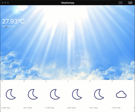
Source: https://github.com/davidortinau/weather-app/tree/macos-and-location
Accelerators
Accelerators, also known as key modifiers, allow you to add keyboard shortcuts to activate menu items. In this example, we’re adding the cmd+R accelerator to the refresh menu item.
MenuItem.SetAccelerator(refreshItem, Accelerator.FromString("cmd+r"));
Then the accelerator is added to a top level menu item, and is available to use from anywhere in the application.
Preview Today!
Xamarin.Forms 2.5.0.19271 is available now on NuGet. To update, open your NuGet package manager, enable the Pre-Release option, and update all of your project references.
What’s with the new version numbers? Our builds are now being generated from Visual Studio Team Services which simply generates a different build number.
Your participation in our pre-releases are essential. Please let us know about any issues you find by filing detailed reports in Bugzilla.