The Visual Studio UI Refresh Preview is here!

Dante Gagne

Back in May, we showed a first look into the UI Refresh that we’ve been working on for Visual Studio. We’ve been working on a refresh for the Visual Studio UI to improve productivity, create a more inclusive environment, and keep up with evolving global accessibility requirements. The feedback we’ve collected from that first post and the developer community ticket has been wonderful. We’ve been spending the time since then working through all your comments to ensure your valuable feedback gets weaved into the UI Refresh. Now, here at Ignite, we’re excited to finally make a version of the UI Refresh available for folks to try for themselves.

A stylized image of the Visual Studio IDE in the Dark theme with the new UI Refresh. The image is shown with a 3D skew against a dark background.
The Visual Studio UI Refresh Preview

To enable the UI Refresh, first go to Tools > Manage Preview Features from the main menu in Visual Studio. Then, look for “Experimental control styles”. Once that box is checked, you’ll need to restart Visual Studio for the UI Refresh to be enabled.

Driven by feedback

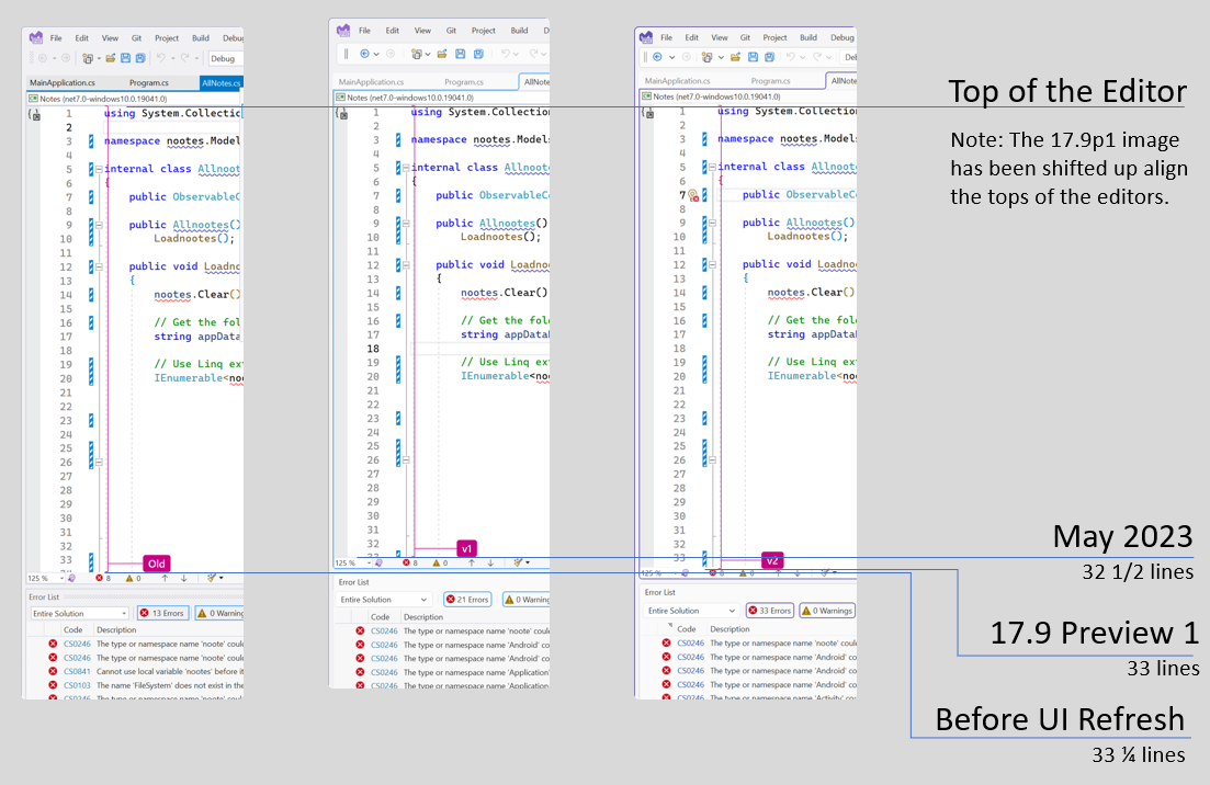
The fundamentals of the new experience haven’t changed. Our main goals are still based around the Fluent design language and focus on three pillars: cohesiveness, accessibility, and productivity. However, since we revealed the images in our first post, we got a lot of feedback about the things that our developers found important. In this version of the UI Refresh, you’ll get to experience a balance of the feedback we received with the accessibility requirements around things like clickable target space and reduction of visual clutter. This means a more inclusive experience to help everyone be more productive and comfortable while still maximizing code space and respecting the feedback you’ve shared with us. As an example of this, the first screenshots we shared, showed a reduction of nearly a full line of code in the editor space, but the editor in 17.9 preview 1 is only reduced by a quarter of a line.

An image comparing the relative heights of the editor before the UI Refresh, back in May and in the 17.9 preview 1. Before the UI Refresh, the editor could show 33.25 lines, in May, the editor could show 32.5 lines and in 17.9 preview 1, the editor can should 33 lines.
Comparison of the Editor in the various iterations of the UI Refresh

We’ve found that we can meet the ideals of the Fluent design language while still prioritizing the things that our developers say are the most important. Now, this experience is ready for you to try so we can continue to build on your feedback. Our journey isn’t done yet; your feedback is absolutely critical! At this time, we don’t have a timeline for when this will be the primary UX for Visual Studio, which is why we’re spending so much time working with our users to get as much information as we possibly can.

A cohesive and colorful experience

One of the pillars of the Fluent UI design language is around cohesiveness. For the Visual Studio UI Refresh, this has been most evident in the simplification of the colors that we use in Visual Studio. Styles across Visual Studio before the UI Refresh used over 4,000 color tokens which were difficult to maintain and were easily misused. This frequently led to inconsistent experiences, accessibility issues and many other issues that led to an experience that didn’t feel cohesive. The new refreshed styles use only about one hundred tokens, which may still seem like a lot, but are much easier to maintain and will make it easier to spot incorrect use. This is leading to more consistency, and we believe will result in the cohesive experience that will make Visual Studio more comfortable to use.

Our current blue theme has some compatibility issues that we couldn’t iron out in time for Ignite, and instead of delaying this preview, we’ve had to make the decision to make it unavailable for now. We’re also aware that 3rd party themes may run into similar complications, so those may not work as expected with the UI Refresh yet. We’re working on both issues, so stay tuned and we’ll update as we make progress.

One of the benefits of streamlining the color service is that we can provide a fresher set of color themes beyond the basic “Dark” and “Light”. We’re calling these the new “Tinted” themes, and you can take a look at these below.

These tinted themes are inspired by Microsoft Edge and give Visual Studio a new, fresh look beyond the simple Light and Dark that have been the mainstay for the last decade. These themes can be found when the UI Refresh has been enabled and can be accessed either from the Tools > Theme or from the “color theme” combobox under Environment > Visual Experience in Tools\Options.

We want to hear from you

We’re excited to hear what folks think now that you can try out the UI Refresh instead of simply seeing static screenshots. We know that there’s still more we need to do. When switching to the tinted themes, customers not using the default Cascadia font will need to set their font back to their font of choice, and custom themes may not be compatible with the UI Refresh at this time. This is the first preview, but it certainly won’t be the last.

To share your feedback on the UI Refresh, you can join the discussion on Developer Community. If you want to share your feedback on the Tinted Themes, we’ve got a Developer Community discussion specifically for that too. We want to thank all our folks again for all the feedback that has gotten us this far and we’re eager to continue this conversation. Stay tuned here and in Developer Community as we continue down this journey.

54 comments

Discussion is closed. Login to edit/delete existing comments.

  • Mladen Mihajlovic 0

    Looks great, but I don’t have time to dive into previews – is there an ETA on a production release?

    • Dante GagneMicrosoft employee 3

      We don’t currently have a timeline for when this will be in the GA channel. Major changes to the UI like this are something we want to make sure are correct before we take them out of the preview channel, which is why we’re engaging as early as we are. Stay tuned to the Visual Studio blog and we’ll let folks know as we know more.

    • Mike Diack 0

      Is this coming in VS Next (presumably something like Visual Studio 2025)?

  • Ferdinand Oeinck 12

    Exactly what I feared. Way too much useless white space. I hope the old dense UI will be available for ever…

    • Mladen Mihajlovic 7

      Weird I don’t see any useless white space. Which part are you referring to?

      • Bradley Uffner 1

        I’m seeing additional space in the gutters to the left of the code.

        • Flashbang 2

          I hate gutters spaces, too.

  • Oleksandr Liakhevych 14

    It would be really great if some “compact” mode would be available. It might be OK to have bigger buttons for a bigger screen, but I often use my Surface Pro 8 for coding, and even with the old UI all the toolbars take way too much space.

  • Bradley Uffner 11

    So in the initial post about the refresh most of the comments were about there being too much white space. It seems that you addressed that by adding even MORE whitespace…. 🤷‍♂️

    • JAO 0

      where do you see that whitespace? for me it looks like a crammed UI

      • Bradley Uffner 2

        The gutters on the left side of the code have gotten wider.

        • Jason Baginski 2

          Maybe I’m missing something. I took that first preview image(that has “Before UI Refresh” and “May 2023”), tossed it into Paint.Net, selected the first few lines of code and border of the “May 2023” image and pasted it a few lines below the “Before UI Refresh”. They line up the same. I think that’s what the magenta line is supposed to give you the hint of. Why do you feel it has a wider gutter?

  • Muhammad Miftah 18

    How about no. Just stop messing around with the interface. Stop adding more negative space, stop increasing font size, stop adding rounded corners to rectangles, stop adding thick lines to borders. And stop adding new garish color schemes.

    I’m still on VS2022 17.4 LTSC trying to avoid this UI-redesign-garbage and even now, the context menu on a project node in the Solution Explorer can barely fit on a 1080p screen. With this re-design, now the entire menu will require scrolling to see it all – it’s not just code editing space you’re wasting with this redesign.

    > We’ve found that we can meet the ideals of the Fluent design language while still prioritizing the things that our developers say are the most important.

    So you’re basically admitting that this whole re-design endeavour isn’t driven by customer/developer feedback? What is it then? A hollow indulgence cooked up by some pretentious designer/product manager, so they can tick this off on their resume?

    > These tinted themes are inspired by Microsoft Edge

    Oh yes how logical – let’s take inspiration from a friggin web browser and not say another heavily used dev/code editor like VSCode?

    • Ryan Statzer 4

      Looks like all they did was change the color. Layout looks identical to how its been for years.

    • Aronne Gandini 11

      Go somewhere else, this is great.

    • anonymous 0

      this comment has been deleted.

    • Greg Wojan 9

      I totally agree — Fluent UI is hot garbage. I understand the need to convert to WinUI but changing the UI just for the sake of change is really dumb. Why not work on things like stability and performance? How about font rendering? Why does switching between VSCode and Visual Studio with all the same font settings have to be so jarring?

      Maybe I’m just salty because Windows 11 has turned out to be such a turd because of increased use of Fluent UI components like the “new” completely brain-dead File Explorer. So, if you want to really ruin Visual Studio keep dumbing down menus, adding whitespace, and otherwise buggering up the UI.

      • Pierre Huguet 2

        I would like to know why you hate the Fluent UI design so much?
        Windows 11 works really well and looks better with each release.
        I personally have no issues with the fluent look, and it does not change the way I interact with windows.
        I would not call it a turd for sure. I’d like to know your user experience painpoints.

  • Melissa P 3

    I’m positively surprised. In the past your UI refresh always ended in everything broken, but this time I don’t notice any issue.

    I don’t use or show any toolbar, I do everything with keyboard (except scrolling). And this new thin lined menu bar and all the rest is integrated, like search, account, feedback really makes me just see the code editor. I also use the dark theme, and this purple-go-around-line around the code window make it so obvious which tab is open, as the line also swings around the tab itself. I honestly could even live without the menu bar nowadays, it’s so unorganized. CTRL+Q shows me the command I need, and the shortcut to remember. That’s all I need. I really like it.

  • jackey coopers 5

    It looks gorgeous.

  • Hamed 1

    Nice work!

  • Bela Zsir 4

    Funny how an entire department at MS is working months to gain just a quarter of a line of vertical space in the editor (are you hiring, btw? doing such things ‘without a timeline’ looks like a dream job to me 🙂 ) Joking aside, I very much agree on the extreme value of vertical space.

    But, at the same time, all the code examples I’ve ever seen (including Microsoft’s own), programming tutorials, and what’s worse, all automatic code formatters, (VS’s own, prettifiers, etc.) insist that the more lines are wasted, the more ‘structured’ is our programming style, teaching us that a one-statement-per-execution-path if-then-else structure is only comprehensible to a human if written across 15 lines and 3 indentation levels, with each curly bracket eating up a whole line. …or that we should insert up to 6-8 lines of empty space and nonsense comments with added decoration lines, a couple lines of asterisks, slashes or whatever between each function declaration.

    All this ‘structuredness’ is resulting meters of scrolling up-and-down if someone wants to comprehend a chunk of code doing something more meaningful than ‘if (a == null) return;’ spread across one third of my editor. Come on, we are not having those 32 characters wide screens any more I used to have on my ZX-80, I have over a meter of width (6976 pixels) on my three-monitor desktop setup, (what about using just 25% of its width?) But vertically I have limited space, and even if I didn’t, I wouldn’t want to use it, my eyes are placed horizontally, (maybe that’s why I hate those vertical videos also). And those who have difficulties to understand this instruction written into one line, will not get it if written across 7 lines either.

    I appreciate saving a quarter of a line, but what about promoting (or at least not condemning) one-liner ‘if’s and loops, or not to consider an inline comment to be some evil? That would allow us to instantly save much more of vertical space than any UI Refresh can achieve with a development pace of one pixel/month.

  • JC Kodel 0

    MS should throw Visual Studio in the trash and rebuild it with a cross platform UI framework that don’t waste tons of Gb of memory (i.e.: Flutter instead of javascript) and make ALL of it available cross-platform.

    VSCode for C# is garbage and there are no options for MacOS or Linux (the lack of a good terminal (aka bash/zsh, without that nonsense WSL), the missing POSIX Fork() (so more docker utilities can run on Windows), etc. makes Window unproductive for development – what is the point in using an OS where you must install another OS on top of it to run things????).

    • Kenneth Hoff 0

      I agree. I’m using JetBrains Rider currently (and have been for a long time – even when I was still on Windows). The fact that Visual Studio is still Windows-exclusive is honestly kind of a joke.

      Visual Studio Code is a non-option (for obvious reasons?), so the only option is Visual Studio and JetBrains Rider, and while Visual Studio has come a long way in the last few years (In 2021 JetBrains Rider was strictly superior, nowadays VS has at least some selling points), it’s still Windows-exclusive, so for anyone even remotely interested in developing on non-Windows (Mac or Linux) there’s only one option – JetBrains Rider.

      I do not agree with using Flutter however.

      • Russ Z 0

        What are the reasons for VSCode not being an option? I love it, switch between it and Kakoune with the C# LSP all the time…

        I haven’t opened VS since 2017 because it’s so bloated.

        As you spend more years writing code, the need for an IDE becomes less and less. It just gets in the way.

  • John King 2

    When will it move to the new .Net 8 + avalonia , so we can get a better,faster,cross platform(win/linux/mac/web/mobile) visual studio ?

    • Bela Zsir 1

      I guess we will have to wait for some AI to do it for them. until then we must learn to be happy with achievements like a quarter of a line more space.
      Btw. Funny, how they expect us to easily adapt our code from .NET X to .NET X+1, and at the same time they consider upgrading their flagship product of this very genre an impossible (or even worse: unnecessary / dangerous) challenge.

  • ayya M 3

    Love it!

  • Lior Banai 2

    The border around the focused tab/file/UI elements is great. I no longer need to check which file is currently active or where the keyboard presses will act upon.

  • Nikita Vasilev 2

    Looks good.

  • James Wil 1

    I use sublime text, i gave up on visual studio since it became unbearably slow

    I wish you put this much effort into improving the ecosystem instead

    Please let me install the C++ compiler and cmd tools without the whole IDE

    example:

    winget install msvc14

    • Péter Ádám 2

      It is possible: winget install Microsoft.VisualStudio.2022.BuildTools –force –override “–wait –passive –add Microsoft.VisualStudio.Component.VC.Tools.x86.x64 –add Microsoft.VisualStudio.Component.Windows11SDK.22000”

  • mrherkar 1

    A great and useful feature could be to be able to resize/zoom each dialog/window/menu independently with CTRL + mouse wheel like what we can do in source editor window.
    Yeah, I can change font size but it’s not easy to do so and find the right settings, but with this zoom feature it could be so fast when we want to have a quick look at project files and errors or so.
    I think people with impaired vision would appreciate this so much.

  • Julian Mussi 1

    Very happy with this direction. The changes are subtle but provide some measurable improvements to the UX. I think the colored borders are a nice way to draw focus to the selected windows. I appreciate the OPTION to further refine the UI without being forced to as well. I do feel like the menu spacing went too far in the other direction. I’d like to see a density that split the difference as the legacy styling had become too dense.

  • Jared Parr 0

    It would be really cool if any, just any of this stuff actually works. Google and Microsoft are scamming people alive. What happened to ResponsibleAI? This sounds more like BullshitAI.

  • Gary Cole Jr. 2

    I like the dark theme with the different tints. Especially the blue and green tint ones. Look forward to seeing it when its in production.

  • mukhlim kurowo 1

    actually the best visual studio look and feel was vs2010. after that day ms just add more and more craps.

  • Michael B Puckett 1

    I think it’s time to hire a graphics designer and add someone with some out of the box thinking. Tweaking the margins is good and it’s all more than appreciated but the IDE needs a real refresh. There’s a lot of moving parts and the IDE holds suite to many forms of development. I would focus on optimizing user styles and customization if there’s no clear direction. The ribbons are aggravating to me and in the way, the hundreds of sliding out windows and popups get on my nerves. I’m a bit OCD and use several screens to develop on when I can and transfer to my laptop to mobile when I can’t and VS has some layout savings for those things which I enjoy… but the truth is the IDe itself is always overly crowded and getting to what I need the most always makes me claustrophobic and grasping for air (so to speak). I’m not saying I have the answer but developers, artists, and myself have imagined some pretty fun and fluent styles that would give developers more focus on the programming and tools and less obtrusiveness. This probably comes across harsh and I apologize, I certainly don’t mean it that way. I just feel like the refresh ideas are not coming from anyone with graphical user experience and are only thinking of what they can do, as an engineer, to make what they already have work a little better. We need to reimagine this a bit, consider CoPilot. That extra placement layout and inline coding does get us going but it’s really in the way and mostly annoying. I love inline programming, but I tab and enter and write code with hot keys and lately I spend more time fighting with CoPilot than using it. Although I like it, I set our org up with CoPilot, and foot the bill for all devs; I just know there’s a better way to implement that feature. The same for the ribbons, I don’t use any of those buttons, almost, I mean I push play when it’s easier than F5 and … that’s probably it. Stop button too. I mean that ribbon is confusing, cluttered, and annoying to customize. The same for the watch, debug, etc layouts that popup. Testing windows, solution explorer, the ‘how many git windows now’? I mean this thing is turning into a nightmare to open and mess with. It’s like Adobe; all the tools, no room to work or draw. We need to focus on one thing, the code. That path is not set, it changes, we need to see the models being mapped, the API’s being called, the interfaces that we’re building against, the break points, values in memory, all the things we have but without the hunt, without the drag and drop and without F12’ing and moving forward and back between tabs. There is a way to make this fluid and have what we need, when we need it; shoot, borrow the AI for prediction or something but primarily – let us see the code. Anyway, this would be a great in person conversation with demos and ideas tossed around; it’s definitely not a stab at MS or anyone working on VS because it’s by far still my favorite, I just think it’s time to let Win95 die and leave the minor tweaks alone. Let’s rebuild this in a way that looks past today. Think Iron Man… It’s time people.

  • NN 1

    The new UI is not looking well in Light mode, it is too white.
    I would like to see a feature where I can select a separet theme for Light mode and a separate theme for Dark mode.

  • Kacper Witek 0

    It looks good, however you still have a long way to go. The Visual Studio 17.9 – Preview 1 is now a combination of several design styles from different eras.

  • Syun Segawa 0

    The edges of the round corner seem a bit rough. It feels like they are somewhat jagged.

  • Abelardo León González 0

    Hondy!
    I installed Microsoft Visual Studio Community 2022 (64-bit) – Current Version 17.7.7.
    I have looked for enabling this feature but I don’t see it.
    What’s am I doing wrong?
    Best regards.

  • Johan Visser 1

    I wish they spent that time on adding XAML designers for MAUI and WinUI.
    As long as there is no designer, I will not touch either of them.

    And the Code Review is broken for a very long time (I think it is broken since introduction)

    Please fix what is broken before adding new stuff or tinkering with themes, colours and line spacing.

    • Pierre Huguet 0

      I agree, a XAML visual designer is direly needed. I don’t understand the huge step back. It impedes greately the adoption of MAUI and WinUI development.

  • Sebastian Graf 1

    I would be interessted in a comparison of the UI-refresh with the old one with the opened document tabs not on the top but on the left side.
    I guess there are no plans for an “UI Density control” as in Thunderbird?

  • Steve Tabler 0

    I’m certain that I’m alone in this. But for the moment I think my preference is to simply stay with the current GUI of whichever Visual Studio version I’m using. But what *I* would really like to see for setting the Visual Studio environment is a 1-button action that will set my default font preferences across the entire UI, instead of having to go through line after line after line of drop down and tell everything that I want the font to be BOLDFACE. And some items for some crazy reason absolutely disallow BOLDFACE. I also prefer to use the open source font Liberation Sans (and Liberation Mono when it’s actual code). In 14-pixel size. Sorry, but I’m eyesight-challenged these days, and my eye surgeries haven’t been particularly revealing.

  • Didier Donner 0

    The video showing the various color schemes really helps to see the various changes and I would say I have a good feeling at first. I like a lot the way the current document is more highlighted to the other tabs. I am not completely convinced on the separation between the various sub blocks: document well, solution explorer, output bottom. It may be a question of contrast between the background and the actual dialogs.
    I have a question: does the setting to disable the Compact Menu and Search still exist with the UI Refresh?
    I cannot check it myself as I cannot install the Preview.

  • mahmoud saed 1

    When we want to add a new item
    There are several options
    For example, adding a class, adding an interface, etc
    But there is an option to add enum and struct
    We hope that you add this feature and that there is a special icon for each of them
    I’ve seen this feature before in Rider

  • Caffè Latte 0

    Looks great 💙

    I hope VSCode themes will be compatible, at least with the converter

  • Pierre Huguet 0

    I like it!
    The changes are subtle but give useful visual clues.
    Good job!
    I don’t think it impedes the coding environment at all. I am surprised with the negative trolling. In particular from people who claim they don’t even use VS, that’s funny.

    The fluent design language is clean and well thought of.
    It brings out a nice cohesive user experience without dictating too much.

  • Tyrone T.M. Berhane Engr 0

    #2024dotNetFramework #fiscality #businessIntelligence #quantumSDK_updates #updates #supervised_machine_learning

  • Mark Nash 2

    Just enabled this after reading a tweet/skeet about it. Don’t remember which.

    I love it. Once enabled, it switched to the Cool Breeze, and man is it literally a sight for sore eyes.

    Added padding here and there helps a lot, and the gentle syntax coloring I find soothing. I have early onset mild diabetic glaucoma, and am short-sighted with an astigmatism in my left eye, so I have issues with headaches and blurry eyes. This change has made a world of difference in the 3 hours I have been using it.

    I have read some of the other comments with people grumbling about space etc. Noone is making you use the new layout. Relax. Not all of us are lucky enough to have 20/20 vision. I hope these optional changes help lots of people, and not just me.

    Well done to the VS design/accessibility team. The move toward dark themes everywhere is not for all.

    Cheers

    Mark

  • Dean Jackson 0

    While you’re fixing issues with the Blue theme, please fix the bug introduced somewhere around 17.5 or later that causes the Extra Contrast version of Blue theme to not show unused “using” statements (top of code file) and unused method parameters in a different color like they should be.
    https://developercommunity.visualstudio.com/t/blue-extra-contrast-theme-doesnt-visu/10334392

    I like the traditional blue theme, and I use the extra contrast version because it’s very similar, but with true black color for menus and text in solution explorer, and uses more contrast colors for the code editor.

Feedback usabilla icon