A lesson about the software forensics process involved in developing the Bring Back Plus/Minus extension, which brings back the plus/minus symbols to the editor outlining feature in Visual Studio 2022.
While I did have the advantage of being able to look at the Visual Studio source code, I could have figured this out just as well without it, and that’s the focus of this article.
The investigation of how to bring back the plus/minus symbols started with this important clue from a comment on the Developer Community feedback ticket for this issue:
However, Visual Studio has a very rich extensibility model, and if users have strong feelings about the visuals in their IDE, I encourage people to try writing an extension to change the icon used here. The class that controls the expansion is this one: OutliningMarginHeaderControl
A quick internet search for the class name led me to this reference article for OutliningMarginHeaderControl Class where the definition contains the following valuable information:
- Namespace:
Microsoft.VisualStudio.Text.Editor - Assembly:
Microsoft.VisualStudio.Text.UI.Wpf.dll - Package:
Microsoft.VisualStudio.Text.UI.Wpf v17.9.187
Now that we know where to find this class, it’s time to examine the assembly. For that we will use the excellent ILSpy tool, which you can install from the Microsoft Store: ILSpy Fresh
Once you’ve installed ILSpy, launch it and load the assembly Microsoft.VisualStudio.Text.UI.Wpf.dll. You can find this assembly in the Visual Studio installation folder, usually in the following path:
<VSInstallDir>\Common7\IDE\CommonExtensions\Microsoft\Editor\Microsoft.VisualStudio.Text.UI.Wpf.dll
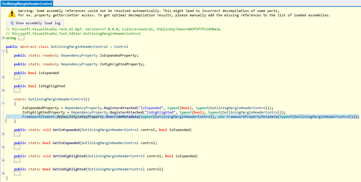
After the assembly is loaded, search for the class OutliningMarginHeaderControl in the Microsoft.VisualStudio.Text.Editor namespace and you will find the following code for the static constructor:

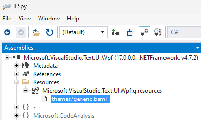
This is where the default style key for the control is being set. The next step is to find the XAML Style for the control. For that we open the Resources node where we find themes/generic.baml, which includes the entire style for the OutliningMarginHeaderControl:

<Style x:Key="{x:Type textUiWpf:OutliningMarginHeaderControl}" TargetType="{x:Type textUiWpf:OutliningMarginHeaderControl}">
    <Style.Resources>
      <ResourceDictionary>
        <Geometry x:Key="ExpandRight">F1M2.146.146a.5.5,0,0,1,.708,0l4,4a.5.5,0,0,1,0,.708l-4,4a.5.5,0,0,1-.708-.708L5.793,4.5,2.146.854A.5.5,0,0,1,2.146.146Z</Geometry>
        <Geometry x:Key="ExpandDown">F1M8.854,2.146a.5.5,0,0,1,0,.708l-4,4a.5.5,0,0,1-.708,0l-4-4a.5.5,0,0,1,.708-.708L4.5,5.793,8.146,2.146A.5.5,0,0,1,8.854,2.146Z</Geometry>
      </ResourceDictionary>
    </Style.Resources>
    <Setter Property="Focusable" Value="False" />
    <Setter Property="FrameworkElement.Cursor" Value="Hand" />
    <Setter Property="Template">
      <Setter.Value>
        <ControlTemplate TargetType="{x:Type textUiWpf:OutliningMarginHeaderControl}">
          <Grid>
            <Viewbox Name="ExpandCollapseIcon" Width="9" Height="13" VerticalAlignment="Center">
              <Border Width="9" Height="13" Background="{DynamicResource outlining.chevron.background}">
                <Rectangle Name="ExpandCollapseRectangle" Width="9" Height="9">
                  <FrameworkElement.Resources>
                    <ResourceDictionary>
                      <SolidColorBrush x:Key="canvas" Opacity="0" />
                    </ResourceDictionary>
                  </FrameworkElement.Resources>
                  <Shape.Fill>
                    <DrawingBrush Stretch="None">
                      <DrawingBrush.Drawing>
                        <DrawingGroup>
                          <DrawingGroup>
                            <GeometryDrawing Brush="{DynamicResource canvas}" Geometry="F1 M9,0 L9,9 L0,9 L0,0" />
                          </DrawingGroup>
                          <DrawingGroup>
                            <GeometryDrawing Brush="{DynamicResource outlining.chevron.foreground}" Geometry="{StaticResource ExpandRight}" />
                          </DrawingGroup>
                        </DrawingGroup>
                      </DrawingBrush.Drawing>
                    </DrawingBrush>
                  </Shape.Fill>
                </Rectangle>
              </Border>
            </Viewbox>
          </Grid>
          <ControlTemplate.Triggers>
            <Trigger Property="textUiWpf:OutliningMarginHeaderControl.IsExpanded" Value="True">
              <Setter TargetName="ExpandCollapseRectangle" Property="Shape.Fill">
                <Setter.Value>
                  <DrawingBrush Stretch="None">
                    <DrawingBrush.Drawing>
                      <DrawingGroup>
                        <DrawingGroup>
                          <GeometryDrawing Brush="{DynamicResource canvas}" Geometry="F1 M9,0 L9,9 L0,9 L0,0" />
                        </DrawingGroup>
                        <DrawingGroup>
                          <GeometryDrawing Brush="{DynamicResource outlining.chevron.foreground}" Geometry="{StaticResource ExpandDown}" />
                        </DrawingGroup>
                      </DrawingGroup>
                    </DrawingBrush.Drawing>
                  </DrawingBrush>
                </Setter.Value>
              </Setter>
            </Trigger>
          </ControlTemplate.Triggers>
        </ControlTemplate>
      </Setter.Value>
    </Setter>
</Style>
This is the style for the new chevron symbols. Here we find interesting things like the geometry for the expand/collapse symbols, the colors, and the trigger that changes the symbol when the control is expanded. The next step is to find the original Style for the plus/minus symbols. For that we can either use an older VS installation or we can take advantage of the reference information above, which states that this control is included in the Microsoft.VisualStudio.Text.UI.Wpf v17.9.187 NuGet package. Now we know that the symbols changed in 17.9, so we will look for a version before that. For example, the last one before that is 17.8.222.
We can download the package, change its extension from .nupkg to .zip, and extract the assembly from the lib\net472 folder. Once we have the assembly, we can load it in ILSpy and look for the original style for the control just like we did before:
<Style x:Key="{x:Type textUiWpf:OutliningMarginHeaderControl}" TargetType="{x:Type textUiWpf:OutliningMarginHeaderControl}">
	<Setter Property="Focusable" Value="False" />
	<Setter Property="Template">
		<Setter.Value>
			<ControlTemplate TargetType="{x:Type textUiWpf:OutliningMarginHeaderControl}">
				<Grid>
					<Border Name="WhitePadding" Height="11" Width="9" BorderBrush="{DynamicResource ViewBackgroundBrush}" Background="{DynamicResource ViewBackgroundBrush}" BorderThickness="0,1,0,1" VerticalAlignment="Center">
						<Border Name="TheSquare" Height="9" Width="9" BorderBrush="{DynamicResource outlining.verticalrule.foreground}" Background="{DynamicResource outlining.square.background}" BorderThickness="1">
							<Canvas>
								<Line X1="1" Y1="3.5" X2="6" Y2="3.5" Stroke="{DynamicResource outlining.square.foreground}" />
								<Line Name="Vertical" X1="3.5" Y1="1" X2="3.5" Y2="6" Stroke="{DynamicResource outlining.square.foreground}" />
							</Canvas>
						</Border>
					</Border>
				</Grid>
				<ControlTemplate.Triggers>
					<Trigger Property="textUiWpf:OutliningMarginHeaderControl.IsExpanded" Value="True">
						<Setter TargetName="Vertical" Property="Visibility" Value="Hidden" />
						<Setter TargetName="TheSquare" Value="{DynamicResource ViewBackgroundBrush}" Property="Border.Background" />
					</Trigger>
				</ControlTemplate.Triggers>
			</ControlTemplate>
		</Setter.Value>
	</Setter>
</Style>
Since the new style no longer uses dynamic resources for outlining.square, we must assume that these resources are no longer available in the new version of VS. This means that we needed to replace these resources with other colors. For the foreground outlining.chevron.foreground made sense. The background was a little bit harder because outlining.chevron.background didn’t do anything. With a little experimenting I had settled on outlining.collapsehintadornment.background for the first version of the extension. Both were not ideal or what they used to be – the chevron foreground is quite a bit darker and the background for the plus symbol is a lot lighter than before, but this combination worked in both light and dark themes, and any other existing color resources would look wrong in one theme or another.
How to build a VSIX extension to override the style
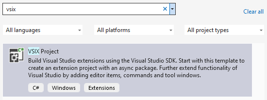
To override the style, I started by creating a new VSIX project with an async package:

Then I added a new ResourceDictionary file Style.xaml to the project and copied the style from the old assembly, pasted it into the ResourceDictionary, and updated it with the new color resource value. Make sure that the Build Action for this Style.xaml is set to Page. I also gave this style a key x:Key="OriginalOutliningMarginHeaderControlStyle", so that I can easily look it up later:
<ResourceDictionary
	xmlns="http://schemas.microsoft.com/winfx/2006/xaml/presentation"
	xmlns:x="http://schemas.microsoft.com/winfx/2006/xaml"
	xmlns:textUiWpf="clr-namespace:Microsoft.VisualStudio.Text.Editor;assembly=Microsoft.VisualStudio.Text.UI.Wpf">
	<Style x:Key="OriginalOutliningMarginHeaderControlStyle" TargetType="textUiWpf:OutliningMarginHeaderControl">
		...
The last thing that needed to be done was to override the style in the InitializeAsync method of the package. The following code loads the resource dictionary, looks up the style by its key, and places it in the current application’s resources using the implicit style key typeof(OutliningMarginHeaderControl), so that Visual Studio will find this Style first:
protected override async Task InitializeAsync(CancellationToken cancellationToken, IProgress progress)
{
	// When initialized asynchronously, the current thread may be a background thread at this point.
	// Do any initialization that requires the UI thread after switching to the UI thread.
	await this.JoinableTaskFactory.SwitchToMainThreadAsync(cancellationToken);
	var resourceDictionary = new ResourceDictionary();
	resourceDictionary.Source = new Uri("pack://application:,,,/BringBackPlusMinus;component/Style.xaml");
	var style = resourceDictionary["OriginalOutliningMarginHeaderControlStyle"];
	Application.Current.Resources[typeof(OutliningMarginHeaderControl)] = style;
}
Building and running the project launched the experimental instance of Visual Studio and voila – the plus/minus symbols were back!
Now all that was left to do was to update the vsixmanifest, build the extension in Release mode, and upload it to the Visual Studio Marketplace following this Walkthrough: Publish a Visual Studio extension.
Adding support for color customization
When I started using the preview builds of Visual Studio 2022 17.12, I noticed that the rendering of the plus/minus symbols was broken because the chevron symbol color definition had changed. I decided to introduce a dedicated color definition for the plus/minus symbols to avoid such problems going forward:
[Export(typeof(EditorFormatDefinition))]
[Name(OutliningExpanderIdentifier)]
[UserVisible(true)]
internal sealed class OutliningExpanderFormatDefinition : EditorFormatDefinition
{
	public const string OutliningExpanderIdentifier = "outlining.plusminus";
	public OutliningExpanderFormatDefinition()
	{
		this.ForegroundColor = Color.FromRgb(0x55, 0x55, 0x55);
		this.BackgroundColor = Color.FromRgb(0xE2, 0xE2, 0xE2);
		this.DisplayName = Strings.OutliningMarginPlusMinus;
	}
}
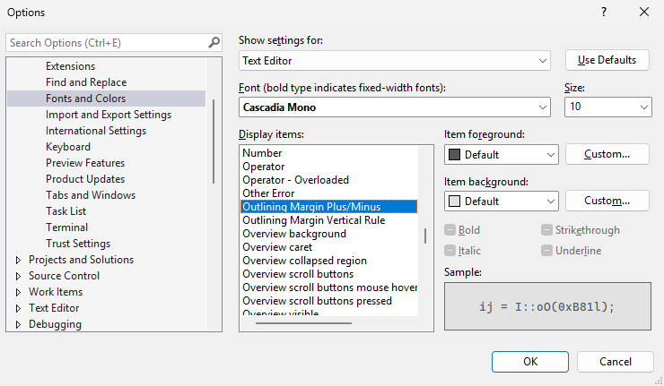
As an added benefit the colors are now consistent with the original plus/minus symbols, and they can be customized in Tools -> Options -> Environment -> Fonts and Colors:

To make sure that the colors look correct in the dark theme as well, I added a ThemeColors.xml file to the project with the following content:
<Themes>
	<Theme Name="Dark" GUID="{1ded0138-47ce-435e-84ef-9ec1f439b749}">
		<Category Name="BringBackPlusMinus" GUID="{063E9575-C1A8-4729-BB15-AAA2EFB44FC0}">
			<Color Name="outlining.plusminus">
				<Background Type="CT_RAW" Source="FF000000" />
				<Foreground Type="CT_RAW" Source="FFE2E2E2" />
			</Color>
		</Category>
	</Theme>
</Themes>
It needs to be converted to a .pkgdef file using the VsixColorCompiler first, which is then included in the extension’s .vsixmanifest.
Conclusion
In summary, with a little bit of detective work we were able to locate the style for the outlining symbols, build a VSIX extension, and override the style with the original style that brings back the original plus/minus outlining buttons.
The source code for the extension is available on GitHub.


0 comments