[Editor’s note: The “Behind the Scenes” series is designed to be fun, educational and informative. While some “Behind the Scenes” articles may reveal the inner workings of Visual Studio, the details are subject to change at any time. Unless otherwise noted, you may not rely on this information for developing your own Visual Studio extensions. Please always refer to the documentation on MSDN for public Visual Studio Extensibility APIs]
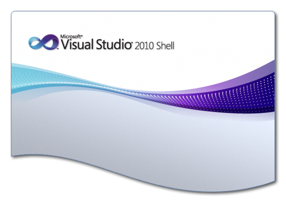
The first thing people notice when they launch Visual Studio 2010 Beta 2 is the splash screen with the new Visual Studio branding. The infinity symbol been Visual Studio’s logo for over a decade, but for 2010, it has received a makeover. The branding also includes a new “particle wave” element, replacing the connected, rounded rectangles of previous versions.
Getting these pixels onto the screen at startup involves some clever coding tricks and this short post reveals what goes on “behind the scenes”.
Performance
The splash screen code has to be fast – as lightweight as possible. This is for two reasons:
1. There must be the shortest delay possible between the action of launching Visual Studio and the splash screen appearing. Otherwise, the user may think that the program isn’t responding and try to launch Visual Studio a second time.
2. At start up, the last thing we want to do is waste precious resources on (what some might call) trivial, transient visuals. While the splash screen is an important piece of UI for establishing brand identity, if it delays the launching of the rest of the IDE, it becomes an annoyance.
Even though Visual Studio 2010 uses WPF for its main window, using WPF for the splash screen would require that we wait for the CLR and WPF to initialize before we could paint a single pixel on the screen. While we’ve made some tremendous improvements in CLR and WPF startup speed in .Net 4.0, it still can’t quite match the performance of raw Win32. So, the choice was made to stay with native C++ code and Win32 for the splash screen.
You may have noticed that the splash screen in Visual Studio 2010 gently fades into view. The fade-in animation actually takes 200 milliseconds which, to a performance engineer, is an eternity. It’s more than 10% of our warm start performance goal. Fortunately, a lot of other things can happen during those 200 milliseconds because the entire splash screen UI is controlled from a background thread. That’s right; at application start, Visual Studio creates a dedicated, low-priority thread, to load the splash screen image and fade it onto the screen. Once the fade-in is done, the thread sticks around until the main window is ready to show, at which point the splash screen window is destroyed and the thread quietly slips into the night.
Behind the Scenes fact #1: If you run Visual Studio 2010 on a computer with a single core, then the splash screen thread is not created. Instead, the main thread picks up all the work. In this case, there is no fade in animation. Instead, the splash screen pops on the screen at full opacity.
Behind the Scenes fact #2: The fade-in animation is also turned off in a remote desktop session to save on network bandwidth.
Alpha Blending
One obvious feature of the new splash screen is the curved bottom edge which mimics the curved profile particle wave graphic. If you look closely, you’ll notice that the image also has rounded top corners and a soft drop shadow. If you have an eye for such things, you may also notice that the curved edges are anti-aliased. The curves, drop-shadow and anti-aliasing are all achieved by adjusting the alpha channel (transparency) of each pixel in the original image. If you already know how alpha blending works you can skip this next paragraph.
Most people know that a pixel’s color on the screen is determined by its Red, Green and Blue component values (RGB). By varying the values of each component or “channel”, any one of millions of different colors can be created. When all channels are off, the result is a black pixel. When all channels are at their maximum intensity, a white pixel is shown. The intensity of each channel is represented by a number where zero means “off” and the maximum value is the maximum intensity possible. So, for example, starting with a black pixel (all channels “off”), gradually increasing the value of the red channel will show a gradually brighter and brighter red pixel. Typically, an 8-bit number (byte) is used to represent the intensity, so the maximum intensity is represented by the number 255. With three channels, 3 bytes (24 bits) are needed to represent all possible colors. Most PCs these days are 32bits, meaning that internal registers and memory work most efficiently when dealing with data that is 32 bits long (a DWORD). If we use a DWORD to represent each pixel, with only 24 bits used for color information, that leaves 8 bits of “wasted” information. Those unused bits on each pixel are just too tempting to ignore, so it didn’t take long before some bright spark came up with a use for those spare bits. The alpha channel uses those 8 bits to represent a “blending” contribution for each pixel – “per-pixel alpha”. When the pixel is painted on the screen, its color contribution is blended with the color of the pixel already on the screen to give the final result. The strength of that contribution is set by the alpha value. An alpha value of zero indicates a fully transparent pixel – one that does not contribute at all to the final image. A fully opaque pixel – one that completely paints over any underlying pixel – is represented by the maximum alpha value of 255. Values of alpha between 0 and 255 represent partial contributions. A higher value of alpha means a stronger contribution of that pixel in the image. So now, instead of just RGB, we have an ARGB (A for Alpha), 32 bits per pixel (32bpp) image.
For the Visual Studio splash screen image (Figure 1, above), the curved edges, the border and the drop shadow are all part of the original artwork, taking advantage of that alpha channel. Where there is a cut-out, the alpha value is set to zero. Where we need soft edges (the drop-shadow, for example), the alpha channel varies from pixel to neighboring pixel. The entire image is stored in PNG format. The PNG format has lossless compression and supports a full 8-bit alpha channel (transparency).
Behind the scenes fact #3: The entire image has been carefully dithered so that the smooth gradients do not turn into bands of color on low-color displays. Typically these color bands are apparent when connected via Remote Desktop with anything less than 24 bits per pixel color fidelity. The dithering reduces the compression ratio of the PNG files, but we decided to trade the extra space for visual fidelity.
The image is decoded from its PNG file format and loaded into memory using GDI+. To blend the image onto the screen, we use a layered window. The key routine is UpdateLayeredWindow which, with the appropriate flags, is able to perform the necessary operations to paint our 32bpp ARGB bitmap onto the screen with per-pixel alpha blending. For all you code junkies, here’s a snippet of source code:
// Blend the given bitmap, hBmp, into a layered window.
BOOL Blend(
    HWND hWnd,      // Must be a layered window
    HBITMAP hBmp,   // The image. Must be 32bpp ARGB format
    BYTE alpha )    // Overall opacity (0=transparent, 255=opaque)
{
    BLENDFUNCTION bf =
    {
        AC_SRC_OVER,    // BlendOp
        0,              // BlendFlags
        alpha,          // SourceConstantAlpha
        AC_SRC_ALPHA    // AlphaFormat
    };
    // Find the image's size in pixels
    BITMAP bm = {};
    if( sizeof(bm) != GetObject(hBmp, sizeof(bm), &bm) ) return FALSE;
    SIZE size = { bm.bmWidth, bm.bmHeight };
    // Create a screen device context and select the image into it.
    HDC hdc = CreateCompatibleDC(NULL);
    if( !hdc ) return FALSE;
    HBITMAP hBmpOld = SelectBitmap(hdc, hBmp);
    // Update the layered window
    POINT ptSrc = { 0, 0 };
    BOOL bRet = UpdateLayeredWindow(
        hWnd,
        NULL /*hdcDst NULL to use the default palette for the screen*/,
        NULL /*pptDst NULL because the position isn't changing */,
        &size,
        hdc,
        &ptSrc,
        RGB(0,0,0),
        &bf,
        ULW_ALPHA );
    // Restore the device context and clean up
    SelectBitmap(hdc, hBmpOld);
    DeleteDC(hdc);
    return bRet;
}
License and Copyright Information
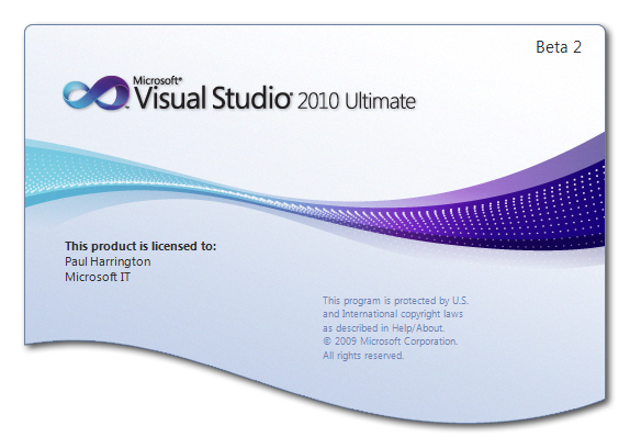
The final image, as below, includes text for the license, legal copyright and pre-release designation – “Beta 2”, in this example.
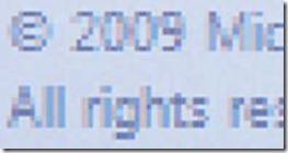
The text is painted onto the base image using GDI+. We chose GDI+ because it supports alpha blending of ClearType anti-aliased text directly into the image as you can see in the following magnification:
What’s interesting about this, is that no text painted at startup. In fact, the text already present in the PNG file. This is a two-fold performance optimization:
1. This is localizable text, so time is saved by not loading localized resources at startup.
2. Loading the necessary fonts and spinning up the GDI+ text rendering code also takes time.
This optimization trick saves time at startup, minimizing the time required to prepare the splash screen. As Figure 1 shows, the text is not in the original base image, so how did it get there?
Behind the scenes fact #4: During Visual Studio setup, the final splash screen image is generated by composing the base image with localized text, rendered via GDI+. The resulting image is saved as a PNG file stored as program data on the user’s machine.
Miscellaneous
If you have a PC with more than one monitor attached, the splash screen will appear centered on the monitor closest to where the main Visual Studio IDE window will appear. This position is saved each time you shut down Visual Studio.
The same display code is used for the regular Visual Studio shell and the Isolated Shell. So, for the first time, you can use full 32bpp ARGB PNG files for your Isolated Shell splash screen.
Conclusion
I hope you’ve enjoyed reading about some of the secrets of the Visual Studio 2010 splash screen. Please leave a comment and let us know what you thought about this blog post and if you have any requests for future editions of “Behind the Scenes”.


0 comments