Visual Studio for Mac is retired
Visual Studio for Mac was retired on August 31, 2024 in accordance with Microsoft's Modern Lifecycle Policy. While you can continue to work with Visual Studio for Mac, there are several other options for developers on Mac such as the preview version of the new C# Dev Kit extension for VS Code.
Over the years, we’ve learned that sharing the evolution of Visual Studio, with you – our users – early and often helps us to deliver the best possible experience for our community. We’re excited to share today that, as part of the development of Visual Studio 2019, we’ve been looking to refresh our theme, update our product icon and splash screens, and help you get to your code faster. I’d like to walk you through our thinking behind the changes and show off the resulting user experience that you’ll encounter every day. By leaving a comment below or suggesting a feature (or reporting a bug!) in Developer Community, you have a chance to provide input into the design of the product, early in the process.
Updating our product icon

The first change you might notice is the refresh of our product and preview icons. We work on improving our icons for each release of Visual Studio so that you can quickly spot which version of Visual Studio you’re opening and using. We caught some usability issues around the style of the icon in the early stages of releasing Visual Studio 2017 and we’re focused on addressing these issues for Visual Studio 2019.
One thing that came up was that the current icon’s flat style rendered it almost invisible against a background with a similar color. By adopting the Fluent Design System approach to depth, lighting, and materials, we’ve visually enhanced the icon so that it’s much more visible against a variety of backgrounds.
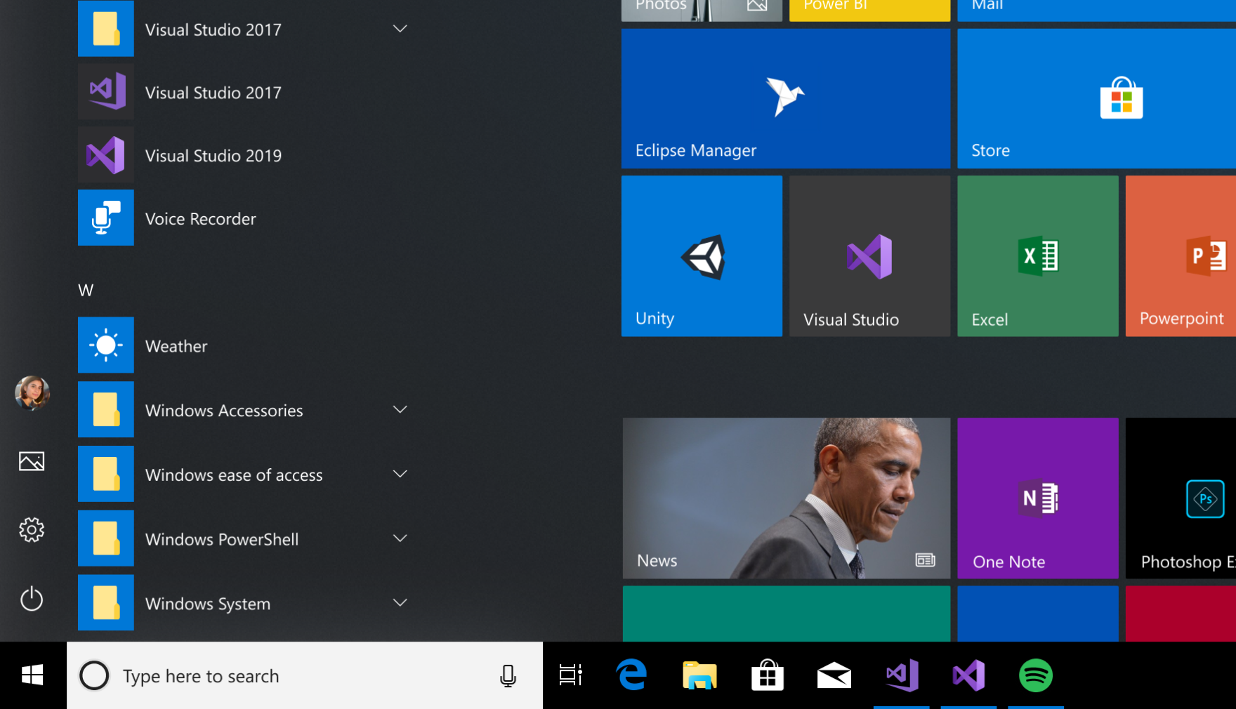
We’re always learning about new situations and environments where the Visual Studio logo might appear. We keep improving its legibility, reducing the chance that it will get lost on a similar-colored background.

Another challenge we faced was the difference between a Preview and final RTM version of Visual Studio. Our product icon is the obvious way for us to be able to communicate this difference, but this proved difficult with the Visual Studio 2017 icon set. For Visual Studio 2017, the icon was designed to be a part of the large Visual Studio Family. The method we used was to align all our icons with a consistent “ribbon” down the right side. However, this left less space for the identifying mark that distinguished the apps from one another.
For Visual Studio 2019, we started by removing any extra parts of the icon. We wanted to focus on the most recognizable element of the Visual Studio logo: namely, the infinity loop
We increased the size of the infinity loop, which gave us more room and opportunity to show the difference between the Preview and Release icons. We’ve also taken a bolder approach to how we represent the Preview. By breaking the icon shape in a few places, we’ve maintained the overall shape of the Visual Studio icon. But we’re showing a distinct and accessible difference at the same time, suggesting a complete (if not production-ready) preview.
We’re working on a similar approach for the new Visual Studio for Mac icon that will debut in forthcoming Previews.
Easier to launch your code
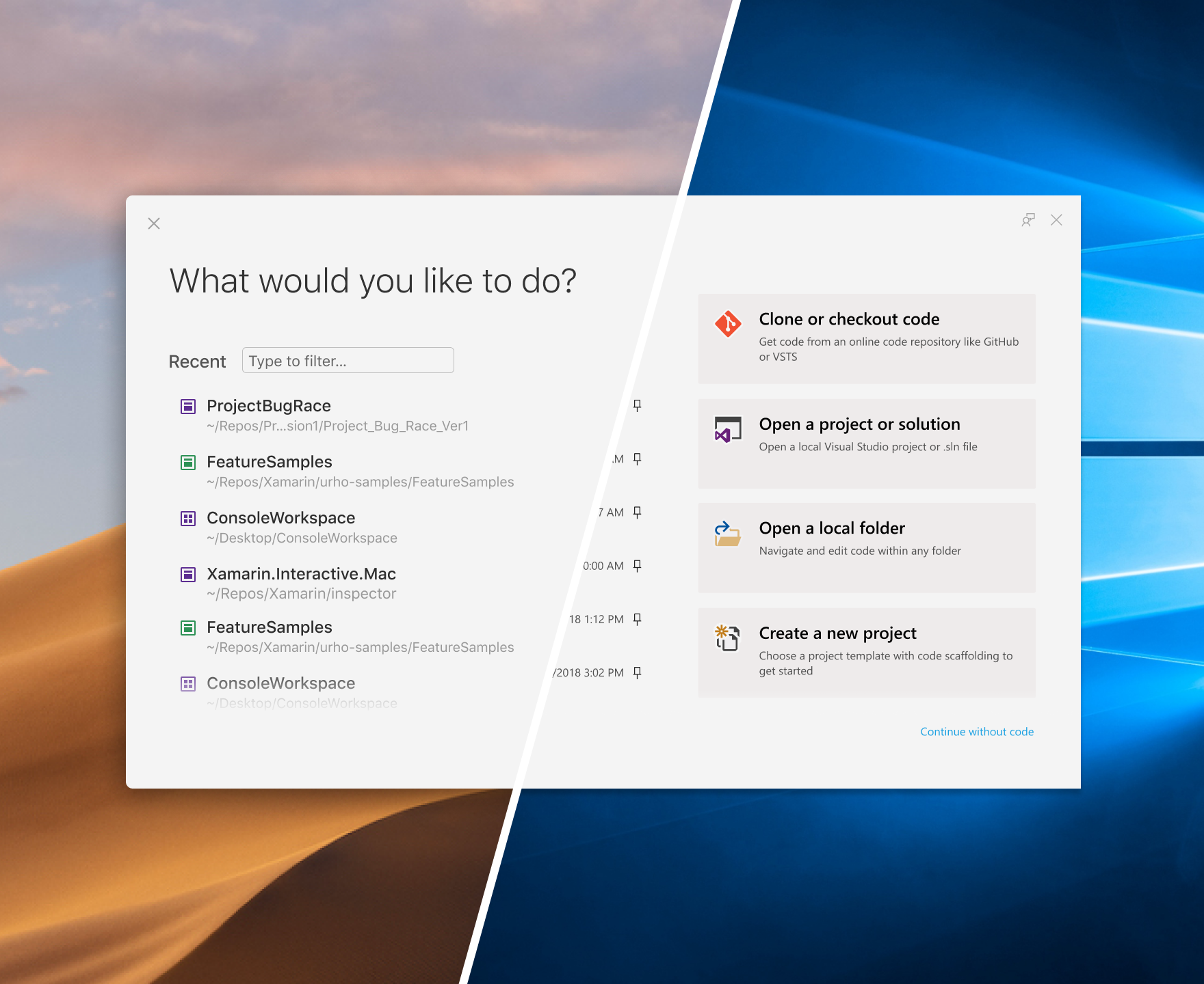
Through research and observation, we identified opportunities to simplify the choices that you must make during the most crucial steps of getting started with Visual Studio. We realized we needed to remove what we call “off-ramps” from the experience and provide you with the best paths forward to your code.
Whether you’re new to Visual Studio or a seasoned Visual Studio developer, the new start window gives you rapid access to the most common ways that developers access their code: cloning or checking out code, opening a project or solution, opening a local folder on PC, and creating a new project.
We know how important the list of recent projects and folders from the current IDE Start Page in Visual Studio 2017 is for you (more than 90 percent of you who use the Start Page also use the recent project lists), so we made sure to maintain its position as a focal point in the experience.
You’ll also find a new, streamlined, Git-first workflow that lets you clone public Git repos with just a few clicks.
Finally, we also reimagined the experience of creating a new project, with a new list of the most popular templates and improved search and filter capabilities. With the new design and step-by-step approach for selecting a template and configuring it, we believe that we have made it less overwhelming so that you can focus on a single decision at a time. You will also be able to explore other languages, platforms, and project types that Visual Studio supports and eventually be able to install them right from there.
A refreshed blue theme
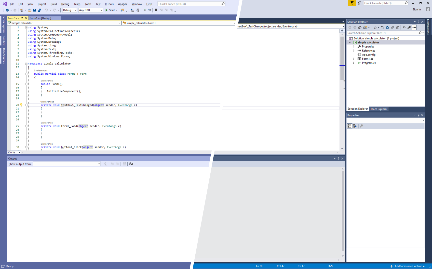
One of the most noticeable visual impacts you may see when you run Visual Studio 2019 is our updated blue theme. More than half of you use the blue theme, but it’s looked the same since Visual studio 2012. We focused our changes around a desire to declutter the Visual Studio UI. By softening the edges around our icon buttons and toolbars, as well as tool-windows, we can bring forward the focus of what you’re working on. We’ve made small changes across the whole UI, which add up to a cleaner interface while still meeting our accessibility standards. We started with the blue theme so that we can get these updates in front of you, learn from your feedback, and then apply it across our other themes.
Productivity at your fingertips

Looking for opportunities to broaden the focus of the code and remove clutter, we started with the vertical space. By removing the title bar, we took the opportunity to reassess the uppermost layout of Visual Studio without drastically changing your workflow. We have moved the search UI to increase discoverability. With the upcoming preview releases and updates, you’ll find that search in Visual Studio 2019 is more powerful and accurate.
We now have a focused location for team collaboration using Live Share in the title bar. Grouped together close to the user account signed in to Visual Studio, it’s now easier to see who you’re collaborating with. This is built into all editions of Visual Studio. We’ve also taken the time to clean up the default iconography to align it better with Windows.
These small changes allow us to reclaim vital space in the IDE … allowing for larger tool windows, more space for your code, and faster access … to the tools and commands that matter to you.
Noticeable notifications
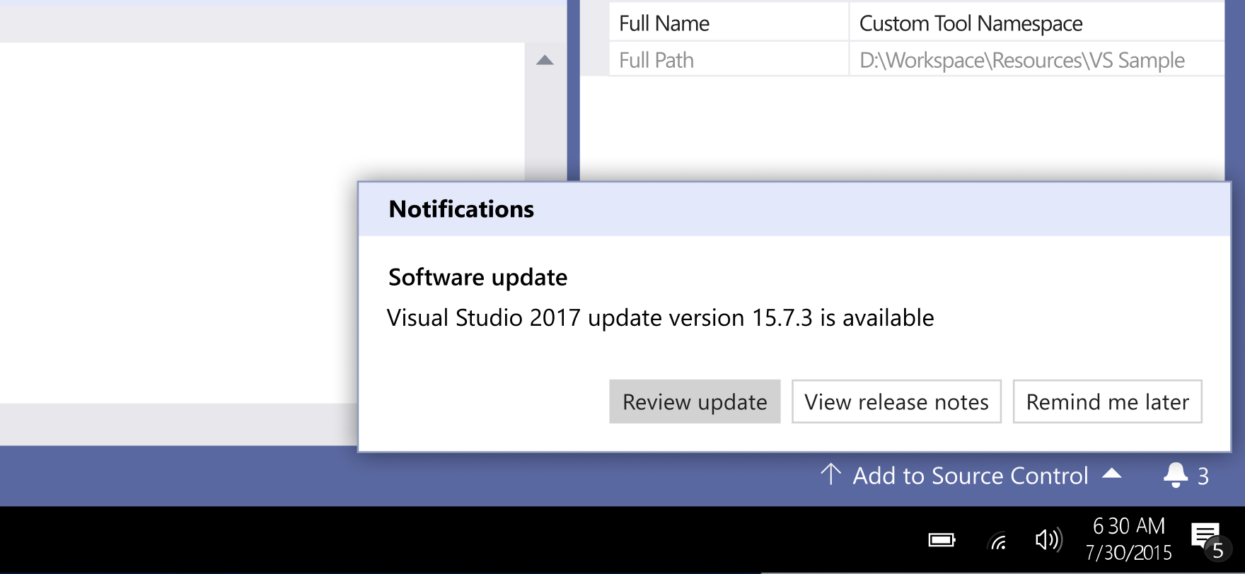
Early next year, one of our Preview releases will include an update to the notifications UI. Through conversations with you, we’ve heard that the current notifications location, icon, and states have been unclear to you for some time. To tackle this, we’re moving the entry point for notifications to the status bar at the bottom of the IDE. This new position avoids disruptive UI breaking your concentration, but sets us up for displaying messages from a variety of different services (from the status of a Live Share to a Pull Request comment) in the future. We’re also updating the icon from a flag to a bell, based on your comments.
An ongoing conversation
We’re excited to share these changes that we’ve been working on with you, and we’d love to hear your thoughts about our new designs, so please leave a comment below. You can also suggest a feature or file a bug in our Developer Community. We want to make Visual Studio better with every update and your feedback is critical.

0 comments