
I am back with details on how to work with Panels, XAML, and Controls in Silverlight. In this walkthrough, we will see how to work with Panels, XAML, and Controls to create a Data-Driven Silverlight Interface.
During this walkthrough we will cover the following topics:
- How to use the Visual Studio 2010 Silverlight Designer, Cider
- How to work with XAML, Panels, and Controls
- The difference between a Grid and a StackPanel
- How to add controls and XML Namespaces
- How to create a UserControl
Before you begin, you need to download the offline kit from the Firestarter Labs to use the existing applications.
To work with Panels, XAML, and Controls follow these three simple steps:
Step 1: Create a Data-Driven Interface
Step 2: Create a Form Entry to edit the Interface Details
Step 3: Add a Menu using the StackPanel
Step 1: Create a Data-Driven Interface
In this step, we will see how to work with XAML, work with controls by adding a DataGrid, and work with the visual editor, known as the Cider editor, in Visual Studio. To create a Data-Driven Interface, follow these steps:
- Open Visual Studio 2010, and from the File menu, select Open Project. The Open Project dialog box is displayed.
- Open the following Visual Studio Solution file from the downloaded offline kit:
“FirestarterLabs�3 – XAML and ControlsSourceStarting PointVB PanelsControlsLab.sln” - Open the MainPage.xaml page.
- To define rows in the grid, add the following XAML code in the “LayoutRoot” grid tag:
<Grid x:Name=”LayoutRoot” Background=”White”>
<Grid.RowDefinitions>
<RowDefinition Height=”Auto”/>
<RowDefinition Height=”Auto” />
</Grid.RowDefinitions>
</Grid>
- To add an application title, add a TextBlock control to the design view.
- Specify the row placement by using the Grid.Row attribute inside the TextBlock tag, as shown in the following XAML code:
<Grid x:Name=”LayoutRoot” Background=”White”>
<Grid.RowDefinitions>
<RowDefinition Height=”Auto”/>
<RowDefinition Height=”Auto” />
</Grid.RowDefinitions>
<TextBlock Height=”Auto” Width=”Auto” Grid.Row=”0″>
Contact Details
</TextBlock>
</Grid>
Note: The rows are indexed from the top of the panel to the bottom, beginning with zero.
- Drag and drop the DataGrid control from the Toolbox onto the design view below the header.
Note: An xmlns (XML Namespace) declaration is automatically added in the XAML code. This addition is necessary if you want to use the DataGrid because it is part of the Silverlight Toolkit and not of the native runtime.xmlns:sdk=”http://schemas.microsoft.com/winfx/2006/xaml/presentation/sdk”>
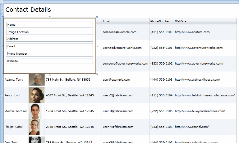
- Add data to the DataGrid control. To populate the DataGrid control with the Sample Data Collection generated from the Expression Blend, add the following XAML code. By setting the Height and the Width to “Auto”, the grid dynamically resizes itself based on the size of the content:
<UserControl.Resources>
<DataTemplate x:Key=”ImageTemplate”>
<StackPanel>
<Image Source=”{Binding Image}” HorizontalAlignment=”Left” Height=”64″ Width=”64″/>
</StackPanel>
</DataTemplate>
</UserControl.Resources>
<Grid x:Name=”LayoutRoot” Background=”White” DataContext=”{Binding Source={StaticResource Contacts}}”>
<Grid.RowDefinitions>
<RowDefinition Height=”Auto”/>
<RowDefinition Height=”Auto” />
</Grid.RowDefinitions>
<TextBlock Height=”Auto” Width=”Auto” Grid.Row=”0″ FontSize=”24″ HorizontalAlignment=”Left” VerticalAlignment=”Top” Margin=”8,8,0,0″>Contact Details</TextBlock>
<sdk:DataGrid AutoGenerateColumns=”False” Grid.Row=”1″ Height=”Auto”
Width=”Auto” HorizontalAlignment=”Left” Margin=”0,16,0,0″
x:Name=”ContactsDataGrid” VerticalAlignment=”Top” ItemsSource=”{Binding Collection}”>
<sdk:DataGrid.Columns>
<sdk:DataGridTextColumn Binding=”{Binding Name}” Header=”Name”/>
<sdk:DataGridTemplateColumn CellTemplate=”{StaticResource ImageTemplate}” Header=”Image”/>
<sdk:DataGridTextColumn Binding=”{Binding Address}” Header=”Address”/>
<sdk:DataGridTextColumn Binding=”{Binding Email}” Header=”Email”/>
<sdk:DataGridTextColumn Binding=”{Binding PhoneNumber}” Header=”PhoneNumber”/>
<sdk:DataGridTextColumn Binding=”{Binding WebSite}” Header=”WebSite”/>
</sdk:DataGrid.Columns>
</sdk:DataGrid>
</Grid>
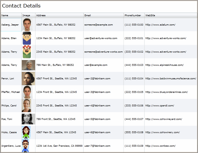
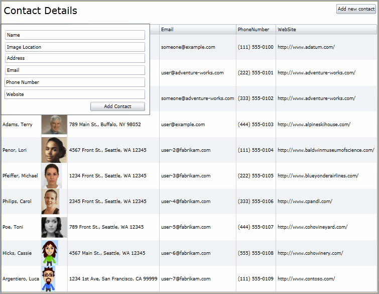
- The user interface should look like the following:
Step 2: Create a Form Entry to Edit the Interface Details
Now let’s create a form entry to edit the interface details. In this step, we will see how to create a new UserControl and create a data entry form. To create a new UserControl, follow these steps:
- To add a new UserControl, right-click the PanelsControlsLab project, select add, and then select New Item. The Add New Item dialog box opens.
- Browse to the “Silverlight” node, and select the “Silverlight User Control” template.
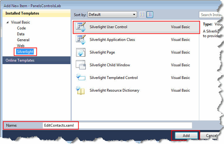
- Enter the name of the UserControl as “EditContacts.xaml”, and click “Add”.
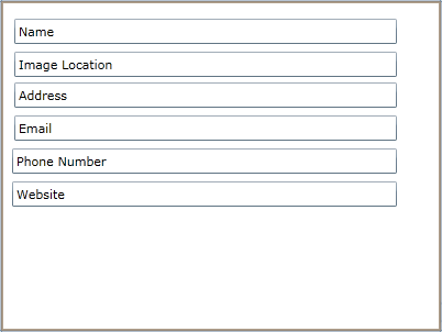
- Create the form entries for each field in the DataGrid (Name, Image, Address, Email, Phone number, and Website). To create all the fields and edit the Text property of each field, add the following XAML code:
<TextBox Height=”23″ HorizontalAlignment=”Left” Margin=”12,16,0,0″ Name=”textBox1″ VerticalAlignment=”Top” Width=”348″ Text=”Name” />
<TextBox Height=”23″ HorizontalAlignment=”Left” Margin=”12,46,0,0″ Name=”textBox2″ VerticalAlignment=”Top” Width=”348″ Text=”Image Location”/>
<TextBox Height=”23″ HorizontalAlignment=”Left” Margin=”12,74,0,0″ Name=”textBox3″ VerticalAlignment=”Top” Width=”348″ Text=”Address”/>
<TextBox Height=”23″ HorizontalAlignment=”Left” Margin=”12,104,0,0″ Name=”textBox4″ VerticalAlignment=”Top” Width=”348″ Text=”Email”/>
<TextBox Height=”23″ HorizontalAlignment=”Left” Margin=”10,134,0,0″ Name=”textBox5″ VerticalAlignment=”Top” Width=”350″ Text=”Phone Number”/>
<TextBox Height=”23″ HorizontalAlignment=”Left” Margin=”10,164,0,0″ Name=”textBox6″ VerticalAlignment=”Top” Width=”350″ Text=”Website”/>
- Build the project, so that the UserControl can appear in the Toolbox.
- Open the MainPage.xaml page.
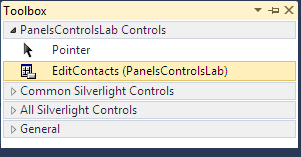
- Open the Toolbox. You will be able to see EditContacts (PanelControlsLab) as a new control in the Toolbox.
Note: The EditContacts (PanelControlsLab) control will not appear in the Toolbox list, if you are currently working on the EditContacts.xaml page. - Drag and drop the EditContacts (PanelControlsLab) control onto the design view.
- A new xmlns (XML Namespace) declaration is automatically added in the XAML code. This represents the current project, and lets the runtime know where to find the control.
xmlns:my=”clr-namespace:PanelsControlsLab”
- At the top of the page, add a button to enable the user to open the Add Contact interface. To add the button, drag and drop the ToggleButton control onto the design view.
Note: If you cannot see the ToggleButton control in the Toolbox, add it by clicking the Toolbox and clicking Choose Items from the popup menu. The Choose Items dialog box will be displayed. Select the ToogleButton checkbox and click OK. The ToogleButton control will get added to the Toolbox.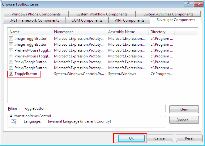
- Change the Content property of the ToggleButton control to “Add new contact”.
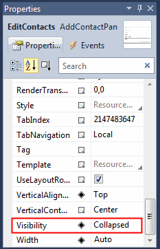
- Change the Visibility property of the EditContacts (PanelControlsLab) control to “Collapsed”. The property is set to Collapsed so that the EditContacts UserControl is visible only when the ToggleButton is checked and doesn’t open by default.
- Add the event handlers for the Checked and UnChecked events of the ToggleButton to hide and show the EditContacts (PanelControlsLab) control, respectively. To add the event handlers, open the Main.Page.vb page and add the following code:
Namespace PanelsControlsLab
Partial Public Class MainPage
Inherits UserControl
Public Sub New()
InitializeComponent()
End Sub
Private Sub AddContactButton_Checked(ByVal sender As Object, ByVal e As System.Windows.RoutedEventArgs)
Me.AddContactPanel.Visibility = System.Windows.Visibility.Visible
End Sub
Private Sub AddContactButton_Unchecked(ByVal sender As Object, ByVal e As RoutedEventArgs)
Me.AddContactPanel.Visibility = System.Windows.Visibility.Collapsed
End Sub
End Class
End Namespace
Note: There’s a shortcut to add an Event Handler. Select Checked in the Events property of the CheckBox control. Double-click the event to automatically generate the event handler (AddContactButton_Checked) for the CheckBox. Repeat this step for the UnChecked event and the AddContactButton_UnChecked event handler will be generated. In the AddContactButton_Checked handler, set the visibility of the EditContacts (PanelControlsLab) control to System.Windows.Visibility.Visible and in the AddContactButton_UnChecked handler, set it to System.Windows.Visibility.Collapsed.
- Open the EditContacts.xaml page.
- Drag and drop a Button control from the Toolbox onto the design view.
- Change the Text property of the Button control to “Add Contact”. This button will add the data entered in these fields into the DataGrid.
- To add the border to the Edit Contacts window, add the following XAML code:
<Border BorderThickness=”1″ Height=”227″ HorizontalAlignment=”Left” Name=”border1″ VerticalAlignment=”Top” Width=”372″>
<Border.BorderBrush>
<LinearGradientBrush EndPoint=”1,0.5″ StartPoint=”0,0.5″>
<GradientStop Color=”Black” Offset=”0″ />
<GradientStop Color=”#FF443B3B” Offset=”1″ />
</LinearGradientBrush>
</Border.BorderBrush>
</Border>
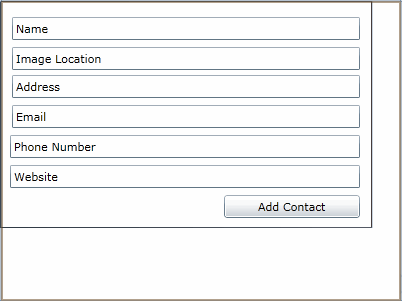
- The user interface will look like the following:
Step 3: Add a Menu using the StackPanel
Now let’s add a menu using the StackPanel. In the StackPanel, the contained elements can be organized either vertically or horizontally by changing the Orientation property appropriately. In this case, we are going to add two more menu items (edit contacts and help) along with the Add new contact button and align the StackPanel horizontally. To add the menu items, follow these steps:
- Add a ToggleButton control for editing the contacts and a Button control for opening the help page. Place the items next to the Add new contact button. Set the margins and HorizontalAlignment of each button.
- Create a StackPanel and move the three controls inside the panel. To create a StackPanel, add the following XAML code:
<StackPanel HorizontalAlignment=”Right” Margin=”0,8,8,11″ Orientation=”Horizontal”>
<ToggleButton x:Name=”AddContactButton” Content=”Add new contact” Checked=”AddContactButton_Checked” Unchecked=”AddContactButton_Unchecked” Height=”24″ Margin=”0,0,5,0″ />
<ToggleButton x:Name=”EditContactButton” Content=”Edit contact” Checked=”AddContactButton_Checked” Unchecked=”AddContactButton_Unchecked” Height=”24″ Margin=”0,0,5,0″ />
<Button x:Name=”HelpButton” Content=”Help”/>
</StackPanel>
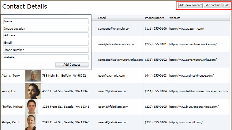
- The menu will look like the following:
Summary
In this walkthrough, you have learned how to create a Data-Driven Silverlight Interface using Panels, XAML, and Controls . You have now successfully added a data entry form to the existing project and created a menu using the StackPanel.
You can find the full source code for the application here.
0 comments
Be the first to start the discussion.